
Long border illusion for stack image block (7.0 & 7.1CE)

I don’t know about you but, when looking to get creative with Squarespace customizations, I like to go beyond inspirational sites and get ideas from other artistic mediums, such as magazines.
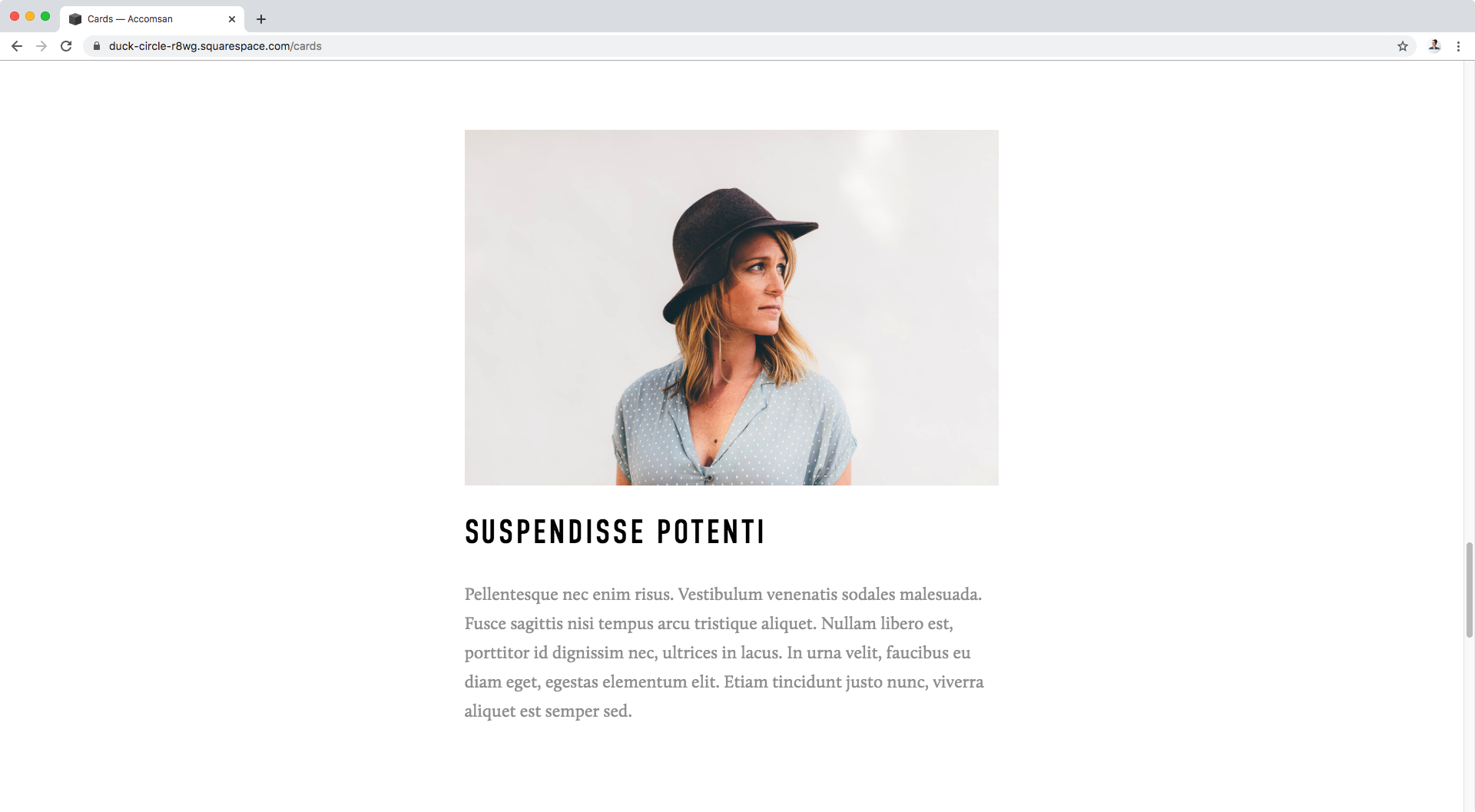
And since the magazine-look for websites seems to be a trend meant to stick around for a while, I thought today I’d share the result of one of my recent experiments involving a pretty cool image and text layout, this one right here on the left side:

Like the idea? Then let’s get started!
Customizing the stack image block
We’ve covered other image blocks in this blog, but so far we haven’t touched the Stack layout and I think that’s the perfect block to start with to achieve our customization.
Here’s what mine looks like:
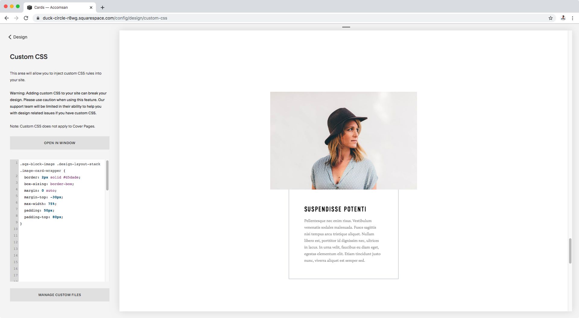
It seems like the best way to go about this is by targeting the content area and giving it a border, so let’s look through our Inspect Element tool and find out what that container is called:


Alright, we can see a couple of classes, but I’m going to go with the first one that seems appropriate, .image-card-wrapper.
Now, since we want to do this just for stack blocks, we should look for at least one more class that clearly indicates that layout style.
Scrolling upwards just a tad, in our Inspect Element window, we see this:

Again a bunch of classes, but there’s one in particular that will work great for us here: .design-layout-stack.
Additional to these selectors, I’m also going to use the class .sqs-block-image – that’s in the container just before this last one – as part of our selector.
Note: I’m doing this because at some point while working with the customization, I came across a style that was being overridden by one of the default ones for the stack block, and instead of using !important to force my change, I chose to make my code more specific by using the exact same classes Squarespace was using to apply the default style that was giving me a hard time.
So, this is what I’ll be working with to target the container area of our stack layout:
.sqs-block-image .design-layout-stack .image-card-wrapper {

}

How about we begin by adding a border?
I’ll be making mine 2px in thickness and using a light blue as the color:
.sqs-block-image .design-layout-stack .image-card-wrapper {
  border: 2px solid #d5dade;
}

And how about some padding to separate the content from the edges?
.sqs-block-image .design-layout-stack .image-card-wrapper {
  border: 2px solid #d5dade;
  padding: 30px;
}

Good!
Now, in our inspirational illustration we have that the content is narrower than the actual image, so let’s restrict the size of our content container.
You can use pixels if you like! I’ll go with a percentage here:
.sqs-block-image .design-layout-stack .image-card-wrapper {
  border: 2px solid #d5dade;
  max-width: 75%;
  padding: 30px;
}

I actually want to tweak the padding since I want more whitespace, I’ll change it to 50px.
And let’s also use margin: 0 auto to center this:
.sqs-block-image .design-layout-stack .image-card-wrapper {
  border: 2px solid #d5dade;
  margin: 0 auto;
  max-width: 75%;
  padding: 50px;
}

Not bad, but the padding seems to be expanding the box instead of narrowing things down inside.
Let’s fix that by adding box-sizing: border-box, since that declaration tells our browser that the padding should count as part of the width of the container, instead of going beyond it.
.sqs-block-image .design-layout-stack .image-card-wrapper {
  border: 2px solid #d5dade;
  box-sizing: border-box;
  margin: 0 auto;
  max-width: 75%;
  padding: 50px;
}

That’s better!
Now, here you can do one of two things:
Remove the top border of the box, so it looks like it continues behind the image.
Add a top margin to pull the box upward and then some padding to the top as well to add more space.
It’s up to you! I’m going with #2, just because.
I’ll set a top margin of -30px and then add a top padding of 80px:
.sqs-block-image .design-layout-stack .image-card-wrapper {
  border: 2px solid #d5dade;
  box-sizing: border-box;
  margin: 0 auto;
  margin-top: -30px;
  max-width: 75%;
  padding: 50px;
  padding-top: 80px;
}
This is the result in desktop:
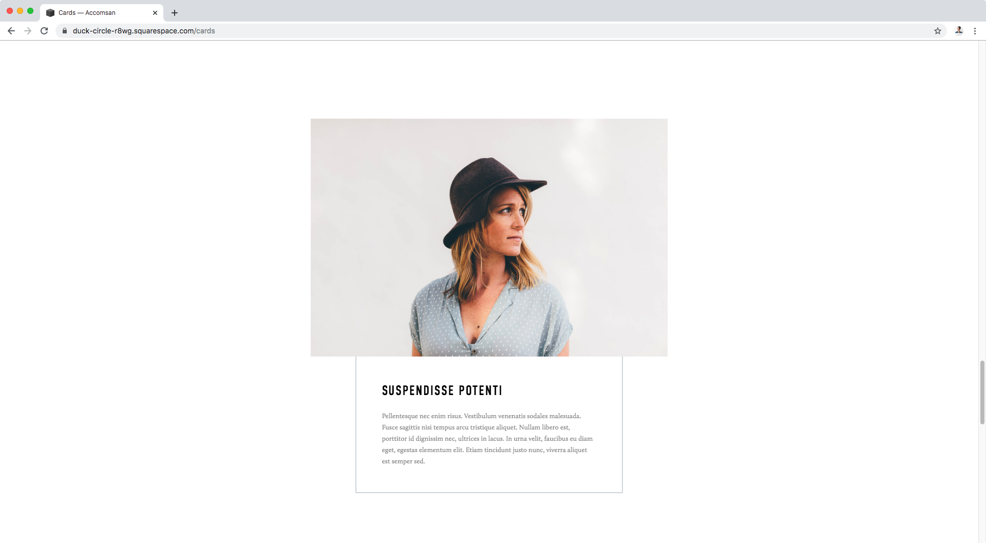
Looks nice! Doesn’t it?
You could absolutely leave your customization here, but if you want to keep going, let’s go ahead and tackle the “long” border part.
Creating the long border illusion
The first thing that comes to mind when moving onto this part of the customization – having the bit of border come up the top of the image – is to add a lot of height or padding to the content area and “pull it” upwards with a margin to put it in place.
Personally, I think this is going to be a pain for us mainly because the image and the content container resize based on screen sizes, so using a margin would make things move around too much and possibly cause overlapping headaches at some point.
Instead, why don’t we just create the illusion that the border is taller than the image by “attaching” a smaller container with a border to the top of the block, in order to have more control over its position.
After all, that’s what our dear friends the pseudo-elements are for!
Here’s my train of thought for this part: I need to “attach” a pseudo element to the thing that dictates the size of my content container (the one we already gave the border to), so that the restricted width I give it matches the restricted width of the content area.
So, with that in mind, let’s take a look at what the container holding BOTH our image and our content is called, because I think that’ll be the perfect candidate to hold our fake border bit.


We already used a class from this container in the first part of the tutorial to indicate we’re targeting only the stack layout (.design-layout-stack). Let’s use that class and also grab the one called .image-block-outer-wrapper to make sure we’re only touching that wrapper.
I’ll also use the .sqs-block-image class like we did last time, but you can give it a shot without it and see if your code doesn’t get overridden by the one set by Squarespace.
Alright, let’s create a ::before pseudo element for this container by setting up some basic properties to set up an empty container, with 90px in height, 100% in width and a temporary background color:
.sqs-block-image .design-layout-stack.image-block-outer-wrapper::before {
  content: '';
  display: block;
  height: 90px;
  width: 100%;
}

Awesome!
Now, let’s restrict the size just like we did before. I’ll give mine the same max-width of 75% I gave my content container:
.sqs-block-image .design-layout-stack.image-block-outer-wrapper::before {
  content: '';
  display: block;
  height: 90px;
  max-width: 75%;
  width: 100%;
}

Alright, let’s center it!
.sqs-block-image .design-layout-stack.image-block-outer-wrapper::before {
  content: '';
  display: block;
  height: 90px;
  margin: 0 auto;
  max-width: 75%;
  width: 100%;
}

Now, let’s switch the background for the border:
.sqs-block-image .design-layout-stack.image-block-outer-wrapper::before {
  border: 2px solid #d5dade;
  content: '';
  display: block;
  height: 90px;
  margin: 0 auto;
  max-width: 75%;
  width: 100%;
}

And let’s “pull” it downwards with a negative margin-bottom so we can’t see the bottom border (you can simply remove it if you prefer!):
.sqs-block-image .design-layout-stack.image-block-outer-wrapper::before {
  border: 2px solid #d5dade;
  content: '';
  display: block;
  height: 90px;
  margin: 0 auto;
  margin-bottom: -30px;
  max-width: 75%;
  width: 100%;
}

Lastly, let’s use the box-sizing fix again because I think this looks juuuuuuuust a bit bigger than the bottom box:
.sqs-block-image .design-layout-stack.image-block-outer-wrapper::before {
  border: 2px solid #d5dade;
  box-sizing: border-box;
  content: '';
  display: block;
  height: 90px;
  margin: 0 auto;
  margin-bottom: -30px;
  max-width: 75%;
  width: 100%;
}

Let’s check this out in different screen sizes:


Beautiful!
I hope you enjoyed this little experiment using a magazine as inspo to create this lovely Squarespace customization.
Until next time,
B.
Full code
/*LONG BORDER ILLUSION FOR STACK IMAGE BLOCK*/
.sqs-block-image .design-layout-stack .image-card-wrapper {
  border: 2px solid #d5dade;
  box-sizing: border-box;
  margin: 0 auto;
  margin-top: -30px !important;
  max-width: 75%;
  padding: 50px;
  padding-top: 80px;
}

.sqs-block-image .design-layout-stack.image-block-outer-wrapper::before {
  border: 2px solid #d5dade;
  box-sizing: border-box;
  content: '';
  display: block;
  height: 90px;
  margin: 0 auto;
  margin-bottom: -30px;
  max-width: 75%;
  width: 100%;
}