
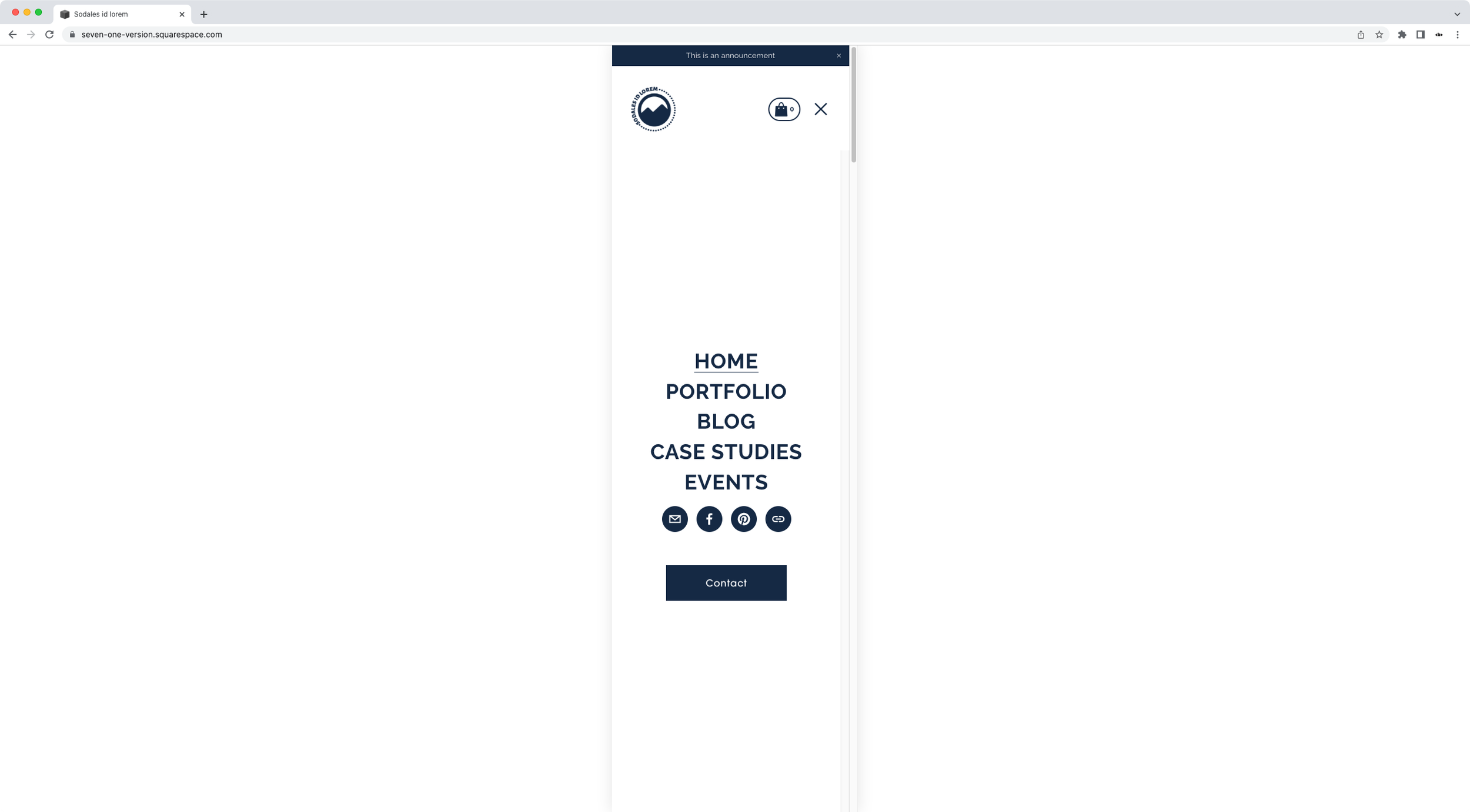
Moving the mobile menu button in Squarespace closer to the links (7.1)
It's funny how such a silly little detail can cause so much frustration, isn’t it?
Whether it was your idea or not to tweak this part of the mobile nav in 7.1, not being able to make this change through the native editor is a tad infuriating.
And, if you’ve tried to tackle this with CSS, the problem is that there's no padding, no margin, no nothing creating the gap between the nav links and the button.
So, excuse my french but, WTF?
Well, that's exactly what we'll be looking into in today's tutorial!
I’ll be showing you how you can bring the button (or social icons) closer to the menu links on mobile – in 7.1 – with just a few lines of CSS!
Tutorial
Overview & timestamps
Luckily for us, this customization is pretty easy to achieve since all the structure is already created for us in a flexible way…
You know where I’m going with that?…
No?
That’s ok! You’ll find out soon enough:
00:00 - Intro
01:21 – Looking into what's pushing the CTAs to the bottom of the mobile menu
Before being able to get rid of the gap between the links and the button/social links, we first need to know WHAT is causing it. So, we’ll take a few minutes to look through the Inspector Tool and understand what the heck is going on in there.
03:21 – Targeting the corresponding container to remove the extra space between links and button
Next, we’ll need to target the culprit container via CSS to force it to shrink down and stop being such a bully, pushing everyone else out of the way. Once we’re done here, there’s just one more thing to do!
04:03 – Center-aligning links and button inside the mobile menu in 7.1
We’ll need to decide how we want to REALIGN things within our overlay menu: do we want everything in the center? Perhaps aligned to the bottom of the screen? Or how about spread out evenly? I’ll show you what you can do in each case to achieve the exact look you’re going for.
And that’s it!
That’s how you can take control of the look of your client’s Squarespace 7.1 mobile menu.
Until next time,
B.
Full code
Custom CSS Window
/*MOVING THE MOBILE MENU BUTTON IN SQUARESPACE 7.1 CLOSER TO THE LINKS*/
.header-menu-nav-folder-content {
 flex-grow: 0;
}
.header-menu-nav-folder {
  justify-content: center;
}