
Keeping centered navigation links in one single line, in Squarespace (7.1)
Ah yes.
We have another “if you know you know” type of tutorial on our hands this week.
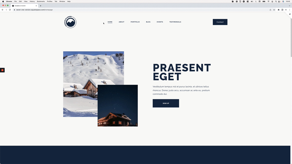
If you’ve worked with the centered-links header option in 7.1 in the past (or are currently doing so), depending on the number of links you have you may have noticed that even when there seems to be space available on the sides for the menu to stretch out, for some reason the elements just decide to drop onto multiple lines.
If you’re reading this, it’s very likely you know exactly what I’m talking about so why don’t we just jump into the video so you can a) find out the reason why that happens and, b) fix it, and force the menu items to stay on one line for as long as possible.
Let’s go!
Tutorial
Overview & timestamps
This one’s gonna be a quick CSS trick, so let’s just dive right into it:
00:00 - Intro
00:57 - Overview of how the nav can be stretched out
First and foremost, we’ll need to check how things are currently laid out in the navigation to see what we can do about it. With this in mind, we’ll inspect both the logo and the button area of the header, to see how much space they occupy and what we can modify to reduce it.
02:59 - Creating the CSS to stretch out the navigation links
Next up, we’ll target both sides of the nav via CSS and modify the corresponding flex and width values needed, to ensure the menu links have enough room to expand out if they need to, and ensure that (for the most part) we’ll be able to keep the links in one single one across as many devices as possible.
05:14 - What happens when a smaller value is used
Last but not least, we’ll do a quick test to see what happens if we use a value that’s too small for our elements, so you can easily tell if you should increase the number or not in your own project.
That was easy, right?
Hope you found this helpful!
Until next time,
B.
Full code
Custom CSS Window
/*KEEPING CENTERED NAVIGATION LINKS IN ONE SINGLE LINE, IN SQUARESPACE 7.1*/
.header-layout-nav-center .header-title,
.header-layout-nav-center .header-actions {
  flex: 0 0 auto;
  width: 10%;
}