
How to create “Read More” dropdowns inside Auto Layouts (7.1)
We’ve covered Auto Layouts on this blog multiple times already since they’re so so versatile.
We’ve also covered Accordion Block customizations and even collapsible form sections in previous tutorials.
And today, we’ll be combining a little bit of both into one AWESOME customization!
Thanks to a Club client I learned that we can use markdown markup inside the description area of Auto Layouts, and based on that cool realization today we’ll be building a “Read more” dropdown for Auto Layouts in 7.1, that can help us hide/show extra information without the need to clickthrough to another page.
Interested? Then hop onto the video to learn how to set everything up for your project!
PLUS, if you’d like to be able to:
Easily turn the dropdown link into a BUTTON,
and, choose whether the original slide button element (when enabled) sits INSIDE or OUTSIDE of the dropdown.
Make sure to check out the Text Expand plugin by SQS Mods (affiliate)!
Note: in case you’re as curious as I am, in their demo, they’re using their Social Icons Everywhere plugin (affiliate) to display those icons!
Tutorial
Overview & timestamps
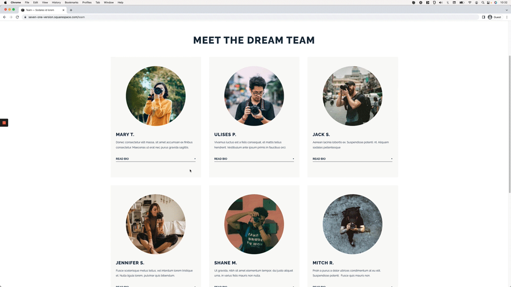
I’ll be working with the Auto Layout Simple List in the example site, but the code can be used for the Slideshow Banner and Carousel Auto Layouts as well! So, let’s go ahead and get started:
00:00 - Intro
01:00 - Quick overview of the setup
First of, I’ll walk you through the layout that I’m using for the example (although any of the other two options will work) and we’ll look into how to add the markup necessary to create that trigger “Read More” or “Read Bio” text, to make things super easy to target through the code.
03:41 - Adding the dropdown functionality
Once we have the dropdown trigger in place, we’ll move onto adding the script necessary to create the actual collapsible functionality. We’ll see what each part of the function does, in case you want/need to adapt it to your own project requirements.
07:11 - Styling the dropdowns with CSS
Last but not least, we’ll hop onto the Custom CSS window to set up the initial “hidden” state of the dropdown content, style the “Read Bio” link and add in the alternative symbol that we want to display when the dropdown is open, to indicate it can be closed up again. We’ll also take a minute to check things out on mobile to make sure everything works correctly.
And just like that, we’ll be done with our new collapsible sections!
I hope you found this tutorial helpful for your current project and don’t forget to check out SQS Mods plugins(affiliate) to customize your dropdowns even more!
Until next time,
B.
Full code
August 2024: the code was modified to work with the most recent Squarespace update that disables markdown code inside Auto Layout fields. Instead of an h6, you’ll need to set your “Read More” link as Underlined text through the native toolbar options!
Footer Code Injection
<!-- HOW TO CREATE A "READ MORE" DROPDOWN INSIDE AUTO LAYOUTS IN 7.1 -->
<script src="https://code.jquery.com/jquery-3.6.0.min.js"></script>
<script>
  $(function() {
    $('.list-item-content__description p:has(u)').click(function() {
      $(this).nextUntil('p:has(u)').slideToggle();
      $(this).find('u').toggleClass('open-dropdown');
    });
  });
</script>
Custom CSS Window
/*HOW TO CREATE A "READ MORE" DROPDOWN INSIDE AUTO LAYOUTS IN 7.1*/
.list-item-content__description p:has(u) ~ * {
  display: none;
}

//To style the "Read More" link
.list-item-content__description u {
  align-items: center;
  border-bottom: 1px solid #152944;
  display: flex;
  cursor: pointer;
  font-size: 14px;
  justify-content: space-between;
  pointer-events: auto;
  text-decoration: none;
  text-transform: uppercase;
}
.list-item-content__description u::after {
  content: '+';
}

//(Optional) To change the symbol when the dropdown is open
.list-item-content__description u.open-dropdown::after {
  content: '-';
}