
Change the number of thumbnails per row on mobile for Portfolio pages set to Grid layout (Simple & Overlay) (7.1)
The title pretty much says it all.
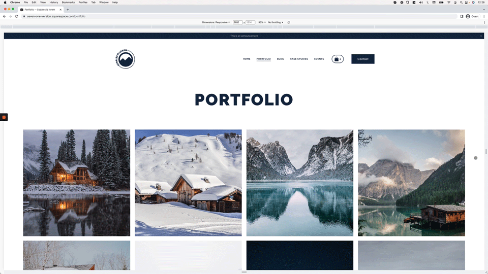
In this week’s video we’ll be looking at how we can take control of how many images per row display on mobile for Portfolio pages in 7.1, when set to one of the Grid layouts (i.e. Grid: Simple or Grid: Overlay).
So, if this is something you’d like to learn how to modify for your current or future client sites, jump straight to the video to find out!
Tutorial
Overview & timestamps
Similarly to a previous tutorial where we modified the number of thumbnails per row on mobile for 7.1 blog pages, the key thing about today’s customization is to find out HOW Squarespace is controlling the layout in the first place to know what we can do about it:
00:00 - Intro
01:11 - Looking into the original HTML structure and CSS used to create the Grid: Simple portfolio layout
The first thing we’ll do to achieve our goal will be to dive into the Inspector tool to understand how the original grid is created, when the Grid: Simple option is selected.
02:16 - Quick tip on knowing when CSS grid has been applied and why it's useful to know
While looking through the HTML of the portfolio section, I’ll let you know a little secret about CSS grids (i.e. how you can quickly figure out WHAT needs to be modified to make changes such as the thumbnail-per-row one we’re tying to tackle today).
03:15 - Understanding the existing column-creating value that Squarespace uses
Once we’re clear on how the current grid is built, we’ll spend a minute breaking down the value that’s being used to see how we can modify it to suit our needs.
04:28 - Creating the code to modify the number of thumbnails per row for different mobile breakpoints
Then, we’ll move onto the Custom CSS window to set up our own media query breakpoints, based on the look we want to create for tablets and or mobile devices to avoid any unwanted thumbnail/text “squishiness”.
09:22 - Modifying the code to make it work with the 7.1 Portfolio Grid: Overlay layout
Last but not least, I’ll share with you the tiny modification required for the code to work with the portfolio’s Grid: Overlay layout and why it needs to be done.
And that’s it! Now you can create as many breakpoints as you want to build the grid however you need to for your project!
I hope you found this CSS trick useful.
Until next time,
B.
Full code
Portfolio Grid: Simple
Custom CSS Window
/*CHANGE THE NUMBER OF THUMBNAILS PER ROW ON MOBILE FOR 7.1 PORTFOLIO PAGES SET TO GRID: SIMPLE LAYOUT*/
@media screen and (max-width: 1400px) {
  .portfolio-grid-basic {
    grid-template-columns: repeat(~"3,minmax(0,1fr)");
  }
}

@media screen and (max-width: 800px) {
  .portfolio-grid-basic {
    grid-template-columns: repeat(~"2,minmax(0,1fr)");
  }
}
Portfolio Grid: Overlay
Custom CSS Window
/*CHANGE THE NUMBER OF THUMBNAILS PER ROW ON MOBILE FOR 7.1 PORTFOLIO PAGES SET TO GRID: OVERLAY LAYOUT*/
@media screen and (max-width: 1400px) {
  .portfolio-grid-overlay {
    grid-template-columns: repeat(~"3,minmax(0,1fr)");
  }
}

@media screen and (max-width: 800px) {
  .portfolio-grid-overlay {
    grid-template-columns: repeat(~"2,minmax(0,1fr)");
  }
}