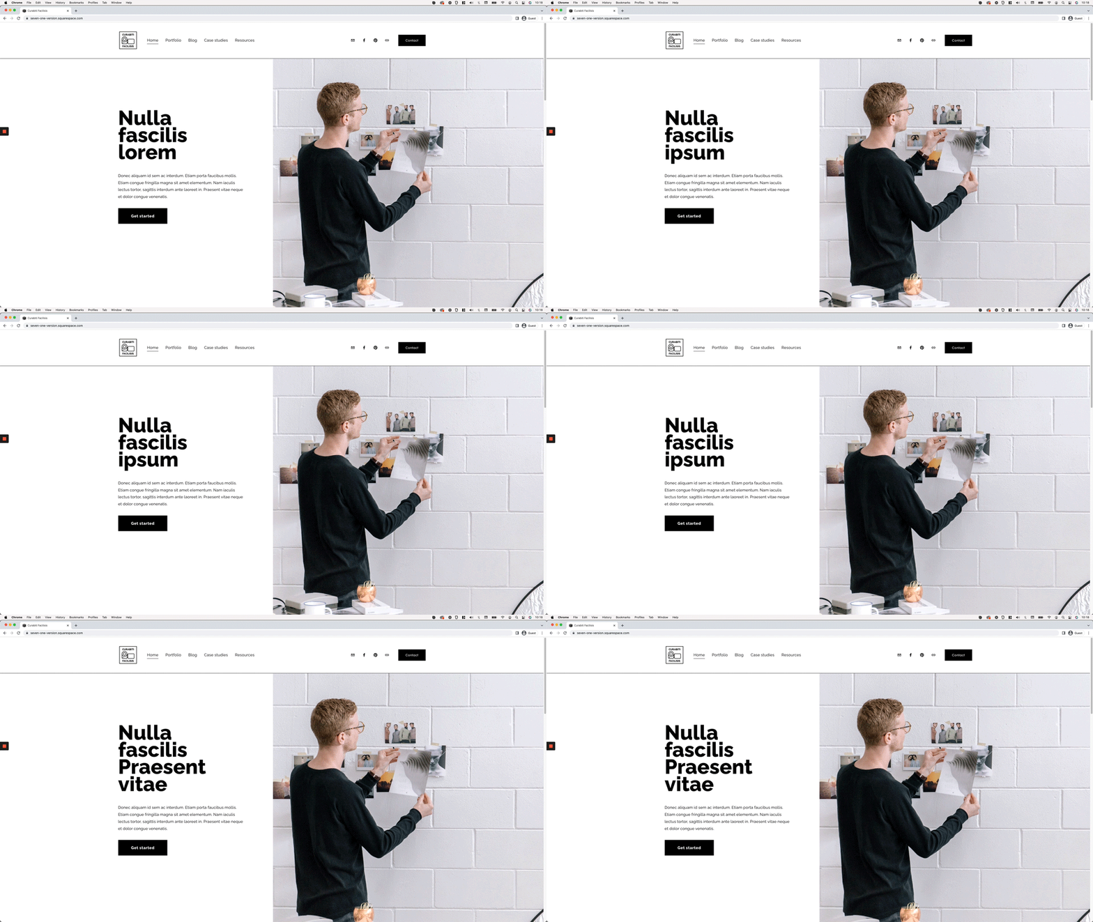
Looping rotating words effect for headings in Squarespace
I think we can both agree: rotating headings look pretty awesome on a website.
The annoying part is creating the actual animation!
CSS – when cleverly used – can help achieve the illusion of a rotating effect with the right properties and keyframes in place.
But, more often than not, and even when it pains me to say it… JavaScript can do the job a lot better, even when it’s much more complicated to set up.
The good news is that, today, we won’t need to rack our brains creating the code to apply this effect to client sites.
There’s an AWESOME third-party plugin out there ready for us to use.
And in this tutorial, I’ll be showing you exactly how to implement and tweak it.
Let’s get started!
Tutorial
Overview & timestamps
Setting up this plugin in Squarespace is super easy, but we will take additional steps to modify things here and there to adapt it to our design!
00:00 - Intro
00:48 - Overview of the plugin we'll be using
We’ll start out looking at the CodePen that we’ll be implementing on the site to see where each part of the code needs to go and what the different snippets take care of.
01:40 - Implementing the plugin as is inside Squarespace
Next, we’ll add the corresponding parts to the Code Block, Custom CSS window and Code Injection section without making any changes to it, to make sure that everything’s set up correctly.
03:52 - Changing the phrases and the type of heading
Once we have everything in place, we’ll begin modifying the HTML part inside the Code Block, to replace the original phrases with our own, and swap the type of heading the plugin is using by default with one that works better with our project.
05:10 - Modifying the CSS styles
Moving onto the CSS, we’ll remove some of the styles of the original plugin that don’t work for us and add in any extra snippets necessary to modify the look of our new rotating heading.
08:47 - Modifying CSS styles for mobile devices
After we check how everything looks on mobile, we’ll get rid of some of the original tweaks for smaller devices and add in our own under a media query.
11:51 - Wrapping longer phrases into multiple lines
With those modifications out of the way, we’ll take a few minutes to see what we need to change in the original plugin to make sure that the longer rotating phrases are able to split into multiple lines – instead of keeping everything in one single line – to make things more responsive.
14:03 - Stopping bottom of words from getting cut off
Before calling it a day, we’ll make a small adjustment to the containers holding the rotating words to make sure that the whole text fits vertically and doesn’t get cut off.
16:15 - Modifying the speed of the looping effect
And, last but not least, we’ll take a quick look at where we can adjust the timing of the whole looping effect inside the Code Injection section.
And that’s it!
You can make more or less tweaks to your heading depending on the style that you’re going for, but for the most part, once you make these basic changes you should be ready to go with this part of your project!
Until next time,
B.
Full code
Note: make sure to implement the original code first from Ken’s CodePen.
jQuery Library (if needed)
Footer Code Injection
<script src="https://code.jquery.com/jquery-3.6.0.min.js"></script>
Additional code (if needed)
Custom CSS Window
/*LOOPING ROTATING WORDS EFFECT FOR HEADINGS IN SQUARESPACE - ADDITIONAL CODE*/
//To style the looping phrases
.sp-intro b {
  font-weight: 900;
  padding-bottom: 15px;
}

//To style the heading on mobile
@media screen and (max-width: 767px) {
  .sp-intro * {
    font-size: 50px;
  }
}
FAQs & Troubleshooting
-
If your looping words are sitting higher up than the rest of your phrase, you can edit the following values as needed:
The top: .2em inside the original CodePen CSS portion.
The padding: 15px inside the additional CSS snippet used in this tutorial.
-
If you’re center-aligning your looping words and see a glitch of the word that “leaves” briefly to the left side, you can adjust the opacity values (IN YOUR EXISTING CODE FROM THE CODEPEN) of the slide-out keyframes animation from 1 to 0, like so:
@-webkit-keyframes slide-out {
0% {
opacity: 0;
.
.
.
.
@-moz-keyframes slide-out {
0% {
opacity: 0;
.
.
.
.
@keyframes slide-out {
0% {
opacity: 0;
.
.
.
.
-
If your looping text is getting cut off, you'll want to make the following changes to the original CodePen CSS portion:
Set overflow: hidden to overflow: visible.
If you don't want to see the fade-out of the word that goes away, you can implement the opacity adjustment on the slide-out animation, as mentioned in the "leaving" words glitch fix.
-
If in your HTML portion you have the static phrase AFTER the rotating ones, and the difference in their length is creating an unsightly gap, you can include the following bolded line in the existing CSS snippet of the Codepen:
.sp-headline.slide .sp-words-wrapper {
overflow: hidden;
vertical-align: bottom;
width: auto !important;
} -
In MOST cases (not all), using this modified version of the HTML vs. the original structure from Ken’s code will do the trick:
<h4 class="sp-headline slide">
Specializing in some of the best things in the world
<span class="sp-words-wrapper">

