
Creating collapsible form sections in Squarespace (7.0, 7.1 CE & 7.1 FE)
Today’s tutorial is a really useful one, especially if you have to deal with large-ish form blocks on a regular basis when building your client sites.
We’ll be using a crafty little trick to HIDE parts of a form when the page loads, and then reveal those hidden fields on click, almost like an accordion block!
So, if you’ve ever needed something like this for your projects, make sure to check out the tutorial below to learn how to implement this solution next time around!
Tutorial
Overview & timestamps
This customization requires a little bit of a setup and code that goes beyond CSS, but it’s 100000% worth it.
So, let’s take it step-by-step:
00:00 - Intro
00:57 - Overview of the Form Block setup and the logic of the customization
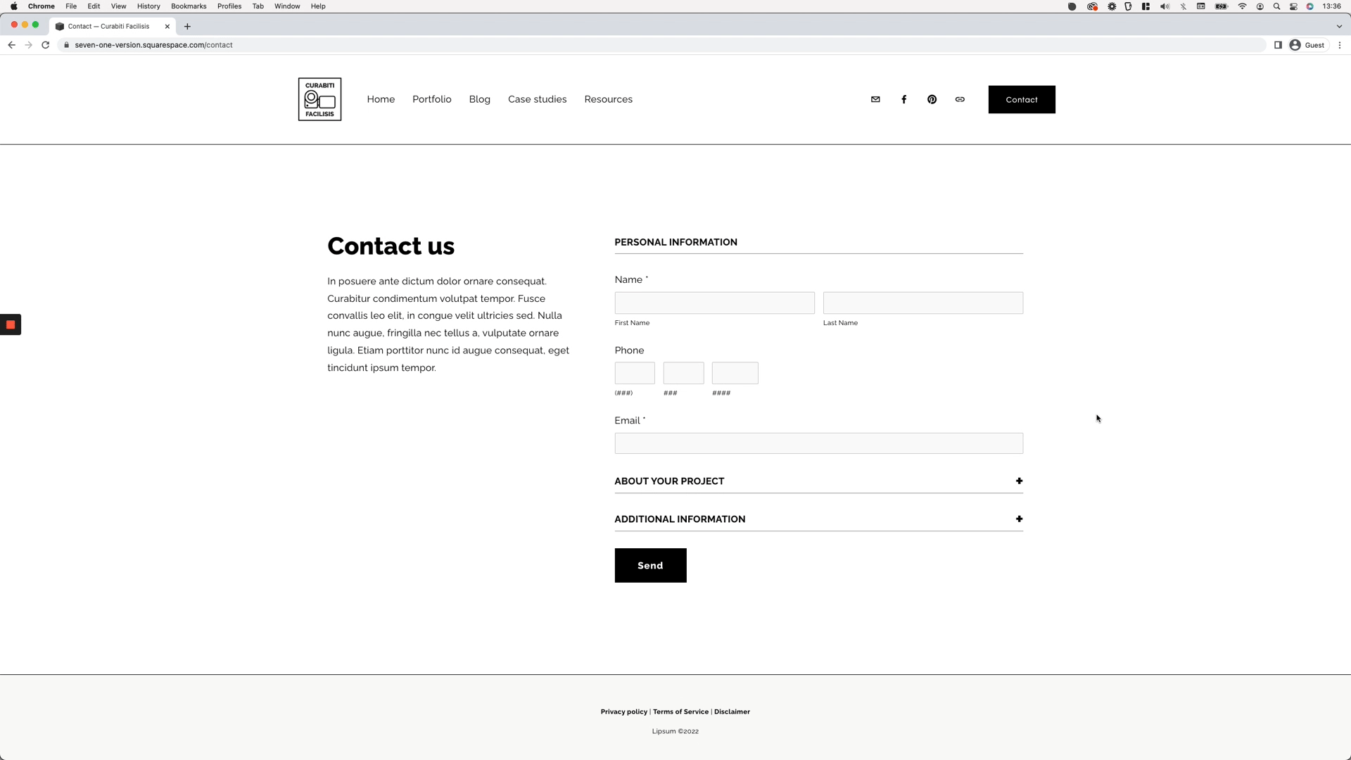
We’ll begin by taking a look at how the Form Block needs to be set up, which fields need to be in place, in order to create the collapsible functionality we’re after.02:41 - Implementing and breaking down the code needed to collapse the form sections
Next up, we’ll add the necessary script to make this trick happen and break down what each part of it does to better understand what everything’s doing. This will help us see what CSS needs to be included in our customization to achieve the exact look we’re going for. I.e having all the fields collapsed on page load and then revealing them only on click.
05:38 - Setting the initial hidden state for all the fields
Moving onto our Custom CSS window, we’ll take a look at how we can target ALL the fields in the form EXCEPT the section titles, to make sure that everything that shouldn’t be there isn’t, and everything that should show up at all times, does.08:58 - How to make sure the first section of the form shows up at all times
Now, this next step is optional. It depends on the look you’re going for with your client’s form. If you want to make sure the first field section is showing up at all times, you can include this part of the customization in your code. If you want to have everything hidden from the get-go, you can skip it!11:34 - Stopping the first form section from collapsing on click
Another optional customization here. We’ll tackle how to stop the first section from being collapsable, so that the fields inside it are always on display, regardless of when users interact with the area.
12:37 - Changing the cursor to indicate clickable areas
To make things a bit more obvious “click-wise”, we’ll change the cursor on the clickable section titles of the form. But once again, this is completely optional.13:35 - Styling the line form section titles to make them more obviously clickable
And, last but not least, we’ll spend a few minutes styling the section titles and adding a little plus sign that can help make it very clear to the visitor that they’re looking at a dropdown element.
With all of this in place, you’ll end up with an awesome collapsible form block in no time!
Hope you liked this one!
Until next time,
B.
Full code
May 2023: the jQuery snippet has been modified to work with the recent form update!
jQuery library (if needed)
<script src="https://code.jquery.com/jquery-3.6.0.min.js"></script>
jQuery
<!-- CREATING COLLAPSIBLE FORM SECTIONS IN SQUARESPACE (7.0, 7.1 CE & 7.1 FE) -->
<script>
  setTimeout(function() {
    $('.form-item.underline').click(function() {
      $(this).nextUntil('.underline').slideToggle();
    });
  }, 1000);
</script>
CSS
/*CREATING COLLAPSIBLE FORM SECTIONS IN SQUARESPACE (7.0, 7.1 CE & 7.1 FE)*/
//To hide fields
.form-item.underline:not(#section-53d4396a-6454-4c4b-89ad-a9a4b7ab498c) ~ *:not(.form-item.underline) {
  display: none;
}

//To style first section title
#section-53d4396a-6454-4c4b-89ad-a9a4b7ab498c {
  pointer-events: none;
}
#section-53d4396a-6454-4c4b-89ad-a9a4b7ab498c .title {
  font-weight: bold;
  text-transform: uppercase;
}

//To change cursor of clickable sections
.form-item.underline:not(#section-53d4396a-6454-4c4b-89ad-a9a4b7ab498c) {
  cursor: pointer;
}

//To style clickable section titles
.form-item.underline:not(#section-53d4396a-6454-4c4b-89ad-a9a4b7ab498c) .title {
  display: flex;
  font-weight: bold;
  justify-content: space-between;
  text-transform: uppercase;
}
.form-item.underline:not(#section-53d4396a-6454-4c4b-89ad-a9a4b7ab498c) .title::after {
  content: '+';
  font-size: 2em;
  font-weight: bold;
}