
Center-align card, overlap and collage blocks with heavy content (7.0 & 7.1 CE)

The problem
Here’s the situation.
You’re designing a Squarespace site for your client, and adding in image blocks to create a gorgeous design for them.
Your perfectionist self is in charge, so you’re making sure that all blocks have the right amount of content to image ratio, in order to keep things centered.
Even if that means leaving some text behind.
Plus, with the handy option inside Site Styles, it’s easy to place the content where you want it:

Bottom-line is, your initial idea looks something like this:
Beautiful and oh so satisfyingly aligned.
But then… your client changes its mind.
Regardless of the type of boundaries you’ve set in terms of feedback, your client is prone to request a larger image, a larger font size for the title, and some additional text that’s super important and should be included.
Which means, now your block will end up looking like this:

To be honest, I think that’s a perfectly good looking block… buuuuuuut it’s not centered anymore.
The image is now aligned to the top of the title, not in the middle of the content like it was before.
If you’re ok with this look then… I’m not quite sure why you’re reading this post but knock yourself out!
However, if you’re itching as much as I am to vertically realign the image with the content side, keep reading.
The reason
It seems like Squarespace has set up the Content Position option inside Site Styles to align the content of your image blocks based on the height of the image.
Meaning that if your image is taller than your text, then you can set the latter to align with the top, middle or bottom of the image.
However, if your image is shorter, like in the example above, that option won’t be able to do anything anymore.
But don’t fret my friend because the solution is much simpler than you think!
The solution for the card block
You see, Squarespace built these image blocks using a pretty handy CSS layout model called Flexbox.
We’ve talked about this before on the blog when doing things like adding a background color to summary block items AND force them to have the same height.
In this case, image blocks like the card, overlap and collage layout have been styled in a way that not only allows us to move things around easily through block options and site styles, but it has also made it ridiculously simple for us to fix this center-alignment thing.
If we take a look through Inspect Element at the card block we used in the example from before, we’ll notice that the HTML structure of that block is made up of a parent container that’s holding the image container and the content container:


This structure – where both elements we’re looking to align are children of the same parent container – is perfect to apply flexbox.
Which is precisely what Squarespace has already done.
As you can see below, the parent container has been set to display: flex; effectively creating a flexible container.


Now, we’re not going to get into what this means right now because this tutorial would get way longer than necessary.
All we need to keep in mind is that the presence of that rule is what will allow us to use a flexbox-specific property to realign the sides of our image block the way we want to.
And that property is called align-items.
By default, once we set the display property of a container to flex, the align-items property is immediately used by our browser to make the children, inside said container, stretch out the height of the longest one.
Note: keep in mind we’re not seeing an actual stretching of the contents of our image because the containers being affected don’t have a background color or background image that could make it easier to spot! However, we can see it through inspect element by noticing that both sides have the same height for the content area (blue area).
You can also see this as aligning the children by both their top AND their bottom edge.
However, we can change that default for the alignment of our preference!
We can use flex-start to align both children by the top, flex-end to align both children by their bottom edge, or center to align both (you guessed it) by their middle!
As for how we’re going to target our parent container to make this happen, we don’t need to look far!
We can simply use the same selector Squarespace used to set the container as flex in the first place:

And now, all we need to do is pop this into our Custom CSS window…
.sqs-block-image .design-layout-card:not(.sqs-narrow-width) {

}

…and adding the align-items property with our new value:
.sqs-block-image .design-layout-card:not(.sqs-narrow-width) {
  align-items: center;
}

Whoomp! There it is!

What about the overlap block?
“B, that’s such a cool trick!… but I’m not using the card block, I’m using the overlap and collage blocks…”
No problem, I gotchu!
Thankfully, Squarespace built the card, overlap and collage blocks in a very similar way.
And the part that we need to care about for this customization is virtually the same!
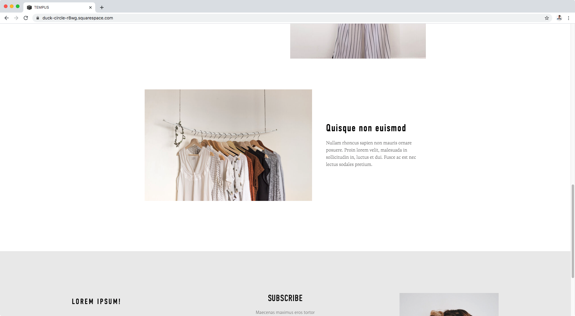
Taking our example to an overlap block, here’s what we get:

Once again, a slight misalignment, regardless of if we chose to set the Content Position to center in our Site Styles:

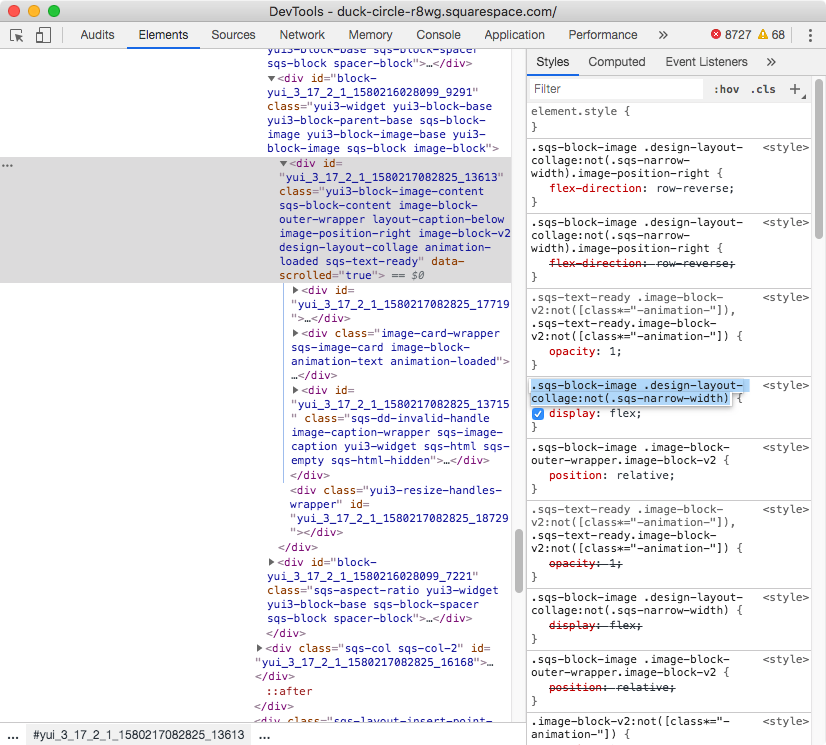
Now, if we take a look at this through inspect element we’ll notice the same structure from before: a parent container holding our content and image containers as its children.
Note: you may notice there’s a third children in there, but that’s just part of the editor not of the live site, so we don’t need to worry about it.
Additionally, we’ll also notice the parent is set to display: flex;:


So, same process as before: we’ll grab the selector Squarespace is already using for the parent container to apply the align-items property that will realign the children inside it!

Let’s plop that into our Custom CSS window:
.sqs-block-image .design-layout-overlap:not(.sqs-narrow-width) {

}

And set our new value for the align-items property:
.sqs-block-image .design-layout-overlap:not(.sqs-narrow-width) {
  align-items: center;
}


Awesome! Just like magic.
Now, how about we use the same process for the collage block?
And what about the collage block?
Once again, we have our lovely content-heavy block in place and even when we’ve set the Content Position to center in our Site Styles, things are misaligned:


So, let’s check that the structure is the same as before (a parent container wrapping both parts of interest as its children):

Yep, all good!
Note: in this other block we can also see additional children inside the parent container, but once again these are part of the editor, not the live site, so we don’t need to worry about them.
Now, let’s check it’s already set to display: flex…


Yes it is!
Time to grab that selector, then!
And paste it inside our Custom CSS window:
.sqs-block-image .design-layout-collage:not(.sqs-narrow-width) {

}

Last step, let’s add our new alignment value!
.sqs-block-image .design-layout-collage:not(.sqs-narrow-width) {
  align-items: center;
}


Awesome! High five!
Now you know how you can vertically realign the content side of your image blocks to your image, regardless of who’s the tallest of the bunch!
Until next time,
B.
Full code
/*CENTER-ALIGN CARD BLOCKS*/
.sqs-block-image .design-layout-card:not(.sqs-narrow-width) {
  align-items: center;
}

/*CENTER-ALIGN OVERLAP BLOCKS*/
.sqs-block-image .design-layout-overlap:not(.sqs-narrow-width) {
  align-items: center;
}

/*CENTER-ALIGN COLLAGE BLOCKS*/
.sqs-block-image .design-layout-collage:not(.sqs-narrow-width) {
  align-items: center;
}