
Styling and bottom-aligning ‘Read More’ links for the Basic Grid Blog in Squarespace (7.1)
Blog pages in Squarespace 7.1 are pretty stylish-looking already.
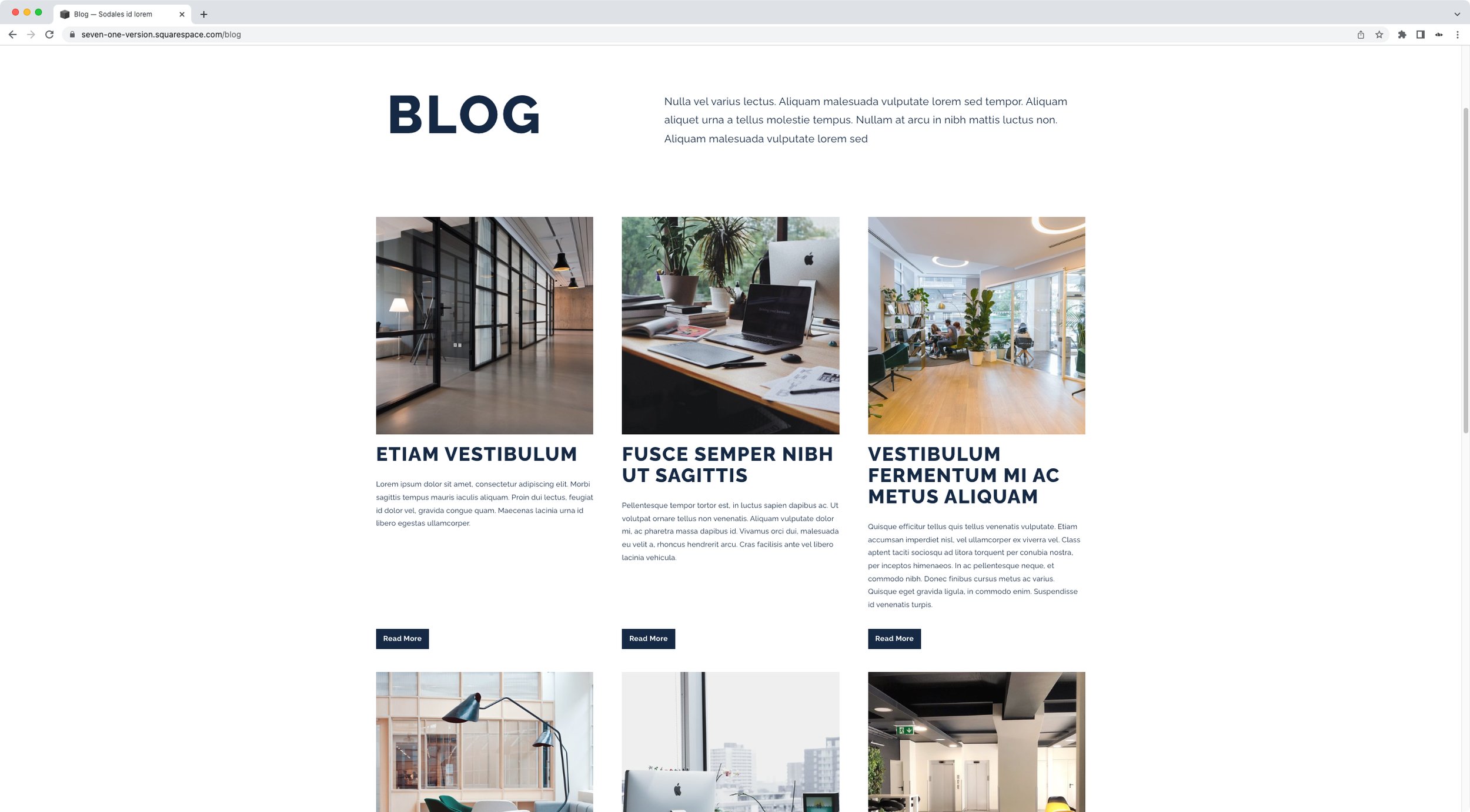
But that doesn’t mean we can’t take things up a notch by making some extra tweaks such as styling the “Read More” links into buttons.
And, for those of us who love things that are perfectly aligned, why not also move the buttons to the edge of the content area, to make sure the layout looks just right?
If you’re interested in diving into either of these customizations, then today’s tutorial is for you!
We’ll first tackle the link-to-button transformation and then look into how we can reposition them at the very end of the blog items.
Let’s do it!
Tutorial
Overview & timestamps
The whole customization will be pretty straightforward, so let’s go ahead and jump right into it:
00:00 - Intro
00:45 - Styling the 7.1 Blog page Read More Links as buttons
Let’s begin by targeting the links, making sure only the ones for the Basic Grid Blog get modified (in case we’re working with other blog page layouts in the same site). We’ll make them look like buttons by giving them a background color, a bit of padding and adding some extra styles to the font to make them stand out more.03:13 - Removing the underline from Read More Links inside Blog pages in 7.1
Once we’re happy with the look, we’ll take a minute to get rid of the underline that Squarespace natively adds to these elements. You’ll notice that the method used is not as obvious as it may seem. However, by finding the corresponding container being styled, we’ll be able to hide the line without much hassle.
04:46 - Aligning the Read More Links to the bottom of blog items in 7.1
Then, it’s time to decide how we want to space out the content of the blog posts from our new buttons: by creating a small gap or by pushing them to the bottom of the container. Depending on the result we want, we’ll tackle this part of the customization in 2 very different ways. Once we’re happy with the spacing, we’ll also check out mobile devices to make sure everything looks great.
And that’s it!
Now you can take control of how your Read More links look for the Basic Grid Blog layout in 7.1.
Until next time,
B.
Full code
/*STYLING AND BOTTOM-ALIGNING 'READ MORE' LINKS FOR THE BASIC GRID BLOG IN SQUARESPACE 7.1*/
//To style the links as buttons
.blog-basic-grid .blog-more-link {
  background-color: #152944;
  color: white;
  font-weight: bold;
  margin-top: auto;
  padding: .5em 1em;
}

//To remove the underline
.blog-basic-grid .blog-more-link:after {
  display: none;
}

//To bottom-align the buttons
.blog-basic-grid .blog-basic-grid--text {
  display: flex;
  flex: 1;
  flex-direction: column;
}
.blog-basic-grid .blog-more-link {
    margin-top: auto;
}

//(Optional) To add an initial distance between excerpt and button
.blog-basic-grid .blog-excerpt {
  margin-bottom: 30px;
}