
How to create a business info bar above the header in Squarespace
Whether it was part of your original design or your client requested it, if you’re reading this it means you’re wanting to add some extra info about the brand at the very top of the Squarespace site you’re working on: business hours, its address, a contact email, a phone number, etc.
If that’s the case, then search no more my friend, this tutorial is for you!
We’ll be creating – from scratch – a simple yet flexible business information bar that can hold all those important details in plain sight.
To create the structure we’ll need a bit of HTML, and then we’ll style away both the desktop and mobile version with some CSS.
I’m ready when you are! Let’s get to it.
Note: all icons came from this collection on IconFinder!
Tutorial
Overview & timestamps
00:00 - Intro
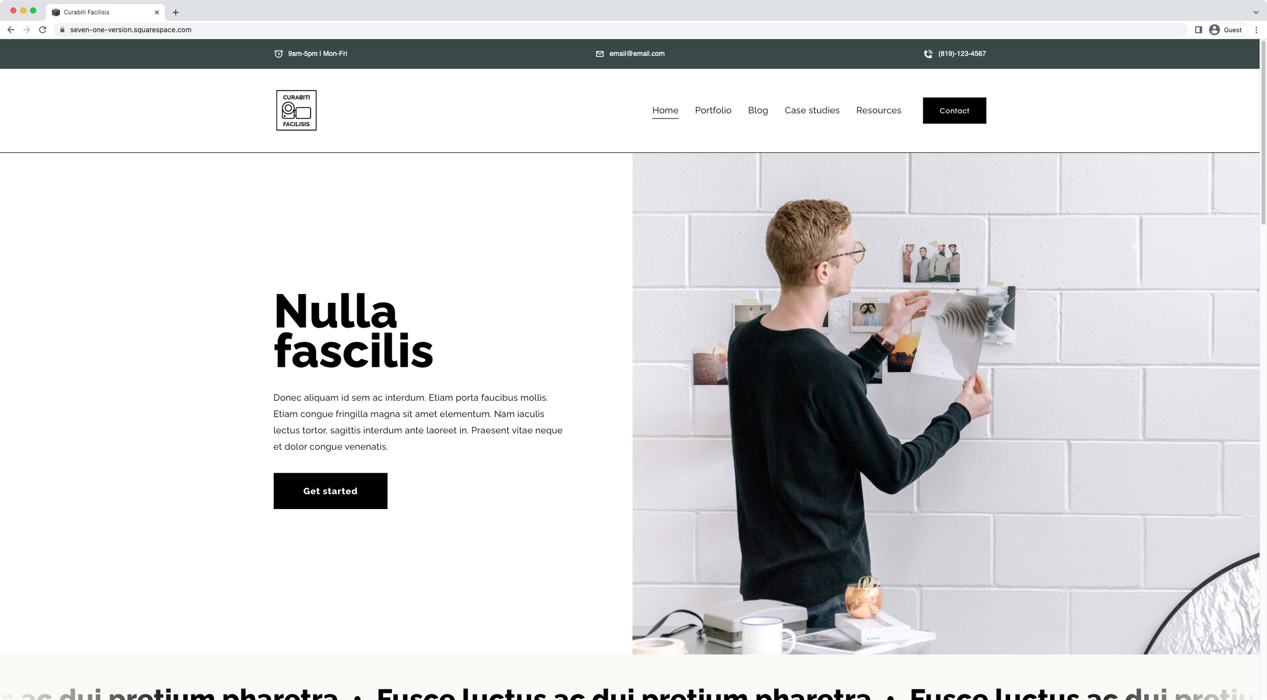
00:48 - Overview of the business info bar we'll be creating
To start out, we’ll take a quick look of the final result we’ll be achieving with the code implemented for both desktop and mobile.
01:36 - Creating the business info bar at the top of the header
Next, we’ll move onto actually building the bar via HTML. We’ll take it step-by-step and break down the structure needed to create the layout, while making sure that everything that needs to be clickable is clickable, and the rest remains as text.
09:12 - Overview of the final business info bar structure inside the IE tool
Once everything’s in place, we’ll hop onto the Inspect Element tool to compare what things look like in there vs. the code we just wrote. It’ll help us make sure that everything’s in order before moving onto the Custom CSS window.
10:20 - Styling the business information bar
And now, it’s time for the fun part. We’ll begin styling the info bar by adding a background color, laying out the elements horizontally, resizing the icons, changing the font color, vertically aligning the sections, and also the icons with their corresponding text.
14:49 - Separating the different sections of the info bar
Moving on, we’ll spend a few minutes deciding how we want to lay things down in our bar: spaced out, centered, or aligned to one side of the screen.
16:17 - Adding padding to match the alignment of the full width header
Now, to make sure there’s enough breathing room on the sides of the bar, I’ll give you a quick tip on how you can set up the padding so that the content on the edges aligns with the content of the header.
18:10 - Making sure the middle section is right in the center and that the right side section is right aligned
Next, we’ll continue to tweak the sections a little bit, to ensure the middle one stays in the dead center of the bar. I’ll give you another quick tip here to achieve this when working with spaced out layouts using Flexbox!
20:58 - Fixing the space between the business info bar and the header nav
Before hopping onto mobile, we’ll make sure that there’s no overlap between the bar and the native header by using a bit of margin to push things down the screen.
23:31 - Making changes to the business info bar for smaller devices
At this point we’re almost done with desktop! So now it’s time to tackle mobile screens. We’ll spend some time making a few adjustments to the layout under the breakpoint of your choice: stacking the different sections to avoid “squishiness”, realigning the content so that it sits the way we want it to once it stacks, etc.
27:36 - Fixing the space between stacked elements and the header and the bar on mobile
After everything’s set into the mobile layout, we’ll make a couple of adjustments to the spacing of the sections that will trickle onto desktop as well.
30:20 - Re-checking the padding for desktop and making the last few spacing adjustments
Then, it’s a matter of tweaking some of the spacing issues here and there to make sure that everything looks correctly on all screen sizes and that there are no gaps or overlaps going on.
32:22 - How to align the business info bar aligned to the edges of the inset header in 7.1
Last, but certainly not least, I’ll give you another quick tip to ensure that – if you’re working with the “Inset” header option in Squarespace 7.1, you’re able to fully align the content of the info bar to the edges of the header content.
And there you have it!
Now you know how to build an simple and super useful business information bar for your client’s Squarespace site.
I hope you found this customization helpful!
Until next time,
B.
Full code
Note: this tutorial DOES NOT cover the adaptations needed if you’re working with a FIXED header.
Header Code Injection
<!-- HOW TO CREATE A BUSINESS INFO BAR ABOVE THE HEADER IN SQUARESPACE -->
<div class="business-bar-wrapper">
  <div class="business-bar">
    <div class="business-bar--left">
      <p>
        <img src="ICON.png" alt="Clock icon">
        <span>9am-5pm | Mon-Fri</span>
      </p>
    </div>
    <div class="business-bar--center">
      <a href="mailto:email@email.com">
        <img src="ICON.png" alt="Email icon">
        <span>email@email.com</span>
      </a>
    </div>
    <div class="business-bar--right">
      <a href="tel:8191234567">
        <img src="ICON.png" alt="Phone icon">
        <span>(819)123-4567</span>
      </a>
    </div>
  </div>
</div>
Custom CSS Window
/*HOW TO CREATE A BUSINESS INFO BAR ABOVE THE HEADER IN SQUARESPACE*/
//General bar styles
.business-bar-wrapper {
  background-color: #384948;
  padding: 20px 4vw;
}

//Section organization
.business-bar {
  align-items: center;
  color: white;
  display: flex;
  justify-content: space-between;
  margin: 0 auto;
  max-width: 1440px;
}

//Icon styles
.business-bar img {
  margin-right: 10px;
  max-width: 20px;
  vertical-align: middle;
}

//Section adjustments
.business-bar--left,
.business-bar--right {
  width: 30%;
}
.business-bar--right {
  text-align: right;
}
.business-bar--left p {
  margin: 0;
}

//To avoid header overlap on desktop
#header {
  margin-top: 60px;
}

//Mobile styles
@media screen and (max-width: 960px) {
  .business-bar {
    flex-direction: column;
  }
  .business-bar--left,
  .business-bar--center,
  .business-bar--right {
    text-align: right;
    width: 100%;
  }
  .business-bar--left,
  .business-bar--center {
    margin-bottom: 10px;
  }
  #header {
    margin-top: 120px;
  }
}