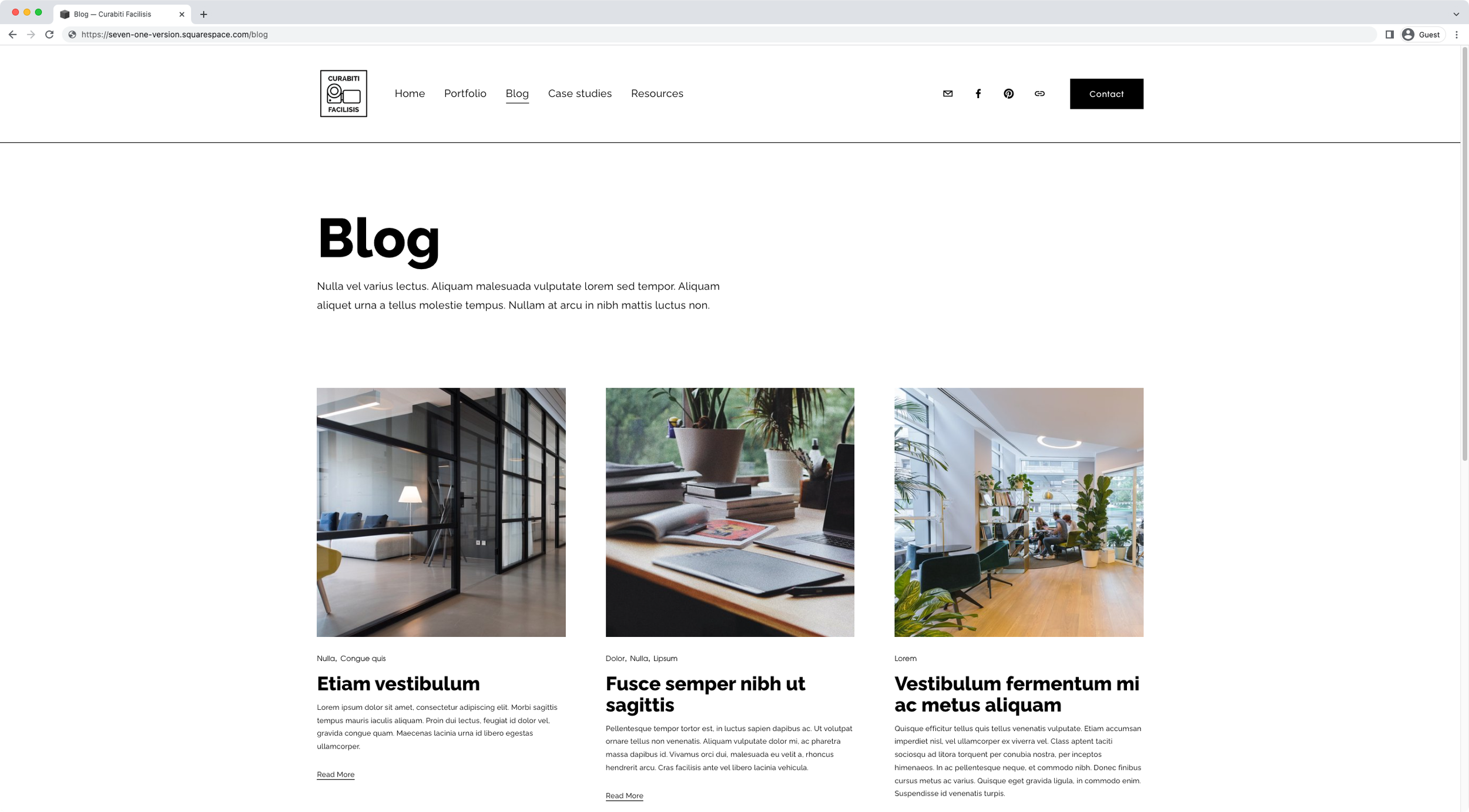
Change the number of columns and thumbnail aspect ratio of ONE blog page in Squarespace (7.1)
So, you're using multiple blog pages on your client's site for different purposes, and you're trying to have more columns on one of them than the rest.
Or, perhaps you want the thumbnails to be vertical on one blog page but square in the other ones.
If you’re on the same boat, this is the tutorial you’ve been looking for!
We’ll be breaking down how to change both the col number and the image aspect ratio for ONE blog page in Squarespace.
Keep in mind that I’ll be working with the Basic Grid Blog layout, but you can adapt the code to a different layout if you’re working with something else!
Take a look…
Tutorial
Overview & timestamps
Believe or not, making these two small tweaks to blog pages is actually fairly simple!
The key thing is to identify what Squarespace is already doing, to make the necessary modifications to the corresponding properties and have things look the way we want them to:
00:00 - Intro
01:00 - Overview of the blog pages settings
First of, I’ll give you a quick peek of the main options I’m working with in the example, so that you can follow along if you’d like! Keep in mind that I’m starting out with the Basic Grid Blog, so you’ll need to adapt the code to the other layouts if you rather use a different one.02:05 - Changing the number of columns on a main blog page in 7.1
Next, we’ll move onto the code! We’ll be starting out with the column issue and see how we can keep one of the blog pages at 2 columns per row, while making the other one 3 columns per row instead.
We’ll dig into the Inspect Element tool to look for the current culprit of the existing layout, and pinpoint the property that’s setting the original number. Taking all of this into consideration – plus the existence of the desktop media query – we’ll reuse Squarespace’s selector and property in our code to get going.06:30 - Slight adjustment for the repeat( ) function to make it work inside the Custom CSS window
Once inside our code, we’ll need to make a small tweak to the value in order to make sure it gets “read” correctly by the browser. We won’t cover the details about why that’s needed here to save time but, in short, the reason is the LESS pre-processor.07:37 - How to make the column modification page-specific
We’ll have to make a second adjustment to the code to make sure it applies to ONE blog page, and not the rest. As you can probably guess, we’ll need to get the page ID for this.08:36 - Changing the aspect ratio of main blog page thumbnails in 7.1
With the column number swap out of the way, we’ll move onto the aspect ratio modification. We’ll need to do the same thing here and look at what Squarespace is already doing, before knowing what it is that WE need to do to change it. Through the Inspect Element tool we’ll also locate the selector we can reuse to make the change happen without issues.12:23 - Making the aspect ratio thumbnail modification page-specific
And, last but not least, we’ll also need to include a page ID in our snippet to make sure ONE page gets modified. However, we’ll come across an interesting (and wildly common) issue that has to do with the existing selectors being used to set the original value.
And just like that, you’ll be able to create a different layout for ONE specific blog page on your client’s site!
I hope you find this useful!
Until next time,
B.
Full code
/*CHANGE THE NUMBER OF COLUMNS AND THUMBNAIL ASPECT RATIO OF ONE BLOG PAGE IN 7.1*/
//To change the number of columns on desktop
@media screen and (min-width: 768px) {
  #collection-636952b8e9c80e316822cc2f .blog-basic-grid {
    grid-template-columns: repeat(~"3,minmax(0,1fr)");
  }
}

//To change the aspect ratio of the thumbnails
#collection-636952b8e9c80e316822cc2f.tweak-blog-basic-grid-image-aspect-ratio-32-standard .blog-basic-grid .image-wrapper {
  padding-bottom: 100%;
}
