
Alternative image on hover for overlap blocks (7.0 & 7.1)

If you’re looking to add something extra to your image blocks without going too crazy, then today’s tutorial is for you!
We’ll be breaking down how to easily change the image of the Overlap Block on hover, to catch the attention of visitors to the site.
This customization is perfect for when you’re using these blocks as a brief preview of services or products since it’ll give you the opportunity to showcase more visuals of the offer without occupying extra space.
It looks awesome, it’s a handy tweak, AND it’s easy to implement.
So, how about we jump right in?
Finding the right container
We basically have two options if we want to add the alternative image via CSS: either we create a pseudo-element or we use the background image property.
Because we don’t really need the new image to do anything except show up on hover, we can take the second route and give one of the containers of our block a background image.
The tricky part is finding the right container.
Starting out with a basic Overlap Block, let’s take a look at the image side:


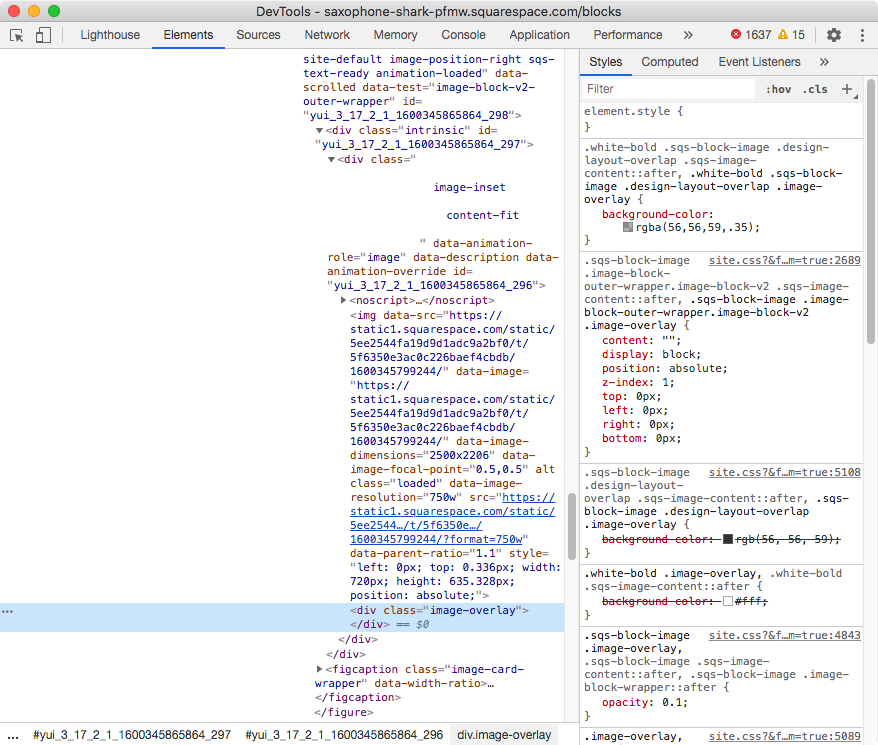
The first thing we can see here is a div with the class .image-overlay.
That’s literally just the overlay color that we can set up via Site Styles.
It’s sitting in front of the image element (img), so we could potentially use it to set our alternate image. The problem is that if we do that we won’t see the overlay color anymore. We’ll only see the new image.
So, better keep looking:

Right above the overlay we can see the img element we mentioned, carrying the current block image.
We can’t add a background-image to this either since it wouldn’t make sense.
We can’t really hide the existing image and make its background show at the same time so, let’s move on.

Going back one more container, we come across the direct parent container of both the image element (img) and the overlay (.image-overlay).
Now THIS is promising.
By giving this div a background image, this would sit BEHIND both the image and color overlay.
And then, with just a bit more of CSS, we could hide the existing image on hover so that the new one peeks through.
Perfect!
Let’s target this container through one of its classes – I’ll go with .image-inset.
However, since that doesn’t really say much about the type of block we’re working with, let’s scroll up a bit more to look for a class that does:

This ancestor/parent figure element (shown in light blue above) has a bunch of classes, including one called .design-layout-overlap that we can use!
So, let’s build our selector:
.design-layout-overlap .image-inset {

}
Adding the alternative image
Now that we know WHERE to add the new image, let’s go ahead and set it up!
All we need here is to use the background-image property to load it, and then tweak its position, repetition and size values to make the image fit the space nicely:
.design-layout-overlap .image-inset {
  background-image: url(https://static1.squarespace.com/static/5ee2544fa19d9d1adc9a2bf0/t/5f625ada2c9b383ae0b97275/1600281308761/kam-idris-_HqHX3LBN18-unsplash.jpg);
  background-position: center;
  background-repeat: no-repeat;
  background-size: cover;
}

Of course, we can’t see the result right off the bat since, as you may recall, this background is sitting BEHIND the existing image.
So, let’s lower the opacity of that img element for a sec to make sure that the new image is in place:
.design-layout-overlap img {
  opacity: 0;
}
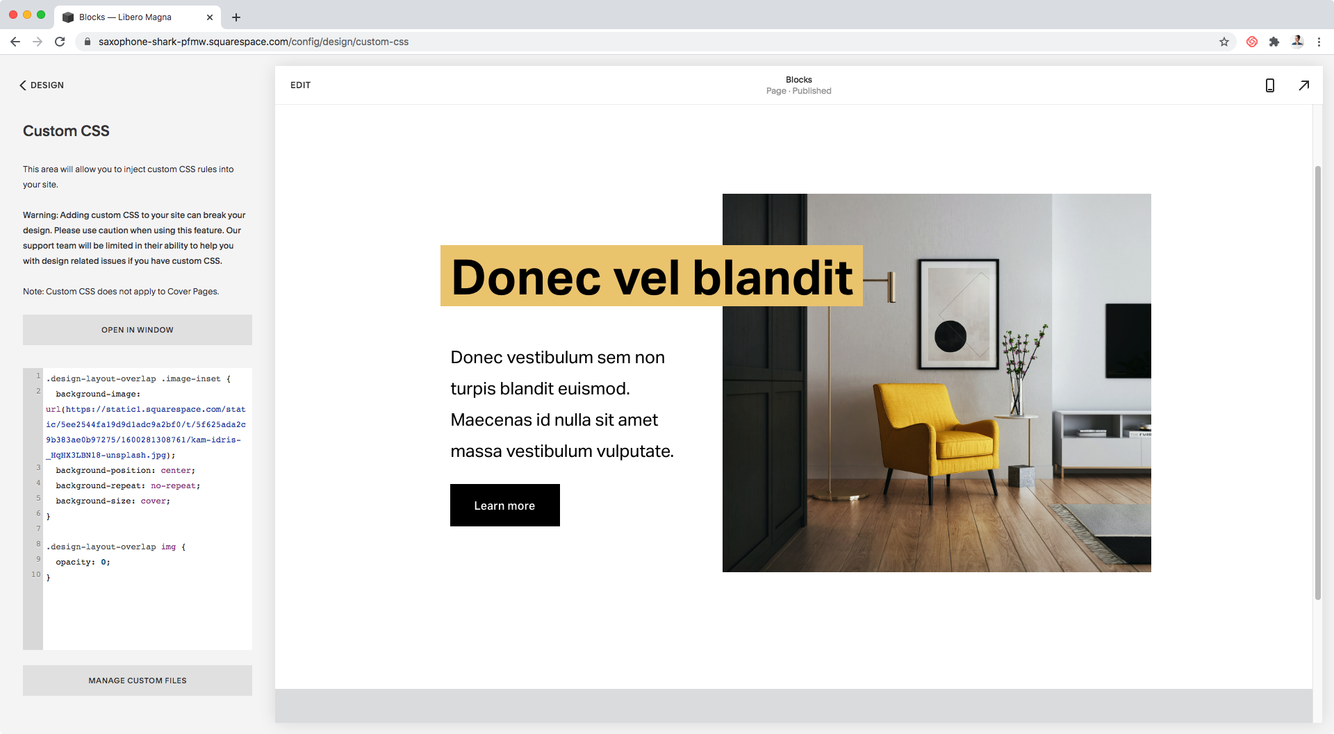
Awesome!
Everything’s looking nicely resized and centered, so let’s move on and create the actual hover effect!
Creating the hover mode
We just saw that lowering the opacity of the existing image (img) makes the new one show through.
So, let’s bring back that little snippet and modify it slightly to make sure that that only happens when the block is hovered.
Note: in this case, the same .design-layout-overlap container will work as our “hover trigger” since it’s not only holding the image side of the block, but also the content portion!
.design-layout-overlap:hover img {
  opacity: 0;
}


Nice!
You could totally keep the customization as is, but personally I want to make the change happen a little bit more smoothly.
To achieve this, I’ll be giving the non-hover state of the img element a transition value:
.design-layout-overlap img {
  transition: opacity .2s linear;
}

Faaaantastic!
"Can I switch between multiple images?"
Because I know this question is most likely forming in your head, I thought I’d address it right away.
Yes, you can totally make more than 1 image show on hover… just replace your .png or .jpg for a .gif!
Here’s an example of what that can look like:

Granted I’m not a pro at making gifs, so please excuse the speed of the transitions, but you get the idea!
You can create your own gif from a video or frames like I did and then use that as your background-image value.
So, there you go!
Now you know how you can add an alternative image on hover to your Overlap Block!
Until next time,
B.
Full code
Note: the snippet below includes a second selector (.design-layout-overlap .sqs-image-content) to apply the background image to the SAME container but on edit mode. It’s not necessary to do this since the customization will show on the live site regardless, but it may be helpful to see the new image on the backend too.
/*ALTERNATIVE IMAGE ON HOVER FOR OVERLAP BLOCKS (7.0 & 7.1)*/
.design-layout-overlap .image-inset,
.design-layout-overlap .sqs-image-content {
  background-image: url(your-image-or-gif-goes-here);
  background-position: center;
  background-repeat: no-repeat;
  background-size: cover;
}
.design-layout-overlap img {
  transition: opacity .2s linear;
}
.design-layout-overlap:hover img {
  opacity: 0;
}