
Simple pricing tables without HTML (7.0 & 7.1 CE)

So, you’re working on a client site and are looking to showcase their different service/product packages via pricing tables, but there are a few roadblocks:
You don’t want to create images in Photoshop, you want the tables to be actual text.
You don’t want to use a Code Block or Markdown Block and HTML, because you want to keep things easy for your client to update.
You want to have some flexibility in terms of customization.
If this is your situation, I gotchu!
Because today, we’ll be creating these awesome pricing tables using Squarespace’s native blocks, and a bit of CSS magic.
Let’s go!
Prepping the blocks
To bring our tables to life, we’ll be starting out with the Stack Image Layout.
I’m creating mine in Squarespace 7.1 (Classic Editor section) to take advantage of the flexibility of text styles.
Note: if you’re working with 7.0, you can check near the end of this tutorial how to set up the blocks to achieve the same look, and get the modified version of the code.
Here’s what I have in place:
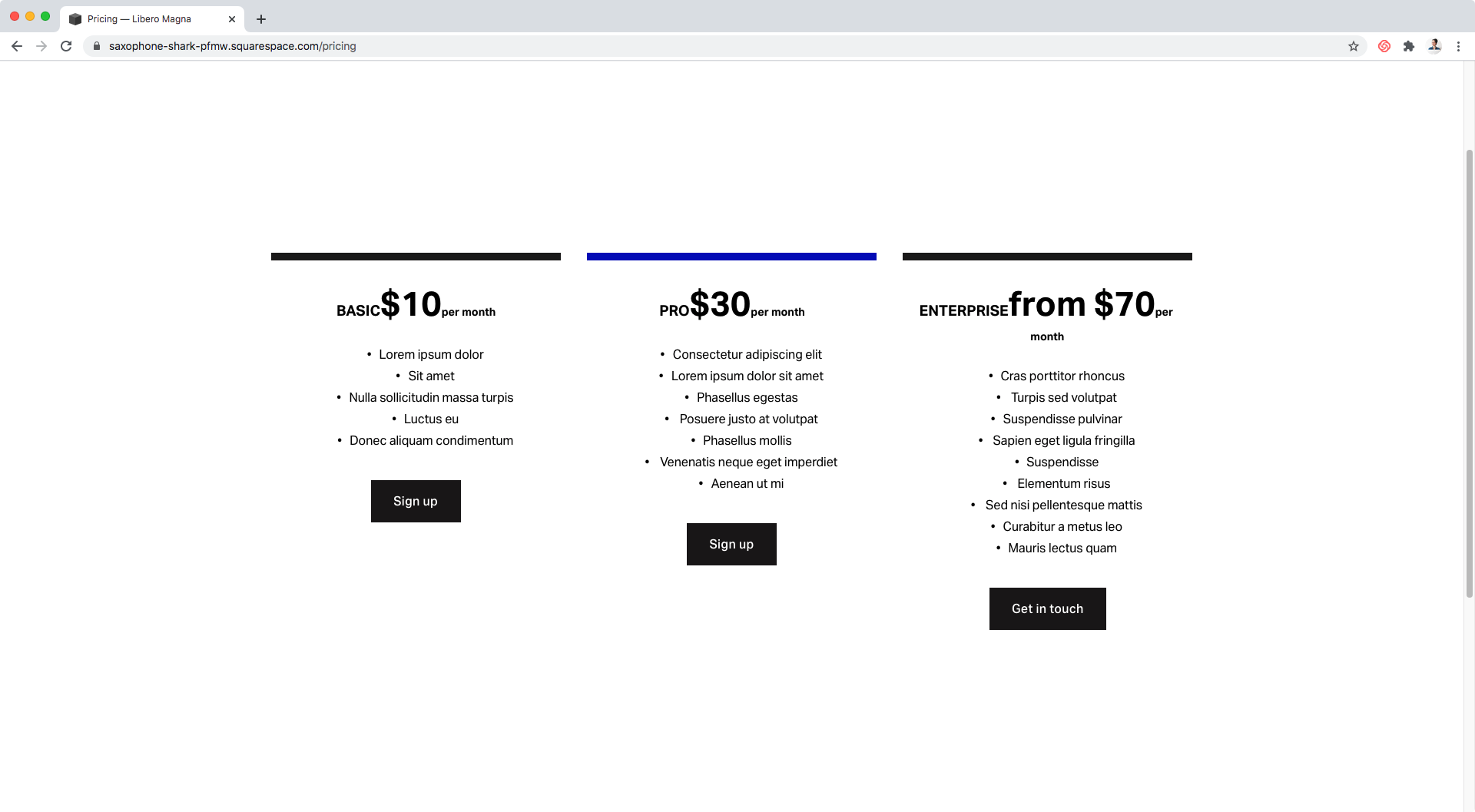
I’m using a very thin colored image as the top border:

Followed by a Heading 4 for the name of the tier:

A Heading 2 for the price:

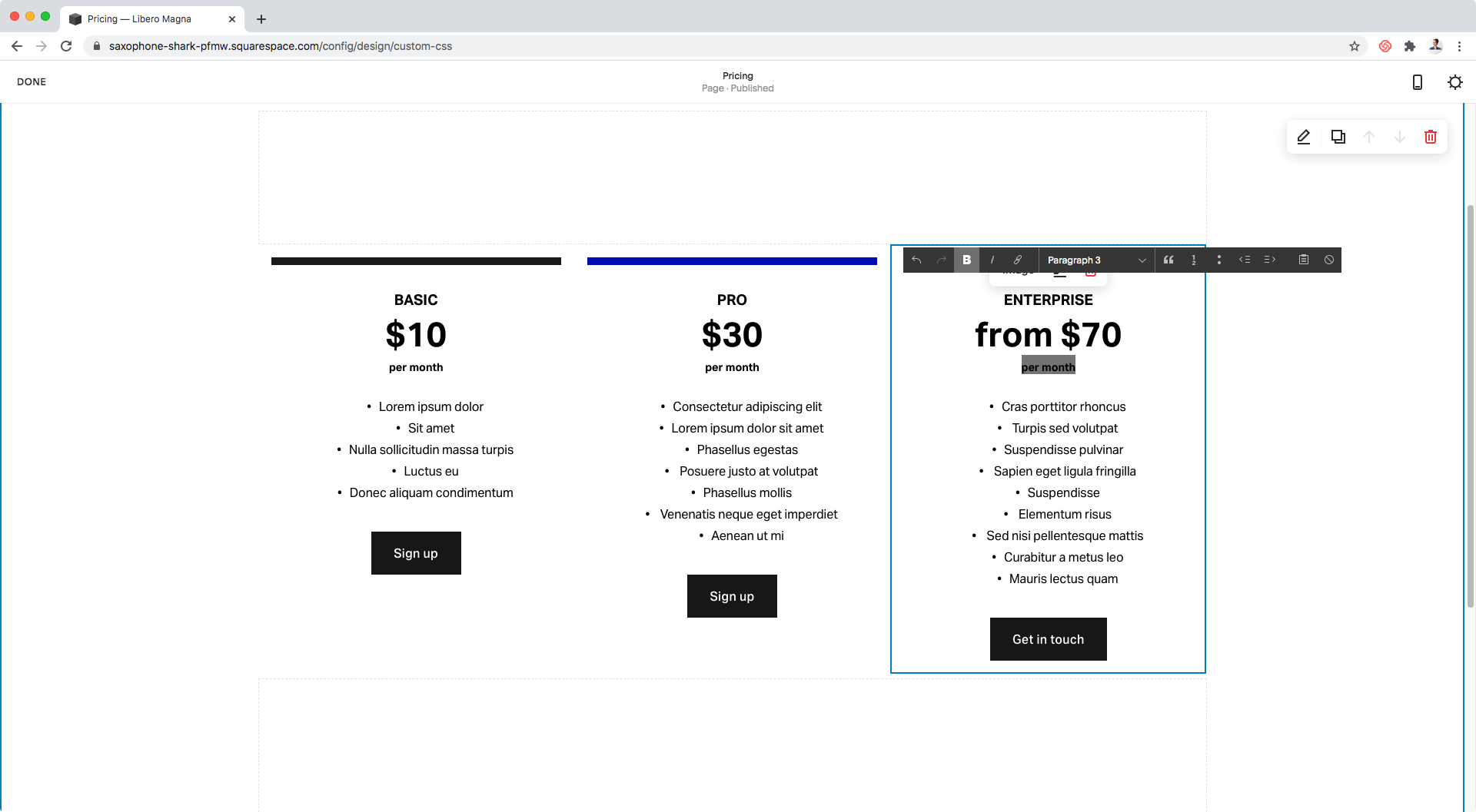
A Paragraph 3 for the payment frequency:
And a simple bullet point list as the “subtitle” of the image, breaking down the perks of each tier line by line.
Stacking the titles
If you have more than one type of heading/paragraph in the title section, you may see them sitting side by side or stacked, depending on if you’re in edit mode or not.
So, our first customization step will be to make sure they’re always stacked.
To do this, we’ll have to target the headings and set them to display: block so that they expand the full width of the container and sit in different lines.
However, in this particular case, by only modifying the middle heading the other two will be forced to sit on their own since there will be no space left next to it to stay in the same line.
Therefore, let’s just look at how to target the pricing text:


As we can see above it’s an h2 element without any useful classes, so we’ll target it by its element selector.
However, we’ll need to make this way more specific so let’s look higher up the code for a parent/ancestor container with a class that can help us identify the heading within our blocks:

Alright, so this ancestor container is a figure element with a bunch of classes, amongst which there’s one called .design-layout-stack that clearly points to the type of block we’re using.
We could leave it at that, but on the first run of the customization I came across some specificity issues that we can avoid altogether by simply making the whole selector more specific.
So, let’s scroll up a bit more and a look at the “main” container of the Stack Block and grab one of its classes as well:

Let’s just go with .image-block and pop that into our final selector:
.image-block .design-layout-stack h2 {

}
Alright, and now let’s stack the heading!
.image-block .design-layout-stack h2 {
  display: block;
}

Awesome!
The titles of our pricing tables are in place.
Removing the bullet points
Next, we’ll take care of the “perks” of the tables.
Usually, bullet points are set through the ul element holding each line item, and they can be removed by setting list-style-type to none.
However, Squarespace sets bullet points differently, so we have to take a different approach.
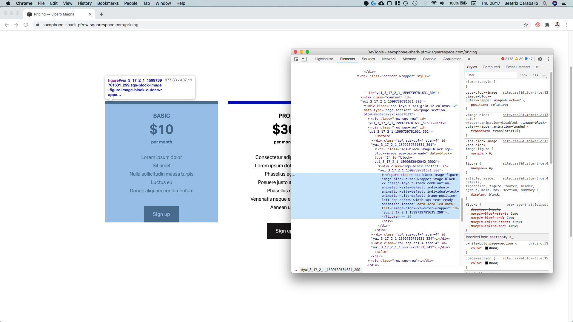
By using our handy dandy Inspect Tool on a line item…


…we can see that the bullet points are actually pseudo-elements added to the paragraph elements inside each line of the list.
So, in order to get rid of them, we’ll need to target those ::before pseudo-elements and set them to display: none.
To make sure we’re only pointing at these ones inside our tables – and considering that the selector that was used to set them in the first place was pretty specific (top-right corner of the previous screenshot) – we’ll grab the p element selector:

The li selector:

And the two classes we used previously to point to this particular image layout (.image-block and .design-layout-stack).
So, our final selector will be:
.image-block .design-layout-stack li p::before {

}
And now, we can hide the bullets!
.image-block .design-layout-stack li p::before {
  display: none;
}

Cool!
However, I’m not sure if you can tell from the screenshot but, there’s a little misalignment going on. There’s some extra space on the left side of the line items that’s pushing them off-center.
Let’s check out what’s going on:


Alright, so the culprit is a left padding that has been applied to the ul container to make room for the bullets we just got rid of.
Let’s remove this, then!
We’ll target the ul element and include the two image classes from before to keep things specific for this image layout:
.image-block .design-layout-stack ul {
  padding: 0;
}

Lovely!
Adding a background color
With the text part taken care of, let’s move onto color!
We could target the “main” image container (.image-block) and give that one a background color but, because of the padding, we would end up with a background that’s wider than the image:

So, instead, let’s target the figure element inside the image block and color that one:

I’ll make mine slightly grey:
.image-block .design-layout-stack {
  background-color: #f0f0f0;
}
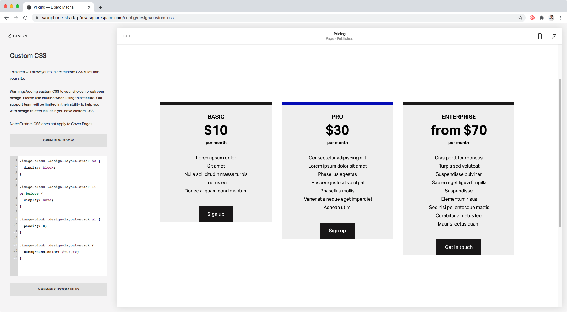
And to detach the button a bit from the bottom, I’ll throw in some padding as well:
.image-block .design-layout-stack {
  background-color: #f0f0f0;
  padding-bottom: 30px;
}

Nice!
Alternating line colors
Last but not least, let’s make it easier to differentiate between “perks” by adding an alternating background color to our tables.
To pull this off, we’ll be making use of a pseudo-class called :nth-child() and using the parameter odd.
First, let’s target the line items:


We’ll do that through their li element selector, and include the image block classes we’ve been using along this tutorial:
.image-block .design-layout-stack li {

}
Then, we’ll just pop in that pseudo-class I mentioned:
.image-block .design-layout-stack li:nth-child(odd) {

}
And finally, add in the background color:
.image-block .design-layout-stack li:nth-child(odd) {
  background-color: #e0e0e0;
}

Awesome!
Now, how about we give ALL line items a bit of padding to create more separation?
.image-block .design-layout-stack li {
  padding: 10px;
}
Perfect!
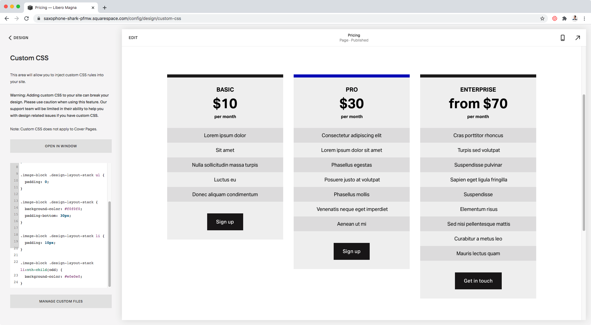
Let’s check out the final result on different screen sizes:


Awesome! All good.
"But... what if I'm using 7.0?"
If you’re working on a 7.0 site, you’ll notice that the Stack Block doesn’t have the option to add different heading styles nor bullet point lists to its content areas. At least not at the moment.
But don’t worry! You can still achieve the same look by making some adjustments:
To create different headings, you’ll need to apply something similar to this little trick to the title of your block. You’ll need to set the name of the tier as bold, the frequency of payments as italics, and leave the price as is. This way, you’ll be able to control the size/styles of the first two via CSS!


To add your list of perks, you’ll simply need to make sure to hit return/enter after the end of each line.

Then, you can use the following modified version of the CSS to apply the customization:
.image-block .design-layout-stack .image-title strong,
.image-block .design-layout-stack .image-title em {
display: block;
}
//Top text
.image-block .design-layout-stack .image-title strong {
  font-size: 20px;
  font-weight: normal;
}
//Bottom text
.image-block .design-layout-stack .image-title em {
  font-size: 16px;
  font-style: normal;
}
.image-block .design-layout-stack {
background-color: #f0f0f0;
padding-bottom: 30px;
}
.image-block .design-layout-stack .image-subtitle p {
  margin: 0;
  padding: 10px;
}
.image-block .design-layout-stack .image-subtitle p:nth-child(odd) {
background-color: #e0e0e0;
}

And ta-dá!
There you have it!
That’s how you can create some simple, user-friendly and custom pricing tables for your Squarespace clients.
Until next time,
B.
Full code
SQUARESPACE 7.1
/*SIMPLE PRICING TABLES WITHOUT HTML (7.1)*/
.image-block .design-layout-stack h2 {
  display: block;
}
.image-block .design-layout-stack li p::before {
  display: none;
}
.image-block .design-layout-stack ul {
  padding: 0;
}
.image-block .design-layout-stack {
  background-color: #f0f0f0;
  padding-bottom: 30px;
}
.image-block .design-layout-stack li {
  padding: 10px;
}
.image-block .design-layout-stack li:nth-child(odd) {
  background-color: #e0e0e0;
}
SQUARESPACE 7.0
/*SIMPLE PRICING TABLES WITHOUT HTML (7.0)*/
.image-block .design-layout-stack .image-title strong,
.image-block .design-layout-stack .image-title em {
  display: block;
}
//Top text
.image-block .design-layout-stack .image-title strong {
  font-size: 20px;
  font-weight: normal;
}
//Bottom text
.image-block .design-layout-stack .image-title em {
  font-size: 16px;
  font-style: normal;
}
.image-block .design-layout-stack {
  background-color: #f0f0f0;
  padding-bottom: 30px;
}
.image-block .design-layout-stack .image-subtitle p {
  margin: 0;
  padding: 10px;
}
.image-block .design-layout-stack .image-subtitle p:nth-child(odd) {
  background-color: #e0e0e0;
}