The Codebase
Filter through all the code
Find the Squarespace tutorial, plugin or snippet that’s going to help you fix or customize your client’s site in a heartbeat.
Styling the title area (even height) (7.0, 7.1 CE & 7.1 FE) - Gallery Block Grid
Customize the title box under your Grid Gallery Block slides with this copy/paste code. You’ll be able to modify the background color, border style and padding of those little sections, to make them as prominent or subtle as you need to, in order to match your design’s vision. Plus! You’ll automatically get them to match in height with the rest of the slides on the row, to achieve that even look you’re going for.
Styling the caption area (even height) (7.1) - Gallery Section Grid Simple
Customize the caption area of your Grid Simple Gallery Sections in 7.1 with this short snippet. You’ll be able to set your own background color, padding, and border style, to make the slides match the look of the rest of your Squarespace site! Plus! You’ll get that lovely even-height look that you’re aiming for too.
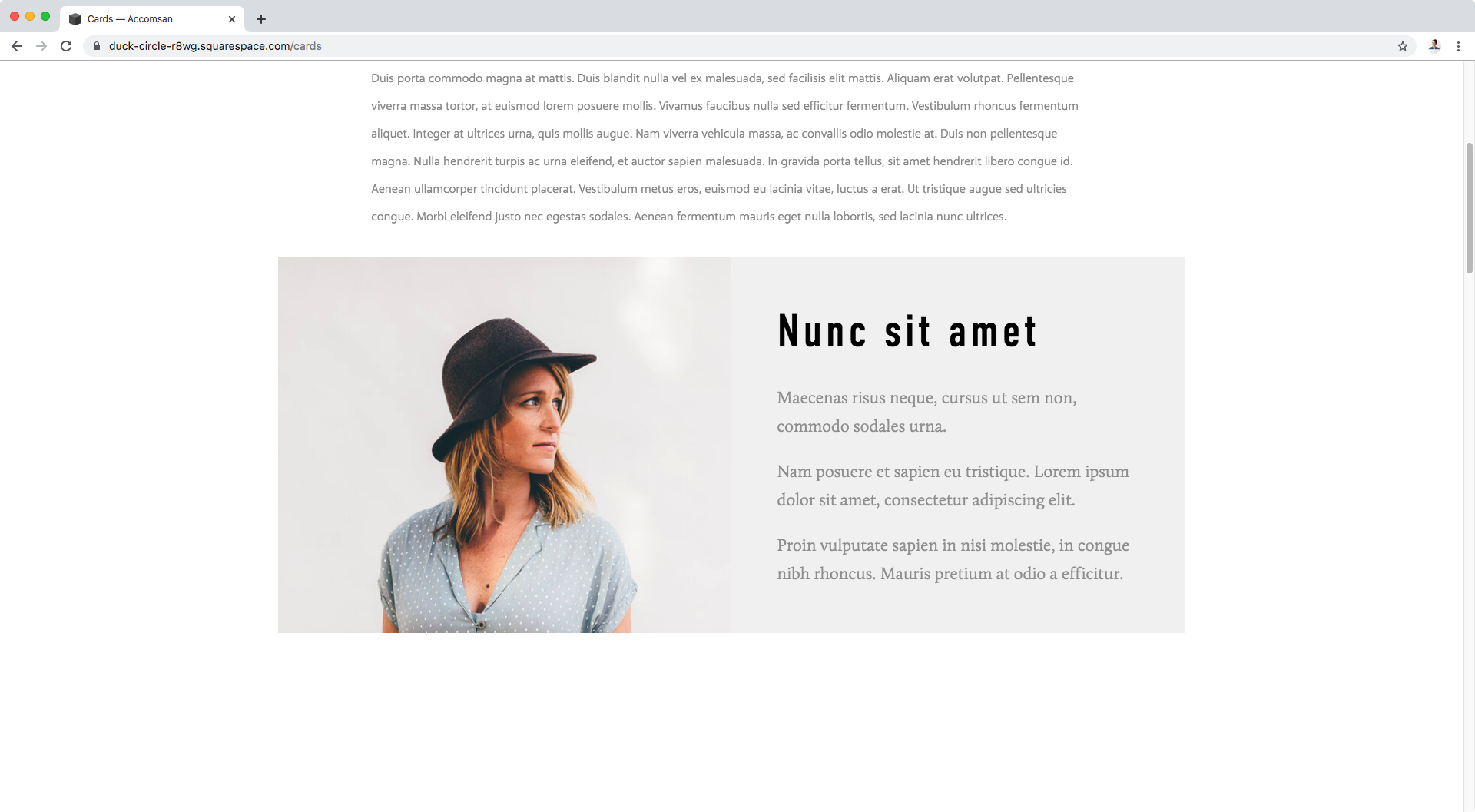
Same height for image and content (7.0 & 7.1 CE) - Image Block Card
If you’re working with a Card Image Block and want to have the satisfying feeling of evenness when looking at it, then this snippet is for you. Copy/paste this code and you’ll automatically get the image and content side of your cards matching in height across the site!
Styling the content area (even height) (7.0, 7.1 CE & 7.1 FE) - Summary Block Grid
Not a fan of unevenness? Me either. If you’re wanting to rectify the situation for the Grid Summary Blocks on your site and make sure the items match in height automatically, this handy little code snippet will help you achieve just that!
Styling the content area (even height) (7.0, 7.1 CE & 7.1 FE) - Summary Block Carousel
Not a fan of unevenness? I get you. If you’re wanting to rectify the situation for your Carousel Summary Blocks and make sure the items match in height automatically, this handy little code snippet will help you achieve just that!
Styling the content area (even height) (7.0, 7.1 CE & 7.1 FE) - Summary Block List
If you want to add something like a background color or a border to the content side of your List Summary Block items, AND make sure that the image thumbnail has the same height, this snippet is for you. Copy/paste the code into your site and you’ll be able to pull off the even height look across all of this kind of block across your site!
How to create responsive equal height columns in Squarespace (7.0 & 7.1 CE)
Spacers, image blocks, fixed height, and min-height values. Those are just a couple of workarounds that help a little bit when trying to create 3 equal-height columns inside a client’s site. However, there’s a better way…
Vertically aligned 3-column footer layout in Brine (7.0)
We’ve tackled footer customizations before but, this time, we’ll be looking at how to create a lovely vertically-aligned column layout in Brine, that includes the actual Footer nav vs manual links!
Same height background for items on a blog page in Brine (7.0)
I know you’re here to find out how to FINALLY achieve this customization because although you may have found a way to add a background color to your blog page items, it’s been tricky trying to make them have the same height, without manually setting one that only works if you don’t reduce your screen size.
Adding a background color to summary excerpts (7.0, 7.1 CE & 7.1 FE)
In today’s tutorial, we’ll be looking at how to add a background color to those Summary Blocks with summary excerpts you have hanging around your site… AND how to make sure the colored portions have THE SAME HEIGHT. Oooh, intriguing right?
Creating a boxed-in footer in Squarespace (Brine 7.0)
Let’s face it, the footer is the part of our Squarespace design we think about last when it comes to adding customizations. However, that doesn’t mean we can’t show it some love and have it help our site look more custom by giving it a non-default style!


