Same height background for items on a blog page in Brine (7.0)
Another tutorial, another non-catchy title for it.
But you’re not here for the title alone, are you?
Oh, no.
I know you’re here to find out how to FINALLY achieve this customization because although you may have found a way to add a background color to your blog page items, it’s been tricky trying to make them have the same height, without manually setting one that only works if you don’t reduce your screen size.
So, are you ready to do this? Let’s go!
Note: if you’re looking for the Squarespace 7.1 version, you’ll find the snippet to achieve this inside the Snippet Directory!
Adding a background color to blog post items
I’ll be starting out with a regular blog page on my Brine template.
I have set it up to display 3 post items through my Site Styles, but you can have as many items per row you want.
The first thing we’ll be doing here is looking for the class of our individual blog page items, to be able to give them a background color.
Alright, so above we can see each of our post excerpts is an article element with a bunch of classes.
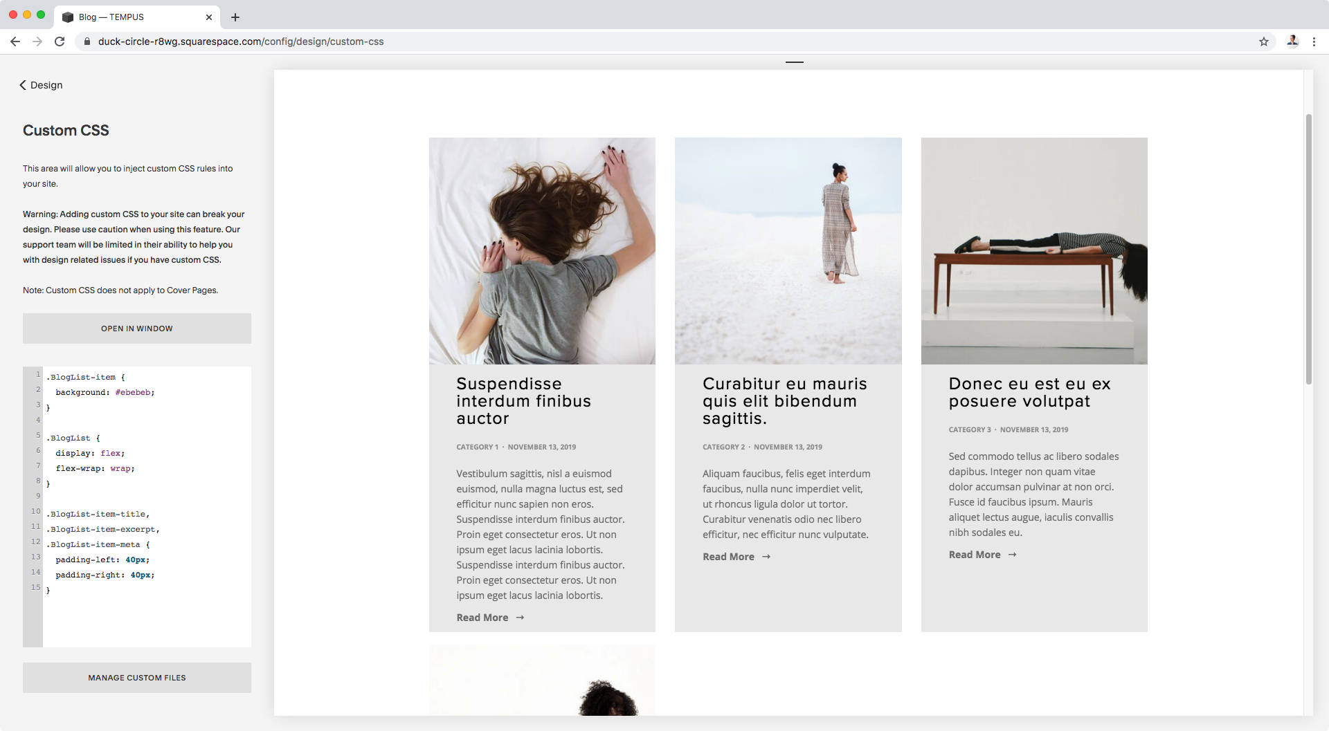
I’ll be using the .BlogList-item class to target mine, and give them a grey background color:
.BlogList-item {
  background: #ebebeb;
}
Good!
Now, to be able to stretch them out vertically so they have the same height, we’ll be using our good friend flexbox.
What we need to do is find the PARENT container holding all of our blog post items and set it to display: flex. By default, that’ll make its immediate children elements (our article elements/blog post items) stretch to fill the space created by the tallest one.
So, looking through our Inspect Element window, we can see the container we’re looking for:
It’s a section element with a few classes.
I’ll be using .BlogList to target it in my CSS:
.BlogList {
  display: flex;
}
Awesome!
They all have the same height now.
However, they’re all bunched up together and I’m assuming you don’t want that any more than I do.
So, to fix this, we’ll be using the flex-wrap property under our .BlogList container.
What this’ll do is let our browser send our elements to a second line, once their given width makes it hard to fit more than X in one single line.
.BlogList {
  display: flex;
  flex-wrap: wrap;
}
Awesome! I know have 3 per row again and you should be seeing your original per row number as well.
Ok, let’s move on.
Note: if you’re looking for the Squarespace 7.1 version, you’ll find the snippet to achieve this inside the Snippet Directory!
Adding padding to the excerpt portion
Right now you may be noticing that the content of the colored area is a taaaaad too close to the edges, so I’d like to add some breathing room around it.
Depending on the look you’re going for, you could simply add some padding to the .BlogList-item container.
However, that will add padding around the image thumbnail as well, and I’m not interested in doing that.
So, I’ll take a different route.
Normally, at this point we would simply need to look for the container holding all of our content area and add the padding to it.
But, looking through our Inspect Element window we come across a different structure:
In the screenshots above, the dark blue represents the whole article container, and the lighter blue all of the different pieces or elements inside it: thumbnail, title, excerpt and metadata.
So, as you can see, these elements are not being grouped together by any other container that we could target.
What we’ll need to do instead is target EACH individual element, and give them the same padding in order to create that space from the edge of the colored background.
Considering I don’t want to touch the thumbnail, the classes I’ll use are the following: .BlogList-item-title, .BlogList-item-excerpt, .BlogList-item-meta.
And because I want to give them all the same padding style, I’ll group them in my CSS:
.BlogList-item-title,
.BlogList-item-excerpt,
.BlogList-item-meta {
  padding-left: 40px;
  padding-right: 40px;
}
Awesome!
Now, let’s add more space at the top and bottom of the background section.
Once again, because we don’t have any “content” container that we can target, we can simply add some bottom padding to the entire article element, and then a bit of top padding to the first text element (in my case that’ll be the title).
.BlogList-item {
  background: #ebebeb;
  padding-bottom: 40px;
}

.BlogList-item-title {
  padding-top: 40px;
}
Alright!
Let’s check the final result:
Faaaantastic!
So there you have it.
That’s how you can add a same-height background to your main blog page items in Brine!
Note: if you’re looking for the Squarespace 7.1 version, you’ll find the snippet to achieve this inside the Snippet Directory!
Until next time,
B.
Full code
.BlogList-item {
  background: #ebebeb;
  padding-bottom: 40px;
}

.BlogList {
  display: flex;
  flex-wrap: wrap;
}

.BlogList-item-title,
.BlogList-item-excerpt,
.BlogList-item-meta {
  padding-left: 40px;
  padding-right: 40px;
}

.BlogList-item-title {
  padding-top: 40px;
}


