
How to create responsive equal height columns in Squarespace (7.0 & 7.1 CE)
Spacers, image blocks, fixed height and min-height values.
Those are just a couple of workarounds that help a little bit when trying to create 3 equal-height columns inside a client’s site.
However, we both know that after hours of tweaking, moving, dragging, resizing, etc, what we have on desktop gets completely messed up as soon as the screen shrinks down.
I don’t know about you but I feel this type of layout should be way easier to accomplish.
And luckily, there is a way.
Let’s take a look!
Prepping the section (DO NOT SKIP THIS)
This is THE KEY to this trick, so make sure to have things set up correctly before jumping into the code.
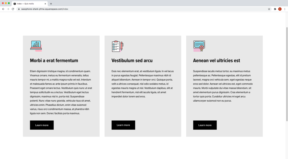
The first thing we need is to have a blank section on our site with three spacers (or code blocks) side-by-side.
Note: as you drop the third spacer in the same line as the other two, note if they automatically resize to occupy a third of the space. If they do, they’re set correctly for the code to work. If they don’t, and you find yourself trying to manually adjust their width, THEY’RE NOT SET UP CORRECTLY. In that case, remove them and try again.


Once the spacers are in place, we can go ahead and add the corresponding content under each one.
I recommend NOT dragging blocks, but instead clicking on the drop under each spacer to add the respective content.
For this example, I added an image block, a text block and a button block to each column (icons can be found here):
Targeting the right container
With all the content in place, it’s time to add our code.
To achieve our 3 equal-height column look we’re going to be using our good friend Flexbox.
In this case, what we want is for the columns (.col) holding our content to match in height:
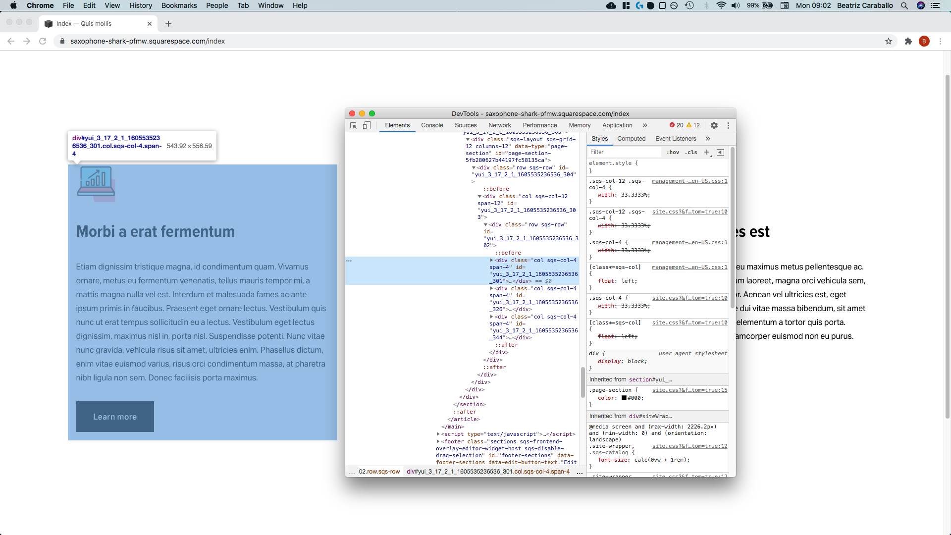


Therefore, we need to look for their direct parent container to target it via CSS.
That container is .sqs-row:

Now, because .sqs-row is a common class for ALL row containers in Squarespace, we need to make sure we’re only targeting the ones inside our specific section.
To do so, we’ll include our section ID in our selector.
I’m working with 7.1 here, so I’ll go with the data-section-id:
[data-section-id="5fb280627b44197fc58135ca"] .sqs-row {

}
Then, we’ll give this a display value of flex, and allow the columns to stack when there’s no more space available to sit side-by-side with flex-wrap:
[data-section-id="5fb280627b44197fc58135ca"] .sqs-row {
  display: flex;
  flex-wrap: wrap;
}

Ok, perfect.
Styling the columns
There’s no apparent change to the naked eye but, if we now target the columns of our section through their .sqs-col-4 class…

…and give them a background color:
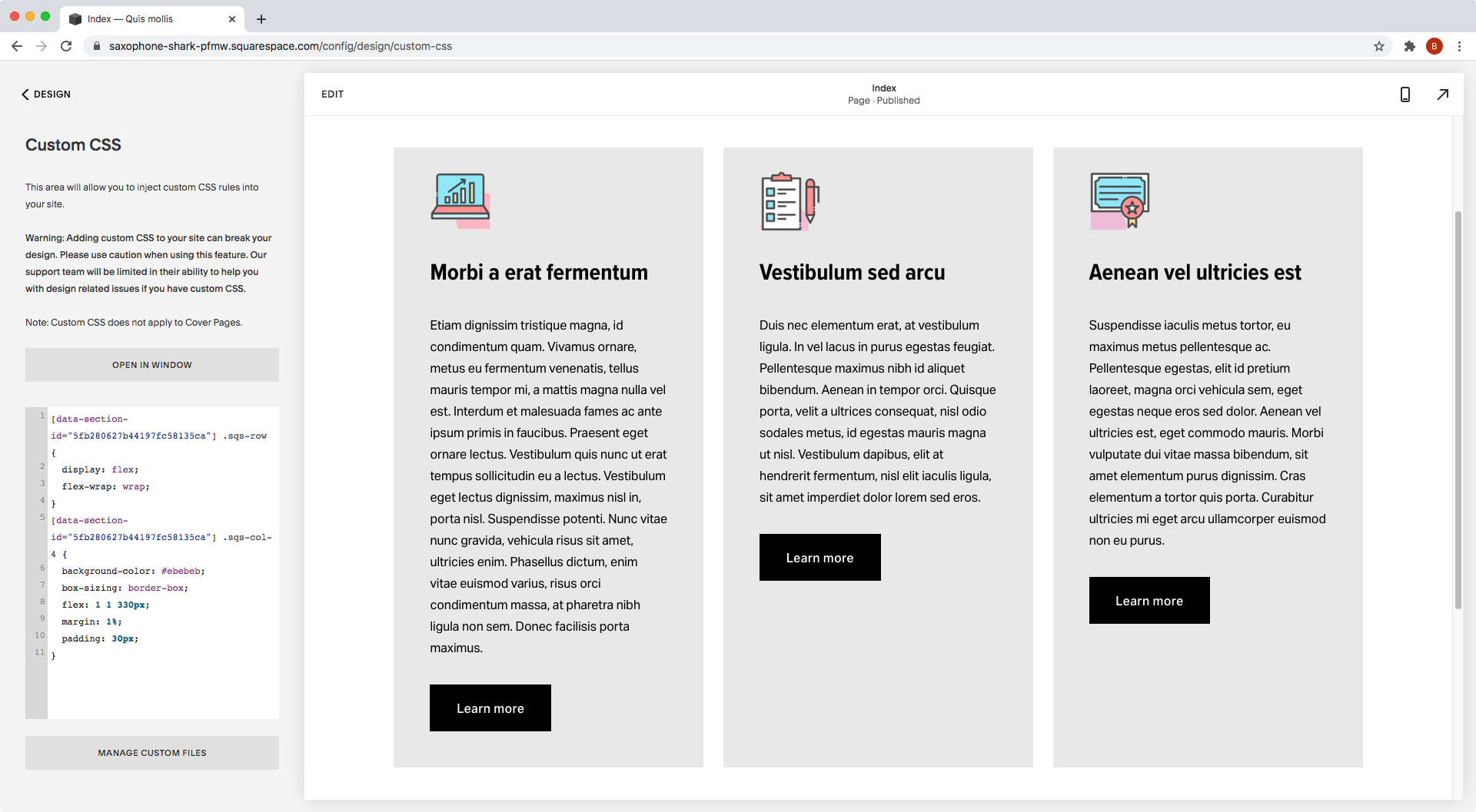
[data-section-id="5fb280627b44197fc58135ca"] .sqs-col-4 {
  background-color: #ebebeb;
}

They all align!
Now, let’s make the separation clearer with a bit of margin:
[data-section-id="5fb280627b44197fc58135ca"] .sqs-col-4 {
  background-color: #ebebeb;
  margin: 1%;
}

Awesome!
See how the third column went down one line?
That’s thanks to the flex-wrap property we used. Otherwise, the column would have overflowed the site, creating a horizontal bar.
Now, to decide when the columns start moving into another line we’ll be using the flex property.
With it, we’ll tell our browser that we want the columns to grow (1) and shrink (1) to fit the available space, BUT using a specific number of our choice as the “starting point" or base size.
I’m going to go with 330px as the base size of the columns:
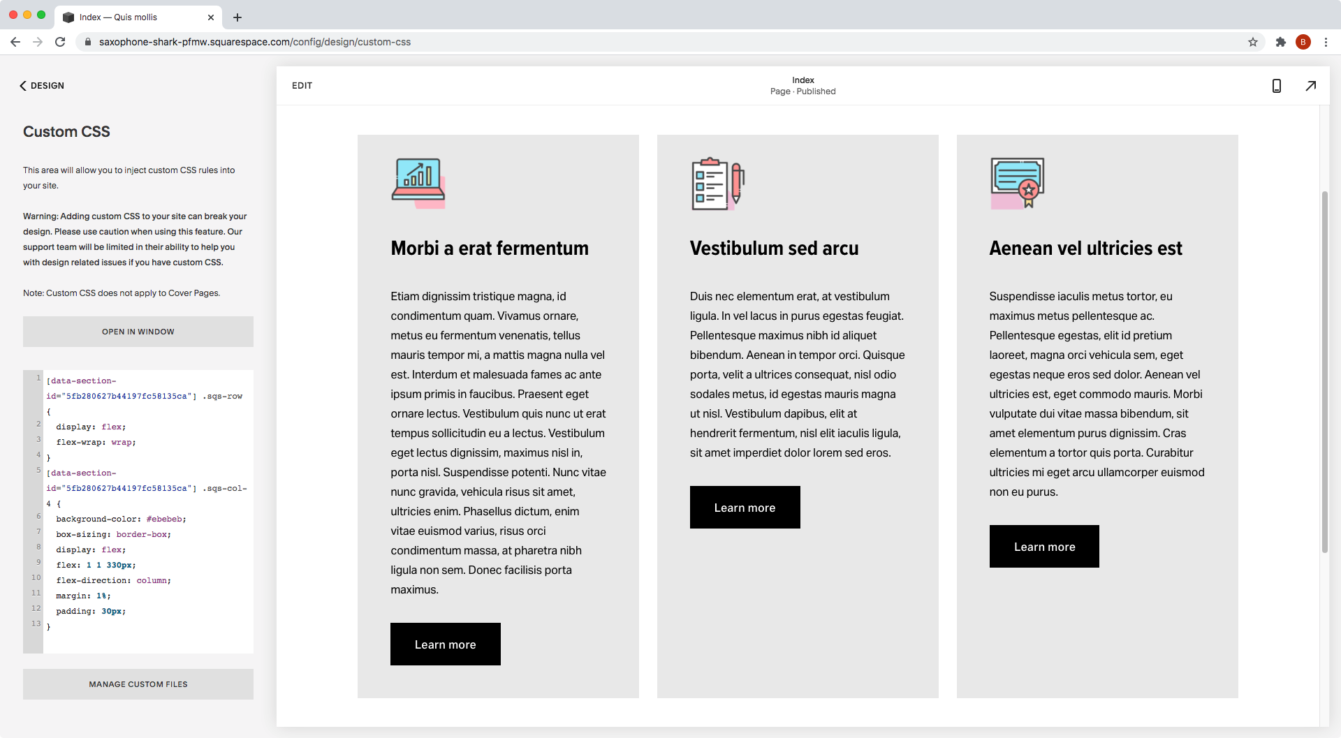
[data-section-id="5fb280627b44197fc58135ca"] .sqs-col-4 {
  background-color: #ebebeb;
  flex: 1 1 330px;
  margin: 1%;
}

Alrighty! This is looking great so far.
Before testing the responsiveness tho, let’s add some padding, shall we?
I’ll also incorporate the box-sizing fix to make sure that the padding is included in the 330px width, and not as extra space:
[data-section-id="5fb280627b44197fc58135ca"] .sqs-col-4 {
  background-color: #ebebeb;
  box-sizing: border-box;
  flex: 1 1 330px;
  margin: 1%;
  padding: 30px;
}
How about that!?

Checking out smaller screens
Let’s see what this looks like on tablets:

As you can see, once there’s no more space available for all 3 columns to fit, they start moving into a different line.
And, because inside the flex property we allowed the columns to grow when possible (i.e. we set the first value set to 1), the third column that moves onto the next line on tablets is able to expand to fill the entire space available.
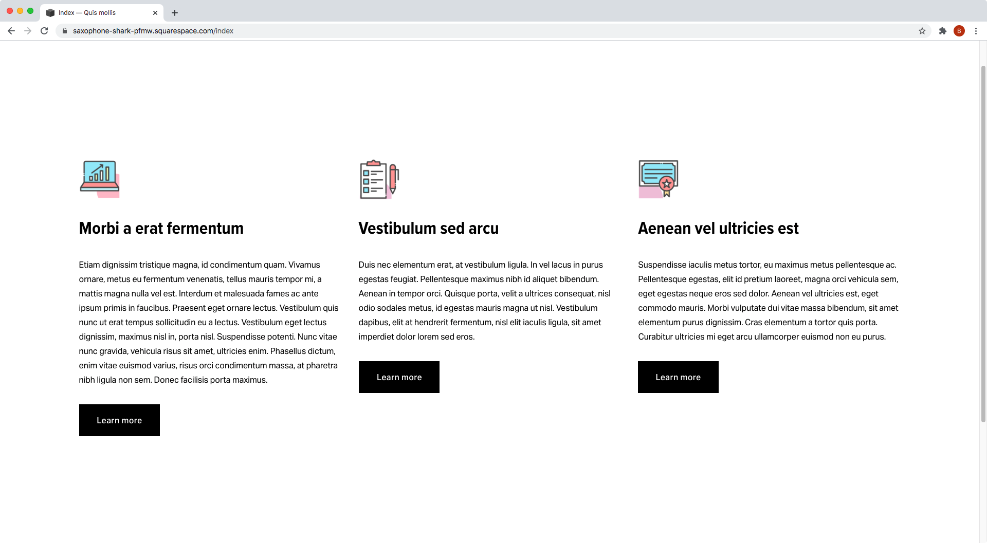
Then, on mobile screens:

Only one column is shown per row.
And, because in the same flex property we allowed the columns to shrink down (i.e. we set the second value to 1), if the space is narrower than our basis (330px in my case), the column keeps squishing down as needed.
Note: keep in mind that if the content INSIDE your column (image block, text, button, etc) is set to a fixed width, or the text isn’t able to hyphen or break into new lines, you may see that content overflowing the narrower column on very small screens.
Neat right?
"What if I want the button bottom-aligned?"
Well, I’m glad you asked!
In that case, we’ll need the help of Flexbox again.
But this time, we’ll apply it to the columns themselves so we can play around with the blocks inside them!
So, continuing from where we left off, let’s set our .sqs-col-4 columns to flex:
[data-section-id="5fb280627b44197fc58135ca"] .sqs-col-4 {
  background-color: #ebebeb;
  box-sizing: border-box;
  display: flex;
  flex: 1 1 330px;
  margin: 1%;
  padding: 30px;
}

Yikes!
Not a good look, is it?
This is happening because the default of a flex container is to make the things inside it sit side-by-side.
So, to change that and keep things stacked, we’ll include flex-direction: column in our code:
[data-section-id="5fb280627b44197fc58135ca"] .sqs-col-4 {
  background-color: #ebebeb;
  box-sizing: border-box;
  display: flex;
  flex: 1 1 330px;
  flex-direction: column;
  margin: 1%;
  padding: 30px;
}
Awesome!
And now, let’s inspect our buttons to see which class we can use to target them:


We have a few classes here, but let’s go with .button-block.
And, once again we’ll include our section ID to make sure we’re only modifying the buttons in there.
[data-section-id="5fb280627b44197fc58135ca"] .button-block {

}
Last but not least, we’ll give these buttons a top margin of auto, since that will push it downwards to the edge of the columns:
[data-section-id="5fb280627b44197fc58135ca"] .button-block {
  margin-top: auto;
}


Will you look at that?
We now have 3 gorgeous columns that are perfectly aligned with each other, totally responsive and totally versatile!!
Not too shabby.
Until next time,
B.
Full code
Note: for Brine in 7.0, make sure to substitute [your-data-section-id] for #your-index-section-id
/*HOW TO CREATE RESPONSIVE EQUAL HEIGHT COLUMNS IN SQUARESPACE (7.0 & 7.1)*/
[your-data-section-id] .sqs-row {
  display: flex;
  flex-wrap: wrap;
}
[your-data-section-id] .sqs-col-4 {
  background-color: #ebebeb;
  box-sizing: border-box;
  display: flex;
  flex: 1 1 330px;
  flex-direction: column;
  margin: 1%;
  padding: 30px;
}
[your-data-section-id] .button-block {
  margin-top: auto;
}