
Vertically aligned 3-column footer layout in Brine (7.0)
In a previous customization, where we tackled how to create a “boxed-in” footer in Brine, we saw how we could have footer columns that remain vertically aligned in larger screens.
And some time later, in the full version of the Snippet Directory, we tackled how to have that same layout but only using blocks located in the middle footer area, to allow more freedom with the top and bottom sections.
However, neither the tutorial nor the snippet tackle how to make this happen when Squarespace’s footer nav is being used.
So, let’s do that today!
The layout
To achieve this customization, we’ll need to work with the Brine template and have the footer navigation in place with a couple of links.
Any other content will need to be added to the top and bottom blocks.
Note: make sure that your footer layout is set to Stacked inside your Site Styles.
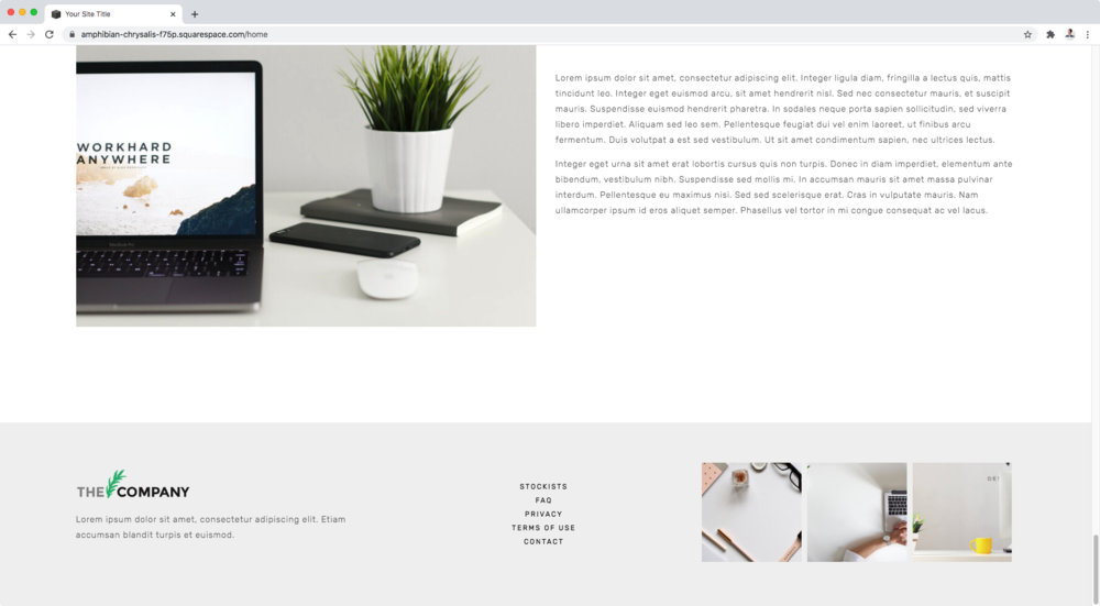
Here’s what I have in place:
Top block – image block and text
Middle block – footer navigation (from Pages’ panel)
Bottom block – gallery block

Now, in order to set this horizontally and be able to play with the blocks’ alignment we’ll be applying flexbox.
Therefore, we need to start by finding the direct parent container that’s holding our three main blocks (top, middle and bottom).
Let’s take a look.
Finding the right container
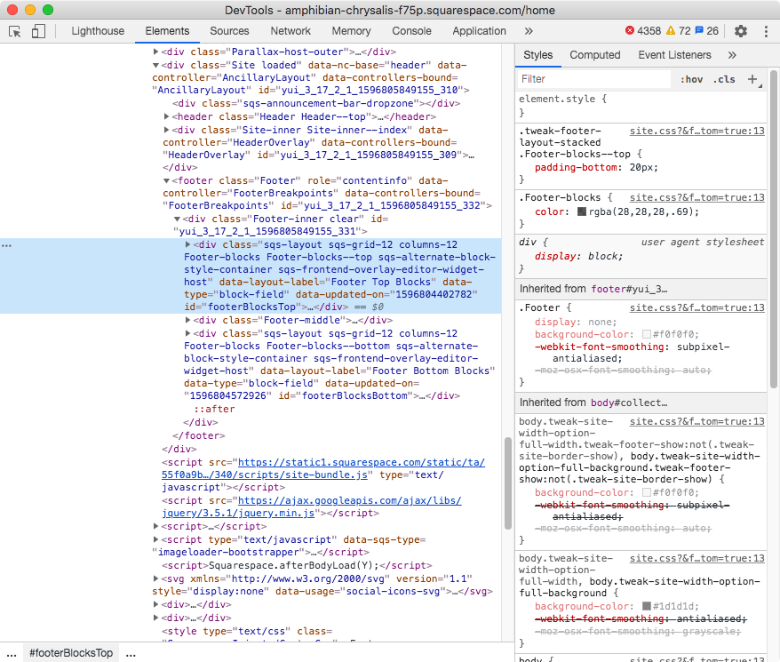
Looking through our Inspect Element window, we can see our top block:

Our middle block:

And our bottom block:
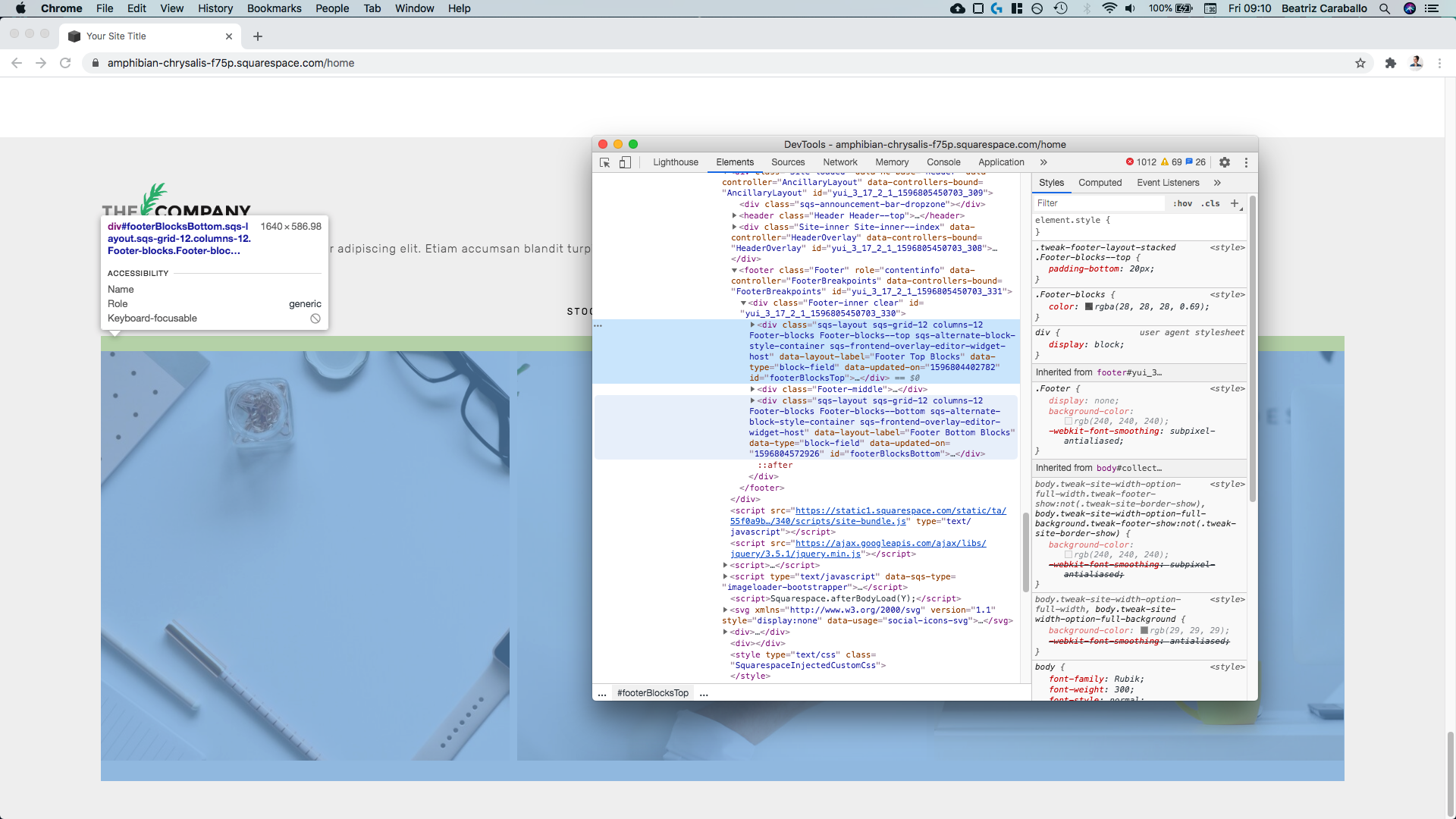
All three are direct children of the same parent container (.Footer-inner):

Therefore, we can target that container and set it to display: flex in order to rearrange the children inside it the way we want to.
.Footer-inner {
  display: flex;
}
And just like that we have our three blocks side by side!
Setting the blocks in three neat columns
Now, let’s make some changes here starting with the width of the blocks.
In order to do that, we’ll have to look for a way to target each of those areas.
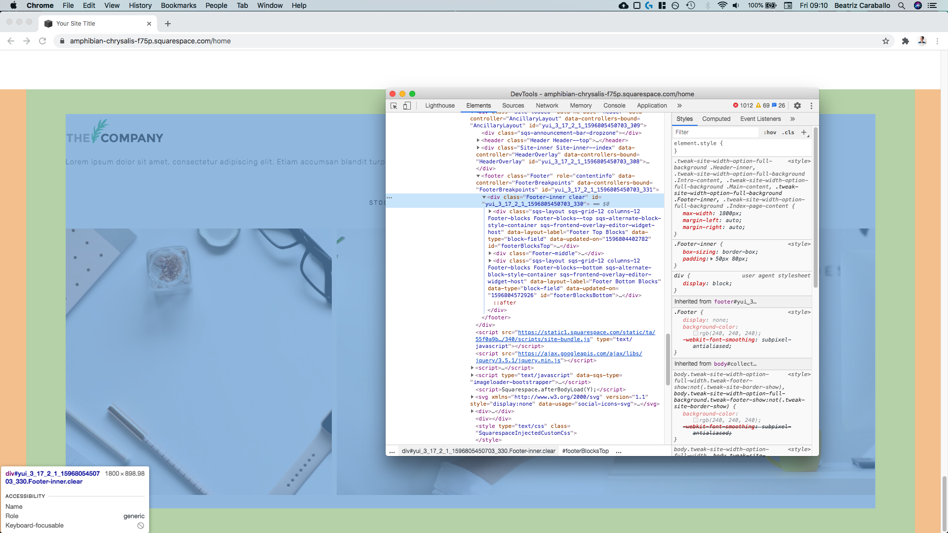
So, going back to our Inspector tool and looking at the top block…

Amongst all of those classes we can see there’s one called .Footer-blocks--top, so we’ll grab that one.
Next, for the middle block…


There’s one lonely class of .Footer-middle that we can use.
And lastly, for the bottom block…


Within all those different names we can see one called .Footer-blocks--bottom, so that’ll do!
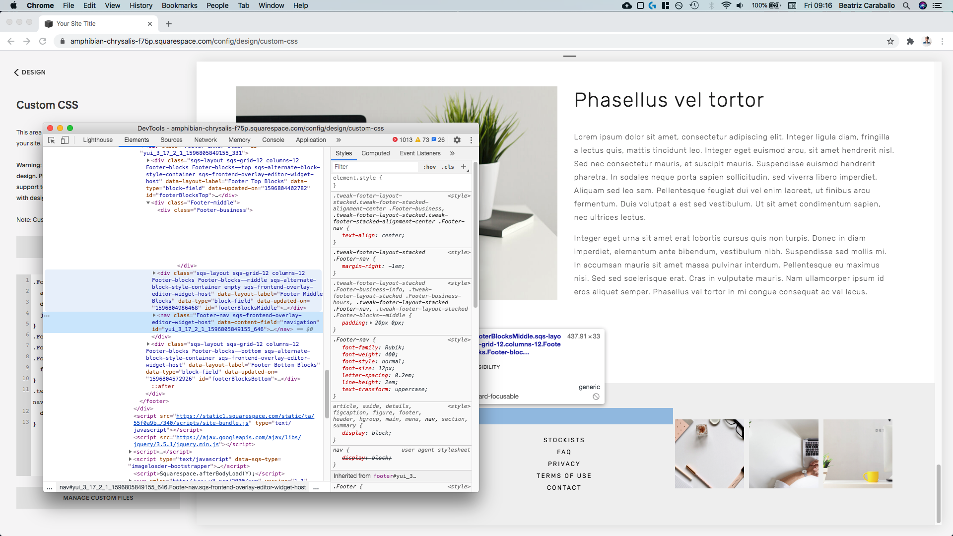
Now, since I want to set my blocks to the same width, I’ll group all three selectors in my code:
.Footer-blocks--top,
.Footer-middle,
.Footer-blocks--bottom {

}
And then, instead of width, we’re going to use the flex property.
The first value will be 0 so that the blocks don’t stretch out, the second value will be 0 as well so that they don’t shrink down, and the third value will be the width we want to give them (I’m going with 33%).
Note: depending on how much space you want between your three columns, you can use a different value. I’m going with 33% because out of the 100% width of the container holding all three columns, I want each to be that wide so that the remaining 1% of the available space (100% - 33% - 33% - 33% = 1%) is split between the columns to create the gaps. If you want larger gaps, go with a smaller column width (e.g. 30% to get a gap of 10% split between your columns).
.Footer-blocks--top,
.Footer-middle,
.Footer-blocks--bottom {
  flex: 0 0 33%;
}

Awesome!
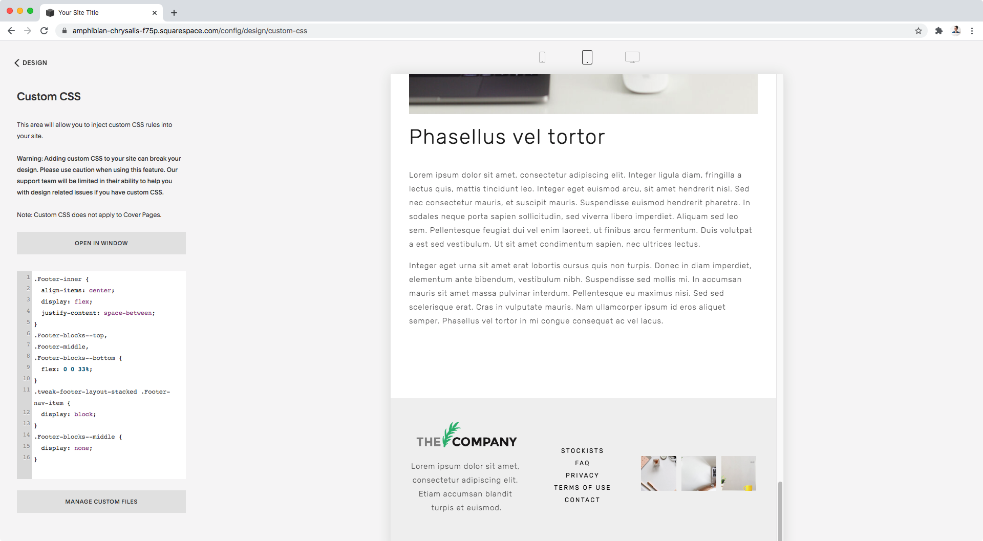
Next, let’s make sure everything’s spaced out across the entire width of the parent container (.Footer-inner) by going back to it and setting justify-content to space-between:
.Footer-inner {
  display: flex;
  justify-content: space-between;
}

And now let’s align everything vertically by using align-items:
.Footer-inner {
  align-items: center;
  display: flex;
  justify-content: space-between;
}

Perfect!
Stacking the footer nav
If you’re already happy with your layout you can stop here!
But personally, I would like to stack the footer nav so it occupies less (horizontal) space.
Let’s take a look through the Inspector tool to see how our links are set up:


Alrighty so they’re all a links inside a div, and they have a display value of inline-block which is keeping them side by side.
Let’s change that to block to stack them!
We’ll grab the same selector Squarespace used to set them as inline-block in the first place (just the part that isn’t grayed out since that’s what refers to the element we’re standing on):

So, by popping that into our Custom CSS window and changing the display value to block:
.tweak-footer-layout-stacked .Footer-nav-item {
  display: block;
}

Our footer nav is now stacked!
However, now that it is, I’m noticing there’s a bit of extra space at the top of the nav.
Let’s see what’s causing it…


Ok, so even when there’s no additional content besides the footer nav (dark blue above) inside the middle block container, the wrapper that would hold that extra content is still showing up (light blue above).
It’s fairly short, but it’s still there and it’s not letting the three columns to be perfectly aligned vertically.
Let’s get rid of it!
The unwelcome div has a bunch of classes, including one called .Footer-blocks--middle so let’s go with that and set it to display: none.
Note: just in case, this isn’t the same middle container that’s part of the three (top, middle and bottom) that make up our columns! That one is called .Footer-middle and is currently sitting between the top and bottom areas holding the navigation AND this intruding extra div.
.Footer-blocks--middle {
  display: none;
}

Alright! Much better.
Adjusting for smaller screens
Last but not least, let’s check out what this looks like on all screens:


Not too shabby!
However, I would rather have the blocks stack on tablets and phones, so let’s make that happen!
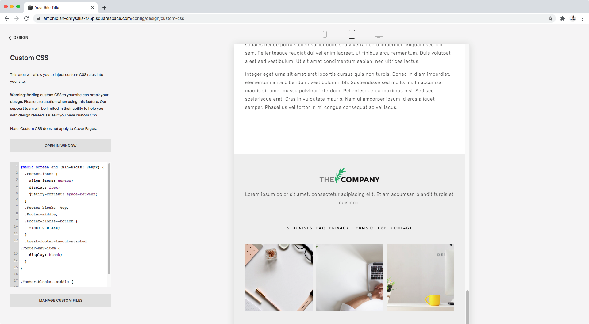
At this point, we could write a media query overriding the layout we have going on.
Or, we could wrap the code we already have inside one!
I prefer the later solution, so I’ll grab my code and put a minimum width media query around it, so that the horizontal layout only happens on desktop.
Note: I’m leaving out of the media query the removal of the extra middle section we did before since I want that to happen regardless of screen size.
@media screen and (min-width: 960px) {
  .Footer-inner {
    align-items: center;
    display: flex;
    justify-content: space-between;
  }
  .Footer-blocks--top,
  .Footer-middle,
  .Footer-blocks--bottom {
    flex: 0 0 33%;
  }
  .tweak-footer-layout-stacked .Footer-nav-item {
    display: block;
  }
}

Perfect!
Everything looks neatly stacked on smaller screens.
And then on desktop…

We have a gorgeous vertically-aligned footer layout!
Until next time,
B.
Full code
Note: did you notice the center alignment for the text block on smaller screens? Here’s the tutorial on how to do that!
/*VERTICALLY ALIGNED 3-COLUMN FOOTER LAYOUT IN BRINE*/
@media screen and (min-width: 960px) {
  .Footer-inner {
    align-items: center;
    display: flex;
    justify-content: space-between;
  }
  .Footer-blocks--top,
  .Footer-middle,
  .Footer-blocks--bottom {
    flex: 0 0 33%;
  }
  .tweak-footer-layout-stacked .Footer-nav-item {
    display: block;
  }
}

.Footer-blocks--middle {
  display: none;
}