
Adding a background color to summary excerpts (7.0, 7.1 CE & 7.1 FE)

It’s not the first nor the last time we’ll be addressing Summary Blocks in this blog, mainly because they’re pretty darn useful so why not make the best of them?
In today’s tutorial, we’ll be looking at how to add a background color to those Summary Blocks with summary excerpts you have hanging around your site… AND how to make sure the colored portions have THE SAME HEIGHT.
Oooh, intriguing right? Ok, now that I have your attention, let’s jump right in!
Adding a background color to Summary Block excerpts
We’ll start with a Carousel Summary Block, however feel free to replicate this for any other layout you prefer! Just keep in mind you may need to adapt the code.

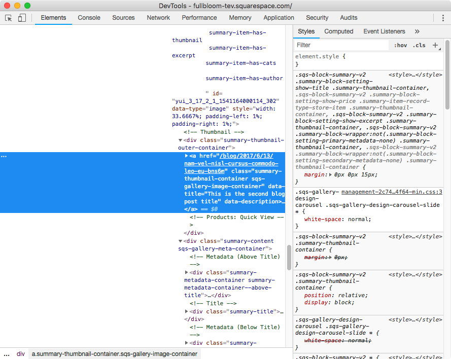
Next, let’s target that excerpt area below each thumbnail to give it a nice color.


Ok, our excerpt section has two classes. I’ll go with the one called .summary-content.
Now, let’s scroll back up a bit to find a parent container that we can use to indicate we’re talking about a carousel summary block here:

Alright, inside the container highlighted in a lighter blue we can see there’s a class called .sqs-gallery-design-carousel-slide. Great, so let’s head over to our Custom CSS window to build our selector!
.sqs-gallery-design-carousel-slide .summary-content {

}
And let’s give this baby a greenish background!
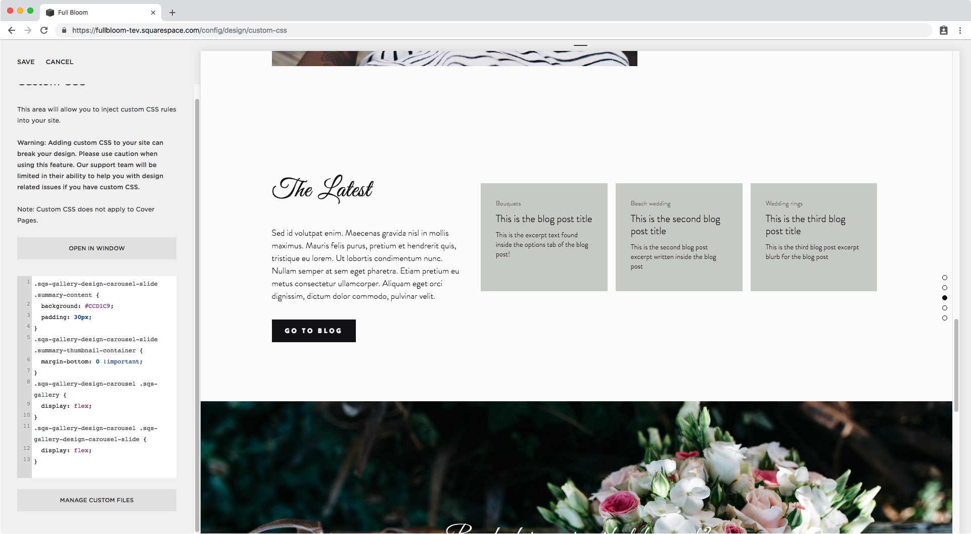
.sqs-gallery-design-carousel-slide .summary-content {
  background: #CCD1C9;
}

Right, how about we add a bit of padding to this so its not looking so weird?
.sqs-gallery-design-carousel-slide .summary-content {
  background: #CCD1C9;
  padding: 30px;
}

Better! But let’s get rid of that gap between thumbnail and excerpt.
Looking through our Inspect Element window here’s what we can see:

Inside our thumbnail container, our link container has a bottom margin that we have to get rid of to close the gap. So let’s target it through one of the classes we see in the Inspect Element window.
I’ll go with .summary-thumbnail-container and then make sure to also use the selector from before that indicates we’re dealing with a carousel.
.sqs-gallery-design-carousel-slide .summary-thumbnail-container {

}
And now let’s just set that bottom margin as 0.
.sqs-gallery-design-carousel-slide .summary-thumbnail-container {
  margin-bottom: 0 !important;
}

Perfect!
Now it’s time to address the elephant in the room: the slides not lining up at the bottom.
How to make summary excerpt items the same height
The process is not very complicated or long, but I really want to show you what’s going on and what our fix is going to help us do.
The quickest way to make all of these slides the same height is by using flexbox, a layout mode we’ve used more than once throughout this blog because it’s so stinkin’ useful!
To understand what we’ll be doing here keep this in mind: we need to have a PARENT CONTAINER that gives us the height we want the CHILDREN (SLIDES) to have.
If we look at our slides (thumbnail + excerpt combo) through Inspect Element, we’ll notice they don’t have the same height as the next slide.

Now, how do we tell our browser “hey, make this slide as tall as the one next to it!“ (without using a language other than CSS)?
Simple, we don’t.
We go to the PARENT CONTAINER instead, the one holding all our slides, to set it as the reference height for the children slides to follow.
In our Inspect Element window we can see our parent container here:


To target it we could use any of the classes we have there available, however if we look over to the right sidebar, we can see a nice little excerpt we can use that targets the carousel block and the container we want:

So let’s use that in our Custom CSS window and set the container to flex:
.sqs-gallery-design-carousel .sqs-gallery {
  display: flex;
}

It seems like nothing happened right?
Hold your horses, let’s take a look through our little X ray machine again:

See that? Now our slide containers have the same height as the parent container we set as flex!
Alright, so now we’re going to do the exact same thing one more time but this time using our slides as the PARENT CONTAINER since our excerpt is one of its CHILDREN (the other is the thumbnail).
From that same screenshot above we can zoom in to find the right selector for our slides:

And once again we can see on the right side we have a nice little snippet built for us:

Let’s pop that into our Custom CSS window and set these containers as flex, just like we did before:
.sqs-gallery-design-carousel .sqs-gallery-design-carousel-slide {
  display: flex;
}
In case you’re wondering, the thumbnail disappeared because when setting an element as flex, by default, its children are set side by side in a row.
However, we’re working with a column here, since the thumbnail (child 1) is stacked over the excerpt (child 2). So let’s simply overwrite that direction through flex-direction and we’ll be back to normal:
.sqs-gallery-design-carousel .sqs-gallery-design-carousel-slide {
  display: flex;
  flex-direction: column;
}

Awesome! Now, last but not least, we have to stretch out that excerpt to fill the rest of the available space we have in the slide/parent container that now has the height of the container holding aaaall our slides.
(See how everything connects?)
To do that, we need to ALLOW our excerpt to stretch by setting its flex-grow property to 1 (or using the shorthand flex).
We simply need to go back to our excerpt snippet and include that!
.sqs-gallery-design-carousel-slide .summary-content {
  background: #CCD1C9;
  padding: 30px;
  flex: 1;
}

How about that!
Our Summary Block slides are now neatly even in height!
Now, before we call it a day, let’s check this out on mobile alright?

I think I’m going to reduce the padding of the green area to avoid the excerpts looking so squished up.
.sqs-gallery-design-carousel-slide .summary-content {
  background: #CCD1C9;
  padding: 20px;
  flex: 1;
}

Much better!
Now let’s check phones…

Ok, this looks too odd here having 3 slides at once, and also if we click to rotate the carousel (I’m only showcasing 3 posts)…

Nothing pops up * face palm*, so definitely not ideal.
Previously I mentioned that we were going to allow our excerpt to stretch the full height of our parent container by setting the shorthand flex.
However, this shorthand is actually useful to set a couple more parameters, not only how much an element grows (flex-grow), but how much and element shrinks (flex-shrink), and the initial size of the element (flex-basis).
This is going to help us to set “limits“ to the width of our slides so not all three of them scrunch over inside the first portion of the carousel.
We’re going to add these parameters under our slide selector inside the flex property:
1 to make the slide stretch if it needs to, 0 to stop it from shrinking, and auto to keep the same width calculated by Squarespace.
.sqs-gallery-design-carousel .sqs-gallery-design-carousel-slide {
  display: flex;
  flex-direction: column;
  flex: 1 0 auto;
}

And now if we click to see the next part of the carousel…

We can see our third post in there!
And there you go!
You now have added a background color to your Summary Block excerpts AND made them have the same height for a clean and organized look!
Until next time,
B
Full code
.sqs-gallery-design-carousel-slide .summary-content {
  background: #CCD1C9;
  padding: 20px;
  flex: 1;
}
.sqs-gallery-design-carousel-slide .summary-thumbnail-container {
  margin-bottom: 0 !important;
}
.sqs-gallery-design-carousel .sqs-gallery {
  display: flex;
}
.sqs-gallery-design-carousel .sqs-gallery-design-carousel-slide {
  display: flex;
  flex-direction: column;
  flex: 1 0 auto;
}