
How to have an additional vertical nav in Brine, without writing HTML (7.0)

We’ve talked about adding vertical things to Squarespace sites a few times on the blog, things like lines, headings and buttons.
However, we haven’t tackled vertical navigation yet… so why don’t we do that?
There are different ways to tackle this customization, and the path you take depends on your design.
In this particular tutorial, we’ll be looking at how to create an additional navigation in your Brine family template that:
Is vertical
Is fixed to the side of your site
Doesn’t require HTML
Doesn’t touch your existing primary or secondary navigation.
Is for links or information that’s useful, but not of the highest priority.
In the end, this is what we’ll have as a result:

So, if you’re ready, let’s jump right in!
Adding the links for the new nav
Before we get started I have to warn you that this WILL require “sacrificing” part of our footer.
So, if you’re already using, or plan to use, all three footer blocks in your design, this may not be the best approach for you.
We’ll begin by adding our desired menu links into the bottom footer block. You could use the middle or top ones too if you prefer, but you’ll need to adjust the code to make it work.
Mine are “About us”, “Services” and “Contact”:

Let’s look for the class of our bottom footer container so we can start tweaking it:


Alrighty, from all these classes we can use .Footer-blocks--bottom to target it.
I’ll be adding a background color to mine to make it easy to spot once we move it.
.Footer-blocks--bottom {
  background-color: #d0d0d0;
}

There we go, now let’s go ahead and move it!
Making the nav fixed
We’ll be setting it to position: fixed since we want to stick it to the side of our browser window to be seen at all times, regardless of scroll.
.Footer-blocks--bottom {
  background-color: #d0d0d0;
  position: fixed;
}

Ok, so it’s gone from our footer but it’s nowhere to be seen.
No worries, we just need to give it its new position through the top and left offset to bring it back into our screen.
.Footer-blocks--bottom {
  background-color: #d0d0d0;
  position: fixed;
  left: 0;
  top: 0;
}

Awesome!
As you can see, our nav is now in the top left corner of our screen.
Let’s expand it across the entire width to see it better.
.Footer-blocks--bottom {
  background-color: #d0d0d0;
  position: fixed;
  left: 0;
  top: 0;
  width: 100%;
}

The text on the sides is too close to the edges for my taste.
I could simply go in and add a space, but I rather check inside Inspect Element to see what’s going on.


By looking through the containers inside our bottom footer blocks, we can see (above) that our row container has some margin to the left and the right that’s pretty much stretching the content further than the size it should have (in this case the 100% we gave it).
That’s standard across Squarespace blocks to set up the layout, but in this case it’s of no use to use, so we can get rid of it.
However, we HAVE to make sure we’re ONLY targeting the row inside the bottom footer blocks since we don’t want this change to happen anywhere else!
Like so:
.Footer-blocks--bottom.sqs-layout > .sqs-row {
  margin: 0;
}
Note: wondering why .Footer-blocks--bottom.sqs-layout isn’t separated? If you look inside the Inspect Element window above, you’ll notice that both classes belong to the same element, therefore no space is required! We could have also used just .Footer-blocks--bottom and not .sqs-layout, but for the sake of keeping things consistent with what we saw through the inspect tool on the right side, I kept both.

Much better!
Making the navigation vertical
Ok, are you ready for the fun part?
It’s time to rotate our navigation! We’ll be using the transform property along with the rotate() function to set the degrees we want to flip it.
.Footer-blocks--bottom {
  background-color: #d0d0d0;
  position: fixed;
  left: 0;
  top: 0;
  transform: rotate(90deg);
  width: 100%;
}

Nice! Our nav is vertical now… although it’s kind of in the way, don’t you think?
To move it to the left side of our screen we’ll be using a property called transform-origin, which allows us to choose the point from where our element will pivot.
By default, the origin point is the middle of the ORIGINAL element, aka our horizontal navigation.
But what we want is for our nav to pivot from our bottom left corner, so the horizontal bottom edge of our nav sticks to the left edge of our screen.
So, let’s that bottom left value in our transform-origin property!
.Footer-blocks--bottom {
  background-color: #d0d0d0;
  position: fixed;
  left: 0;
  top: 0;
  transform: rotate(90deg);
  transform-origin: bottom left;
  width: 100%;
}

Perfect!
Now, as you may notice there’s a gap at the top of our nav. You may have suspected this already, but that’s because since we’re pivoting from the bottom left corner of the container, we have to counteract the height of the navigation in our positioning.
We can do that by simply adding a top margin that pulls our menu upwards the exact pixel amount that makes the horizontal height of our container.
In my case, that’s 73px:
.Footer-blocks--bottom {
  background-color: #d0d0d0;
  margin-top: -73px;
  position: fixed;
  left: 0;
  top: 0;
  transform: rotate(90deg);
  transform-origin: bottom left;
  width: 100%;
 }

We’re almost there!
We just have to adjust the height since the 100% we gave it is based on the 100% width of our browser window, which is evidently larger than its height.
Let’s change that for 100vh instead, so it takes up the height of the browser window instead!
.Footer-blocks--bottom {
  background-color: #d0d0d0;
  margin-top: -73px;
  position: fixed;
  left: 0;
  top: 0;
  transform: rotate(90deg);
  transform-origin: bottom left;
  width: 100vh;
}

Perfect! It resized beautifully.
Let’s take a look at the full result in desktop:


Looking good!
Adjusting for smaller screens
Let’s check tablets now:

Yeah so, this is not great.
But! It’s easily fixed.
What we can do here is simply add some margin to the left of the whooooole site, to make room for that vertical menu. We’ll use the width of the container as our value:
body {
  margin-left: 73px;
}


Perfect!
Nothing is overlapping now.
Last but not least, let’s take a look at our mobile preview.

A mess, as suspected.
Since we’re using the footer blocks as our nav, at this point it reacts as it always does by stacking the content inside it, so we get this fuggly looking menu.
That’s definitely a disadvantage here vs using HTML to create the navigation in the first place, but it’s not the end of the world.
We can simply set the vertical nav to show up only for tablets and desktop, and let the links rest in their place inside the footer for mobile phones! So, it’s time for a media query!
Note: this is why, at the beginning of the tutorial I mentioned that this particular tutorial was meant for links or information that ISN’T of the highest priority, because we’ll be moving the links back into their original position at the bottom of the site for mobile screen sizes.
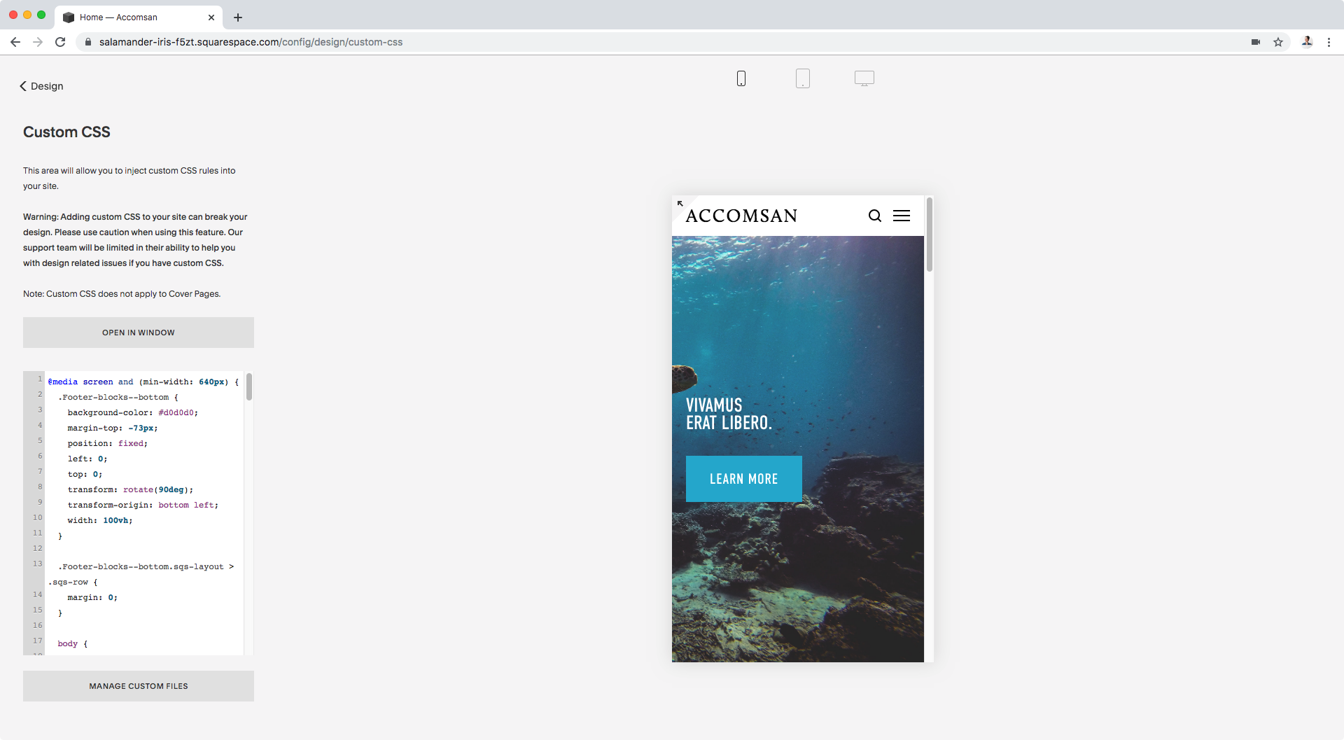
@media screen and (min-width: 640px) {
  .Footer-blocks--bottom {
    background-color: #d0d0d0;
    margin-top: -73px;
    position: fixed;
    left: 0;
    top: 0;
    transform: rotate(90deg);
    transform-origin: bottom left;
    width: 100vh;
  }

  .Footer-blocks--bottom.sqs-layout > .sqs-row {
    margin: 0;
  }

  body {
    margin-left: 73px;
  }
}
Great! It’s like nothing happened.
Oh, and if you’re wondering how I centered the links, you can check out this tutorial (or squint to read the code in the screenshot above, that works too).
Alright, let’s check the other two sizes once again:


Awesome!
So there you have it. That’s how you can create that cool magazine-style vertical navigation or menu thingy in your Squarespace site, without using HTML or touching your current nav!
Bonus tweaks
Personally, I want to make some additional adjustments to the look of the nav links so I’ll make the background white so that the links pop up more against the banner, and make some changes to the text itself.
First, I’ll set a new font size, font weight and letter spacing through the code so I don’t modify any other links in the other menu blocks via Site Styles.
I’ll also make the links uppercase and remove the bottom border:
.Footer-blocks--bottom p a {
    border-bottom-width: 0 !important;
    font-size: 15px;
    font-weight: bold;
    letter-spacing: .2em;
    text-transform: uppercase;
}
And then, I’ll add some short lines to the sides of the text, just because.
To do this, I’ll create a ::before and ::after pseudo-element for each link:
.Footer-blocks--bottom p a::after,
.Footer-blocks--bottom p a::before {
  background-color: black;
  content: '';
  display: inline-block;
  height: 2px;
  margin: 0 5px;
  vertical-align: middle;
  width: 10px;
}
With these additional customizations, this is my final result:

Alright, that’s all for now!
Until next time,
B.
Full code
Notes:
• After implementing the code below, you may need to enable the padding-top declaration to reduce the “thickness” of your vertical nav (simply remove the /* */ around it and adjust the value!)
• Make sure that you substitute the 73px – for both margin-top and margin-left – with the “thickness” of YOUR own vertical navigation, otherwise your bar will be misaligned.
/*ADDITIONAL VERTICAL FIXED NAVIGATION IN BRINE - DESKTOP AND TABLETS*/
@media screen and (min-width: 640px) {
  .Footer-blocks--bottom {
    background-color: #d0d0d0;
    margin-top: -73px;
    /*padding-top: 17px !important;*/
    position: fixed;
    left: 0;
    top: 0;
    transform: rotate(90deg);
    transform-origin: bottom left;
    width: 100vh;
  }

  .Footer-blocks--bottom.sqs-layout > .sqs-row {
    margin: 0;
  }

  body {
    margin-left: 73px;
  }
}
/*(Optional) Additional modifications*/
@media screen and (min-width: 640px) {
  .Footer-blocks--bottom p a {
    border-bottom-width: 0 !important;
    font-size: 15px;
    font-weight: bold;
    letter-spacing: .2em;
    text-transform: uppercase;
  }

  .Footer-blocks--bottom p a::after,
  .Footer-blocks--bottom p a::before {
    background-color: black;
    content: '';
    display: inline-block;
    height: 2px;
    margin: 0 5px;
    vertical-align: middle;
    width: 10px;
  }
}