
How to align footer text to the center in mobile screens (Brine 7.0)

A couple of weeks ago I got a question about center-aligning text inside the footer in smaller screens while keeping it left or right-aligned in tablets and desktop.
The process and code are quite simple BUT, particularly when you originally have text aligned to the right there are additional steps required to have full control over the mobile result.
So, without further ado, let’s jump right into it to see what we can do about it!
Centering the footer text
I’m working on the Brine template and have created a simple footer with a couple of titles and some text. I’ve used both the Top footer block and the Bottom footer block to set the layout, in case you’re curious.
On desktop and tablets it looks really good:
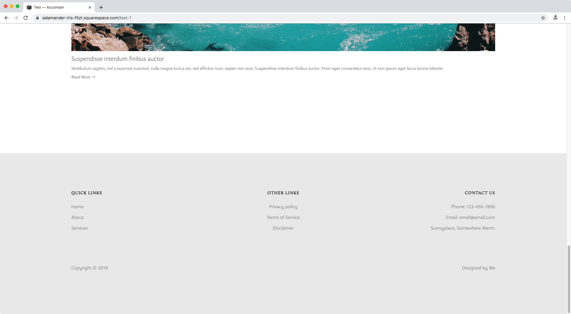

But then on phones, it’s not ideal:

Let’s fix that!
The first thing we need to do is find out what our footer container is called to be able to target it via CSS.
Let’s check through Inspect Element.

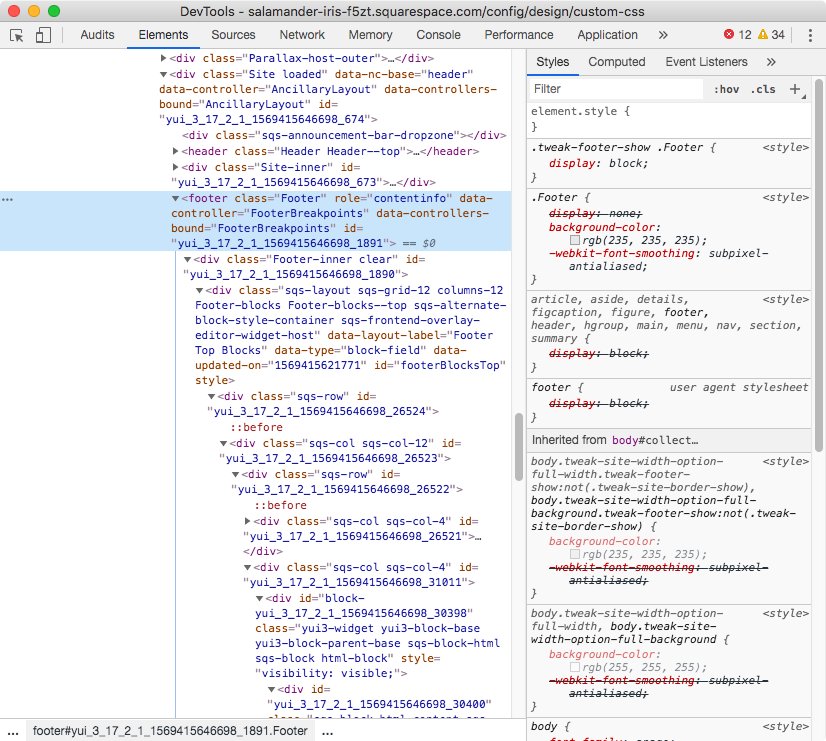
Ok, it’s pretty straightforward.
Our footer is a footer element and has a class of .Footer that we can use as our selector.
So, let’s use that and set the property text-align to center.
Note: I’ll be testing the code first in desktop mode and then create the media query necessary to apply it to mobile only.
.Footer {
  text-align: center;
}

Hum… ok.
So, the Quick links section and the copyright below are now center aligned, but what’s up with the Contact us section and the site credit??
Let’s check the text elements themselves to see what’s going on…

If we zoom into our title, we can see it’s an h3 element that has the text-align: right declaration in use; our center value is not being applied.
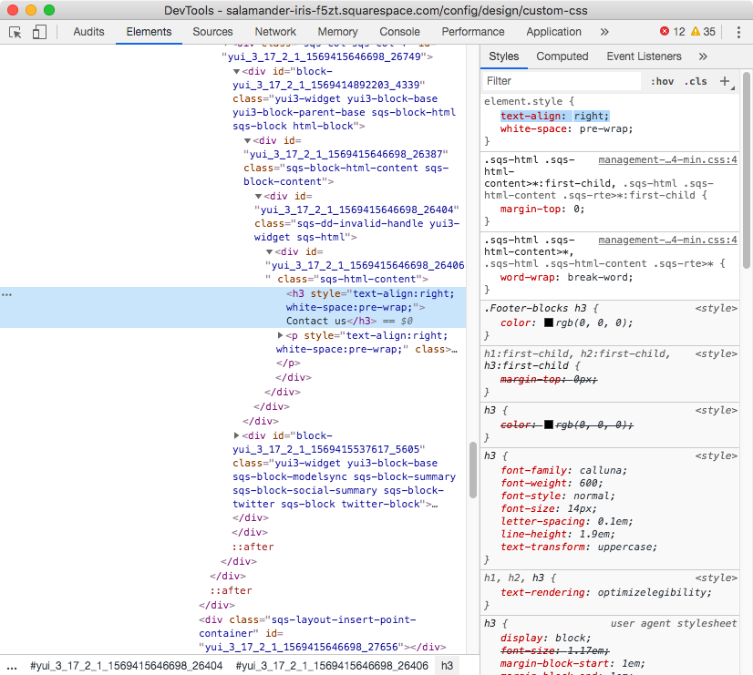
That’s because that right alignment has been set as an INLINE style as you can see below:

Inline styles are CSS styles that are written directly into the site’s HTML as part of the element it should be applied to. These have the highest specificity (or stubbornness if you will), and therefore are trickier to override.
So, that’s the reason why our text-align: center isn’t doing anything for our right-aligned text.
Same thing is happening for our regular text:


Let’s try using the !important rule on our previous code to see if that does the trick.
Note: remember this rule should ONLY be applied when absolutely necessary.
.Footer {
  text-align: center !important;
}

Nope. I told you inline styles are stubborn.
It’s like that person at the movies that won’t shut up. The one who keeps yapping and yapping and no matter how hard you shush they won’t stop… not unless you directly turn to them or poke them in the shoulder and tell them to shut the hell up.
THAT my friend is what we need to do here.
We need to poke our title and paragraph on the shoulder so it listens to us.
Right now, our code is targeting the whole room, but our right aligned text is being completely rude and simply won’t listen.
So, let’s poke it.
We can do that by adding their name to our code. In this case, since they don’t have a class or ID to do so, we can use their element name, aka h3 and p.
We’ll try it out with the h3 first and ask politely (so, without !important).
.Footer h3 {
  text-align: center;
}

Still doesn’t hear us? Ok then, shouting it is:
.Footer h3 {
  text-align: center !important;
}

Finally! Our heading got centered.
Let’s do the same thing for our regular text, our p element.
.Footer p {
  text-align: center !important;
}

Perfect! Now it works.
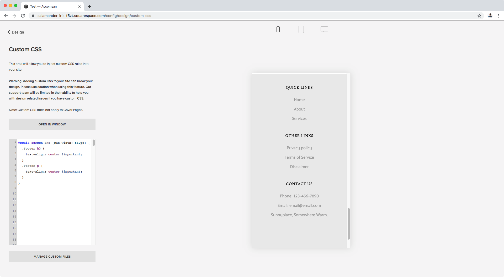
Let’s finish things up by wrapping our code inside a media query so it only gets applied to mobile:
@media screen and (max-width: 640px) {
  .Footer h3 {
    text-align: center !important;
  }
  .Footer p {
    text-align: center !important;
  }
}

Alright, our desktop above stays in the original layout.
Same below for tablets:

And as for mobile phones, we now have our footer text aligned to the center!

High five! We did it.
I hope you found this post enlightening and that the cinema analogy helped you better understand why it required getting more specific to make our code take effect.
Keep it in mind for other customizations!
Until next time,
B.
Full code
/*CENTERING TEXT FOOTER IN BRINE FOR MOBILE SCREENS*/
@media screen and (max-width: 640px) {
  .Footer h3 {
    text-align: center !important;
  }
  .Footer p {
    text-align: center !important;
  }
}