
Add a floating 'Book Now' button to Squarespace

If you’re running or working on a business website, you’ll surely find today’s customization pretty handy!
Besides back to top buttons, there are other types of floating elements you can add to your Squarespace site to make it not only look more custom but also make it easier for your audience – or your clients – to take that first step to getting to work with you!
In this tutorial, we’ll be creating a ‘Book Now‘ or more accurately a ‘Book your consultation‘ button type thing, that leads to our fictional contact page to fictionally get in touch with us about our fictional services.
Creating a floating button in Squarespace
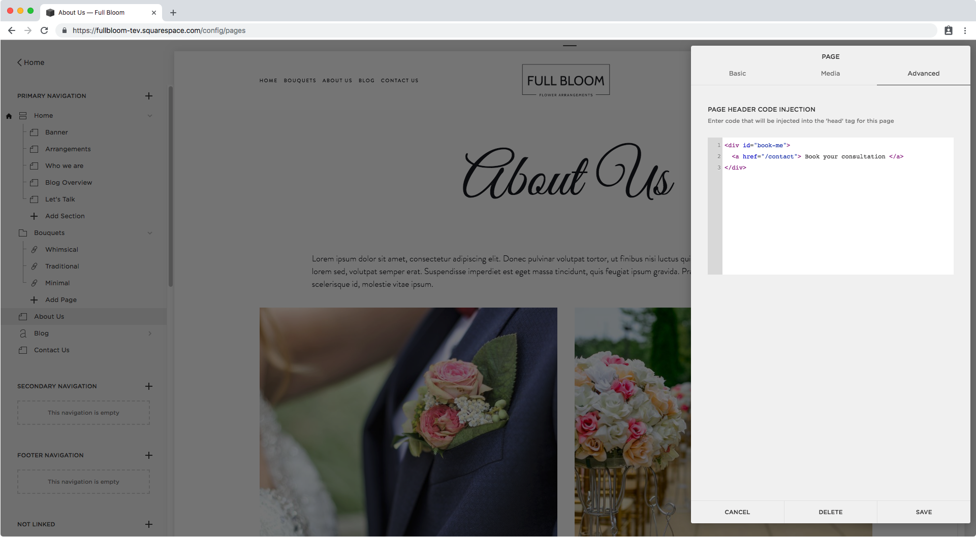
We’ll begin with a bit of HTML to create the actual button.
We’re going to be creating a container with an ID of #book-me, and we’ll place our link inside:
<div id="book-me">
  <a href="/contact"> Book your consultation </a>
</div>
I’ll be placing the button on just one page of my site, so I’ll add the HTML to the header section of that specific page.
However, if you want to showcase yours on all pages, add the HTML snippet into Settings > Advanced > Code Injection instead.
After saving and letting the page refresh, we can see our link popped up in the top left corner of our site:

Ok! Let’s move it.
We want the button to always show up on screen and not be affected by scrolling, so we’ll set it as fixed:
#book-me {
  position: fixed;
}

And now, we’ll use the top and right offset to position it in the middle of the right edge of our site.
#book-me {
  position: fixed;
  top: 50%;
  right: 0;
}

It’s not showing up right because it’s covered with the other elements, so let’s bring it to the front with z-index:
#book-me {
  position: fixed;
  top: 50%;
  right: 0;
  z-index: 99999;
}

Can you see it there on the right?
Let’s add a background color to start styling it and see it better.
To do this, we’re going to be switching snippets and targeting the link inside our container, not the container itself:
#book-me a {
  background: black;
}

Alright, there we have our pretty lame black bar!
Let’s add some pizzazz to it by styling the font inside it:
#book-me a {
  background: black;
  color: white;
  display: inline-block;
  font-size: 14px;
  font-weight: bold;
  text-transform: uppercase;
  font-family: montserrat;
}

Ok ok, we’re getting there!
Now before we add some padding to make the button larger, let’s flip it and make it vertical like we’ve done to create vertical text in Squarespace in the past:
#book-me a {
  background: black;
  color: white;
  display: inline-block;
  font-size: 14px;
  font-weight: bold;
  text-transform: uppercase;
  font-family: montserrat;
  writing-mode: vertical-rl;
}

Good, we now have it vertical but it seems like it’s not completely centered like we thought it was.
I'm going to go back into the first snippet targeting the container and add our lovely friend the transform property to pull it higher up from where it’s sitting (standing?) right now:
#book-me {
  position: fixed;
  top: 50%;
  right: 0;
  z-index: 99999;
  transform: translateY(-50%);
}
And I’m also going to add that padding that our button desperately needs:
#book-me a {
  background: black;
  color: white;
  display: inline-block;
  font-size: 14px;
  font-weight: bold;
  text-transform: uppercase;
  font-family: montserrat;
  writing-mode: vertical-rl;
  padding: 30px 10px;
}

Faaantastic! This is what we have on desktop:

Now, let’s see how this looks on smaller screens…

Not bad, but it’s starting to overlap with the content of the page and cutting it weirdly.
I think it’s best if we keep the button attached to the bottom of our site and horizontal for smaller screens.
Therefore, I’ll be creating a media query to help me achieve that starting from a generic tablet size.
As for the position, I’m going to set the top offset to its default value by setting it as initial, and then set the bottom offset to 0 so it sticks to the bottom of the browser screen.
@media screen and (max-width: 960px) {
  #book-me {
    bottom: 0;
    top: initial;
  }
}

Don’t forget we also need to change back that transform property we used so it’s totally stuck to the bottom:
@media screen and (max-width: 960px) {
  #book-me {
    bottom: 0;
    top: initial;
    transform: none;
  }
}

Awesome!
Now, inside that same media query we’ll be reverting the writing-mode to its default value by setting it to initial as well…
@media screen and (max-width: 960px) {
  #book-me {
    bottom: 0;
    top: initial;
    transform: none;
  }
  #book-me a {
    writing-mode: initial;
  }
}

And as you can see, we have to adjust the padding as well since this doesn’t flip with the direction of the text, so now it looks really odd.
@media screen and (max-width: 960px) {
  #book-me {
    bottom: 0;
    top: initial;
    transform: none;
  }
  #book-me a {
    writing-mode: initial;
    padding: 10px 30px;
  }
}

Perfect! It’s all looking great now, let’s check our phone screen…

And our desktop screen once again…

Great!
There you go, that’s how you can add a floating booking button to your Squarespace site, so your visitors – or your client’s visitors – can quickly get in touch with you or perform that very first step they need to take to work with you!
Until next time,
B.
Full code
Header Code Injection
<!-- ADD A FLOATING "BOOK NOW" BUTTON TO SQUARESPACE -->
<div id="book-me">
  <a href="/contact"> Book your consultation </a>
</div>
Custom CSS Window
/*ADD A FLOATING "BOOK NOW" BUTTON TO SQUARESPACE (UPDATED)*/
#book-me {
  position: fixed;
  right: 0;
  top: 50%;
  transform: rotate(90deg) translateX(50%);
  transform-origin: 100% 0;
  z-index: 99999;
}
#book-me a {
  background: black;
  color: white;
  display: inline-block;
  font-family: 'montserrat';
  font-size: 14px;
  font-weight: bold;
  padding: 10px 30px;
  text-transform: uppercase;
}
@media screen and (max-width: 960px) {
  #book-me {
    bottom: 0;
    top: auto;
    transform: none;
  }
  #book-me a {
    padding: 10px 30px;
  }
}