
Adding folder indicators to desktop links in Brine (7.0)
Today’s CSS trick is going to be short and sweet.
Since there’s no native way to add folder indicators to desktop links, like the ones that show up on our mobile menu (next to About and Work, in this example):

We’ll be taking matters into our hands and create our own indicators:

So, if you want to know how to achieve this, keep readin’!
Finding our target element
Because we want to add the indicator next to the main title of our folder links, the first step is to check with our Inspect Element tool what the heck our folder link is called.
I’ll look into the About folder of my example and see what I find:


Ok, so we can see that our folder is a span element with two classes (.Header-nav-item and .Header-nav-item--folder).
However, we’re not looking for the entire folder container, but the actual “About” link element.
So, if we move down slightly and check inside that container, we come across with the a element that’s our folder title (highlighted in light blue):

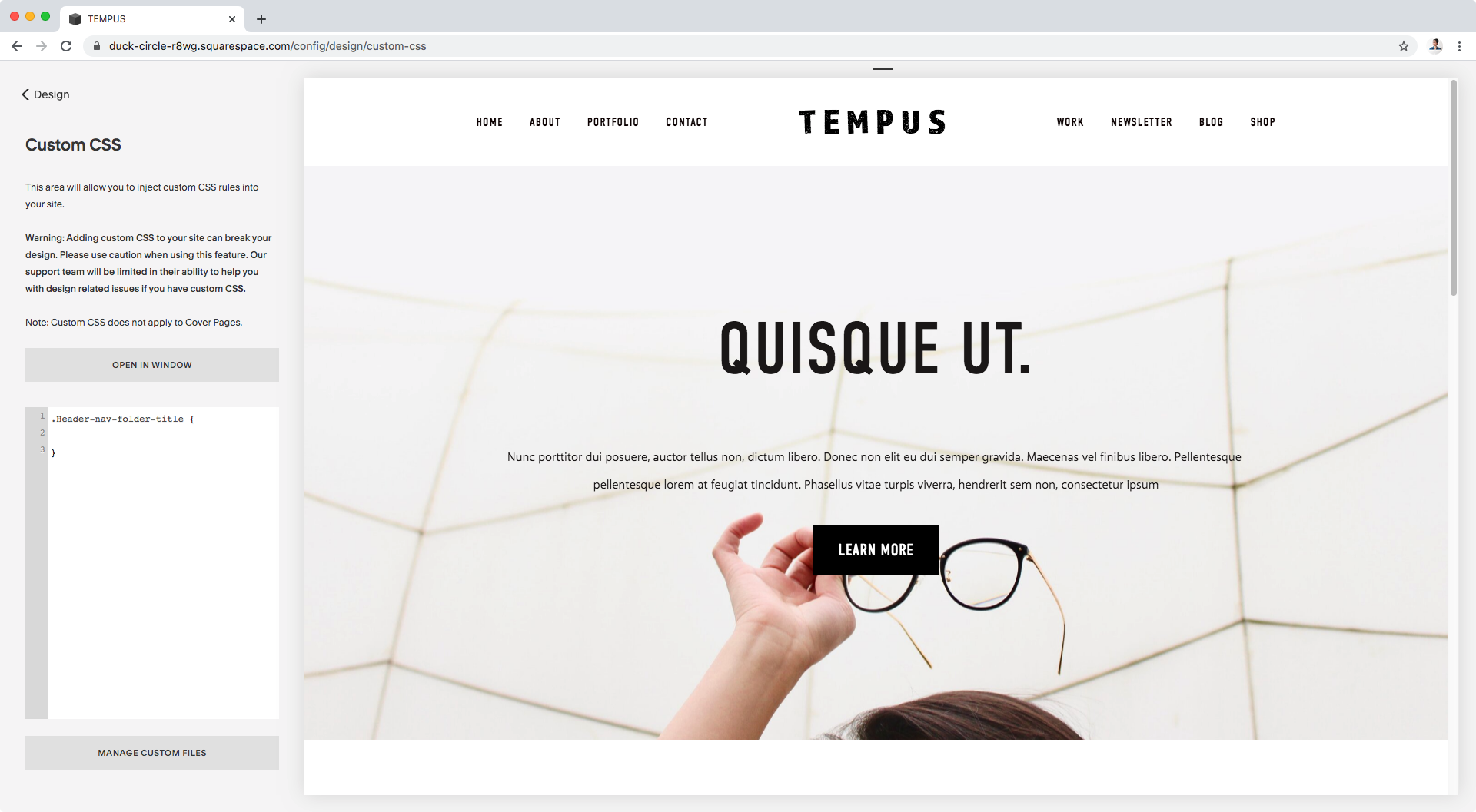
This one has a class of .Header-nav-folder-title so that’s what we’ll be targeting in our CSS!
.Header-nav-folder-title {

}
Creating our indicator
Now, the reason why we needed to specifically find our folder title is because we’ll be creating our indicator with the help of a pseudo-element, and we want it to be “attached” to that title as if it were part of it to be able to keep it in place easily.
So, let’s go ahead and create our indicator!
I’ll be using an ::after pseudo-element because I want the indicator to be displayed on the right side of the title (i.e, after).
.Header-nav-folder-title::after {

}
Next, we have to set the content property.
If you want to use a background image as your icon, go ahead and leave the content property empty to create an empty container.
Personally, I just want to add a simple symbol so I’ll pop it right in there!
.Header-nav-folder-title::after {
  content: '+';
}

Awesome! I’ll just add a bit of margin to the left side to make a bit more room.
.Header-nav-folder-title::after {
  content: '+';
  margin-left: 10px;
}

Alright!
You can literally stop the customization here and go about the rest of your day since we’ve already achieved our goal.
However, if you want to style this a bit further, stick around because that’s what I’ll be doing next!
Styling the new indicator
The first thing I want to do is change the colors of both the background and the plus sign in order to make it stand out a bit more.
.Header-nav-folder-title::after {
  background-color: black;
  color: white;
  content: '+';
  margin-left: 10px;
}

Now, since I added a background color, I want to make the icon look a bit more even by setting a width that closely resembles its current height.
In order to do so, I’ll set the pseudo-element as an inline-block element, in order to be able to play around with its width.
.Header-nav-folder-title::after {
  background-color: black;
  color: white;
  content: '+';
  display: inline-block;
  margin-left: 10px;
  width: 1em;
}

Cool!
And how about we align the symbol to the center of the background?
.Header-nav-folder-title::after {
  background-color: black;
  color: white;
  content: '+';
  display: inline-block;
  margin-left: 10px;
  text-align: center;
  width: 1em;
}

Alright, and what if we make the background round with a bit of border-radius?
.Header-nav-folder-title::after {
  background-color: black;
  border-radius: 50%;
  color: white;
  content: '+';
  display: inline-block;
  margin-left: 10px;
  text-align: center;
  width: 1em;
}

Perfect!
Last but not least, since I have the links of my menu set to “Fade” via my Site Styles, I want to make sure that the icon fades out a bit too when I hover over the link.
To do that, I’ll simply lower its opacity once the cursor hovers over the entire folder container.
So, remember those classes we found at the beginning of the post? The ones that the folder container has?
Well, I’m going to grab one of them, the one that seems more specific to folders (so, .Header-nav-item--folder) and pop it in my custom CSS window:
.Header-nav-item--folder {

}
And then, I’m going to tell my browser “when someone hovers over that folder container, go ahead and change the opacity of my pseudo-element to X”.
Which, translated into code, looks like this:
.Header-nav-item--folder:hover .Header-nav-folder-title::after {
  opacity: .6;
}

Aaand here’s the final result:


Our folder links are now easily spotted on desktop, and we get to keep the same link indicators we had before in smaller screens:

Note: curious about why the plus sign doesn’t show up on mobile menus too? That’s because the folder links are called differently on the desktop header than on the mobile menu. They have different class names, and our browser won’t touch the mobile links unless we tell it to do so through the classes we use in our CSS.
Alright my friend, there you have it!
That’s how you can add a nice little indicator to your desktop folder links in Brine.
Until next time,
B.
Full code
/*ADDING FOLDER INDICATOR TO DESKTOP LINKS IN BRINE*/
.Header-nav-folder-title::after {
  background-color: black;
  border-radius: 50%;
  color: white;
  content: '+';
  display: inline-block;
  margin-left: 10px;
  text-align: center;
  width: 1em;
}

.Header-nav-item--folder:hover .Header-nav-folder-title::after {
  opacity: .6;
}