
How to add a custom font to your navigation menu items (Brine 7.0)

So, you already know how to upload a custom font to Squarespace.
In fact, you may already be using it for headings across your client’s site!
But, now you’re not sure how to add it to your nav items for both your regular navigation AND your mobile menu.
Let’s see how that can be done, shall we?
Using a custom font for nav items in Brine
I’m starting out with a couple of menu items and a custom font already uploaded to my site (it’s this one in case you like it!)

The first thing we have to look for is a way to target our menu items, so we’ll take a peek inside our Inspect Element window to see what we find.

We can see that our menu items are a elements with a class of .Header-nav-item:

Perfect, we can use that!
Now, let’s say we just want to add the custom font to the primary navigation (the one in the example) and not the secondary navigation we may want to add in the future.
In this case, we can look inside the containers holding all our nav items to see if there’s a class used to indicate we’re dealing with the primary navigation.


Ok, so one of the parent wrappers or containers holding our nav items is a nav element with a couple of classes, including one called .Header-nav--primary that seems to be perfect for what we need.
Let’s use that along with our individual menu item class to create our selector, saying we ONLY want to affect the nav items inside our primary navigation!
.Header-nav--primary .Header-nav-item {

}

Now, let’s simply change our font-family to our new font name!
.Header-nav--primary .Header-nav-item {
  font-family: 'bigfish';
}


Awesome! Our menu items are now custom.
Let’s take a look at our mobile menu though:

The font didn’t get applied here.
Most likely, these mobile menu items have a different class, so the CSS we used before is not targeting them.
Let’s take a look!


Yup, as suspected.
Our mobile nav items have a different class, called .Mobile-overlay-nav-item
Let’s also take a look at the primary navigation container class, since most likely it’s also different.


Alright, so the mobile version has – amongst its classes – a class named .Mobile-overlay-nav--primary, so let’s use that along with the our item class to create our selector:
.Mobile-overlay-nav--primary .Mobile-overlay-nav-item {

}

Alrighty, and now let’s add our new font!
.Mobile-overlay-nav--primary .Mobile-overlay-nav-item {
  font-family: 'bigfish';
}

Uhm… yeah, so nothing’s happening.
Let’s see what’s going on with inspect element…

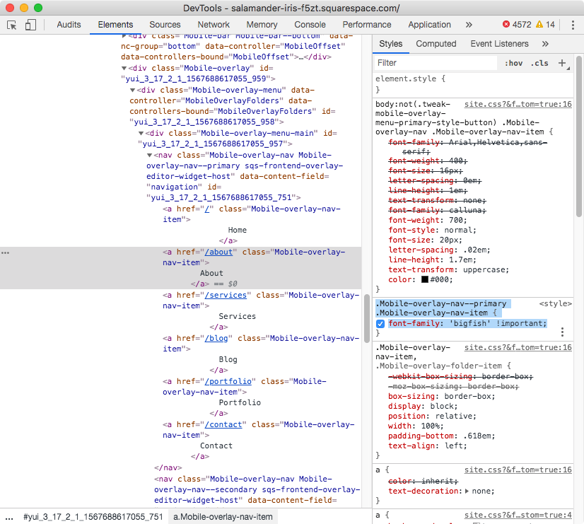
If we check our individual navigation items we’ll notice that on the right side the code we just popped into our Custom CSS window is there, BUT our font-family has been crossed off.
And if we look higher up that section…

We can see that the previous font family is still active.
This is happening because of something we’ve seen on the blog before: specificity issues.
Basically, the selector that Squarespace uses (highlighted below) to set the menu’s font family via the Style Editor is more specific than the one we’re using.

So, we have two choices here:
Copy Squarespace’s selector and use that instead of ours.
If we take this route, we would have to modify the selector to make sure we’re targeting the primary navigation, since the class we were using (to make sure only the primary items were affected) is not included in theirs. If you want to add the custom font to both primary AND secondary navigation, then you can use Squarespace’s selector as is!
Or, keep our selector and use the !important rule for our new value.
If we do this, we’ll be pretty much saying to our browser “hey, I know the original selector is more specific than mine but THIS is the value I reeeeeally want to use”. By doing this we will override the previous font with ours. However, keep in mind the !important rule should not be used all the time. You can read more about this here.
Considering we’re probably going to be the only person touching our code, and the fact that the tweak we’re making is very specific, it’s unlikely this !important rule will affect further customization of our nav.
We can simply go back to our snippet and alter the font any time we want.
So, based on this quick analysis, let’s take the second route!
.Mobile-overlay-nav--primary .Mobile-overlay-nav-item {
  font-family: 'bigfish' !important;
}

Ta-da! Like magic.
Check out what our code looks like now behind the scenes (behind the screen?):
Our new font isn’t crossed off anymore! Meaning it’s being used.
And if we look inside Squarespace’s snippet, at the previous font…

That’s the one that’s being crossed off now!
Perfect! So, there you have it.
Now go and add your own custom font to your navigation!
Until next time,
B.
Full code
/*ADDING CUSTOM FONT TO PRIMARY MENU NAV IN BRINE*/
.Header-nav--primary .Header-nav-item {
  font-family: 'bigfish';
}
.Mobile-overlay-nav--primary .Mobile-overlay-nav-item,
.Mobile-overlay-folder-item {
  font-family: 'bigfish' !important;
}