How to create a multi-column text block in Squarespace, without using separate blocks (7.0, 7.1 CE & 7.1 FE)
Whenever you want to break a chunk of text on a client site into two columns (or more!), what do you usually do?
Most likely – and this is me using my mind-reading powers – you’re pasting half of the content on one text block and the other half in another, placing both blocks side by side. Like this:
That works pretty well doesn’t it? I mean, you sorta have to eyeball the right amount of text to put on each side so it looks good but that’s about it.
However, there is this ooooone tiny detail that just pisses you off: the gap between columns.
This depends on the font you’re using and the styles you’ve set for it, but most often than not, you feel you need juuuust a bit more space between both columns.
The problem is if you shove a spacer in there, the gap looks more like an airport runway than anything else.
So, whether you’re losing sleep over this or not, I want to show you a nifty CSS trick that can help you create these multi-column text blocks with only 2 properties.
Creating multi-column text blocks in Squarespace
We’re going to start out with our text all laid out in one single block:
Since you’re most likely going to want to split specific text blocks across your site, we’ll be using our block’s ID to make sure we’re only targeting the one(s) we want to alter.
So, let’s find that shall we?
Here’s our entire text block in our Inspect Element tool…
… and right there is our unique block ID!
In my case, it’s #block-yui_3_17_2_1_1566479666984_40463
So, I’ll pop that into my custom CSS window.
#block-yui_3_17_2_1_1566479666984_40463 {

}
Now, the properties that we’re going to be using are called column-count and column-gap.
Column-count allows you to, as the name suggests, set a specific number of columns you want the text to split itself into.
The beauty of using this property is that it will adjust the amount of text on each column automatically based on screen size, so you’ll always have the first column “heavier” than the second one!
Done!
Simple, right?
Now that we’ve decided how many columns we want, we can use the column-gap property to set the amount of spacing that should separate our columns.
We can use a fixed number, let’s say 60px, to make just enough room between them:
#block-yui_3_17_2_1_1566479666984_40463 {
  column-count: 2;
  column-gap: 60px;
}
Nice! Subtle, but definitely much better.
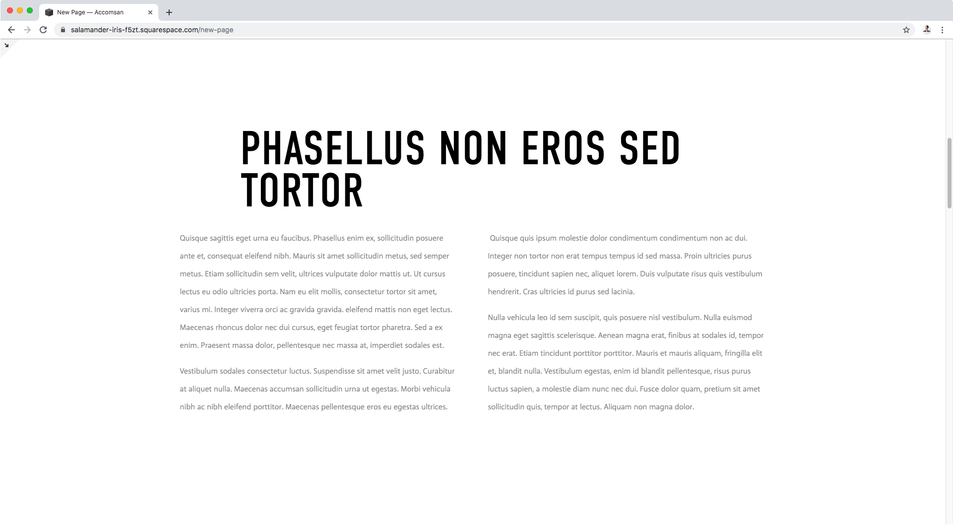
Here’s what it looks like in full screen on desktop:
But, keep in mind, this will make your column split on ALL screen sizes, so what if you want things in a single column on phone screens?
You can simply add your code inside a media query! In this case, the columns will only be created for screens larger than 640px (aka, bigger than phones).
@media screen and (min-width: 640px) {
  #block-yui_3_17_2_1_1566479666984_40463 {
    column-count: 2;
    column-gap: 60px;
  }
}
And there you have it!
Now you know how you can easily create a flowing multi-column text block in Squarespace!
Until next time,
B.
Full code
/*MULTIPLE COLUMNS ON SCREENS LARGER THAN PHONES*/
@media screen and (min-width: 640px) {
  #block-yui_3_17_2_1_1566479666984_40463 {
    column-count: 2;
    column-gap: 60px;
  }
}


