
Add custom 'Read More' links to your Summary Blocks (7.0, 7.1 CE & 7.1 FE)

Have you ever wished you could replace the ‘Read More‘ link from your Summary Blocks for something else? Not just change its color and turn it into a button, but actually change what it says and… why not, change it for a custom image?!
If that’s your case, you’re in luck because today we’ll be looking at how you can do that!
I’ll be showing you 2 methods to switch up the default Read More link for something else, and then how you can do it with text or with an image.
Ready? Let’s go!
Adding a custom ‘Read More‘ link to Summary Blocks (Method #1)
I’m starting off with a grid Summary Block, but you can use another layout if you prefer. However you may need to adjust the code.

We need to know how to target the current Read More link so let’s check it out.
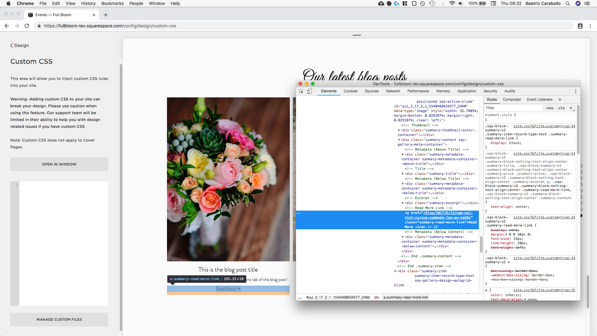
Ok, the link has a class of .summary-read-more-link so we’ll be using that.
Now, if we want to make sure we’re only targeting the GRID type of summary blocks, let’s look further up the code for a class for the entire grid summary block container.

Alrighty, let’s use .sqs-gallery-design-autogrid and set up our selector inside our Custom CSS window:
.sqs-gallery-design-autogrid .summary-read-more-link {

}

Great!
So, what we’re going to do to replace the current ‘Read More’ link is to use our dear friends the pseudo-elements.
I’m going to be working with an ::after, but you can experiment using a ::before if you like! In that case, you may need to adjust the positioning parameters I’ll be using here.
.sqs-gallery-design-autogrid .summary-read-more-link::after {

}

Ok, we’re ready to roll! Let’s begin by adding the new text we want to display.
I’ll have mine say ‘Check out the article’.
.sqs-gallery-design-autogrid .summary-read-more-link::after {
  content: 'Check out the article';
}

Can you see it?? I’ll add a background to it so it’s easier to spot.

Ok, so let’s go ahead and move it below the original link by setting it to display block.
.sqs-gallery-design-autogrid .summary-read-more-link::after {
  content: 'Check out the article';
  display: block;
}

And now we’ll be repositioning it so it goes right on top of the original link.
To do that, I’m first going to set it as absolute so I can move it around however I want.
.sqs-gallery-design-autogrid .summary-read-more-link::after {
  content: 'Check out the article';
  display: block;
  position: absolute;
}

And now I’ll set the offset properties top and left to put it in place.
.sqs-gallery-design-autogrid .summary-read-more-link::after {
  content: 'Check out the article';
  display: block;
  position: absolute;
  top: 0;
}

Alright so it seems our new link is using a different container than the original link as reference, that’s why it went aaaall the way up the thumbnail.
To fix this, we need to tell our browser to switch to the parent element we want it to use as a guide to position the new link.
All we have to do here is target our original link (we already have the selector from our pseudo-element) and give it a position of relative.
.sqs-gallery-design-autogrid .summary-read-more-link {
  position: relative;
}

Cool! Now, let’s center our new link by setting the left offset to 50%.
.sqs-gallery-design-autogrid .summary-read-more-link::after {
  content: 'Check out the article';
  display: block;
  position: absolute;
  top: 0;
  left: 50%;
}

Ok, that seems to be a little off-center so we’ll use the handy transform property to pull it back a little bit so it stays in the dead center.
.sqs-gallery-design-autogrid .summary-read-more-link::after {
  content: 'Check out the article';
  display: block;
  position: absolute;
  top: 0;
  left: 50%;
  transform: translate(-50%);
}
Nice!
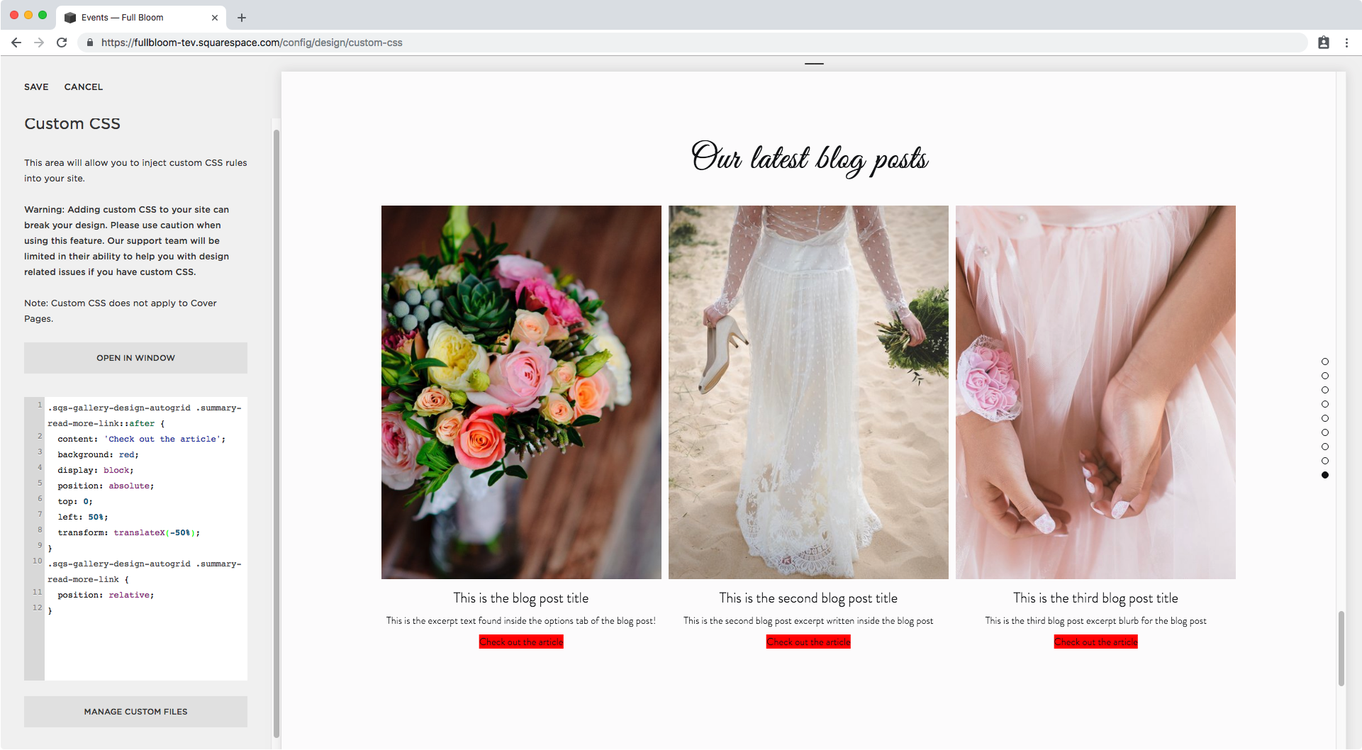
Now, it’s time to get rid of the OLD link since it’s still there, only covered by the red background of our new link.
I’m going to add a temporary background to that old link so we can see it, and make sure it disappears once we get to that.

Alright, now that we have everything prepared for this first method, let’s do this thang.
We’re going to be using the visibility property.
This is going to allow us to keep the space that our OLD link occupies, while removing its content from sight.
Therefore, we’re going to go back to our default link snippet and set visibility to hidden.
.sqs-gallery-design-autogrid .summary-read-more-link {
  position: relative;
  visibility: hidden;
}

Aaaaaaand they’re both gone!
But it’s all good, all part of the plan.
What’s happening here is that since we’re working with a pseudo-element, we’re pretty much “dependent” on the original element.
If the original element moves, the pseudo-element moves.
If the original element changes size, the pseudo-element does too.
If the original element disappears, so does the pseudo-element.
(All of this with particular exceptions, of course)
However, we can OVERWRITE these adjustments made to the original element inside the pseudo-element!
Therefore, we can set the visibility property to visible for our new link and make it pop back in our screen.
.sqs-gallery-design-autogrid .summary-read-more-link::after {
  content: 'Check out the article';
  display: block;
  position: absolute;
  top: 0;
  left: 50%;
  transform: translate(-50%);
  visibility: visible;
}
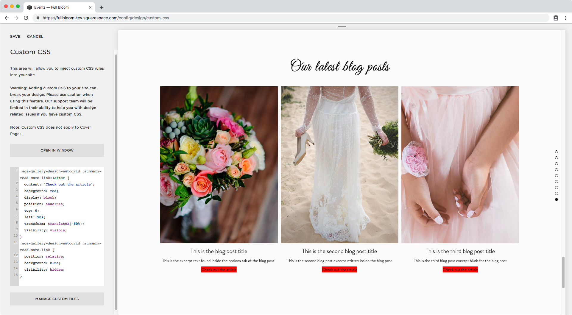
Ta-dá!
Now how about that? We have our new link back and we can’t see the old one anymore (remember it was in blue!).
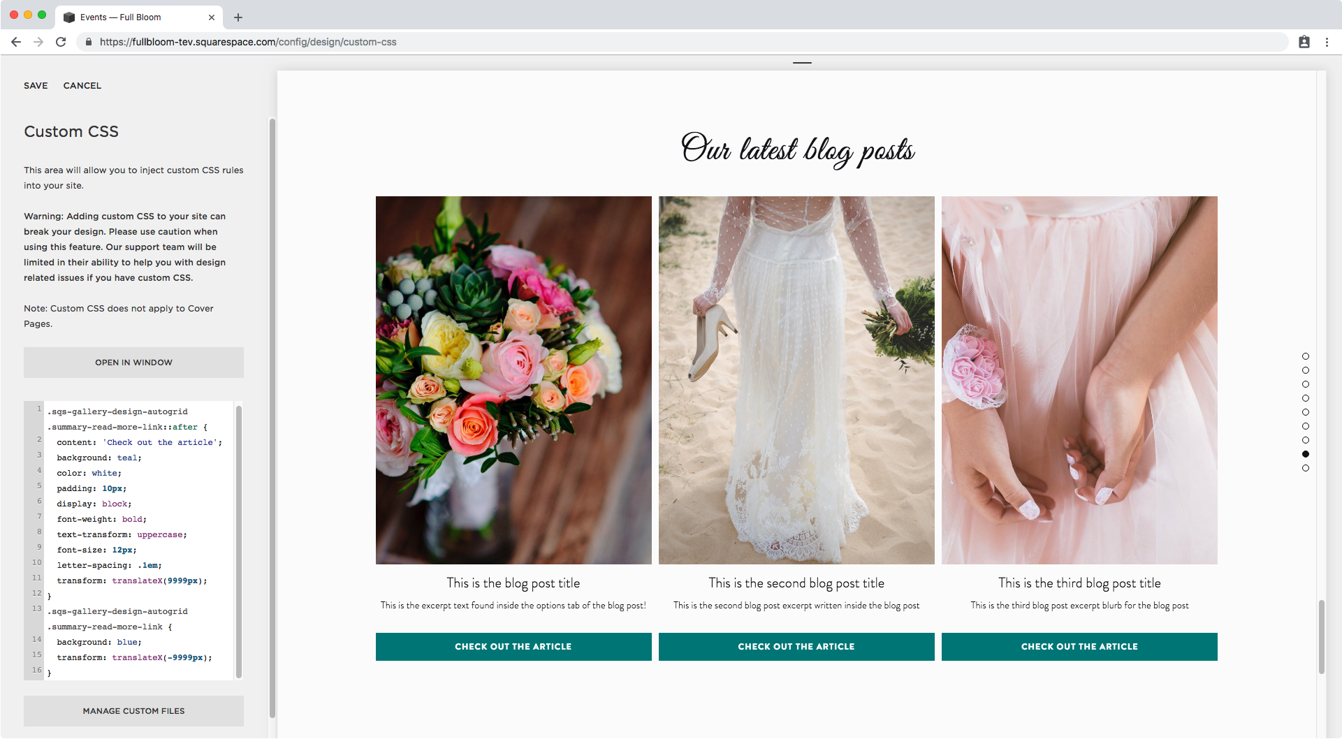
Ok, we can now focus on styling this baby a little bit more.
I’m just going to change the color of the background and font right now:
.sqs-gallery-design-autogrid .summary-read-more-link::after {
  content: 'Check out the article';
  background: teal;
  color: white;
  display: block;
  position: absolute;
  top: 0;
  left: 50%;
  transform: translate(-50%);
  visibility: visible;
}

And how about adding some padding to give the text inside it more space.
.sqs-gallery-design-autogrid .summary-read-more-link::after {
  content: 'Check out the article';
  background: teal;
  color: white;
  padding: 10px;
  display: block;
  position: absolute;
  top: 0;
  left: 50%;
  transform: translate(-50%);
  visibility: visible;
}

Ok ok, It seems like our button is getting cut off so let’s fix that.
I’m going to add a temporary background to the entire excerpt container so we can see what’s going on better…

Alright so, since our new link is set as position absolute, the space it occupies is not being taken in consideration to set the height of our excerpt container.
However, the space that our ORIGINAL link is occupying is still there (even when we can’t see it), soooo… if we add the same amount of padding to it…
.sqs-gallery-design-autogrid .summary-read-more-link {
  position: relative;
  visibility: hidden;
  padding: 10px;
}

Bam! We’re set.
I’ll be removing the grey background to see how the final look is turning out and make some more adjustments to our new custom button!

Alrighty, so I’m just going to adjust the font size and letter spacing, make it bold and set it as uppercase:
.sqs-gallery-design-autogrid .summary-read-more-link::after {
  content: 'Check out the article';
  background: teal;
  color: white;
  padding: 10px;
  display: block;
  position: absolute;
  top: 0;
  left: 50%;
  transform: translate(-50%);
  visibility: visible;
  font-weight: bold;
  text-transform: uppercase;
  font-size: 12px;
  letter-spacing: .1em;
}

Last but not least, I want to add more separation around the button.
But, instead of adding the margin to the pseudo-element (since we already know the space we add to it won’t be taken in consideration by the excerpt container, thus cutting-off our masterpiece) I’ll just add it to our ORIGINAL link element.
.sqs-gallery-design-autogrid .summary-read-more-link {
  position: relative;
  visibility: hidden;
  padding: 10px;
  margin-top: 20px;
  margin-bottom: 20px;
}

Nice!! We have new custom ‘Read More‘ links people!

Adding a custom ‘Read More‘ link to Summary Blocks (Method #2)
Ok, let’s move onto the second way we can replace the ‘Read More‘ link from our Summary Blocks for something else.
The prep process is fairly similar, except that we DON’T want to set the position of our pseudo-element as absolute (or any of the other positioning parameters), and therefore we won’t need to set the position for our original link either.
With all that out of the way – but keeping the same color and font styles – this is what we’re going to be working with.
.sqs-gallery-design-autogrid .summary-read-more-link::after {
  content: 'Check out the article';
  background: teal;
  color: white;
  padding: 10px;
  display: block;
  font-weight: bold;
  text-transform: uppercase;
  font-size: 12px;
  letter-spacing: .1em;
}

I also made the old link bright blue to see it better.
However, what we want is to get rid of it, right? So let’s do that.
We’re going to be using the transform property to pull the OLD link to the left and as far away from the screen as possible, so we’ll set it to a very large negative number.
.sqs-gallery-design-autogrid .summary-read-more-link {
  transform: translateX(-9999px);
}

Once again, both links disappeared since the pseudo-element depends on the original one, so it went away with it.
But no worries, we already know we can overwrite things like that!
We’ll just give the pseudo-element the exact same transform value BUT, we’ll make it positive.
.sqs-gallery-design-autogrid .summary-read-more-link::after {
  content: 'Check out the article';
  background: teal;
  color: white;
  padding: 10px;
  display: block;
  font-weight: bold;
  text-transform: uppercase;
  font-size: 12px;
  letter-spacing: .1em;
  transform: translateX(9999px);
}
Awesome!
Now, I want to get rid of the space from the previous link since it’s creating a rather large gap between the excerpt and our new button.
To do this, since we’re dealing with text (again, even if we can’t see it), I’ll simply reduce the line-height to 0.5em.
.sqs-gallery-design-autogrid .summary-read-more-link {
  transform: translateX(-9999px);
  line-height: .5em;
}

Since our pseudo-element’s line-height got affected as well, we’ll have to set a new number for it to plump the button back up!
.sqs-gallery-design-autogrid .summary-read-more-link::after {
  content: 'Check out the article';
  background: teal;
  color: white;
  padding: 10px;
  display: block;
  font-weight: bold;
  text-transform: uppercase;
  font-size: 12px;
  letter-spacing: .1em;
  transform: translateX(9999px);
  line-height: 1.5em;
}

You can leave it here but I want to show you how you can reduce the size of the button if you don’t like the full-width vibe!
We simply have to give a max-width to our new button…
.sqs-gallery-design-autogrid .summary-read-more-link::after {
  content: 'Check out the article';
  background: teal;
  color: white;
  padding: 10px;
  display: block;
  font-weight: bold;
  text-transform: uppercase;
  font-size: 12px;
  letter-spacing: .1em;
  transform: translateX(9999px);
  line-height: 1.5em;
  max-width: 200px;
}

…and center it!
.sqs-gallery-design-autogrid .summary-read-more-link::after {
  content: 'Check out the article';
  background: teal;
  color: white;
  padding: 10px;
  display: block;
  font-weight: bold;
  text-transform: uppercase;
  font-size: 12px;
  letter-spacing: .1em;
  transform: translateX(9999px);
  line-height: 1.5em;
  max-width: 200px;
  margin: 0 auto;
}

Looking good!
Replacing the 'Read More' link with an image
Now, how about we take a look at how to replace those links with images?
This can be very useful if you want to create something more unique or use an icon or a combination of images, backgrounds, or anything else you want.
For this example I simply created a simple text based image in PS and included a nice little plus sign icon from here.
Then, I uploaded the image into my Custom CSS window and highlighted the old button in blue again.

Ok so as for the code, we need to start from scratch – and don’t worry, this route is much shorter than the others – by setting the content property as an image instead of just text.
.sqs-gallery-design-autogrid .summary-read-more-link::after {
  content: url('https://static1.squarespace.com/static/594024cc1b631b47dc1de9e2/t/5bc0e03eec212d165b1ab528/1539366974986/Custom+read+more.png');
}

Can you see the image there?
Let’s place it below our old link with display block.
.sqs-gallery-design-autogrid .summary-read-more-link::after {
  content: url('https://static1.squarespace.com/static/594024cc1b631b47dc1de9e2/t/5bc0e03eec212d165b1ab528/1539366974986/Custom+read+more.png');
  display: block;
}

Alright! Now it’s time to decide which method you want to use, #1 with the visibility property or #2 with the transform property?
I’m going to go with the first one, so I need to set the old link as hidden…
.sqs-gallery-design-autogrid .summary-read-more-link {
  visibility: hidden;
}

And the pseudo-element as visible!
.sqs-gallery-design-autogrid .summary-read-more-link::after {
  content: url('https://static1.squarespace.com/static/594024cc1b631b47dc1de9e2/t/5bc0e03eec212d165b1ab528/1539366974986/Custom+read+more.png');
  display: block;
  visibility: visible;
}

Finally, let’s reduce the gap between the new link and the excerpt by reducing the line-height of the ORIGINAL link – remember it’s container space is there, even when we can’t see it!
.sqs-gallery-design-autogrid .summary-read-more-link {
  visibility: hidden;
  line-height: .5em;
}

Perfect!
And since our new link is an image, we don’t need to make any line-height adjustments to it, so we’re DONE!

Alright, there you have it!
Now go replace the default ‘Read More‘ links from your Summary Blocks for custom links!!
Until next time,
B.
Full code
METHOD #1
.sqs-gallery-design-autogrid .summary-read-more-link {
  position: relative;
  visibility: hidden;
  padding: 10px;
  margin-top: 20px;
  margin-bottom: 20px;
}
.sqs-gallery-design-autogrid .summary-read-more-link::after {
  content: 'Check out the article';
  background: teal;
  color: white;
  padding: 10px;
  display: block;
  position: absolute;
  top: 0;
  left: 50%;
  transform: translate(-50%);
  visibility: visible;
  font-weight: bold;
  text-transform: uppercase;
  font-size: 12px;
  letter-spacing: .1em;
}
METHOD #2
.sqs-gallery-design-autogrid .summary-read-more-link {
  transform: translateX(-9999px);
  line-height: .5em;
}
.sqs-gallery-design-autogrid .summary-read-more-link::after {
  content: 'Check out the article';
  background: teal;
  color: white;
  padding: 10px;
  display: block;
  font-weight: bold;
  text-transform: uppercase;
  font-size: 12px;
  letter-spacing: .1em;
  transform: translateX(9999px);
  line-height: 1.5em;
  max-width: 200px;
  margin: 0 auto;
}
USING AN IMAGE AND METHOD #1
.sqs-gallery-design-autogrid .summary-read-more-link {
  visibility: hidden;
  line-height: .5em;
}
.sqs-gallery-design-autogrid .summary-read-more-link::after {
  content: url('image-url-goes-here');
  display: block;
  visibility: visible;
}