
Controlling gallery block grid images per row in mobile (7.0, 7.1 CE & 7.1 FE)

That’s a super creative blog title for ya!
Anywho, today I want to walk you through a nifty little CSS trick that you can use to rearrange your gallery block grid images in smaller devices, so you can choose how many thumbnails or slides to display per row!
(Or, if you look it at from another perspective, this will show you how to force a specific number of columns for your gallery block grid images in mobile)
Heads up: this CSS trick is for the Gallery Block set to Grid, and NOT for gallery pages or index galleries.
So, if you’re ready, let’s dive right in!
How the gallery slides per row distribution is based on width
First, let’s take a look at how Squarespace calculates the amount of slides to show per row.
In this example, I’ve chosen to display a maximum of 4 slides on each line via the gallery block grid’s settings.
This is what it looks like on desktop, tablet and phones, respectively:


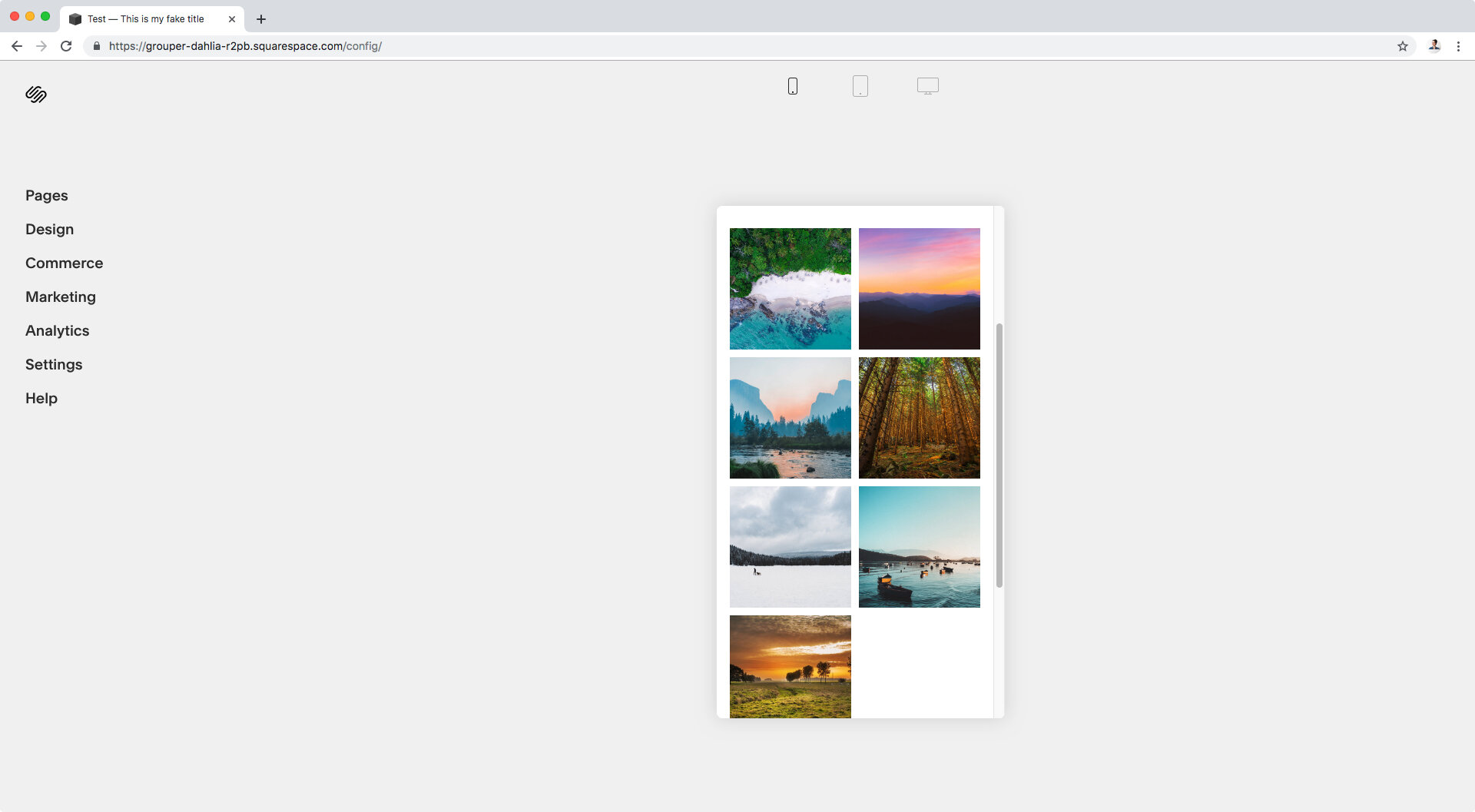
So we have 4 slides on desktop and tablet, and just 2 on phones.
Let’s go back to our desktop screen and take a look with Inspect Element to see how these numbers are chosen.

As you can see, I’m “standing” over one of the slides so I can take a look at the styles set on the right side of my Inspect Element window.
Taking a closer look…

We can see that a width of 25% has been set. Makes sense, since 100% of the space divided by 4 slides makes each slide 25% (#mathwiz).
And if you like geeking out, we can take an even closer look…

And we can see that amongst the parent selectors of our slide there’s one class called .sqs-gallery-thumbnails-per-row-4.
That class is the way Squarespace matches the amount of slides we choose in our gallery block grid to the corresponding width each slide is supposed to have.
Ok, geek time over. Let’s continue!
Since in tablet view we still see 4 slides, we’re also going to see the width for each one has been kept at 25%, so let’s skip that and check our phone screens instead.

Once again, I’ve selected one of the slides in my block so we can see the width natively set by Squarespace.

As you can see, since we’re dealing with mobile CSS here, there’s a media query that’s been set in order to change the width we had in desktop.
A width of 50% is now being used, which corresponds to the two-column layout we saw on our small screen.
What this means is that we can simply create some new media queries with the specific width we want our slides to have, to control how many slides to show per row in our gallery block grid!
Creating the media queries
I’m going to start with tablet mode since I want to have 3 slides per row, instead of 4.
First thing is to set up our media query for this screen size, I’ll be using a max-width of 960px as the viewport size condition.
@media screen and (max-width: 960px) {

}

And now, I have to go back into one of the slides to copy the class (or classes) we’ll be using to target them.

There’s two classes.
We could use just the second one – like it has been used to set the original width on the right – but I’ll be using both. That way, I’ll increase the specificity of my selector and (hopefully) avoid unnecessary usage of the !important rule.
Additionally, I want to make sure we only apply these changes to the slides inside a gallery block set to grid, so we need to look for a class that belongs to that type of block.
Looking upwards through the parent containers of our slides…

We can see there’s an ancestor that has a bunch of classes, including one that’s called .sqs-gallery-block-grid which seems pretty specific to the kind of block we’re using.
We’ll go with that one.
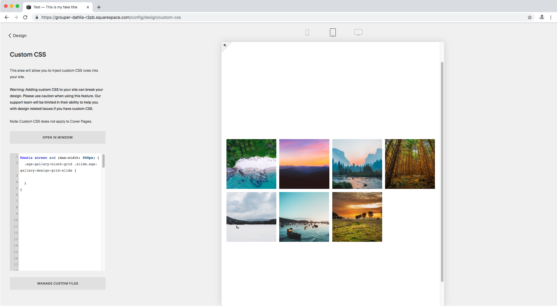
Now, in our custom CSS window we’ll have…
@media screen and (max-width: 960px) {
  .sqs-gallery-block-grid .slide.sqs-gallery-design-grid-slide
And now it’s time to set our new width.
We can use the percentage (or pixel size) we want directly like so:
@media screen and (max-width: 960px) {
  .sqs-gallery-block-grid .slide.sqs-gallery-design-grid-slide {
    width: 33.3%;
  }
}

Or let our browser calculate it on its own, by using the calc( ) function:
@media screen and (max-width: 960px) {
  .sqs-gallery-block-grid .slide.sqs-gallery-design-grid-slide {
    width: calc(100%/3);
  }
}

Awesome!
Now, as you can see, there’s a big white space there.
Note: this shouldn’t show up for you if the number of slides in your tablet view is different than the number of slides per row you have in desktop.
Here’s what’s happening: since the images are being set side by side through the float property, Squarespace automatically gives the slide that should start a new row (in this case, the 5th slide) a property called clear and sets it to left.
What this does is it clears the left float so that the 5th slide doesn’t sit next to the previous slide and stays below instead (since it’s a block element).
Here’s what this looks like through inspect element:
Note: the :nth-child(4n + 1) is being used along with our slide selector to help our browser calculate how many slides to count before applying the clear property. The 4n is given thanks to that same “match” we talked about before regarding the .sqs-gallery-thumbnails-per-row-4 class.

This means, that we now need to remove that clearing so the 5th slide floats once again to the left of the previous slide, effectively closing the gap.
Note: the !important rule is needed to override the value because we aren’t being as specific with our selector as the original code was when applying the clear to the left.
@media screen and (max-width: 960px) {
  .sqs-gallery-block-grid .slide.sqs-gallery-design-grid-slide {
    width: calc(100%/3);
    clear: none !important;
  }
}

Neat! Right?
Ok, let’s create the media query for or phone screen as well, so max-width 640px.
I want to have just 1 slide per row (or one stacked column). We can either use width 100% or the calc function again.
Now, in this case we don’t need to set the clear property again because a) the previous media query is applying it for this screen size too (i.e. anything BELOW 960px); and b) since this smaller screen was already giving us a different slide number per row than on desktop, it was already there.
Take a look:

See? Under the existing media query, the width is being set to 50% (we’re about to change that) and the clear is already there – albeit, it’s crossed off because it’s being overridden by the clear we set for the previous media query at 960px.
It’s the same value so, it still works the same way.
Ok, moving onto the final part of our code:
@media screen and (max-width: 640px) {
  .sqs-gallery-block-grid .slide.sqs-gallery-design-grid-slide {
    width: calc(100%/1);
  }
}

Perfect!
We now have just 1 slide or one stacked column for our gallery block grid on mobile!
And in case you’re wondering, the numbers don’t have to be in descending or ascending order, you can literally control how many you want on each breakpoint!
For example, here I have set only 2 slides per row for desktop via the block’s settings:

And then through this CSS trick, I’ve set 5 for tablets:

And 3 for phone screens:

So there you have it!
You can now control how many slides or images per row you want to display in your gallery block grid, on mobile.
Until next time,
B.
Full code
Note: the code has been modified slightly to work with 7.1 as well.
/*To set the amount of slides for tablets and remove the gap*/
@media screen and (max-width: 960px) {
  .sqs-gallery-block-grid .slide.sqs-gallery-design-grid-slide {
    width: calc(~"100%/3") !important;
    clear: none !important;
  }
}

/*To set the amount of slides for phones*/
@media screen and (max-width: 640px) {
  .sqs-gallery-block-grid .slide.sqs-gallery-design-grid-slide {
    width: calc(~"100%/1") !important;
  }
}