
2 simple ways to create a sticky content navigation

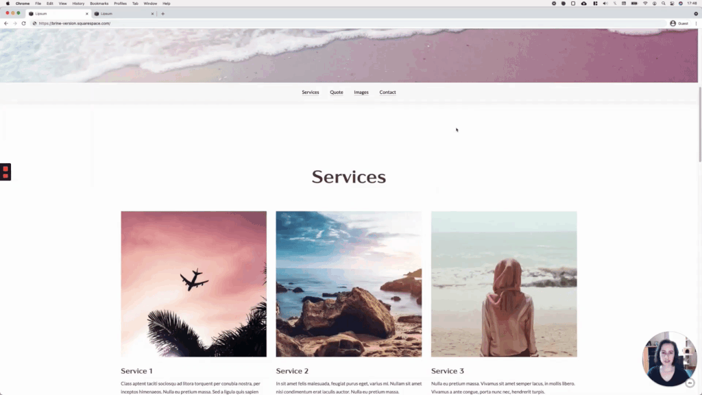
If you have an index page that you want to make more accessible through anchor links, you’ve probably thought about creating one of those sticky content navigations that can be seen on some long websites.
If that’s the case, then today’s video is for you!
We’ll be tackling 2 ways to make this happen, so you can apply the one that fits your project the most and keep the other in your back pocket for later.
Note: the tutorial won’t cover creating the links themselves so, if you’re not sure how to create anchor links, check out this other tutorial.
Tutorial
Overview & timestamps
This kind of sticky navigation is fairly simple to create.
The most time-consuming part is making the style tweaks necessary to give the corresponding element the color, padding, and overall style you want.
But, apart from that, the code needed to make it “stick” is pretty straightforward, so you’ll be able to achieve this in no time!
Let’s jump right into the good stuff:
01:17 - First layout setup
To make the navigation as user-friendly as possible AND responsive, we’ll be using a simple text block inside an index section, with a few stacked anchor links. We’ll be taking care of the horizontality of the links in another step, via CSS.
02:21 - Style tweaks
Depending on the settings you’re working with, and the look you’re going for with your nav, you may not need to make any height or padding adjustments! So, feel free to skip this step of the tutorial if you don’t need to address spacing issues.
05:26 - Setting links horizontally
To avoid having unsightly gaps caused by separating the links with the keyboard’s spacer bar, we’ll be targeting the links via CSS instead, to set them side by side.
07:18 - Fixing spacing issue
We covered this uneven spacing problem in-depth in a previous tutorial, but we’ll be using that trick here too to make the nav’s top and bottom distance match.
07:52 - Making navigation sticky
With everything else in place, it’s time to bring in THE property value that will allow us to stick our content navigation to the top of the browser window, at a specific point.
10:27 - Adding shadow
To make the nav a bit more prominent, we’ll add a nice drop shadow.
11:02 - Checking mobile devices
And lastly, we’ll check out what the result looks like on mobile to see if there are any fixes to make!
11:35 - Quick sticky tip
Before moving onto the next layout, we’ll see how we can deal with this kind of sticky navigation when the original header is already set to fixed!
12:41 - Second layout tweaks
Moving onto the second layout, we’ll keep the original link setup and once again modify the height and padding of the section to make the nav much narrower.
13:52 - Making navigation sticky
Using a slightly different approach, we’ll be sticking our content nav to the side of the browser window, at all times.
14:50 - Moving the navigation
It’s time to decide where the new nav should go! We’ll be using some offsets and the translate trick to make sure our links sit exactly where we want them.
15:54 - Style tweaks
We’ll take care of a few more style tweaks here, to make sure that the width of the navigation is set, and to add back the lovely drop shadow from before.
16:57 - Adjusting mobile
Last but not least, we’ll take a look at mobile to hide the navigation on mobile screens and stop it from interfering with the content behind it.
Until next time,
B.
Full code
Horizontal sticky content nav (7.1)
Custom CSS Window
/*HORIZONTAL STICKY CONTENT NAV (7.1)*/
body:not(.sqs-edit-mode-active) {
  [DATA-SECTION-ID-GOES-HERE] {
    background-color: #fafafa;
    box-shadow: 0 3px 20px rgba(0, 0, 0, 0.08);
    min-height: 0 !important;
    position: sticky !important;
    -webkit-position: sticky !important;
    top: 0;
    z-index: 999;

    .content-wrapper {
      padding-top: 20px !important;
      padding-bottom: 20px !important;
    }
    .html-block {
      padding-bottom: 0 !important;
      text-align: center;

      p {
        display: inline-block;
        margin: 0 20px;
      }
    }

    //Mobile layout
    @media screen and (max-width: 767px) {
      .html-block p {
        display: block;
        margin: 0 20px;
        text-align: center;
      }
    }
  }
}
Stacked side sticky content nav (7.1)
Custom CSS Window
/*STACKED SIDE STICKY CONTENT NAV (7.1)*/
body:not(.sqs-edit-mode-active) {
  [DATA-SECTION-ID-GOES-HERE] {
    background-color: #fafafa;
    box-shadow: 0 3px 20px rgba(0, 0, 0, 0.08);
    min-height: 0 !important;
    position: fixed !important;
    right: 0;
    top: 50%;
    transform: translateY(-50%);
    z-index: 999;

    .content-wrapper {
      padding: 20px 40px !important;
    }

    .html-block {
      padding-bottom: 0 !important;
    }

    .fluid-engine {
      display: block;
    }

    //Mobile layout
    @media screen and (max-width: 960px) {
      display: none;
    }
  }
}
Horizontal sticky content nav - Brine (7.0)
Custom CSS Window
/*HORIZONTAL STICKY CONTENT NAV - BRINE (7.0)*/
#links {
  background-color: #fafafa;
  box-shadow: 0 3px 20px rgba(0,0,0,0.08);
  min-height: 0;
  position: sticky;
  -webkit-position: sticky;
  top: 0;
  z-index: 999;
}

#links .Index-page-content {
  padding-top: 20px;
  padding-bottom: 20px;
}

#links .html-block {
  padding-bottom: 0 !important;
  text-align: center;
}

#links .html-block p {
  display: inline-block;
  margin: 0 20px;
}
Stacked side sticky content nav - Brine (7.0)
Custom CSS Window
/*STACKED SIDE STICKY CONTENT NAV - BRINE (7.0)*/
#links {
  background-color: #fafafa;
  box-shadow: 0 3px 20px rgba(0,0,0,0.08);
  min-height: 0;
  position: fixed;
  right: 0;
  top: 50%;
  transform: translateY(-50%);
  z-index: 999;
}

#links .Index-page-content {
  padding: 20px 40px;
}

#links .html-block {
  padding-bottom: 0 !important;
}

@media screen and (max-width: 960px) {
  #links {
    display: none;
  }
}