Create quick jumps or anchor links in Squarespace
The title already says it all so, let’s keep this short and simple.
Today's CSS trick is all about how to create quick jumps (aka anchor links or anchor points) inside long pieces of content – and between pages in your site – with just a few lines of code!
Ready? Then jump right in! (pun totally intended)
The approach
To create an anchor point or anchor link on a website we need two things:
The landing place of the jump (the anchor), indicated by a unique ID.
The link that will take you there, in your nav or elsewhere.
The latter is pretty straightforward but, depending on the type of page you’re using and the Squarespace version you’re working on, the actual anchor part may need an extra step.
Let’s take a look at how that needs to be handled…
When using index pages in 7.0
If you want to jump to a particular section inside an index page, the URL slug of that section is already the ID you can use as your anchor.
So if the URL slug is /jump-here…
…then the ID will be #jump-here.
Note: if you're using the Pacific template, when setting your link you need to use the word -section as suffix, so if your section's URL slug is /jump-here, your ID would be #jump-here-section
In this case, all that's left to do is create a regular link wherever on your page (or nav) where you want people to click, and use the ID selector as the URL:
When using regular pages in 7.0 or any page in 7.1
In these cases, since there’s no section ID available to use as an anchor point, we need to create our own.
To do so, we can add a Code Block to the top of the content where we want to jump, and create a simple div with an ID of our choice, like so:
<div id="jump-here"> </div>
With that in place, just like we did before, we can go ahead and use that #jump-here ID as our link’s URL and we’re good to go!
How to link to a section on another page
Now, what if you want to have someone click a link and send them to a specific part of another page?
In that case, you’ll need to indicate not only the section of the page where you want to jump to, but the specific page where that section is located.
For example, if we wanted to link to the contact form on our contact page, we would need to grab the ID of our section AND the URL slug of the whole page.
Assuming that our section ID is #contact-form (regardless of it’s the slug of an index section in 7.0 or the ID we created inside a Code Block for either version)…
…and our page’s URL slug is /welcome…
…our nav or button link would look like /welcome#contact-form:
And upon click, the welcome page would open and show us the contact form section right away:
Neat, right?
“B, but my nav covers the top of the section”
Ah yes, annoying, isn’t?
If you’re having this issue, I’m guessing you have your navigation bar set to fixed:
If that’s the case, don’t fret! There’s a sneaky little trick to fix that.
What’s happening here is that the top of the element that has the anchor link is getting aligned to the top of the window, on click.
The problem is that since the anchor element doesn’t have any content or anything else providing some height, everything ends up displaying too far up the page.
And, because the header is set to fixed, it simply sits on whatever is under it.
In this case, both the anchor point and the title beneath it.
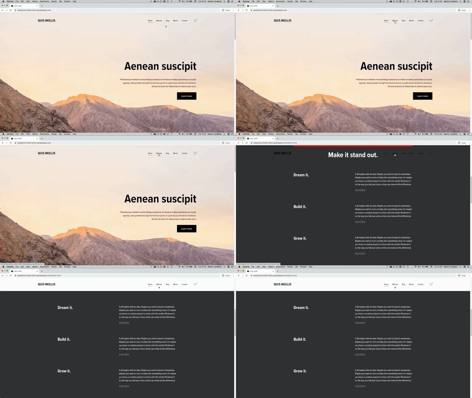
To illustrate the issue, I’m going to give the anchor point we previously created a height of about 10px and a background color:
As you can see, when I click the link, the red line (our anchor point) gets flush against the top of the window and the height of the nav covers it as well as the title:
So, the solution?
We’ll need to make the anchor link taller (to counteract the height of the navigation) AND pull it upwards the same amount of pixels so that there isn’t any gap left.
I’ll go with 90px but you’ll need to adjust it based on your own navigation (also, I’ll keep the color just to illustrate what’s happening):
#jump-here {
  padding-top: 90px;
}
Alright, I think that’s a good size.
Now, to make sure that the extra space doesn’t actually show in the design, we’ll need to add a NEGATIVE top margin of the same value so that the anchor gets pulled upwards the exact amount of pixels it has grown (i.e the same amount of pixels it has pushed the content downwards):
#jump-here {
  margin-top: -90px;
  padding-top: 90px;
}
Perfect!
So now the content is back in its original place, BUT the anchor is taller, meaning that once the top of it hits the top of the window, there will be some extra padding in there to keep the nav from blocking the view of the title:
One last thing I’d recommend doing here is to make the anchor link "clickthrough” so that it doesn’t get in the way of editing other things around it on the page:
#jump-here {
  margin-top: -90px;
  padding-top: 90px;
  pointer-events: none;
}
And that’s it!
Now you know how to create some pretty sweet anchor links/points on your Squarespace site, AND how to handle the issue that comes up when the navigation is fixed at the top.
Until next time,
B.


