The Codebase
Filter through all the code
Find the Squarespace tutorial, plugin or snippet that’s going to help you fix or customize your client’s site in a heartbeat.
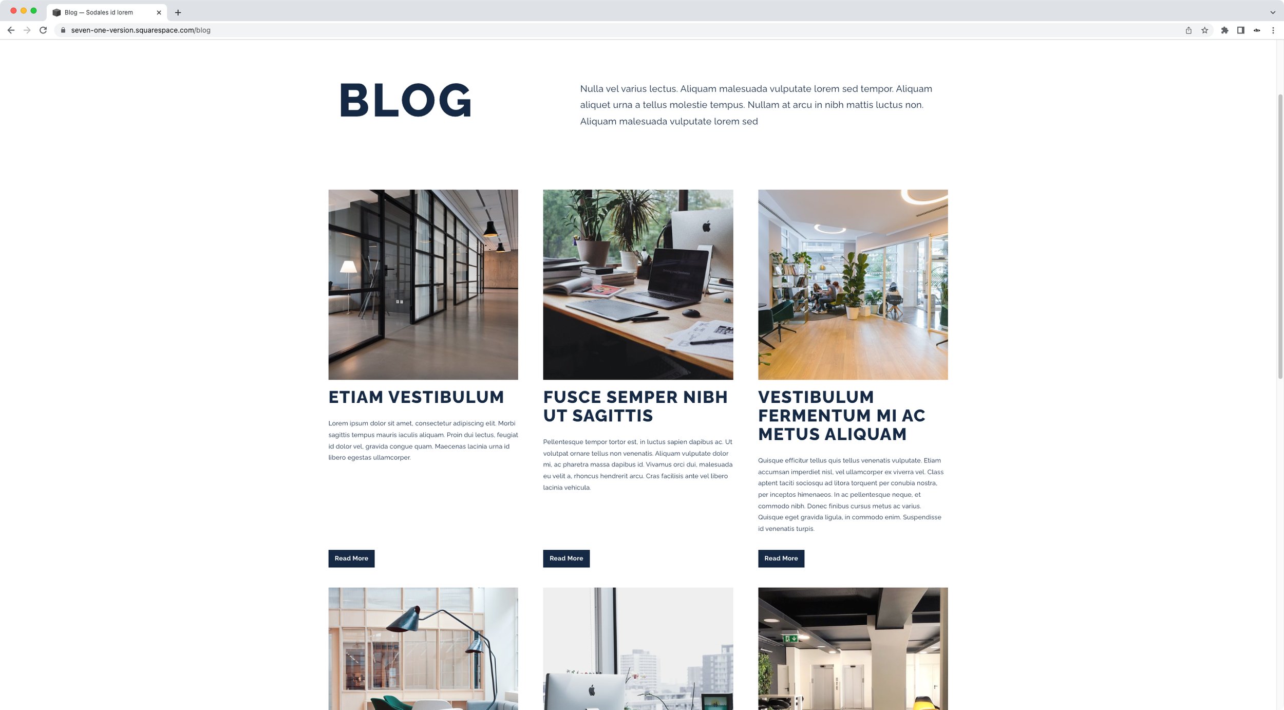
Styling and bottom-aligning ‘Read More’ links for the Basic Grid Blog in Squarespace (7.1)
Want to style the basic grid blog Read More links in Squarespace 7.1? Then today’s CSS trick is the one you’ve been looking for! Check it out.
Customizing the style and text of Read More links inside Summary Blocks (7.0, 7.1 CE & 7.1 FE)
In today’s video, you’ll learn how to replace the text of Read More links for Summary Blocks and how to turn them into buttons!
'Read More' button for blog items (Brine 7.0) - Blog Page
Turn the regular “Read More” links from your 7.0 Blog Page into buttons with this short snippet. You’ll be able to adjust the background color and font styles to match the rest of your site’s design, by copy/pasting the code and modifying the corresponding values!
Bottom-aligned 'Read More' for blog items (Brine 7.0) - Blog Page
Take care of the alignment of the “Read More” links inside your 7.0 Blog Page once and for all. This snippet will automatically set them at the bottom of the content, horizontally centered from post to post, to give you that even look you’re going for!
Bottom-aligned 'Read More' for blog items (7.1) - Blog Page
Take care of the alignment of those darn “Read More” links inside your 7.1 Blog Page once and for all. This snippet will automatically set them at the bottom of the content, horizontally centered from post to post, to give you that even look you’re going for!
Styling the read more link (7.0, 7.1 CE & 7.1 FE) - Summary Block Grid
If you’re looking to turn the “Read More” links into a button inside your Grid Summary Block, this snippet is for you! Just copy/paste the code and you’ll be able to alter the colors, border, border-radius and anything else you want to make them as prominent as you need them to be.
Bottom-aligning 'Read More' links (7.0, 7.1 CE & 7.1 FE) - Summary Block Grid
If you’re working with the Grid Summary Block and you’re wanting to even out the position of the ‘Read More’ links so that they align at the bottom of your summary items, use this little snippet to make that happen.
Styling the read more link (7.0, 7.1 CE & 7.1 FE) - Summary Block Carousel
If you’re looking to turn the “Read More” links into a button inside your Carousel Summary Block, this snippet is for you! Just copy/paste the code and you’ll be able to alter the colors, border, border-radius and anything else you want to make them as prominent as you need them to be.
Bottom-aligning 'Read More' links (7.0, 7.1 CE & 7.1 FE) - Summary Block Carousel
If you’re working with the Carousel Summary Block but the content of your slides differs in length, you can use this little snippet to align the ‘Read More’ links to the bottom of each item to even things out!
Styling the read more link (7.0, 7.1 CE & 7.1 FE) - Summary Block List
Ah yes, the “Read More” links. If you’re looking to change the ones inside your List Summary Block and turn them into a button, this snippet is for you! Just copy/paste the code and you’ll be able to alter the colors, border, border-radius and anything else you want to make them as prominent as you need them to be!
Bottom-aligning 'Read More' links (7.0, 7.1 CE & 7.1 FE) - Summary Block List
So, you’re working with the List Summary Block but your text is fairly short (compared to the height of your image) and you’re wanting to balance things out by aligning the ‘Read More’ link to the bottom of the thumbnail? I gotchu! Use this little snippet to make that happen.
Styling the read more link (7.0, 7.1 CE & 7.1 FE) - Summary Block Wall
Ah yes, the “Read More” links. If you’re looking to change the ones inside your Wall Summary Block and turn them into a button, this snippet is for you! Just copy/paste the code and you’ll be able to alter the colors, border, border-radius and anything else you want to make them as prominent as you need them to be!
Add custom 'Read More' links to your Summary Blocks (7.0, 7.1 CE & 7.1 FE)
Have you ever wished you could replace the ‘Read More‘ link from your Summary Blocks for something else? Not just change its color and turn it into a button, but actually change what it says and… why not, change it for a custom image?!


