How to make any block full width in Squarespace (7.0 & 7.1)
So, your client’s design includes some blocks that should be displayed in full width, while others stick to the boundaries of the site.
And you’ve been trying to make that happen for the past couple of hours (days?) without luck.
Or, maybe you were able to target the right thing but you keep getting this annoying horizontal scroll bar that’s incredibly frustrating.
Are you nodding right now?
If so, then today’s tutorial is for you.
Let’s take a look at how we can make ANY block in Squarespace full width!
A couple of things...
Before we get started, there are a couple of things to keep in mind:
This tutorial will cover the process for Squarespace 7.1, but you’ll find the adapted code for 7.0 (Brine) at the end. However, this trick WILL NOT work with 7.0 sites that have a Constricted Width set via Site Styles.
The code is aimed at blocks that are inside Index Sections (7.0) or Page Sections (7.1). It WILL NOT work for regular pages in 7.0.
It’s recommended that your soon-to-be full-width block sits on its own Index or Page Section.
Ok, with that out of the way, let’s jump right in!
Removing the padding
I’m starting out with a 7.1 site where one page section has some text, and the other one has the block I’m looking to expand.
I’ll be working with the Summary Carousel, but you can use any block you like!
Note: if you’re working with 7.1 too, make sure that your block’s section width is set to “L” in the section’s settings.
The approach here is pretty simple: we need to find out what’s restricting or affecting the width of our chosen block, and get rid of it.
Upon some inspection, the first thing we can see is that the container holding the stuff inside our Page Section has some padding on the sides:
That padding needs to go.
So, we’ll target the container through its class .content-wrapper, and include our Page Section ID in our selector to make sure only the container inside that specific section gets altered:
[data-section-id="5fb519100280d9453322e44a"] .content-wrapper {

}
Alright, now let’s remove the padding.
We’ll have to set it to !important since the original selector that’s being use to ADD the padding is way more specific than what we have in our code:
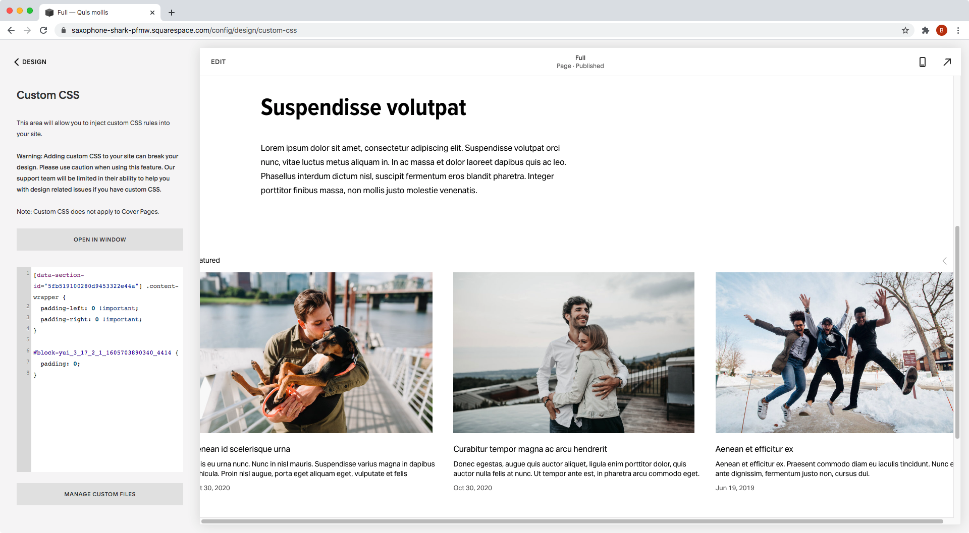
[data-section-id="5fb519100280d9453322e44a"] .content-wrapper {
  padding-left: 0 !important;
  padding-right: 0 !important;
}
Alright!
The padding is gone and the block expanded.
But, we can see that nasty horizontal scroll bar I mentioned at the beginning.
So, how about we get rid of it?
Removing more padding
The horizontal scroll bar is happening because our block is too big and is overflowing.
Therefore, we need to find out what’s causing it to overflow to fix it.
Looking through our Inspect Element tool, we can see that the block carries some side padding with it; the default 17px that all Squarespace blocks have:
So, let’s target the block through our code and remove that.
I’ll be using my Block’s ID, but you can go with one of its classes if you like!
Note: if you DO go with a class, make sure to include your Page Section ID in your selector so that only that specific block gets affected.
#block-yui_3_17_2_1_1605703890340_4414 {
  padding: 0;
}
Hmmm… ok.
The padding is gone but we still see the scrollbar.
Let’s check out what’s going on.
The final piece of the puzzle
There are several reasons why an element may overflow a site, but these are the most common ones:
The element may have a fixed pixel width larger than the screen size.
The element may have a percentage width larger than 100%.
The element may have padding applied to it without the box-sizing fix, causing the padding to be added on top of the element’s original dimensions instead of as part it.
The element may have a width of 100% to occupy the full width of its parent container. But, if that direct parent container (or a previous ancestor container!) is bigger than 100% of the site, then the element will also be bigger than 100% of the site.
Now, I won’t bore you by checking each of these possibilities through the Inspect Element tool.
If you like to geek out I highly recommend it, tho!
But, in any case, the problem we’re encountering here is actually a version of the last one I mentioned: one of the parent containers of our block has a width that goes beyond the site’s dimensions. thus, making our block stretch out further as well.
In this case, the troublemaker is the .sqs-row container:
You see how it goes over the vertical scrollbar, instead of stopping right before it?
That’s happening because of the negative side margins that Squarespace applies to all rows:
That works well across the site.
But in this particular case, for what we want to achieve, it’s a problem.
So, let’s get rid of them!
We can do that by simply targeting the .sqs-row container inside our selected Page Section, and setting its margins to 0:
[data-section-id="5fb519100280d9453322e44a"] .sqs-row {
  margin: 0;
}
And just like that, our horizontal scrollbar is gone, and we have our full-width block in place!
So, there you have it!
That’s how you can easily make any block in Squarespace full-width.
Until next time,
B.
Full code
Note: the 7.1 snippet includes a max-width declaration that wasn’t shown in the tutorial but may be required on some sites, depending on the width settings.
For 7.1
/*HOW TO MAKE ANY BLOCK FULL WIDTH IN SQUARSPACE (7.1)*/
[your-data-section-id] .content-wrapper {
  max-width: 100%;
  padding-left: 0 !important;
  padding-right: 0 !important;
}
#your-block-id {
  padding: 0;
}
[your-data-section-id] .sqs-row {
  margin: 0;
}
For 7.0
/*HOW TO MAKE ANY BLOCK FULL WIDTH IN SQUARSPACE (7.0)*/
#your-index-section .Index-page-content {
  max-width: 100%;
  padding-left: 0;
  padding-right: 0;
}
#your-block-id {
  padding: 0;
}
#your-index-section .sqs-row {
  margin: 0;
}


