
Creating an editorial look with overlap image blocks (7.0 & 7.1 CE)
A couple of tutorials ago we played around with a customization that was inspired by print design.
We made a Stack Image Block look more magazine-y by adding a lovely thin border to the content of the block, while keeping the image outside its boundaries.
And so, today I want to share with you another cool way you can use code in your client designs to make things look more, for a lack of a better word, “editorial”:

Ready to try this out? Let’s go!
Prepping the block
We’ll start out with an Overlap Image Block that has a title and a short subtitle.
Inside the subtitle, we’ll need to create a faux title by adding the text we want before the rest of the paragraph and setting it into a new line with Shift + return.
Also, we’ll need to make that new title bold in order to be able to target it later via code, just like when creating another heading without HTML!

Once the content is in place, you can set the styles of your choice under the Site Styles panel.
Personally, these are the settings I’m using as a starting point (you can click on the image to enlarge it):
Styling the fake title
Once you’re done tweaking your colors, fonts, etc, we can move onto the CSS magic!
First, we’ll change the style of that new fake title of ours.
Let’s look through our Inspect Element tool to see how we can target it:
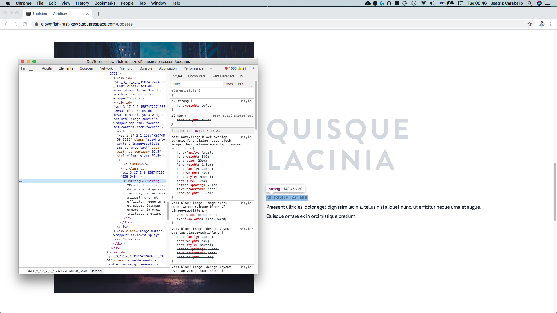
As you can see it’s a strong element, and that sets it apart from the rest of the subtitle just like we needed it to.
On the right side of the screen tho, we can see that the font styles for the font subtitle have been added under a pretty specific selector.
So, in order to make sure our new styles apply and we’re able to override the current ones, we’ll make use of that existing selector and simply include the strong element to make it clear we’re pointing to that short phrase only:

Note: this selector may be different for you if you have dynamic font sizing enabled! So, in my code, you’ll see I grouped both selectors for both scenarios. This is also the case for the titles and subtitles of the other image block layouts in Squarespace. You can find the exact selectors you need in each case inside the Full Snippet Directory.
.image-block-overlap-dynamic-font-sizing .sqs-block-image .design-layout-overlap .image-subtitle p strong,
body:not(.image-block-overlap-dynamic-font-sizing) .sqs-block-image .design-layout-overlap .image-subtitle p strong {

}
And now, all we have to do is set the new styles for our font!
I’ll be changing its size and family:
.image-block-overlap-dynamic-font-sizing .sqs-block-image .design-layout-overlap .image-subtitle p strong,
body:not(.image-block-overlap-dynamic-font-sizing) .sqs-block-image .design-layout-overlap .image-subtitle p strong {
  font-family: 'brandon-grotesque';
  font-size: 30px;
}

Awesome!
I want to separate things a bit tho, so I’ll set the fake title to display block in order to keep it on his own line BUT also have the ability to add a bottom margin to it and create that distance.
.image-block-overlap-dynamic-font-sizing .sqs-block-image .design-layout-overlap .image-subtitle p strong,
body:not(.image-block-overlap-dynamic-font-sizing) .sqs-block-image .design-layout-overlap .image-subtitle p strong {
  font-family: 'brandon-grotesque';
  font-size: 30px;
  display: block;
  margin-bottom: 15px;
}

Subtle, but effective!
Adding a flexible line
Alright, let’s take care of that horizontally centered line that sits lovely next to our subtitle content.
If we look through our Inspector window, we can see that our subtitle is a p element

That sits next right under another p element (an empty one) and that’s wrapped inside a div with a couple of classes (in light blue):

Since our goal is to have our line NEXT to our entire paragraph text, we need to add that line as a SIBLING of our paragraph. Preferably, before it…

Do you know where I’m going with this?
If yes, you know me too well.
And if no, don’t worry because I’ll tell you right now:
We’ll be using our dearly beloved ::before pseudo-element to create the line!
So, we’ll be “attaching” that to the parent container of our paragraph – the div in the previous screenshot with a class of .image-subtitle – and we’ll also need to use the class of an ancestor that makes it clear we’re dealing with the overlap block here since .image-subtitle doesn’t look specific enough.
Scrolling up a bit…

We come across another div that’s still part of our image block and has a couple of classes including one called .design-layout-overlap which may do the trick!
Building our selector we get:
.design-layout-overlap .image-subtitle::before {

}
And now, we’ll set up a basic pseudo-element by giving it an empty content property, the desired width and height of our line, a background-color and the display property set to block.
.design-layout-overlap .image-subtitle::before {
  background-color: #1C2330;
  content: '';
  display: block;
  height: 1px;
  width: 500px;
}

Awesome!
If you like this look you could even keep it this way, it looks pretty good already.
But, if you’re wanting the achieve the customization you came for let’s keep going, shall we?
Ok, so since we now have our ::before as a sibling of our paragraph (or paragraphS if you consider the empty one that isn’t doing anything)…

To go from the vertical layout we have right now into a horizontal one – where the line sits to one side of its brothers/sisters – we can simply use Flexbox!
So, as always, we need to set the DIRECT PARENT container of the things we’re looking to reorder as a flex container.
In this case, our direct parent would be the .image-subtitle container, so:
.design-layout-overlap .image-subtitle {
  display: flex;
}

And just like that, thanks to the default direction of a flex container, our siblings are sitting next to each other!
To align things vertically, we just need to apply the align-items property and set it to center:
.design-layout-overlap .image-subtitle {
  align-items: center;
  display: flex;
}

And, to add a bit more space between the end of the line and the text, we can simply include a right margin amongst the styles of our line pseudo-element!
.design-layout-overlap .image-subtitle::before {
  background-color: #1C2330;
  content: '';
  display: block;
  height: 1px;
  margin-right: 30px;
  width: 500px;
}

How about that?!
If you like this result, you can skip over to the mobile tweaks.
Personally, I want to make two final adjustments before moving on!
First, I want to make the line slightly longer, about 800px, so that the text gets narrower.
Note: the elements inside a flex parent container use width differently than a non-flex parent container. By default, they’re allowed to shrink down as necessary to keep their siblings next to them, so the 800px width I’m using doesn’t really measure 800px but, in this particular case, it does the trick of expanding the line without adding more properties to the code.
.design-layout-overlap .image-subtitle::before {
  background-color: #1C2330;
  content: '';
  display: block;
  height: 1px;
  margin-right: 30px;
  width: 800px;
}

Lovely!
Here’s what that looks like in full screen:

Underlapping the title
Apart from that previous line tweak, I also want to “underlap” (is that a word?) my true title with the image.
I’ll jump into the Site Styles panel to set up its new position by simply sliding the “Title Overlap” option up to 20%:

It looks awesome right now, buuuuuut I want us to take a look at something.
If I change the color of my font…

You’ll notice that the title is OVER the image.
However, I want it to be UNDER the image to achieve the effect I’m after (even when the original color I was using was already giving that illusion).
So, to make that happen, what we can do is target the image container and bring it forward with z-index, so that the title stays in the back.
Looking for that image container…


We can see it’s a div element with a class of .intrinsic.
So, let’s target that along with the ancestor class of .desing-layout-overlap we used before to make it clear we’re targeting the overlap block’s image container.
Note: image blocks in Squarespace sometimes show a slightly different structure on edit mode vs the live site, and even within the same edit mode depending on page refresh. So if you don’t see these same divs inside your Inspect Element tool, check the live site since you should be able to see them there.
.design-layout-overlap .intrinsic {
  z-index: 10;
}

Perfect!
The title is now officially under the image.
I’ll go back into my Site Styles to use my original font color and check things out in full screen:

Beautiful!
Tackling tablets
Alright, now that we’re done with this part, let’s check tablets and see what mess we get, lol.

Well, it could certainly be worse.
I think we can fix this quickly by creating a media query that covers all the way from mobile to tablet sizes and reduces the font size of our big title, as well as the width of our line.
Starting with the title, we need to find a way to target it so let’s take a look:

The title is a p element without any classes.
But, if we look on the right side of the screen, we can see the selector that Squarespace is already using to target it and set its font styles:

So, let’s use that inside our media query and set our new font size!
Note: just like with the subtitle text, this selector may look different for you if you have dynamic font sizing enabled! So, in the code, you’ll notice I’m grouping the selectors for both situations and applying the same styles to them. This is the case for all the other types of image blocks, and you can find the exact selectors to use inside the Full Snippet Directory.
@media screen and (max-width: 960px) {
  .image-block-overlap-dynamic-font-sizing .sqs-block-image .design-layout-overlap .image-title p,
body:not(.image-block-overlap-dynamic-font-sizing) .sqs-block-image .design-layout-overlap .image-title p {
  font-size: 50px;
  }
}

Alright! Much better.
Let’s take care of the line now.
We simply need to target it the same way we created it in the first place, and change the width to something else:
@media screen and (max-width: 960px) {
  .design-layout-overlap .image-subtitle::before {
    width: 150px;
  }
}

Alright, alright!
We’re almost done!
Mobile tweaks
Last but not least, let’s check our layout in mobile phones:

Ok, not bad!
Since the font size and line width changes are also applying here, things aren’t that messy.
However, I think it would be best to just get rid of the line altogether.
So, let’s create a new media query for this screen size, target our line the same way we did before, and set it to display: none
@media screen and (max-width: 640px) {
  .design-layout-overlap .image-subtitle::before {
    display: none;
  }
}

Heck yes!
We’re done here, my friend.
Now you know how you can leverage the overlap block and create a super custom and “editorial” looking style for your client sites!
I hope you enjoyed it.
Until next time,
B.
Full code
/*CREATING AN EDITORIAL LOOK WITH OVERLAP IMAGE BLOCKS*/
.image-block-overlap-dynamic-font-sizing .sqs-block-image .design-layout-overlap .image-subtitle p strong,
body:not(.image-block-overlap-dynamic-font-sizing) .sqs-block-image .design-layout-overlap .image-subtitle p strong {
  font-family: 'brandon-grotesque';
  font-size: 30px;
  display: block;
  margin-bottom: 15px;
}
.design-layout-overlap .image-subtitle {
  align-items: center;
  display: flex;
}
.design-layout-overlap .image-subtitle::before {
  background-color: #1C2330;
  content: '';
  display: block;
  height: 1px;
  margin-right: 30px;
  width: 800px;
}
.design-layout-overlap .intrinsic {
  z-index: 10;
}

@media screen and (max-width: 960px) {
  .image-block-overlap-dynamic-font-sizing .sqs-block-image .design-layout-overlap .image-title p,
body:not(.image-block-overlap-dynamic-font-sizing) .sqs-block-image .design-layout-overlap .image-title p {
  font-size: 50px;
  }
  .design-layout-overlap .image-subtitle::before {
    width: 150px;
  }
}

@media screen and (max-width: 640px) {
  .design-layout-overlap .image-subtitle::before {
    display: none;
  }
}