
Adjusting the number of blog items per row, for tablets, in a Brine blog page (7.0)
If you have your blog pages on Brine set to 3 or more items per row in desktop, chances are you’re not entirely happy with the end result on smaller screens.
Particularly, if you have thumbnail + title + metadata + excerpt showing, your lovely 3 or more item desktop layout squishes up in tablets, kinda like this:

It’s not the end of the world but hey… there’s no shame in wanting to tweak this kind of thing.
My perfectionist side gets you.
So, if you want to know how to fix this and manually control how many items display per row, on tablets, keep reading!
Tweaking the width of our items
I’ll start out with a regular blog page with a grid of 3 elements per row, selected through my Site Styles.

In order to change the number of elements on any screen, what we’ll need to do is change the width of each blog item based on how many we want to fit within the 100% of the parent container.
So, the first thing here is to find out how we’re going to be targeting them through our CSS.
Looking through our Inspect Element window…


…we can see that our items are article elements with a bunch of classes.
And if we check on the right side, we can see the width that Squarespace gave them.
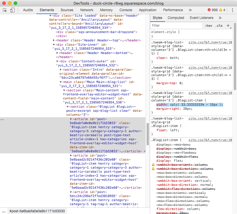
In my case it’s calc(33.333% - 19px), because I chose 3 items per row in my Site Styles. Yours may be different depending on the option you selected when building your site.
Note: curious about that calc( ) value? That’s a CSS function that allows you to ask your browser to calculate stuff! In this case, in order to fit 3 items plus the space between them, Squarespace subtracts what would be the result of 100% of the container width divided by 3, minus the margin value that keeps them apart (19px). This margin was manually calculated by adding up the side margin value of all items (added through Site Styles to all items in a row except for the last one), and then divided by the number of elements per row. In my case that’s (28px + 28px)/3 = 19px.
In any case, what’s important to note here is the way we’re going to target our article elements to change this value.
We could do it by simply grabbing one of the many classes they have (for example, .BlogList-item) but the problem is that, with that class alone, we’re going to have a hard time overriding the existing width since this one’s been set under a pretty specific selector:

So, let’s reuse that same selector instead – with a minor adjustment – in order to save ourselves a headache.
Note: the minor adjustment I’m referring to is removing the =’3’ portion of the [data-columns] attribute selector, since I want the snippet to be usable with any amount of items per row – not just 3. Leaving that particular parameter in would have my code way more specific than I wanted to.
.tweak-blog-list-style-grid [data-columns] .BlogList-item {

}
And now, we can set our new width!
You can use the calc( ) function if you like, but since we’re already adding the value manually, we can simply go with a percentage value.
Since I want to have 2 items per row, I’ll use 45%.
I’m not using 50% because I want to be able to leave a gap between items. We’ll get to that in a minute.
.tweak-blog-list-style-grid [data-columns] .BlogList-item {
  width: 45%;
}

Nice!
However, if we check this in full screen…


We’ll notice there are some gaps in some of the lines that shouldn’t be there.
This is because the current layout is being created with floats, and it has been carefully calculated to break into a new line after the third item of each row.
Potentially, we could go in and undo all those floats and settings to manually set our own layout and breakpoints, BUT… there’s a quicker way, with our dear friend flexbox.
Rearranging our rows
What we need to do here is find the container that’s holding ALL of our article elements, and make it a flex container.
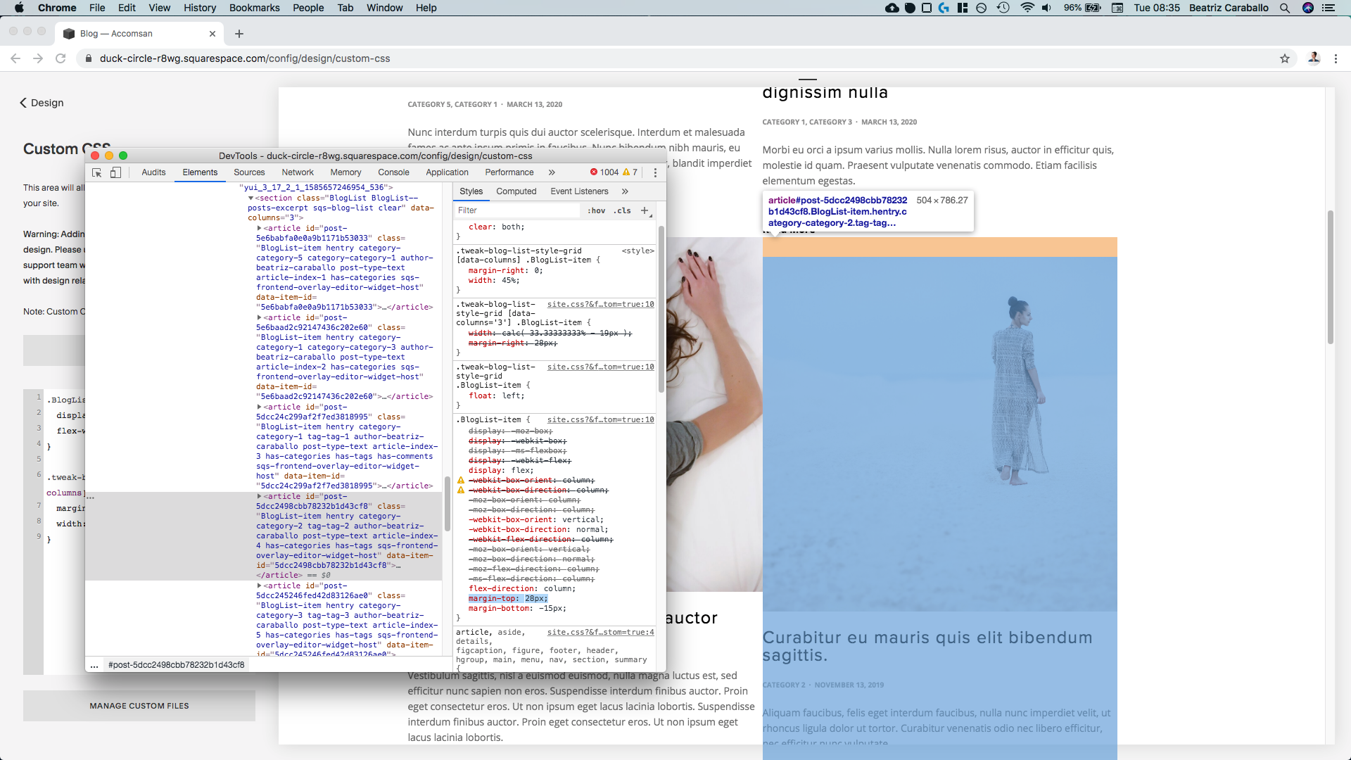
Looking through our Inspect Element window…


… we can see that a section element with a class of .BlogList (amongst others) is the direct parent container of our articles.
So, we’ll be targeting it through that class and setting it to display: flex
.BlogList {
  display: flex;
}

As you can see, we now have a mess.
But not for long!
This is just the default of flexbox kicking in, setting all of the elements inside the targeted container side by side.
Since we don’t want that, and we want our items to fit next to each other based on the width percentage we gave them, we’ll be using flex-wrap to “wrap” items into a new line when they no longer fit in the previous one:
.BlogList {
  display: flex;
  flex-wrap: wrap;
}

Much better!
Now, you may notice that not all items are separated properly, so let’s take care of that.
If we look through our Inspect Element tool we’ll notice there’s a margin set to the right side of some article elements:


The good thing is that since we’re using flexbox for our layout, we can actually get rid of that margin and then have our browser calculate it on its own, based on the remaining space surrounding our items!
First thing’s first, let’s remove that right margin:
.tweak-blog-list-style-grid [data-columns] .BlogList-item {
  margin-right: 0;
  width: 45%;
}

Awesome!
Now, let’s take care of the top margin that’s pushing down some of the items:

Since it seems like there’s no other margin involved, we can simply set margin: 0 and get rid of all the margins around our items at the same time.
However, feel free to set margin-right and margin-top separately if you prefer!
.tweak-blog-list-style-grid [data-columns] .BlogList-item {
  margin: 0;
  width: 45%;
}

Perfect.
With all of that extra gap out of the way, we can now focus on setting our own values!
For the margin in between items, what we can do is go back to our parent container snippet (.BlogList) and use the justify-content property.
By setting it to space-between, our browser will automatically use the space that remains on each line as the space in between items, effectively creating a nice fake margin!
.BlogList {
  display: flex;
  flex-wrap: wrap;
  justify-content: space-between;
}

Then, if we want to adjust it, all we have to do is modify the width of our items!
Personally, I think this is a bit too much so I’ll set my item width to 49%.
.tweak-blog-list-style-grid [data-columns] .BlogList-item {
  margin: 0;
  width: 49%;
}

Beautiful!
To finish this part, let’s set a global bottom margin to all items.
I’ll use 1% for mine.
.tweak-blog-list-style-grid [data-columns] .BlogList-item {
  margin: 0;
  margin-bottom: 1%;
  width: 49%;
}

Love it!
Let’s move on.
Fixing the last row
Checking the result on desktop, you may notice that there’s a weird spacing issue with the last row of our items.
It may not be too noticeable depending on the values you’re using, but it’s there and it’s annoying, so let’s take care of it.

Like I mentioned earlier, Squarespace uses floats to set up this blog layout.
And without getting into much detail, this means that there’s an additional and “invisible” container on our last row that’s messing with our new flexbox layout.
We can see it here inside our Inspect Element window:

Even when its width and height is 0, it’s still messing with our new organization.
So, since we don’t need it, let’s get rid of it!
To target this invisible pseudo-element, we can use the same selector Squarespace used to create it in the first place .clear::after

However, that .clear class is waaaaaaaay too general to use it just like that, especially considering that Squarespace uses floats (and these “invisible” containers) for other layouts inside our template.
So, the best way to make sure we’re not affecting anything else is to look for another class to go with it to make our selector more specific.
If we look into the parent of this ::after pseudo-element, we’ll notice it’s our .BlogList container from before.
In fact, we can see that that .clear class that we were talking about is another class of that same .BlogList container:


This means that instead of targeting the invisible container as .clear::after, we can also do it as .BlogList.clear::after, making things more specific!
Note: in case you’re wondering, there isn’t any space between .BlogList and .clear because they belong to the same element!
Then, all that’s left to do is to set this thing to display: none
.BlogList.clear::after {
  display: none;
}

Ta-da!
The almost non-existent weirdness is now gone.
Awesome!
Setting our media query
If you’ve been following along, you may have noticed that we’ve been modifying the amount of items per row on desktop… not on tablets.
I mean, tablets are being altered as well but the point here was to keep desktop as it was and just change things for tablet screens, right?
It’s ok, we’re going to take care of that right now!
All we have to do is wrap our code inside a media query with a width condition of about 960px.
That way, desktop will remain untouched!
@media screen and (max-width: 960px) {
  .BlogList {
    display: flex;
    flex-wrap: wrap;
    justify-content: space-between;
  }

  .BlogList.clear::after {
    display: none;
  }

  .tweak-blog-list-style-grid [data-columns] .BlogList-item {
    margin: 0;
    margin-bottom: 1%;
    width: 49%;
  }
}


However, as you can see above, this media query also affects phone screens.
But, what if you don’t want this to happen?
What if you just want the new layout to affect tablets?
Then our media query rule will need a slight adjustment.
Instead of setting it up to affect “any screen up to 960px wide”, we’ll set it up to affect “any screen BETWEEN 640px and 960px wide”.
Which, as you may guess, covers tablet sizes.
Translated into code that means:
@media screen and (max-width: 960px) and (min-width: 640px) {
  .BlogList {
    display: flex;
    flex-wrap: wrap;
    justify-content: space-between;
  }

  .BlogList.clear::after {
    display: none;
  }

  .tweak-blog-list-style-grid [data-columns] .BlogList-item {
    margin: 0;
    margin-bottom: 1%;
    width: 49%;
  }
}


And just like that we’ve managed to change up our blog items per row, JUST for tablets.
I hope you liked this one and found it useful!
Until next time,
B.
Full code
@media screen and (max-width: 960px) and (min-width: 640px) {
  .BlogList {
    display: flex;
    flex-wrap: wrap;
    justify-content: space-between;
  }

  .BlogList.clear::after {
    display: none;
  }

  .tweak-blog-list-style-grid [data-columns] .BlogList-item {
    margin: 0;
    margin-bottom: 1%;
    width: 49%;
  }
}