
Adding an image behind a heading in Squarespace (7.0, 7.1 CE & 7.1 FE)

The other day, a member from the Club asked about adding a brush stroke behind a title or heading on her client’s site, and I absolutely loved the final result we got to!
So, for today’s CSS trick, I want to walk you through how you can do the same for your client sites by using any branded image that fits your design!
It’s a gorgeous little customization, and it’s super easy to bring to life so let’s get to it.
A few things to keep in mind
Before we get started, I want to answer a couple of questions that may already be popping into your mind:
Yes, this can be done for ANY title on your site! However, you’ll need to look for the corresponding element type (h1, h2, h3, p) or class needed to target the specific title you’re after! In this tutorial, we’re covering just an h1, but if you need help knowing how to target other types of titles on your site, you can check out the Snippet Directory.
Yes, this can be applied to 7.1 as well! But just like I mentioned before, you’ll need to look for the corresponding element type or class needed to target the specific heading you’re after.
Yes, there’s a way to add the image per line of text, however, it will get chopped off at the edges of each line, so it may look weird depending on the image. There’s a note on how to do that inside the tutorial!
Yes, I’m more than happy to help you out further with this! You can become a member and hop onto the private FB group to ask your questions and get more guidance.
Targeting the title
We’re starting out with a simple layout, that includes some text and some headings:

That bigger title on the left, is the heading 1 that we’ll be targeting and giving the brush stroke background.
So, first thing’s first, we need to find a way to point to it via CSS.
If we look inside our Inspect Element window…

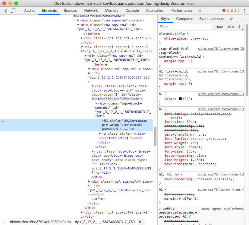
We’ll notice we’re dealing with an h1 element that has no classes or ids whatsoever that we could use to specify that THAT’S the only heading we want to style.
Because I’m working with an index page here, I’ll be using my section id to make sure I’m only affecting this heading 1 and no other.
Notes:
• If you’re working with an index page, you can do the same!
• If you’re working with a regular page, you can look for your page ID instead.
• If you’re looking to add the image to ALL same-type headings, then skip the specification of the index/page id!
My section has a URL slug of /banner so my id will be #banner:
#banner h1 {

}

Adding the background
Once we have that selector in place, we can move onto adding the background image!
We’ll be using background-image to do so and setting the URL of where the pic is being hosted, so:
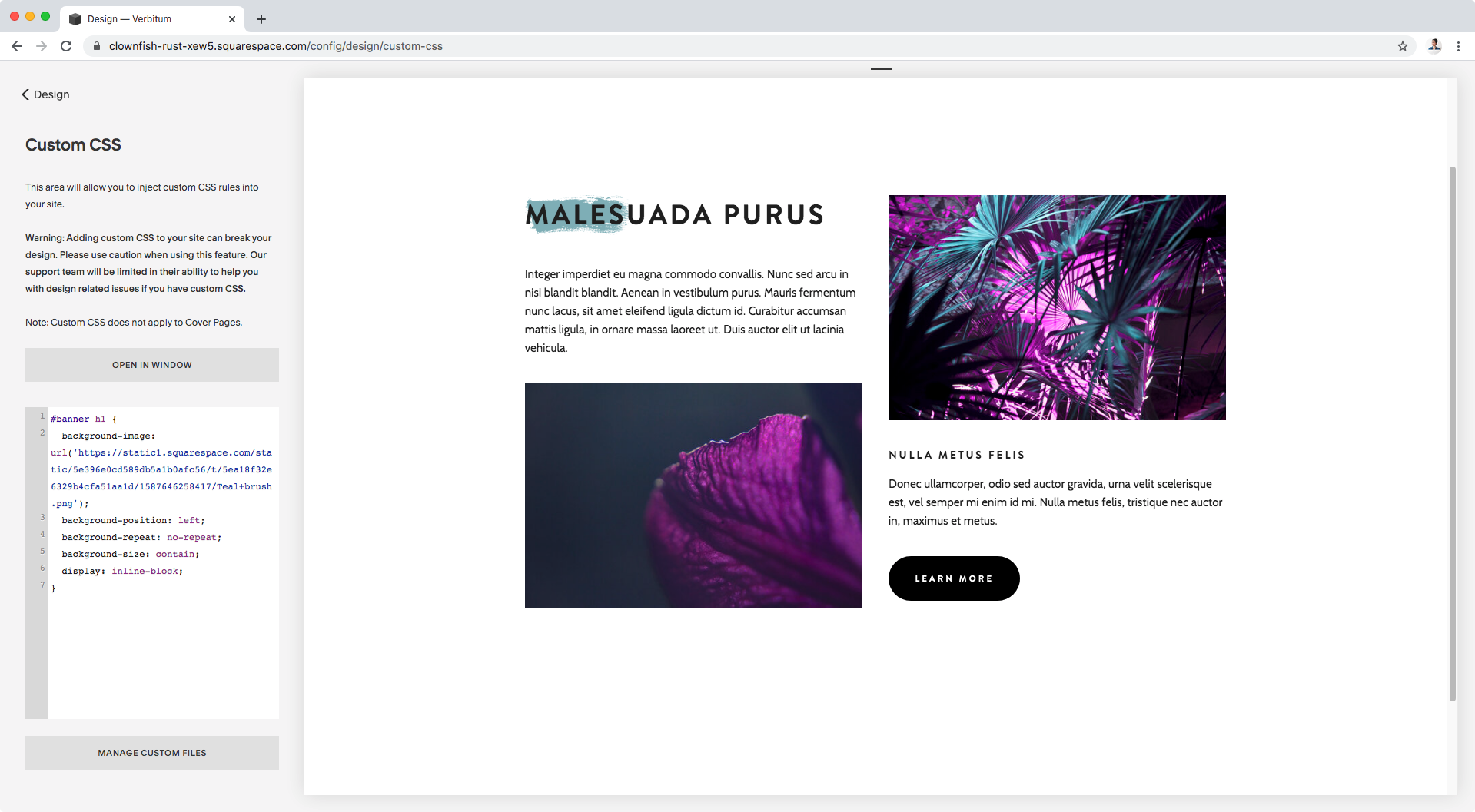
#banner h1 {
  background-image: url('https://static1.squarespace.com/static/5e396e0cd589db5a1b0afc56/t/5ea18f32e6329b4cfa51aa1d/1587646258417/Teal+brush.png');
}

At this point, you may or may not be seeing your image poking out of the title container.
If you don’t see anything, it may be because your image is way bigger than the heading container, if that’s the case your image is there but perhaps only its transparent or white areas are showing.
It’s ok, you’ll be able to confirm this in a second.
In my case, you can see the brush stroke is peeking through the bottom of the heading.
Let’s resize it to see it fully!
We’ll be using background-size for that, and setting it to contain so that the image shrinks down (keeping its ratio) in order to fit the boundaries of our heading container.
#banner h1 {
  background-image: url('https://static1.squarespace.com/static/5e396e0cd589db5a1b0afc56/t/5ea18f32e6329b4cfa51aa1d/1587646258417/Teal+brush.png');
  background-size: contain;
}

Awesome!
We can now see our brush stroke in full.
Note: btw, in case you’re wondering I used one of these brushstrokes and changed its color in PS!
Now, as you may notice it’s being duplicated.
That may work perfectly in your case, depending on the image you’re using, but here I rather have just one brush stroke, so I’ll be using the background-repeat property to get rid of the others.
#banner h1 {
  background-image: url('https://static1.squarespace.com/static/5e396e0cd589db5a1b0afc56/t/5ea18f32e6329b4cfa51aa1d/1587646258417/Teal+brush.png');
  background-repeat: no-repeat;
  background-size: contain;
}

Alright!
Now, if you want to move your image around you can always use background-position and set that to something other than top left (the default).
I want to see what this looks like centered, so I’ll use the keyword center.
You can also specify corners, like bottom right, use percentages, or pixel values!
#banner h1 {
  background-image: url('https://static1.squarespace.com/static/5e396e0cd589db5a1b0afc56/t/5ea18f32e6329b4cfa51aa1d/1587646258417/Teal+brush.png');
  background-position: left;
  background-repeat: no-repeat;
  background-size: contain;
}


That looks a bit off, doesn’t it? I mean, that’s not the center of our heading.
To fix this, we can change the display property that’s currently set as block to inline-block, so that the container ends where the title ends and so that the centered background becomes aligned with the center of the text.
Note: want to add the background per line? then use inline instead of inline-block! Just keep in mind this will remove the right or center alignment you previously had for your heading, if any. You’ll need to set it back again by targeting your text block’s block ID and using text-align manually.
#banner h1 {
  background-image: url('https://static1.squarespace.com/static/5e396e0cd589db5a1b0afc56/t/5ea18f32e6329b4cfa51aa1d/1587646258417/Teal+brush.png');
  background-position: left;
  background-repeat: no-repeat;
  background-size: contain;
  display: inline-block;
}


Ok, that’s better in terms of “centeredness”, but I think I like this better to the left of the heading, so I’ll change background-position to left.
I could simply remove that line altogether since the default would still align it to the left, but I’ll keep it in case I change my mind later!
#banner h1 {
  background-image: url('https://static1.squarespace.com/static/5e396e0cd589db5a1b0afc56/t/5ea18f32e6329b4cfa51aa1d/1587646258417/Teal+brush.png');
  background-position: left;
  background-repeat: no-repeat;
  background-size: contain;
  display: inline-block;
}
Now, depending on the look you’re going for, you can totally stop the customization here.
However, if you want to adjust your image size further, keep readin’!
Adjusting the background size
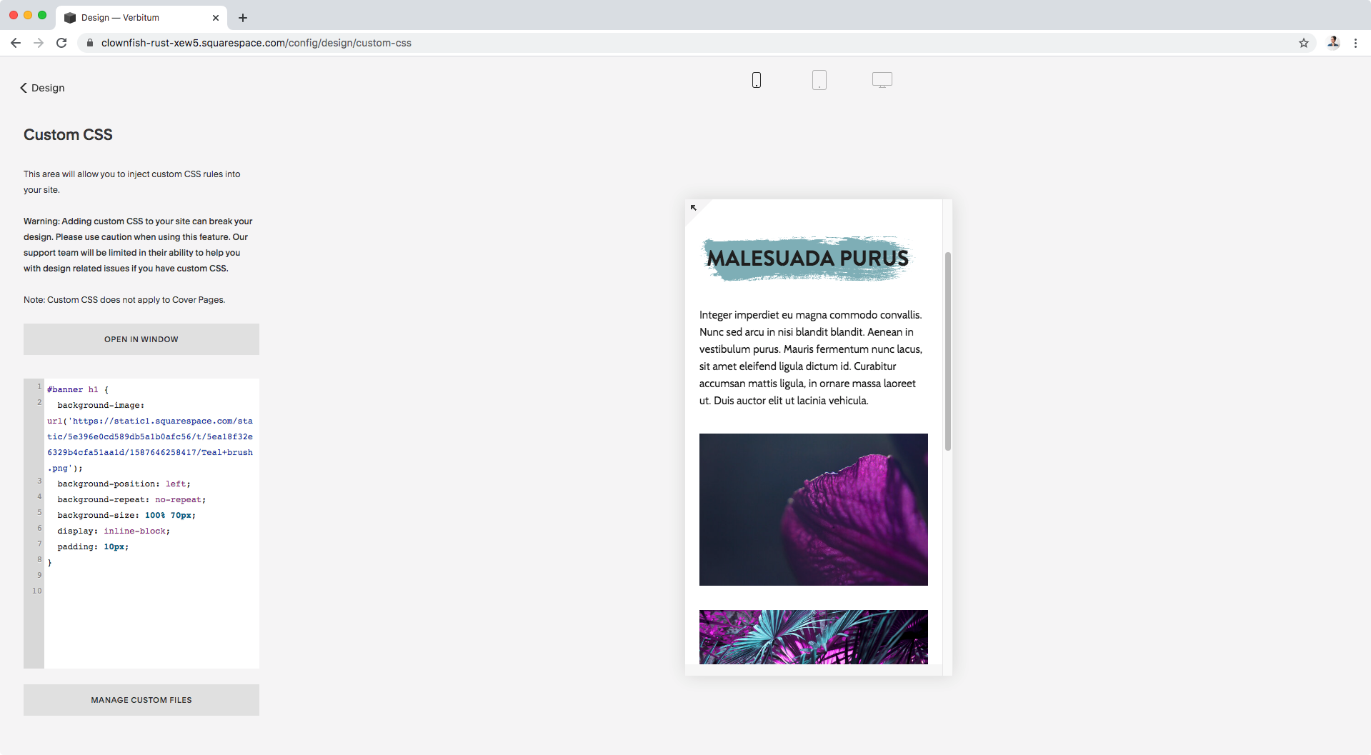
If you’re looking to extend your image so that it covers the whole line of text, or at least more of it, we can make it happen by playing with the background-size image we previously set to contain.
This property also accepts pixel and percentage values, so let’s try stretching out our stroke to see what it looks like! I’ll be using 350px as the width and 70px as the height.
Note: keep in mind that this won’t work if your image needs to maintain its aspect ratio!! If that’s the case, I would recommend editing the original image to make it longer than taller and adjusting whichever design it includes so that it looks good on upload while keeping contain as the value of your background-size declaration.
#banner h1 {
  background-image: url('https://static1.squarespace.com/static/5e396e0cd589db5a1b0afc56/t/5ea18f32e6329b4cfa51aa1d/1587646258417/Teal+brush.png');
  background-position: left;
  background-repeat: no-repeat;
  background-size: 350px 45px;
  display: inline-block;
}

Eh, not too bad but I feel like it’s all squished down too close to the top and bottom of the text.
I’ll add some padding all around the heading so that the image can stretch a bit more!
I’ll also change the height to about 70px to see if that looks better:
#banner h1 {
  background-image: url('https://static1.squarespace.com/static/5e396e0cd589db5a1b0afc56/t/5ea18f32e6329b4cfa51aa1d/1587646258417/Teal+brush.png');
  background-position: left;
  background-repeat: no-repeat;
  background-size: 350px 70px;
  display: inline-block;
  padding: 10px;
}

Ooh! Much better, isn’t it?
Let’s check this out in full screen:

It looks awesome!
But, before we call it a day, you know we have to check small devices…
Adjusting image size for all screen sizes
Let’s see what this looks like on both tablets and phones:


Ooooof course, it’s getting cut off.
No biggie tho, we can fix this very easily.
Depending on how you want things to look like on desktop vs smaller screens, you can create media queries and adjust the width for the background-size for each case.
BUT, since I want the brush stroke to simply stretch out and cover everything behind the text in ALL cases, I’ll go back to the original snippet and change that 350px width to 100%!
#banner h1 {
  background-image: url('https://static1.squarespace.com/static/5e396e0cd589db5a1b0afc56/t/5ea18f32e6329b4cfa51aa1d/1587646258417/Teal+brush.png');
  background-position: left;
  background-repeat: no-repeat;
  background-size: 100% 70px;
  display: inline-block;
  padding: 10px;
}

Awesome!
Let’s check this again to see how it adjusts to all screens:


Perfect!
So, there you have it, now you can wow your client with some awesome text backgrounds!
Until next time,
B.
Full code
#banner h1 {
  background-image: url('https://static1.squarespace.com/static/5e396e0cd589db5a1b0afc56/t/5ea18f32e6329b4cfa51aa1d/1587646258417/Teal+brush.png');
  background-position: left;
  background-repeat: no-repeat;
  background-size: 100% 70px;
  display: inline-block;
  padding: 10px;
}