
Creating a subtle divider for Brine's bottom header (7.0)
You know those pretty and elegant headers on Pinterest where the whole nav is over the banner image but it’s subtly separated by a line that doesn’t quite reach the edges of the site?
Like this one?:

Well, for today’s CSS trick we’ll be looking at how we can achieve this gorgeous look using a Brine template.
Interested? Then let’s dive right in!
Quick setup
I’ll be placing all my nav elements on the bottom header and using a Side Padding of 90px to keep some distance from the edges of the site. Additionally, my header will have elements on the left, center and right side.
You can set up your header however you prefer and leave some areas without elements if you want to!
Note: if you’d like to work with the top header you can absolutely do that! Just make sure to adapt the code to make it work. For this tutorial, you’ll basically need to substitute the word “bottom” for “top” everywhere in the snippets.

Finding the right container(s)
To create that subtle divider we’ll simply be using the border-bottom property.
Nothing more.
However, the tricky part of this customization is finding the right container to target to allow us to achieve that not-reaching-the-site-edges look.
If we inspect our header container and start from its outermost wrapper…


We can see it’s a header element with a couple of classes, including one called .Header--bottom, and that it expands from side to side of the site.
So, if we target that container in our code and apply the border here’s what we get:
.Header--bottom {
  border-bottom: 2px solid white;
}

It looks good but it’s not what we want.
So, let’s take a look at the immediate container inside it:

This one is a div element with a couple of classes including one called .Header-inner--bottom.
It also stretches out the entire width of the site, although what hits the edges is its padding.
So, let’s target it and try it out:
.Header-inner--bottom {
  border: 2px solid white;
}

Nope, same result as before.
If we were dealing with a margin instead of a padding things would be different, but we’re not so they’re not.
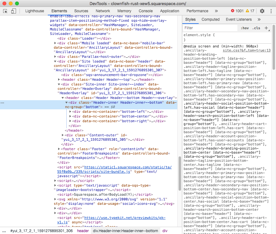
Now, let’s see what’s inside this previous container:


Alright, so inside that .Header-inner--bottom container we have 3 children that are div elements without any classes. They just have an attribute with a slightly different value indicating their position on the header.
How about we target ALL 3 divs and give them the border?
After all, they don’t reach the edges of the site.
To target them, we’ll need to grab their entire attribute + value combo and place it between square brackets.
We’ll need the direct parent’s class as well (.Header-inner--bottom) to make it clear we’re referring to the divs inside that specific header.
Note: if you don’t have content in all three areas, you don’t need to target the empty containers! Just keep the data-nc-container attribute+value combos that you’re actually using on your site and remove the rest.
.Header-inner--bottom [data-nc-container="bottom-left"],
.Header-inner--bottom [data-nc-container="bottom-center"],
.Header-inner--bottom [data-nc-container="bottom-right"] {
  border-bottom: 2px solid white;
}


Ok, this is… better?
At least the lines stay aligned with the content and don’t go over to meet the edges of the site.
But they’re certainly off vertically.
Let’s see what we can do about that.
Adjusting the alignment
Checking the direct parent container (.Header-inner--bottom) of the 3 divs…


We can see on the right side it’s been targeted through its attribute, data-nc-group, and the Flexbox alignment property called align-items has been applied.
That property – when applied to elements sitting side-by-side – helps align them vertically through their top (flex-start), center or bottom (flex-end) section.
The thing with those values is that they make the container shrink down to “hug” the content inside them.
In this case, since the navigation elements, logo, and icons don’t have the same height, that “hugging” is making some shorter than the other, effectively making our borders misaligned.
To fix it, we can change that center value for a fourth one called stretch.
stretch is the default when Flexbox is applied to a container, and it’s what has helped us in the past do things like making blog posts even in height regardless of their content.
So, that’s what’s going to help us here too!
.Header-inner--bottom {
  align-items: stretch;
}


Ta-dá!
Just like magic.
Optional styles
I personally love that single simple clean line look.
However, now that you’ve gone through the process of finding the right containers and making sure they match in height, why not have a bit more fun with the styling?
You could choose to add a top border as well to sandwich the header between two lines:
.Header-inner--bottom [data-nc-container="bottom-left"],
.Header-inner--bottom [data-nc-container="bottom-center"],
.Header-inner--bottom [data-nc-container="bottom-right"] {
  border-bottom: 2px solid white;
  border-top: 2px solid white;
}

Or, you could take it one step further and close up the entire header by adding a left border to the left container and a right border to the right container:
.Header-inner--bottom [data-nc-container="bottom-left"] {
  border-left: 2px solid white;
}

.Header-inner--bottom [data-nc-container="bottom-right"] {
  border-right: 2px solid white;
}

So there you have it!
Now you know how you can create a super subtle and simple divider for your bottom header in Brine, and how you can get creative with it once you have the basics set up!
Until next time,
B.
Full code
/*CREATING A SUBTLE DIVIDER FOR BRINE'S BOTTOM HEADER*/
.Header-inner--bottom {
  align-items: stretch;
}
.Header-inner--bottom [data-nc-container="bottom-left"],
.Header-inner--bottom [data-nc-container="bottom-center"],
.Header-inner--bottom [data-nc-container="bottom-right"] {
  border-bottom: 2px solid white;
  border-top: 2px solid white; /*optional style*/
}

/*Optional styles*/
.Header-inner--bottom [data-nc-container="bottom-left"] {
  border-left: 2px solid white;
}
.Header-inner--bottom [data-nc-container="bottom-right"] {
  border-right: 2px solid white;
}