
Creating a "melted" navigation in Squarespace (Brine 7.0)
To celebrate the beginning of summer, I thought I’d share with you a quick customization that you can adapt for your client’s design to give its nav a really awesome look.
We’ll be creating a “melted” header with the help of a background image and just a bit of CSS:

This is a really cool effect you can use to create some separation between your navigation and the content of the site, without having to use a straight dividing line.
So, are you ready to find out how to make this happen?
Alright, let’s get to it!
Note: even when the tutorial will cover the breakdown of the customization for the Brine family templates, you’ll find the Squarespace 7.1 version of the snippet at the end!
Update Dec 2020: the code at the end of this tutorial was updated to include the mobile version for Brine 7.0!
Prepping the nav
To achieve this look, we’ll work with the Brine template and set up all the elements of our navigation inside the bottom header.

Additionally, we’ll need the image we want to use as the background.
I recommend using one that’s around 1920px wide and has a transparent backdrop.
For this tutorial, I grabbed this vector illustration from Vecteezy and created a repeated horizontal pattern in Photoshop that stretched out 1920px and had 300px in height.
You may need to adjust the height of your image depending on the dimensions of your nav, but feel free to download the one I used as a reference!
Last but not least, upload your file to your Custom CSS window to be able to grab its URL quickly later on.
Selecting the container
With everything in place, we can now look through our Inspect Element window to find the container we need to target.


It seems like the header element with the classes of .Header, .Header--bottom and .Header--overlay may be perfect for our customization, so let’s target it!
We want the effect to show up on ALL pages, so we can skip the .Header--overlay class since that one only corresponds to headers over banner backgrounds.
Let’s go with the other two:
.Header.Header--bottom {

}
And now, let’s add our background image!
.Header.Header--bottom {
  background-image: url('https://static1.squarespace.com/static/5e396e0cd589db5a1b0afc56/t/5ef0a7fb2814402a19ed354a/1592829949190/Ice+cream+drip.png');
}

Creating a reference point
Ok, cool.
Our image is uploaded buuuut it’s not quite right.
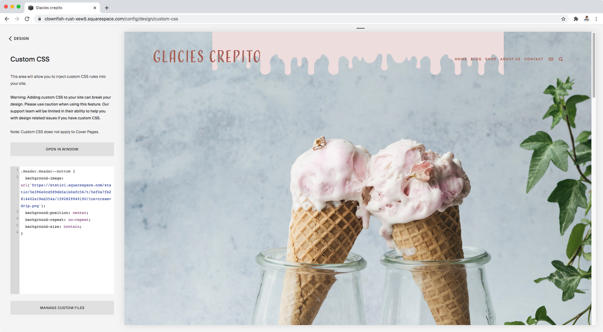
Let’s make it fully visible by setting its size to contain and avoiding any repetition:
.Header.Header--bottom {
  background-image: url('https://static1.squarespace.com/static/5e396e0cd589db5a1b0afc56/t/5ef0a7fb2814402a19ed354a/1592829949190/Ice+cream+drip.png');
  background-repeat: no-repeat;
  background-size: contain;
}

And, how about we center it?
.Header.Header--bottom {
  background-image: url('https://static1.squarespace.com/static/5e396e0cd589db5a1b0afc56/t/5ef0a7fb2814402a19ed354a/1592829949190/Ice+cream+drip.png');
  background-position: center;
  background-repeat: no-repeat;
  background-size: contain;
}
Awesome!
Now, this is obviously not the final result, but it’s a good way to create a reference point for what comes next.
Adjusting the image
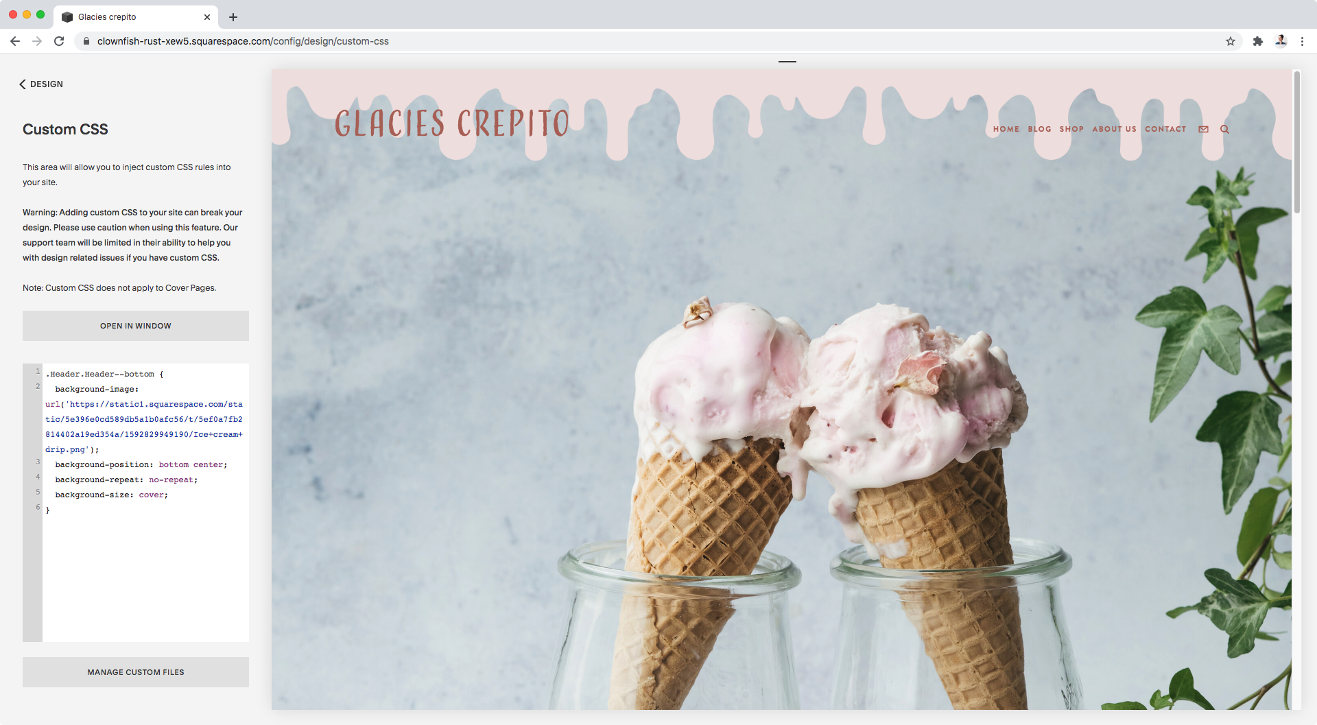
First, to make the image expand across the entire container we selected, we’re going to swap that background size of contain for cover:
.Header.Header--bottom {
  background-image: url('https://static1.squarespace.com/static/5e396e0cd589db5a1b0afc56/t/5ef0a7fb2814402a19ed354a/1592829949190/Ice+cream+drip.png');
  background-position: center;
  background-repeat: no-repeat;
  background-size: cover;
}

Aaaand, to make sure the edge of the drips don’t get cut off, we’re going to align the bottom of the image with the bottom of the header container by setting background-position to bottom center.
Note: when using background-position, the first value (bottom) will set the vertical alignment and the second one (center) the horizontal alignment.
.Header.Header--bottom {
  background-image: url('https://static1.squarespace.com/static/5e396e0cd589db5a1b0afc56/t/5ef0a7fb2814402a19ed354a/1592829949190/Ice+cream+drip.png');
  background-position: bottom center;
  background-repeat: no-repeat;
  background-size: cover;
}
Beautiful!
Let’s check this out in full screen:
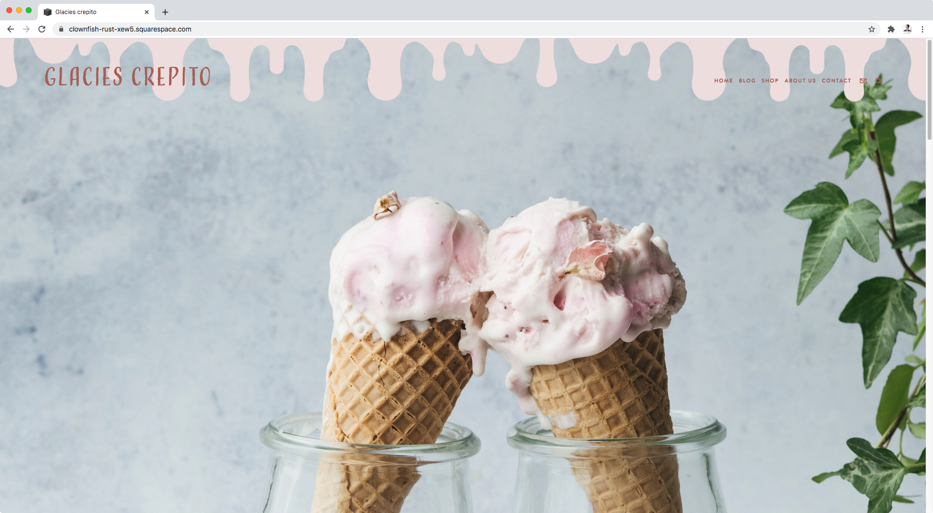
Ok, it doesn’t look bad.
In fact, I think this would look really cool on some websites! But for the style we’re going for, I think we can improve this result with just oooone more line of code.
I feel the “drips” are too close to the header elements, so what I’d like to do is create more space without modifying anything else.
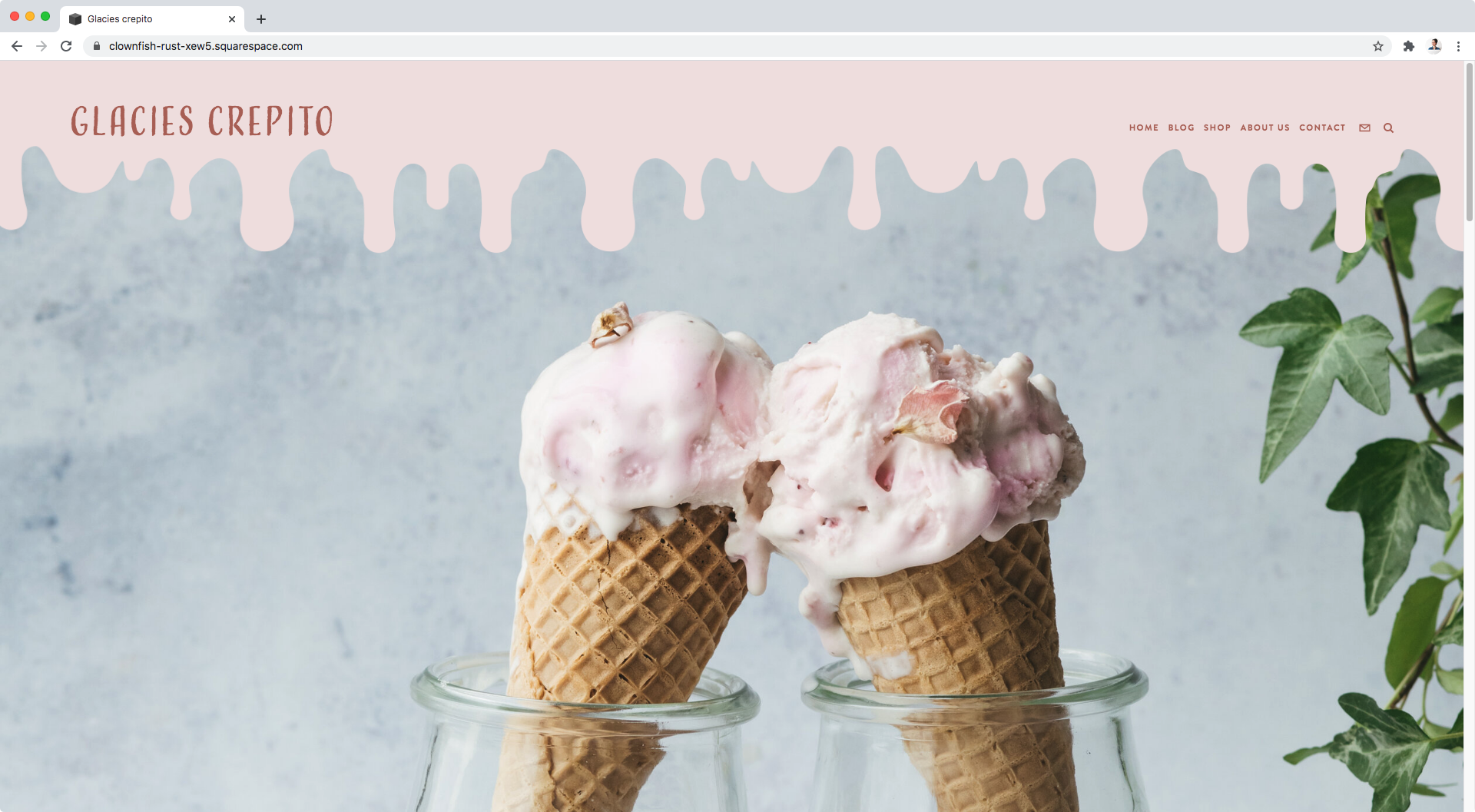
To do this, I’ll simply add a large padding at the bottom of the container so that more room is created for the image to expand further:
.Header.Header--bottom {
  background-image: url('https://static1.squarespace.com/static/5e396e0cd589db5a1b0afc56/t/5ef0a7fb2814402a19ed354a/1592829949190/Ice+cream+drip.png');
  background-position: bottom center;
  background-repeat: no-repeat;
  background-size: cover;
  padding-bottom: 120px;
}

And just like that, our super cool effect is complete!
Now, if you’ll excuse me, I’m going to go and get some ice cream because that background image will haunt me forever if I don’t.
Until next time,
B.
Full code
For Brine 7.0 (Desktop)
/*CREATING A "MELTED" NAVIGATION IN BRINE (DESKTOP)*/
.Header.Header--bottom {
  background-image: url(your-image-goes-here.png);
  background-position: bottom center;
  background-repeat: no-repeat;
  background-size: cover;
  padding-bottom: 120px;
}
For Brine 7.0 (Mobile fixed nav)
/*CREATING A "MELTED" NAVIGATION IN BRINE (MOBILE FIXED NAV)*/
.Mobile-bar--top {
  background-color: transparent;
  background-image: url(your-image-goes-here.png);
  background-position: bottom center;
  background-repeat: no-repeat;
  background-size: cover;
  padding-bottom: 60px !important;
}
body.is-mobile {
  margin-top: 0 !important;
}
body.is-mobile .Intro {
  padding-top: 60px;
}
For Brine 7.0 (Mobile non-fixed nav)
/*CREATING A "MELTED" NAVIGATION IN BRINE (MOBILE NON-FIXED NAV)*/
.Mobile-bar--top {
  background-color: transparent;
  background-image: url(your-image-goes-here.png);
  background-position: bottom center;
  background-repeat: no-repeat;
  background-size: cover;
  padding-bottom: 60px !important;
  position: absolute;
  left: 0;
  top: 0;
  width: 100%;
  z-index: 999;
}
body.is-mobile {
  margin-top: 0 !important;
}
body.is-mobile .Intro {
  padding-top: 60px;
}
For 7.1
/*CREATING A "MELTED" NAVIGATION IN 7.1*/
.header {
  background-color: transparent !important;
  background-image: url(your-image-goes-here.png);
  background-position: bottom center;
  background-repeat: no-repeat;
  background-size: cover;
  padding-bottom: 120px;
}