
Resizing banners on mobile in Squarespace (Brine 7.0)

One of THE most frequent questions I get involves resizing index page banners on smaller screens.
It’s frustrating having to settle for an image crop that benefits 2 out of the three common device sizes, but doesn’t look as good as it could on the third one (usually mobile view).
So, even when this may not be a perfect solution for all of your designs, today I’d like to share with you a fairly simple workaround that can give you WAY more control over your mobile banner resize on Brine (with and without parallax) as well as on 7.1.
Let’s jump right in!
Adjusting the focus dot
I’m starting out with an index page in Brine and with parallax turned on.
I have 4 index sections in total, where 3 of them have a background image.
Focusing on the first one, here’s what the image looks like on the three device previews:


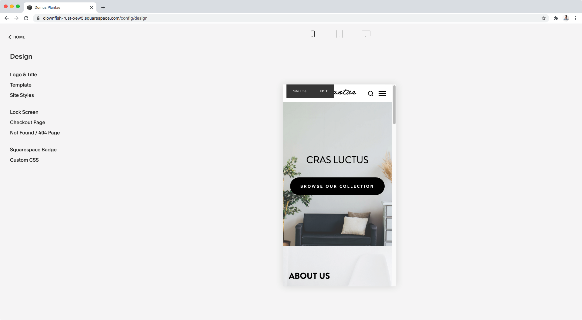
It’s not a bad look, but let’s say my client wants to really showcase the drawers on the right side of the image on mobile.
If I were to adjust the focus dot…

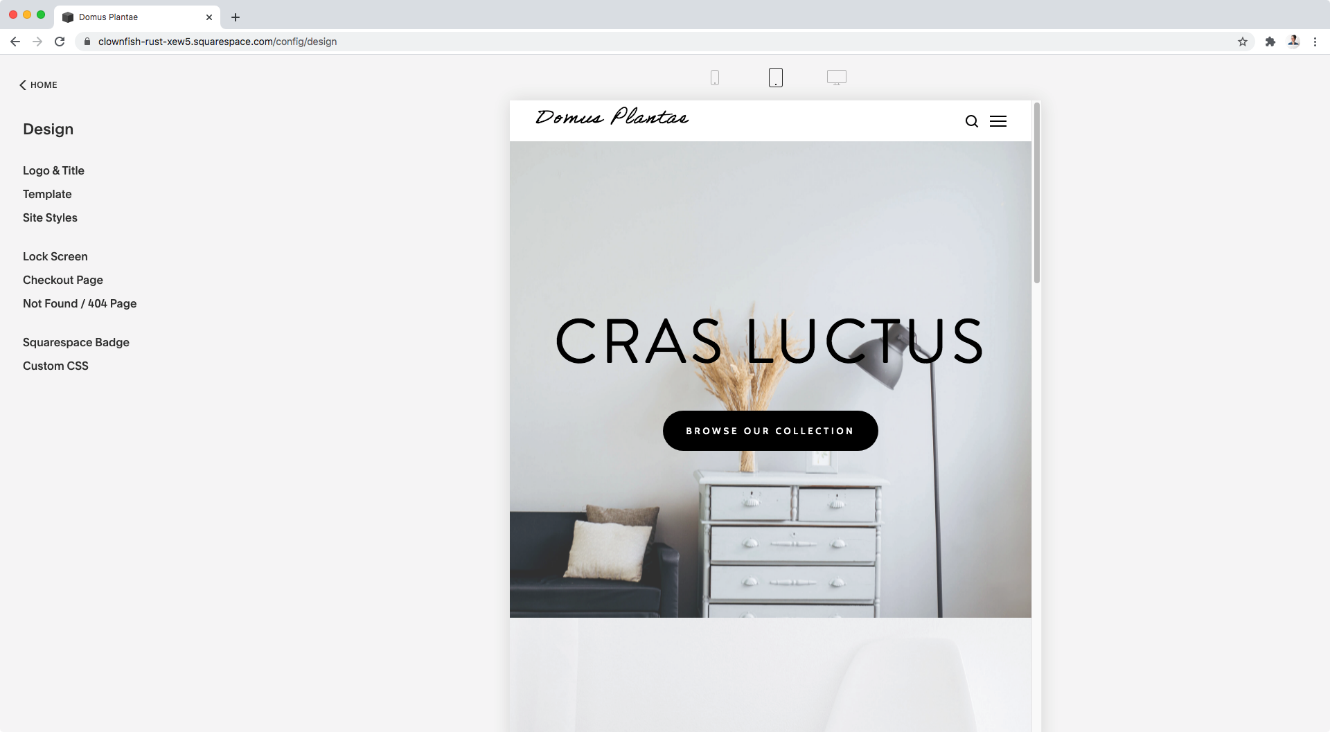
The banner would still look good on desktop:

It would focus on the drawers on tablet (even when I don’t want that):
And I would get an ok crop on mobile, even when I’d like the image to be a bit more zoomed in:

Overall, I would have to settle for either one crop or the other, not really having what I want to see on all devices.
Let’s see if we can find another way to do this.
A more practical approach
Here’s the thing: when we upload images as banners to Squarespace’s index sections, it automatically calculates for us its position based on the different settings that we’re using, including the focus dot.
The problem is that readjusting that automatic positioning, even when doable, can still be too inflexible for what we need.
So what if, instead of trying to fight the image we already set in place that looks pretty good on desktop and tablet, we just use a new image for mobile?
As I said before, this may not be a failproof approach for all your designs, but it’s certainly versatile enough that you may be able to use it on almost all of them!
What we’ll be doing is looking for the container that holds the current background image, hide that existing image element, and then apply a background image of our own.
By doing it this way, we’ll be able to upload either the same image, a cropped version of it or even a different one that can be resized and position (almost) exactly where we want it!
Finding the right container
The most important part here is to find the right container to target to add our background image.
Because we have parallax turned on in this example, we want to keep that effect even when changing the image. So, the best way to go would be to add the background image to the parallax container holding the current banner.
However, that parallax container is pretty sneaky and it’s not located where we may think it is.
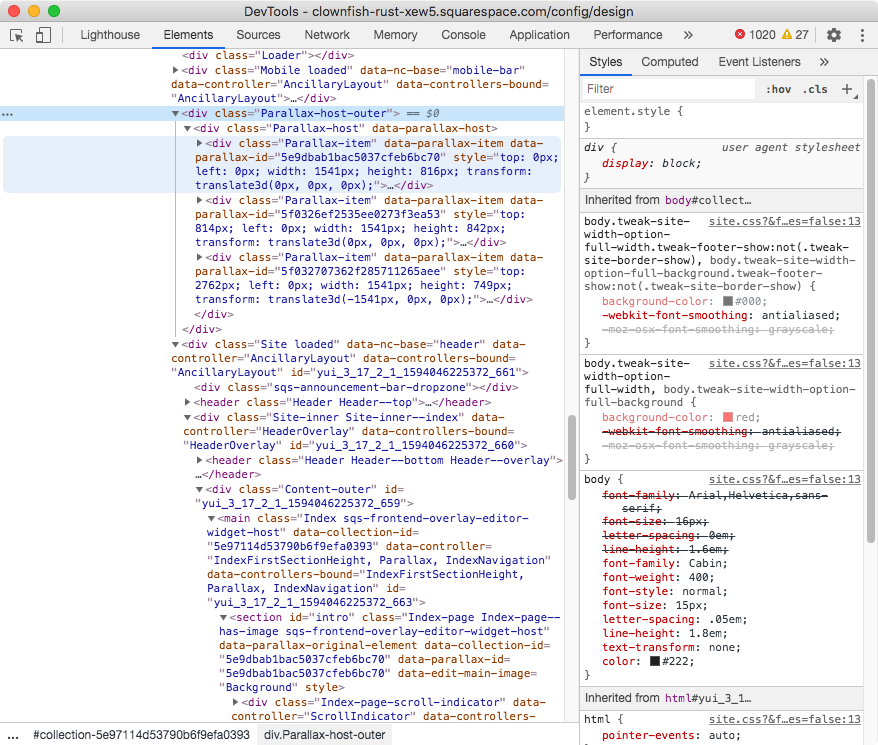
Looking at our first banner through the Inspector tool…

…the container highlighted in dark blue is our whole index section, and the container in light blue is the actual content of the section.
However, that’s not where the banner is located.
All parallax banners in Squarespace are held inside a container called .Parallax-host-outer that you can see highlighted below in light blue with the index section in dark blue as reference:

Inside that main parallax container, there’s a second wrapper followed by the parallax container of each of the banner sections of our page with a class of .Parallax-item (the first one being highlighted in light blue with the dark blue being the main parallax container .Parallax-host-outer):
So, if we stand on each of them we’ll see how the banner of each corresponding section gets highlighted on the site.
Here’s the first one:

And the second one:
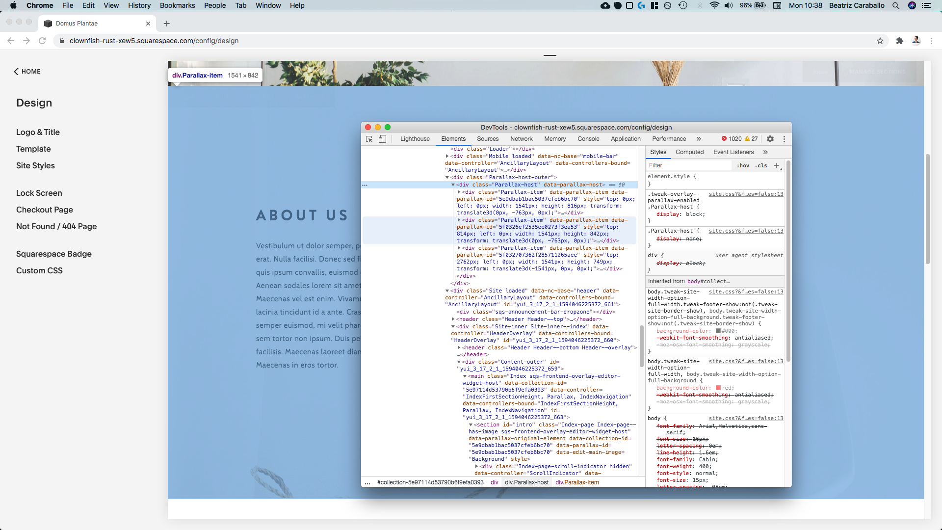
And the third one:

Now, if we open any of these .Parallax-item containers…


…we’ll see that there’s a figure element inside with a class of .Index-page-image…

…and finally the actual banner image we uploaded as an img element:

Awesome!
As per our approach, we’ll need to hide that img element and then set our own background image to the container holding it, i.e. the figure element with the class .Index-page-image
Additionally, to make sure we’re only modifying the banner we choose on the page, we’ll be selecting its corresponding .Parallax-item container by position (i.e. first banner, second banner, etc) with the help of :nth-child( ).
So, let’s put all of this information together and test things out!
Testing our target
Going back to our first banner, we’ll be targeting its .Parallax-item container by indicating its position (i.e. first), and we’ll give a random background color to the container where we’ll be adding our new image (the figure element with the class .Index-page-image) just to test things out.
On top of that, we’ll be targeting the existing image element for the same .Parallax-item container and hiding it with the display property:
.Parallax-item:nth-child(1) .Index-page-image {
   background-color: red;
}
.Parallax-item:nth-child(1) .Index-page-image img {
   display: none;
}

Perfect!
If we wanted to target the second banner we would simply need to change the number inside the :nth-child( ) pseudo-class like so:
.Parallax-item:nth-child(2) .Index-page-image {
   background-color: red;
}
.Parallax-item:nth-child(2) .Index-page-image img {
   display: none;
}

And it’s the exact same thing for the third one:
.Parallax-item:nth-child(3) .Index-page-image {
   background-color: red;
}
.Parallax-item:nth-child(3) .Index-page-image img {
   display: none;
}

Beautiful!
We’re all set.
Adding the new background image for mobile
Alrighty, so going back to our code for the first banner, since that’s the one we want to change, here’s what we have so far:
.Parallax-item:nth-child(1) .Index-page-image {
   background-color: red;
}
.Parallax-item:nth-child(1) .Index-page-image img {
   display: none;
}
So, let’s swap that background color for an image previously uploaded to our Custom CSS window:
.Parallax-item:nth-child(1) .Index-page-image {
    background-image: url('https://static1.squarespace.com/static/5e396e0cd589db5a1b0afc56/t/5f031d04c7077935486d4f3b/1594039557103/image-asset.jpeg');
  }
  .Parallax-item:nth-child(1) .Index-page-image img {
    display: none;
  }

Awesome!
And now, let’s adjust it by avoiding any repetition, giving it an initial center bottom position and setting it to cover to make sure there are no gaps:
.Parallax-item:nth-child(1) .Index-page-image {
    background-image: url('https://static1.squarespace.com/static/5e396e0cd589db5a1b0afc56/t/5f031d04c7077935486d4f3b/1594039557103/image-asset.jpeg');
    background-position: center bottom;
    background-repeat: no-repeat;
    background-size: cover;
  }
  .Parallax-item:nth-child(1) .Index-page-image img {
    display: none;
  }

Cool!
It pretty much looks just like what we had originally, but since we want to make modifications only for mobile, let’s wrap this up in a media query that goes from 0px to 640px to cover that screen size:
@media screen and (max-width: 640px) {
  .Parallax-item:nth-child(1) .Index-page-image {
    background-image: url('https://static1.squarespace.com/static/5e396e0cd589db5a1b0afc56/t/5f031d04c7077935486d4f3b/1594039557103/image-asset.jpeg');
    background-position: center bottom;
    background-repeat: no-repeat;
    background-size: cover;
  }
  .Parallax-item:nth-child(1) .Index-page-image img {
    display: none;
  }
}

Adjusting the banner on mobile
Ok! Now let’s move onto the fun part: resizing and repositioning our image!
If we wanted to showcase the left side of our image, we could use background-position: left bottom like so:
@media screen and (max-width: 640px) {
  .Parallax-item:nth-child(1) .Index-page-image {
    background-image: url('https://static1.squarespace.com/static/5e396e0cd589db5a1b0afc56/t/5f031d04c7077935486d4f3b/1594039557103/image-asset.jpeg');
    background-position: left bottom;
    background-repeat: no-repeat;
    background-size: cover;
  }
  .Parallax-item:nth-child(1) .Index-page-image img {
    display: none;
  }
}
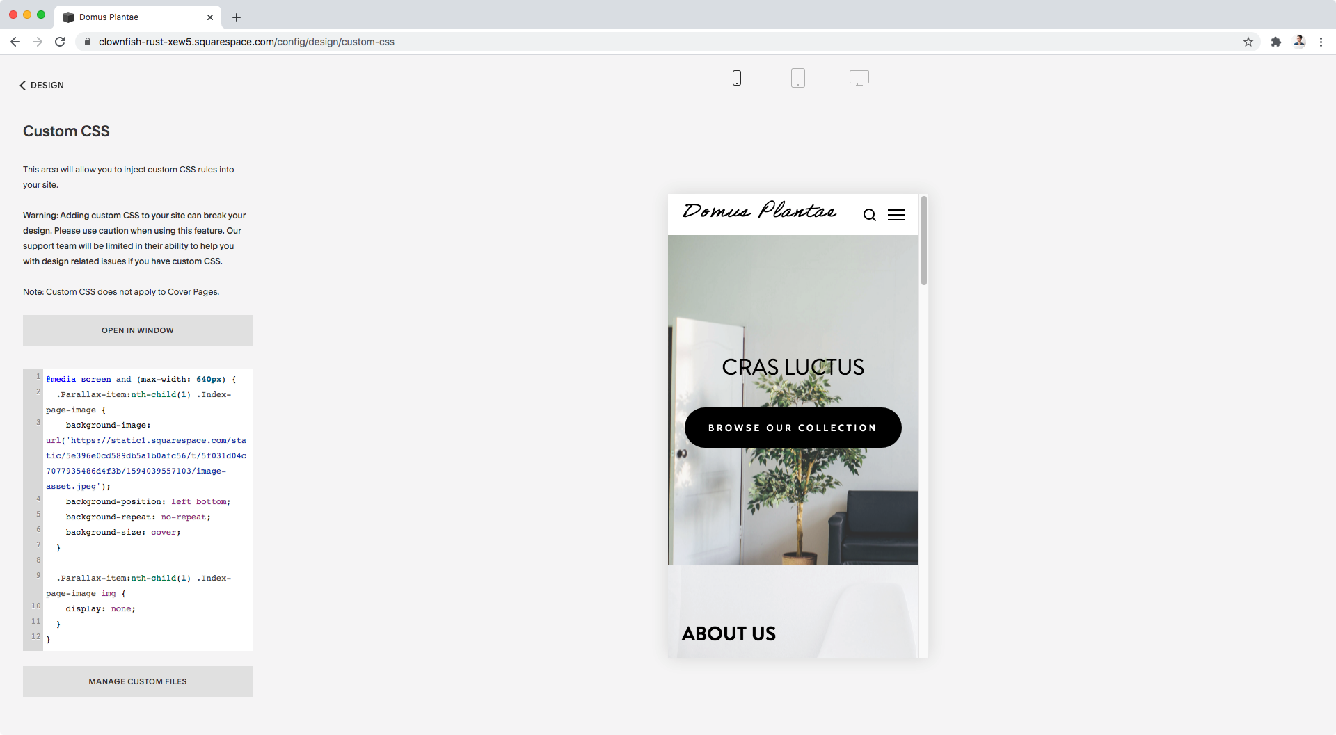
But, since we’re looking to showcase the drawers, let’s try right bottom instead:
@media screen and (max-width: 640px) {
  .Parallax-item:nth-child(1) .Index-page-image {
    background-image: url('https://static1.squarespace.com/static/5e396e0cd589db5a1b0afc56/t/5f031d04c7077935486d4f3b/1594039557103/image-asset.jpeg');
    background-position: right bottom;
    background-repeat: no-repeat;
    background-size: cover;
  }
  .Parallax-item:nth-child(1) .Index-page-image img {
    display: none;
  }
}
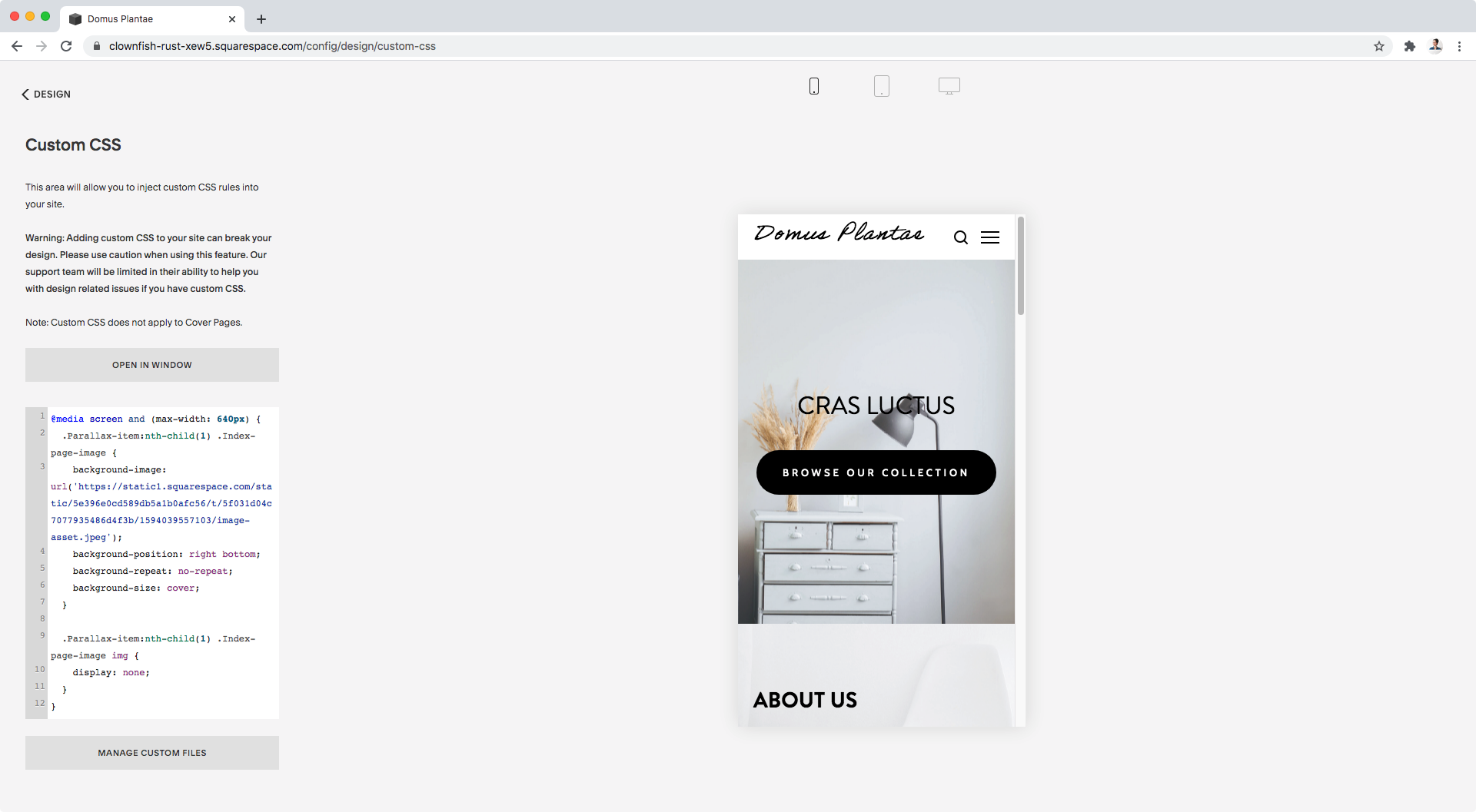
It’s good but not quite.
So, to make things a bit bigger and centered over the display piece, let’s get more precise with our values and drastically increase the size of the image as well as set a percentage value for the horizontal position:
@media screen and (max-width: 640px) {
  .Parallax-item:nth-child(1) .Index-page-image {
    background-image: url('https://static1.squarespace.com/static/5e396e0cd589db5a1b0afc56/t/5f031d04c7077935486d4f3b/1594039557103/image-asset.jpeg');
    background-position: 78% bottom;
    background-repeat: no-repeat;
    background-size: 410%;
  }
  .Parallax-item:nth-child(1) .Index-page-image img {
    display: none;
  }
}

And just like that, we have a new crop for our banner on mobile while keeping things as they were on tablet and desktop:


Getting specific
Before we call it a day, because this approach relies on banner position and not something unique like an ID, we have to make sure that we’re not altering any other banner on the site.
Otherwise, any first banner image will get the new background image we just gave the one on the homepage.
Yikes!
So, what we can do here is simply look for the ID of our page and include that in our current selector, like so:
@media screen and (max-width: 640px) {
  #collection-58af0828bf629a82a10ae7af .Parallax-item:nth-child(1) .Index-page-image {
    background-image: url('https://static1.squarespace.com/static/5e396e0cd589db5a1b0afc56/t/5f031d04c7077935486d4f3b/1594039557103/image-asset.jpeg');
    background-position: 78% bottom;
    background-repeat: no-repeat;
    background-size: 410%;
  }
  #collection-58af0828bf629a82a10ae7af .Parallax-item:nth-child(1) .Index-page-image img {
    display: none;
  }
}
This way, we can be certain that only the first banner of this particular page is getting modified on mobile!
What about sites without parallax and 7.1?
If you’re working with Brine without parallax or on a 7.1 site, the process to apply this workaround to your design is exactly the same!
The difference lies in the names or classes of the containers you need to target.
For Brine without parallax
With parallax disabled, your banner image is located inside a container that shows up inside your index section container.
Therefore, to target it and the image inside it, you’ll be able to use your section ID instead of the .Parallax-item:nth-child( ) selector to indicate which banner you’re referring to, like so:
@media screen and (max-width: 640px) {
  #intro .Index-page-image {
    background-image: url('https://static1.squarespace.com/static/5e396e0cd589db5a1b0afc56/t/5f032b19af864f7a39056faa/1594043162322/jean-philippe-delberghe-vNFeHiYUOSM-unsplash.jpg');
    background-position: 78% bottom;
    background-repeat: no-repeat;
    background-size: 410%;
  }
  #intro .Index-page-image img {
    display: none;
  }
}
For 7.1
On the 7.1 version of the platform, the banner image remains within the container of the corresponding index section – just like with Brine without parallax.
However, because 7.1 doesn’t have section IDs, you’ll need to use the :nth-child( ) approach in order to select the banner you want to modify by its position.
And just like we did for Brine with parallax enabled, you’ll need to include your page’s ID to make sure you’re not altering another banner with the same position on a different page of your site.
@media screen and (max-width: 640px) {
  #collection-58af0828bf629a82a10ae7af article.sections .page-section:nth-child(1) .section-background {
    background-image: url('https://static1.squarespace.com/static/5e32d1d16574e34694bc68eb/t/5f0325a66cac7c5fb6001c94/1594041767313/image-asset+%281%29.jpeg');
    background-position: 78% bottom;
    background-repeat: no-repeat;
    background-size: 410%;
  }
  #collection-58af0828bf629a82a10ae7af article.sections .page-section:nth-child(1) .section-background img {
    display: none;
  }
}
So there you have it!
Now go and resize those banners on mobile!
Until next time,
B.
Full code
/*RESIZING BANNERS ON MOBILE IN SQUARESPACE - BRINE W/ PARALLAX*/
@media screen and (max-width: 640px) {
  #collection-58af0828bf629a82a10ae7af .Parallax-item:nth-child(1) .Index-page-image {
    background-image: url('image-url-goes-here.png');
    background-position: 78% bottom;
    background-repeat: no-repeat;
    background-size: 410%;
  }
  #collection-58af0828bf629a82a10ae7af .Parallax-item:nth-child(1) .Index-page-image img {
    display: none;
  }
}
/*RESIZING BANNERS ON MOBILE IN SQUARESPACE - BRINE W/O PARALLAX*/
@media screen and (max-width: 640px) {
  #intro .Index-page-image {
    background-image: url('image-url-goes-here.png');
    background-position: 78% bottom;
    background-repeat: no-repeat;
    background-size: 410%;
  }
  #intro .Index-page-image img {
    display: none;
  }
}
/*RESIZING BANNERS ON MOBILE IN SQUARESPACE - 7.1*/
@media screen and (max-width: 640px) {
  #collection-58af0828bf629a82a10ae7af article.sections .page-section:nth-child(1) .section-background {
    background-image: url('image-url-goes-here.png');
    background-position: 78% bottom;
    background-repeat: no-repeat;
    background-size: 410%;
  }
  #collection-58af0828bf629a82a10ae7af article.sections .page-section:nth-child(1) .section-background img {
    display: none;
  }
}