
Add a gradient in Squarespace to only one word in your heading (7.0, 7.1 CE & 7.1 FE)

Let’s take this text CSS trick to another level!
In that previous post we looked at how you can select and style just ONE word inside any of your headings with a bit of CSS.
And today, we’ll be using that same approach to give a gradient to any word in your text!
The method is pretty simple, however we have to tackle some compatibility issues to make sure the word is readable in as many browsers as possible.
So, why don’t we get started?
Giving a gradient to a single word in your text
To achieve this cool trick, we need 3 things:
A way to target the specific word we want to style
A gradient
A way to apply the gradient only to the word and not its background
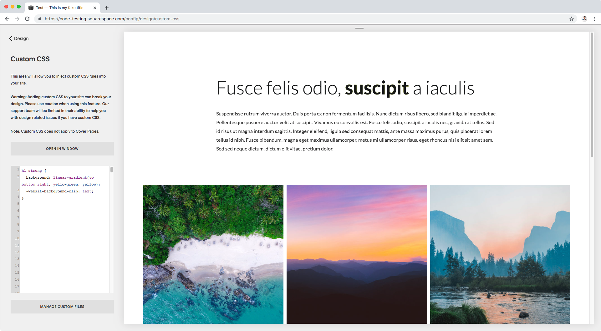
We already know how to approach number 1 to target a single word in a heading (or any other bit of text for that matter), so in this example I’ll be selecting the bold word in this title:

To test it out really quickly, I’ll simply change its color to red via the Custom CSS window:
h1 strong {
  color: red;
}

Perfect.
Now, we need the gradient we’re going to use.
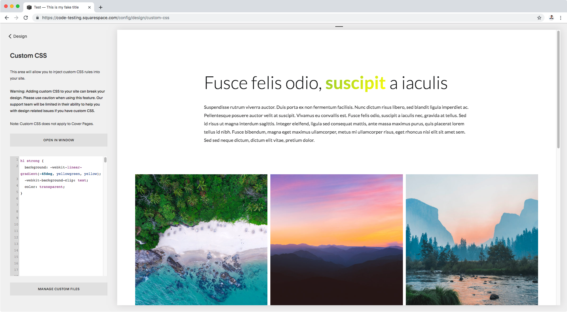
You may already know how to create a CSS gradient but just in case, what we’ll be doing is using the linear-gradient function as the value for our background property and then setting the parameters for colors and the angle we wish to use.
In my case, I want to set a pretty simple neon-ish gradient; for the angle direction I’ll be going towards the bottom right corner (to bottom right) and using a yellow green and a super bright yellow as my colors.
Translating this into code, I get:
h1 strong {
  background: linear-gradient(to bottom right, yellowgreen, yellow);
}

Neat! We have our gradient.
Now, it’s time to apply it ONLY to our text.
To do this, we’ll be using a CSS property called background-clip that, spoiler alert, allows you to clip a background image (or in this case our gradient) to a container.
However, the value we’re interested in using– aptly named text– that’s going to clip our background gradient to our text vs its surrounding container, can only be used (as of May 2019) with the prefixed version of the property, -webkit-background-clip.
So, applying this clipping property to our code we get:
h1 strong { background: linear-gradient(to bottom right, yellowgreen, yellow); background-clip: text; }
“Uhm B… the gradient disappeared”
I know, I know. Hold on to your horses.
The thing is, the background gradient has already been clipped, but the font color is getting in the way.
So what we need to do is switch the font color to transparent and…
h1 strong { background: linear-gradient(to bottom right, yellowgreen, yellow); background-clip: text; color: transparent; }

…ta-dá!
We now have a “gradientized” (?) word!
Pretty cool, right?
Technically, this is all you need to do to achieve this neat trick BUT, like I mentioned at the beginning of this tutorial, there are some compatibility issues with some browser versions that it would be best to address.
Making gradient text clipping more compatible
I found this awesome pure-CSS fallback solution in a post by Divya Manian and I thought it was genius!
So that’s what we’ll be using to make sure everything works nicely with as many browsers as possible.
However, before we get into it I want to show you what the current code would do in a browser version that isn’t compatible with the -webkit-background-clip property we used.
Since I don’t have any old browser versions installed on my computer, I’m using Browserling to check out the result live (I chose Internet Explorer 11):

Looks great, right? #not
As you can see, without the clipping thing we can only see the background gradient (remember the color was set to transparent) so the word is simply unreadable.
So, what we can do is follow Divya’s trick and, first, set the linear gradient function using its webkit prefixed version ONLY.
This way, we’ll only get both the gradient and the clipping to work on browsers that support this prefixed version, and those that don’t understand it will do nothing (aka, the gradient won’t show up)!
Note: when using the prefixed version -webkit-linear-gradient( ) you’ll need to remove the word to from the angle parameter (in this case I’d need to use bottom right instead of to bottom right) or use degrees instead, which is what I’m doing.
h1 strong { background: linear-gradient(-45deg, yellowgreen, yellow); background-clip: text; color: transparent; }
In Chrome, it looks the same, but going back to IE11 this is what we see now:

So, we DON’T see our gradient but we can’t see our word either.
To fix it we’d have to add the font color back in, but the problem is that if we give the font any color that’s not transparent, we won’t see our gradient in our original browser.
This is where the second part of Divya’s trick comes in!
We can use a property called -webkit-text-fill-color that allows you to specify a color for your text, it looks exactly like if you were using the color property although it’s not the same thing.
The key here is that since it requires the webkit prefix, once again it will only be used by browsers who support it and ignored by those who don’t! (aka IE11).
So, this means we can actually set TWO different font colors for our text: one will be used by browsers who are already ignoring our prefixed gradient and clipping property, and the other will be used along with the prefixed gradient and background-clip by browsers who do support it!
Translating this into code, we’ll need to set the color property back to black (so the non-webkit-literate browsers can use it) and then set the -webkit-text-fill-color property to transparent (so the browsers who can understand the prefix can use it instead).
Note: for this to work, the color property needs to be BEFORE the -webkit-text-fill-color one, so the latter overrides the former in compatible browsers.
h1 strong { background: linear-gradient(-45deg, yellowgreen, yellow); background-clip: text; color: #191717; text-fill-color: transparent; }

As you can see, Chrome can apply the gradient, clipping and transparent text fill color!
And then on IE11…

The gradient, clipping and text fill get ignored, while the color property gets applied!
And in case you’re in the same boat as me and many others and simply don’t waste time with compatibility for IE, keep in mind this also helps old versions of actually useful browsers.
For example, here you can see how this fallback trick we used keeps things readable for Firefox 40 too:

Alright so there you have it!
That’s how you can not only add a gradient to a word in your Squarespace headings, but also have a plan B for browser versions that may not be compatible with the prefixed-only clipping property for text.
Until next time,
B.
Full code
/*Code with fallback for incompatible browsers*/ h1 strong { background: linear-gradient(-45deg, yellowgreen, yellow); background-clip: text; color: #191717; text-fill-color: transparent; }