
“Podcastifying” Squarespace’s Summary Block (7.0, 7.1 CE & 7.1 FE)
Podcasts are pretty much THE THING right now.
So, if you or your client has a podcast that wants to promote on their site, what better way to do that than customizing one of Squarespace’s block to neatly display them?
This customization is perfect for when you’re using blog posts inside a blog page for each of your episode, since we’ll be customizing the Summary Block to make it look more… “podcast-y”.
Keep in mind this customization is a bit more advanced than others you’ve seen on this blog, but fret not because it’s still broken down in step-by-step so you can understand what’s going on!
Let’s do this!
Adding a background color to List Summary Block items
We’re going to start off by creating a Summary Block List that’s linked to our podcast blog page.
I set mine to showcase title, excerpt and thumbnail and made the thumbnail square and 21%.
You can use any settings you like!

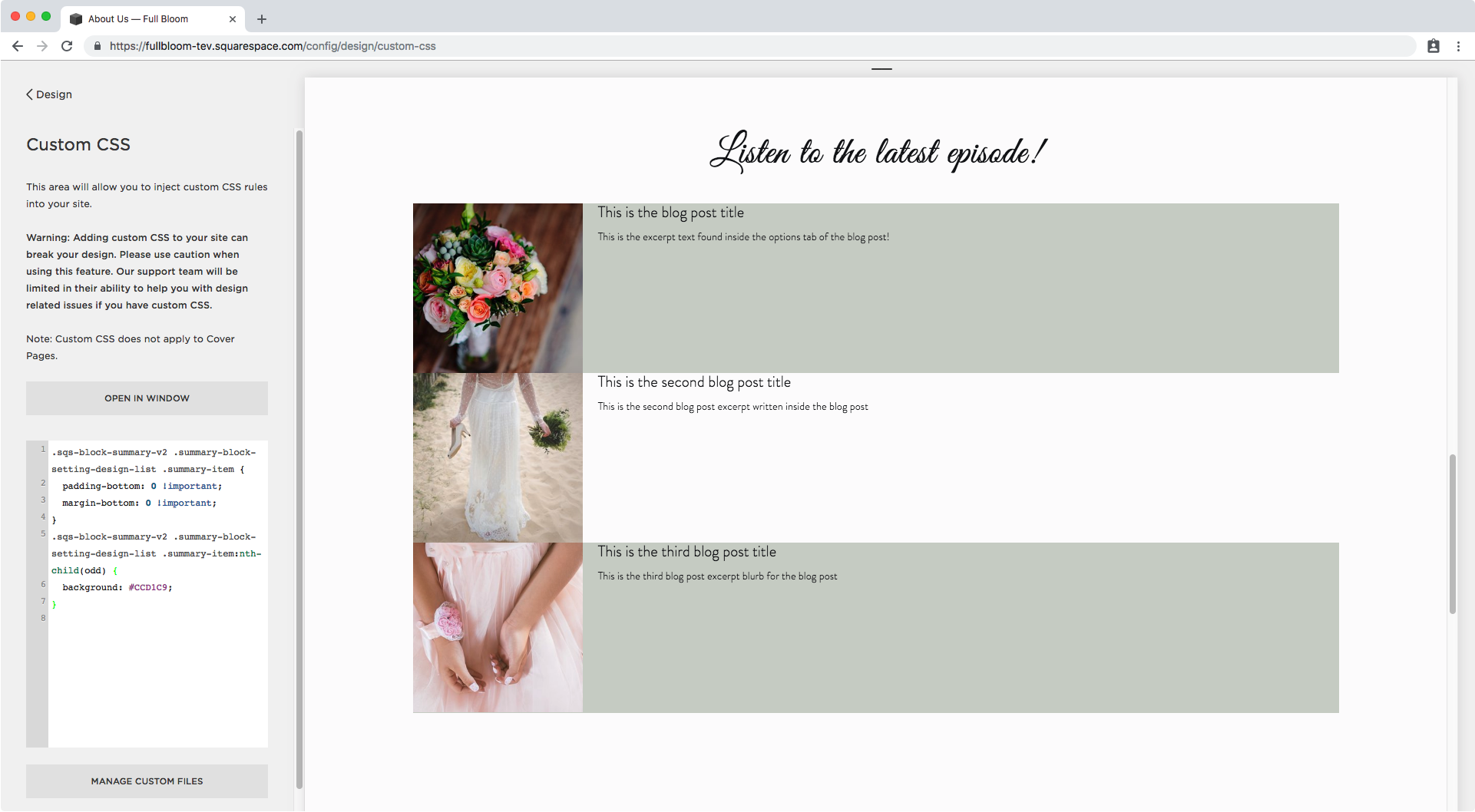
The first thing I want to do is give these episodes some color, so I’m going to look through my Inspect Element window to see what each item or row is called so I can apply a nice background.

On the right side, I can see the exact sections I want to modify have already been targeted and some styles have been applied, so I’ll just reuse the selectors from there instead of building my own.
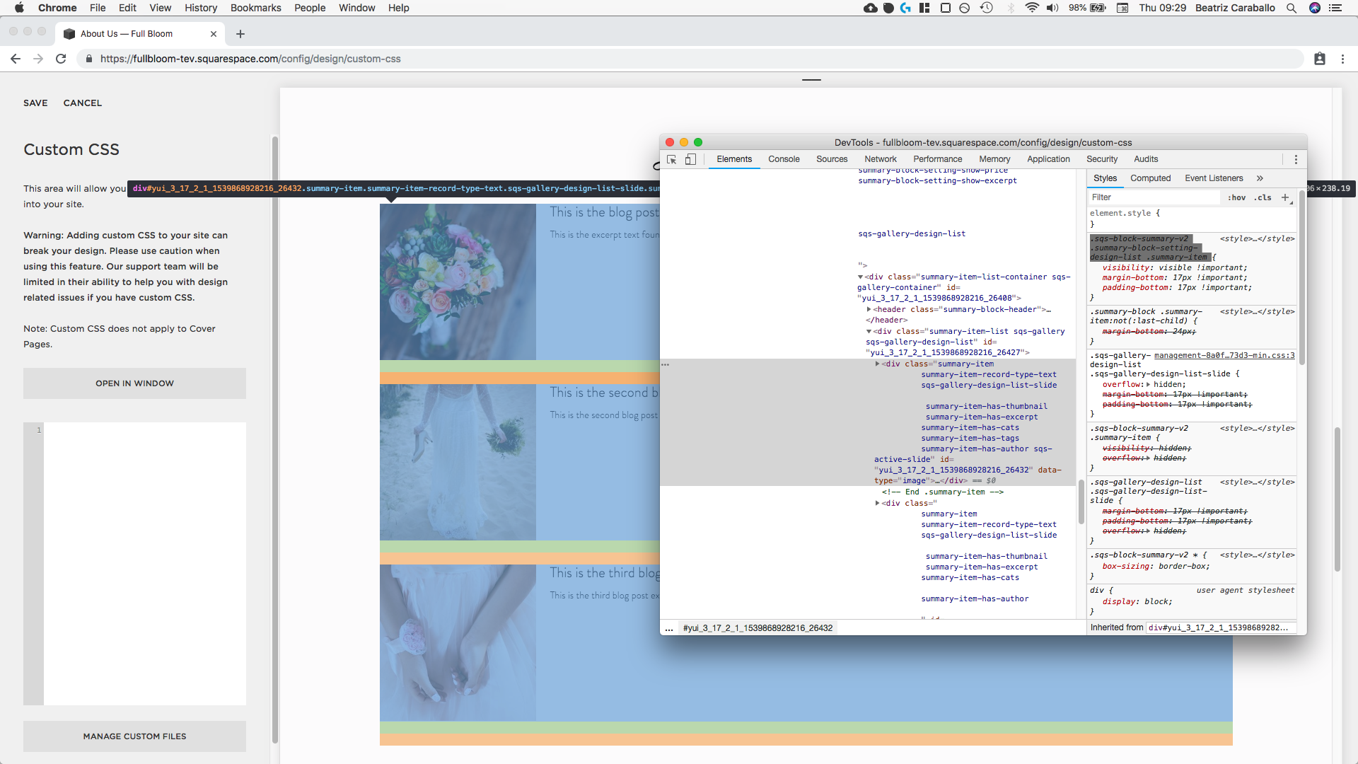

I’ll paste that selector into my Custom CSS window and add a random background color to see what it looks like.
.sqs-block-summary-v2 .summary-block-setting-design-list .summary-item {
  background: #ebebeb;
}
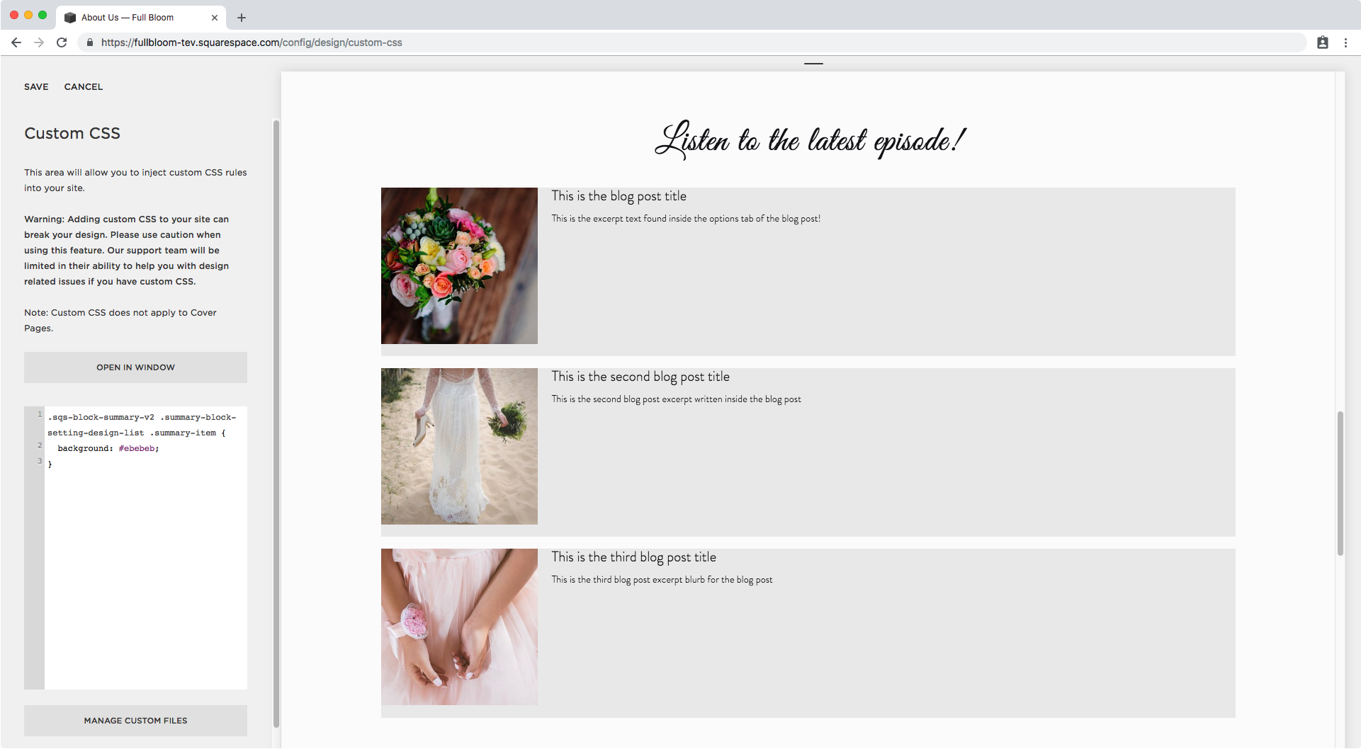
Good, but I want to get rid of that bit of spacing in between rows.
Checking with Inspect Element again I can see there’s a padding and a margin…

…so I’ll set both to 0 inside the same snippet from before.
.sqs-block-summary-v2 .summary-block-setting-design-list .summary-item {
  background: #ebebeb;
  padding-bottom: 0 !important;
  margin-bottom: 0 !important;
}
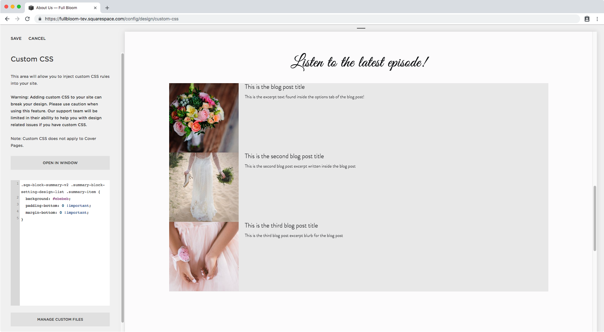
Perfect!
Now, since I’m going to have these rows stuck together, I think it’s going to look much better if I add an alternating background color (and also, not grey).
Alternating background color for List Summary Block items
To make this semi-automatic, I’m going to be using a pseudo-class (like :hover) called :nth-child() and I’m going to be using it to select all the ODD or EVEN children/items/rows in the block.
This way, as more episodes load in the summary block, they will be automatically colored depending on if they’re odd or even.
I already know what each row is called because it’s the same selector we used to set the same background (the #ebebeb) to all of them and to remove the margin and padding, so this is what my snippet will look like:
.sqs-block-summary-v2 .summary-block-setting-design-list .summary-item:nth-child(odd) {

}
And once I give that a background color, this will be the result:
.sqs-block-summary-v2 .summary-block-setting-design-list .summary-item:nth-child(odd) {
  background: #CCD1C9;
}
Alright, we’ll do the same thing for the even rows, we just need to switch odd for even in our selector and choose a different color.
.sqs-block-summary-v2 .summary-block-setting-design-list .summary-item:nth-child(even) {
  background: #DADED1;
}

Ok!
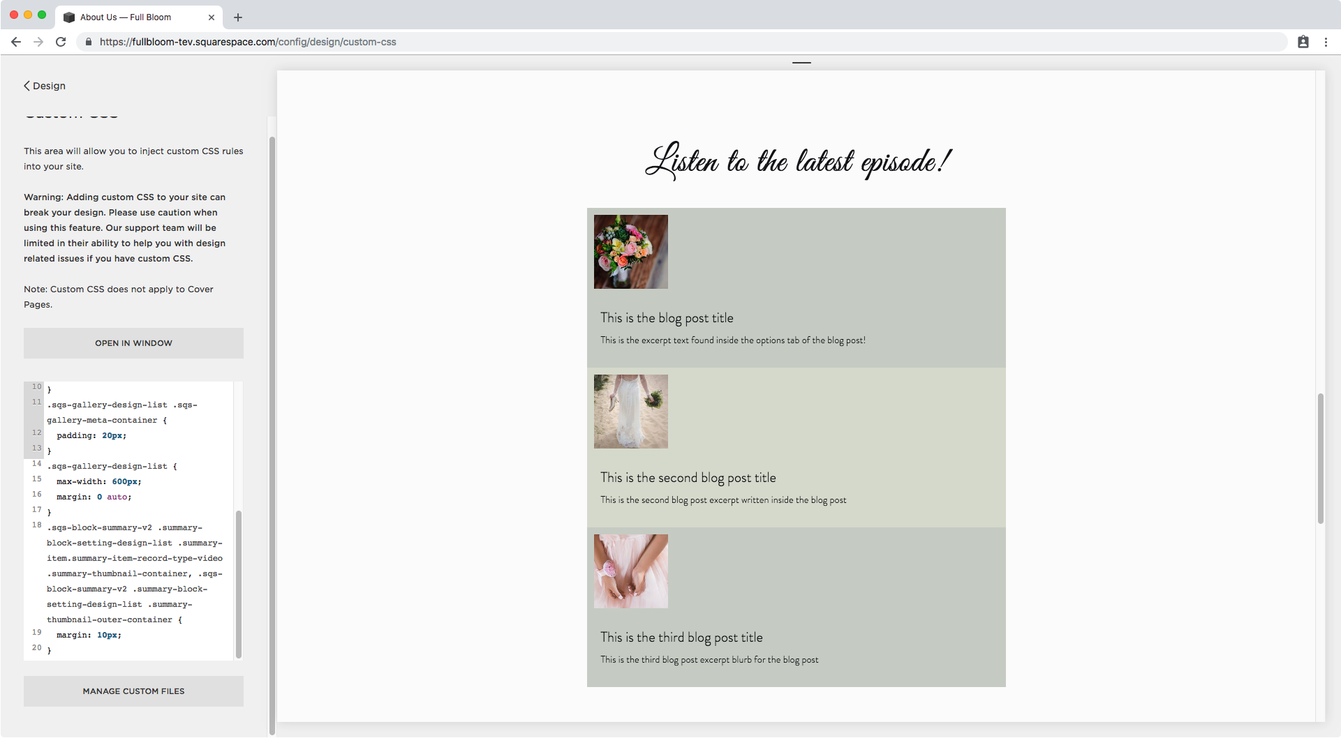
How about we add some padding to the content portion? It looks too close to the edge right now.
Looking through Inspect Element I can see the content has already been targeted and styles set for it, so I’m going to use that one instead of creating my own.

And I’ll give it about 20px of padding on all sides.
.sqs-gallery-design-list .sqs-gallery-meta-container {
  padding: 20px;
}

Nice!
Now, I feel the whole block is way too wide, so I could use spacers to shrink it down but I rather set a max-width so it adapts nicely to smaller screens without getting TOO narrow.
Let’s check what the entire container is called:

It has a bunch of classes but we don’t need them all so I’m going to use that last one .sqs-gallery-design-list and give it a max-width of 600px.
.sqs-gallery-design-list {
  max-width: 600px;
}

And to center it, I’m going to use margin: 0 auto;.
.sqs-gallery-design-list {
  max-width: 600px;
  margin: 0 auto;
}

This is looking great already!
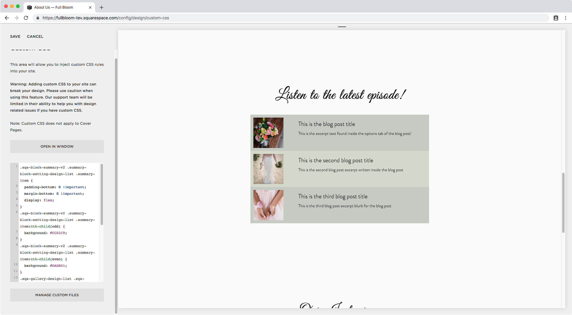
Let’s separate the images a bit from the borders. I’m going to give them an all around margin of 10px.
Through Inspect Element we can see there’s already a selector group we can use to target the thumbnail.

So let’s put that into our CSS window!
.sqs-block-summary-v2 .summary-block-setting-design-list .summary-item.summary-item-record-type-video .summary-thumbnail-container,
.sqs-block-summary-v2 .summary-block-setting-design-list .summary-thumbnail-outer-container {
  margin: 10px;
}
As you can see, adding that extra spacing made the content stack below the thumbnail.
To put it back in place, instead of adding a fixed width to it I’m going to be making the container holding both the thumbnail and the meta content flex.
This will make both elements sit nicely next to each other, and still let us adjust the size of the thumbnail through the block settings!
We already know what that container is called since we gave it the background color, so I’m going to go back into that snippet from before and set it to flex:
.sqs-block-summary-v2 .summary-block-setting-design-list .summary-item {
  padding-bottom: 0 !important;
  margin-bottom: 0 !important;
  display: flex;
}
Cool, right? However we have a slight issue on smaller screens…
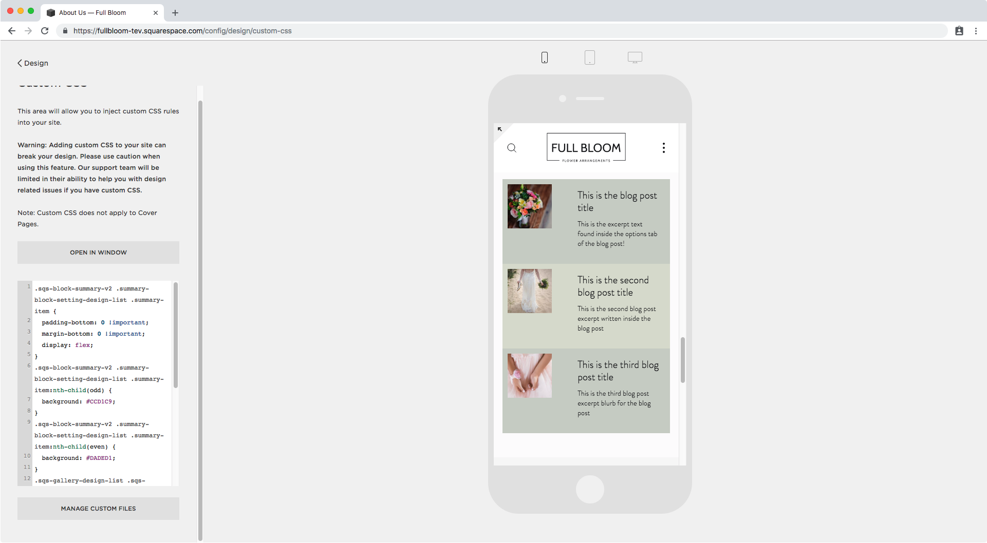
It’s not that big of a deal but I prefer to have the image and text center aligned horizontally, so I’ll go back to my flex container and make that happen through align-items:
.sqs-block-summary-v2 .summary-block-setting-design-list .summary-item {
  padding-bottom: 0 !important;
  margin-bottom: 0 !important;
  display: flex;
  align-items: center;
}

Yes, muuuuch better!
So you can leave the customization here, since you already have a nice looking list block, however I will be moving on to adding a couple more details that will make this list block look unrecognizable!
Adding a fake play button
Since this block is being customized for podcasts, its only logical to add some sort of button that has a play arrow or literally says play.
I’ll be creating the latter and placing it over the thumbnail.
I already know what the thumbnail is called since we added a margin around it, so I’ll be adding the extra play button to it through an ::after pseudo-element.
.sqs-block-summary-v2 .summary-block-setting-design-list .summary-item.summary-item-record-type-video .summary-thumbnail-container::after,
.sqs-block-summary-v2 .summary-block-setting-design-list .summary-thumbnail-outer-container::after {

}
As for the content I’ll make it say PLAY, set the font to bold, white, 14px in size, and also add a thin white border, a slightly transparent white background and make it round.
This is what that translates to:
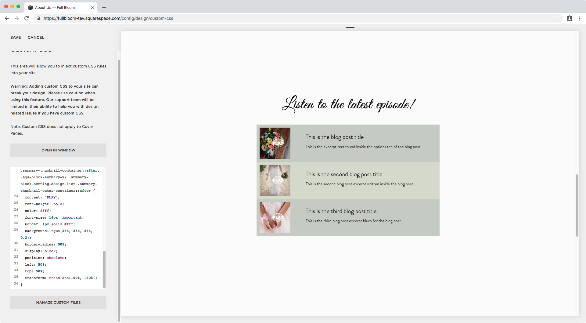
.sqs-block-summary-v2 .summary-block-setting-design-list .summary-item.summary-item-record-type-video .summary-thumbnail-container::after,
.sqs-block-summary-v2 .summary-block-setting-design-list .summary-thumbnail-outer-container::after {
  content: 'PLAY';
  font-weight: bold;
  color: #fff;
  font-size: 14px !important;
  border: 1px solid #fff;
  background: rgba(255, 255, 255, 0.3);
  border-radius: 50%;
}

I’ll be making it display block and changing its position to absolute to be able to move it on top of the image.
.sqs-block-summary-v2 .summary-block-setting-design-list .summary-item.summary-item-record-type-video .summary-thumbnail-container::after,
.sqs-block-summary-v2 .summary-block-setting-design-list .summary-thumbnail-outer-container::after {
  content: 'PLAY';
  font-weight: bold;
  color: #fff;
  font-size: 14px !important;
  border: 1px solid #fff;
  background: rgba(255, 255, 255, 0.3);
  border-radius: 50%;
  display: block;
  position: absolute;
}

Perfect, now we can move it.
We can set the left and top offset as 50%.
.sqs-block-summary-v2 .summary-block-setting-design-list .summary-item.summary-item-record-type-video .summary-thumbnail-container::after,
.sqs-block-summary-v2 .summary-block-setting-design-list .summary-thumbnail-outer-container::after {
  content: 'PLAY';
  font-weight: bold;
  color: #fff;
  font-size: 14px !important;
  border: 1px solid #fff;
  background: rgba(255, 255, 255, 0.3);
  border-radius: 50%;
  display: block;
  position: absolute;
  left: 50%;
  top: 50%;
}

And now let’s use transform to pull it both a bit upwards and to the left from where it is right now.
.sqs-block-summary-v2 .summary-block-setting-design-list .summary-item.summary-item-record-type-video .summary-thumbnail-container::after,
.sqs-block-summary-v2 .summary-block-setting-design-list .summary-thumbnail-outer-container::after {
  content: 'PLAY';
  font-weight: bold;
  color: #fff;
  font-size: 14px !important;
  border: 1px solid #fff;
  background: rgba(255, 255, 255, 0.3);
  border-radius: 50%;
  display: block;
  position: absolute;
  left: 50%;
  top: 50%;
  transform: translate(-50%, -50%);
}
Ok, let’s make it bigger by adding a fixed height, some padding and editing the line height.
.sqs-block-summary-v2 .summary-block-setting-design-list .summary-item.summary-item-record-type-video .summary-thumbnail-container::after,
.sqs-block-summary-v2 .summary-block-setting-design-list .summary-thumbnail-outer-container::after {
  content: 'PLAY';
  font-weight: bold;
  color: #fff;
  font-size: 14px !important;
  border: 1px solid #fff;
  background: rgba(255, 255, 255, 0.3);
  border-radius: 50%;
  display: block;
  position: absolute;
  left: 50%;
  top: 50%;
  transform: translate(-50%, -50%);
  padding: 10px;
  height: 33px;
  line-height: 2.2em;
}

Ok. There seems to be something going on, since the play button is not quite in the center of the image yet.
Looking through the backbone we can see there’s some padding to the right of the thumbnail so let’s get rid of it.

I’ll use the selector that we already have ready to use on the right side of the window.
.sqs-gallery-design-list .sqs-gallery-image-container {
  padding-right: 0;
}

Nice!
Lastly, I want to add pointer-events none to the button, since I don’t want it to be on the way of the clickable thumbnail.
So our fake play button snippet will now look like this:
.sqs-block-summary-v2 .summary-block-setting-design-list .summary-item.summary-item-record-type-video .summary-thumbnail-container::after,
.sqs-block-summary-v2 .summary-block-setting-design-list .summary-thumbnail-outer-container::after {
  content: 'PLAY';
  font-weight: bold;
  color: #fff;
  font-size: 14px !important;
  border: 1px solid #fff;
  background: rgba(255, 255, 255, 0.3);
  border-radius: 50%;
  display: block;
  position: absolute;
  left: 50%;
  top: 50%;
  transform: translate(-50%, -50%);
  padding: 10px;
  height: 33px;
  line-height: 2.2em;
  pointer-events: none;
}
Beautiful!
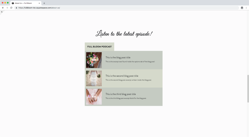
Adding a heading or label to the List Summary Block
To take this customization to the next level, I want to add a heading or a label to the top of the entire summary block to add the name of the podcast!
To do this, I’ll target one of the wrappers holding the episodes.

And I’ll create a pseudo-element for it that sits before the content of the block.
.summary-item-list-container.sqs-gallery-container::before {

}
As for the content, I’ll give it some text.
.summary-item-list-container.sqs-gallery-container::before {
  content: 'FULL BLOOM PODCAST';
}

Next, I’ll give it a background (the same as for the even rows) and some padding.
.summary-item-list-container.sqs-gallery-container::before {
  content: 'FULL BLOOM PODCAST';
  background: #DADED1;
  padding: 20px;
}

Depending on the style you’re after you can then set it as display: block; if you want it to span the full width of the block…
.summary-item-list-container.sqs-gallery-container::before {
  content: 'FULL BLOOM PODCAST';
  background: #DADED1;
  padding: 20px;
  display: block;
}

…or inline-block if you want it to look more like a tab.
.summary-item-list-container.sqs-gallery-container::before {
  content: 'FULL BLOOM PODCAST';
  background: #DADED1;
  padding: 20px;
  display: inline-block;
}

And finally, I’ll make the font bolder!
.summary-item-list-container.sqs-gallery-container::before {
  content: 'FULL BLOOM PODCAST';
  background: #DADED1;
  padding: 20px;
  display: block;
  font-weight: bold;
}

And here’s the final result!


Phew! That was a very long customization but oh so worth it!
Congratulations on making it ‘til the end, you rock!!
Until next time,
B.
Full code
/*LAYOUT & BACKGROUND COLOR*/
.sqs-block-summary-v2 .summary-block-setting-design-list .summary-item {
  padding-bottom: 0 !important;
  margin-bottom: 0 !important;
}
.sqs-block-summary-v2 .summary-block-setting-design-list .summary-item:nth-child(odd) {
  background: #CCD1C9;
}
.sqs-block-summary-v2 .summary-block-setting-design-list .summary-item:nth-child(even) {
  background: #DADED1;
}
.sqs-gallery-design-list .sqs-gallery-meta-container {
  padding: 20px;
}
.sqs-gallery-design-list {
  max-width: 600px;
  margin: 0 auto;
}
.sqs-block-summary-v2 .summary-block-setting-design-list .summary-item.summary-item-record-type-video .summary-thumbnail-container,
.sqs-block-summary-v2 .summary-block-setting-design-list .summary-thumbnail-outer-container {
  margin: 10px;
}
.sqs-block-summary-v2 .summary-block-setting-design-list .summary-item {
  padding-bottom: 0 !important;
  margin-bottom: 0 !important;
  display: flex;
  align-items: center;
}
.sqs-gallery-design-list .sqs-gallery-image-container {
  padding-right: 0;
}

/*FAKE PLAY BUTTON*/
.sqs-block-summary-v2 .summary-block-setting-design-list .summary-item.summary-item-record-type-video .summary-thumbnail-container::after,
.sqs-block-summary-v2 .summary-block-setting-design-list .summary-thumbnail-outer-container::after {
  content: 'PLAY';
  font-weight: bold;
  color: #fff;
  font-size: 14px !important;
  border: 1px solid #fff;
  background: rgba(255, 255, 255, 0.3);
  border-radius: 50%;
  display: block;
  position: absolute;
  left: 50%;
  top: 50%;
  transform: translate(-50%, -50%);
  padding: 10px;
  height: 33px;
  line-height: 2.2em;
  pointer-events: none;
}

/*TOP LABEL*/
.summary-item-list-container.sqs-gallery-container::before {
  content: 'FULL BLOOM PODCAST';
  background: #DADED1;
  padding: 20px;
  display: inline-block;
  font-weight: bold;
}