Adding an overlapping tilted text to an image (7.0 & 7.1 CE)
You’ve probably seen inspirational websites on Pinterest *cough* Showit sites *cough* that include images with overlapping titles or phrases, that look slightly tilted.
In Squarespace, you can absolutely achieve that look by simply adding the text to the image itself, and then using one of the image layouts to add the rest of the text.
But if you want to:
be able to change what that phrase says quickly and/or allow your client to do it without having to edit the image
or, be able to keep it readable on mobile
You may want to take a look at this CSS trick!
Tilting the title of the overlap image block
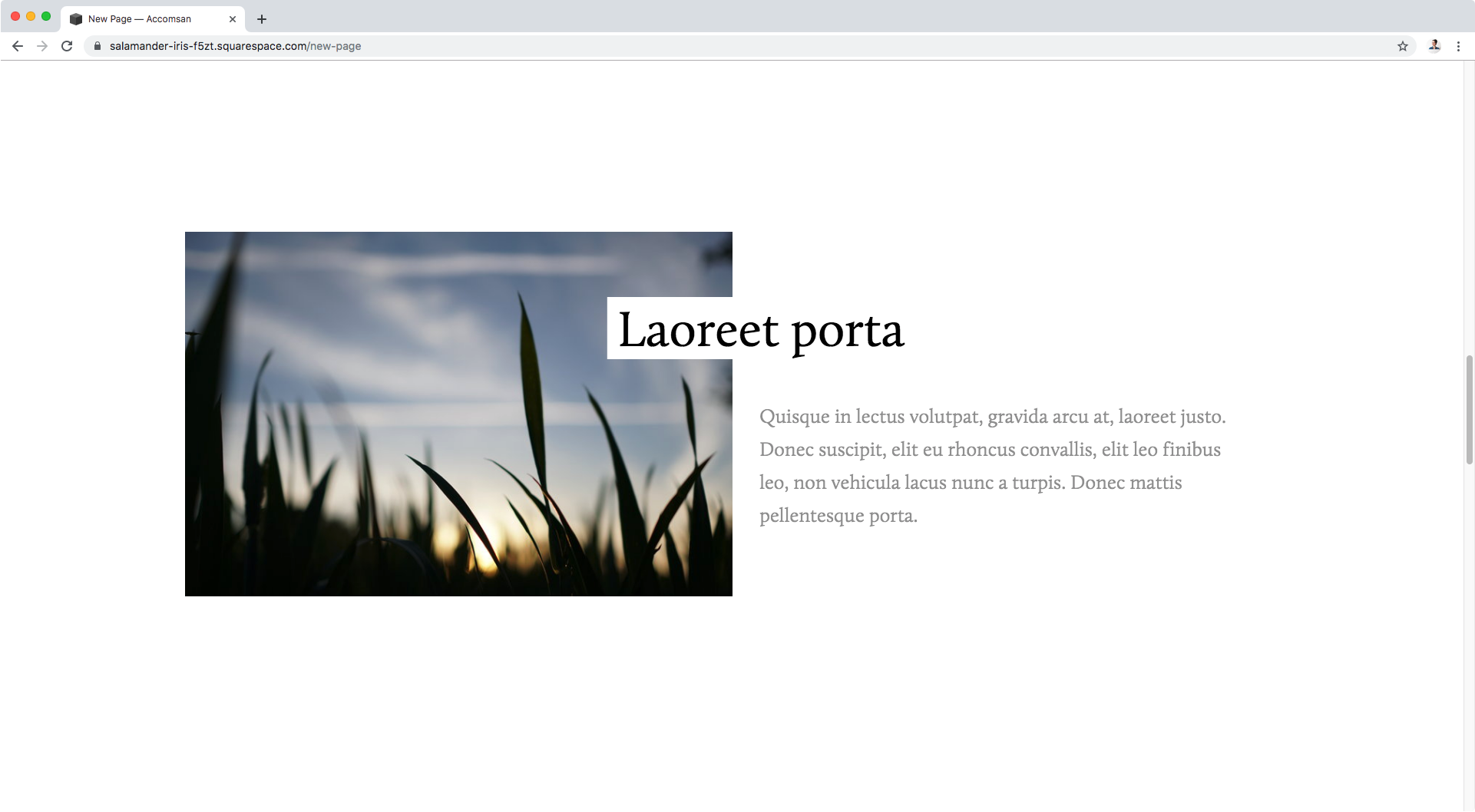
We’ll be starting out with an overlap image block that has a title and some text.
In case you’re curious, in the Site Styles, I’ve set the image to 50% width, the title to overlap 25% and an 8% separation.
Now, we need to find what our overlap image block is called so we can make sure to target either ALL overlap blocks on the site.
Note: you can always do ALL inside the same page or section by finding the page ID or index section ID
So, if we look inside our Inspect Element tool we can see that our image block has a couple of classes including one aptly called .image-block
That’s too general, all the other image blocks (regardless of the layout) have that same class so we’re not being specific enough. We need to find a class that refers to this overlap layout specifically.
Note: if you just want to tilt the text on ONE or very specific overlap blocks on your site, then you can use the block ID instead! You can see it right there in the inspect element window above, the one for his specific image would be #block-yui_3_17_2_1_1560455222510_3738. I won’t be using a block ID so I’ll keep going. If you choose to go the block Id route, you can pop yours in your Custom CSS window and jump to when we start looking for the title class!
If we take a look inside that .image-block container (grey), we can see there’s another one (blue) that has a chunk of different classes.
Within all those names, there’s one called .design-layout-overlap that seems specific enough for our customization!
Ok, let’s start building our selector:
.design-layout-overlap {

}
Ok! Now we know we’re targeting only the overlap image blocks, but we don’t want to tilt the whole thing, we just want to tilt the title.
So, that means we now have to look for what the title is called.
Diving back into our Inspect Element window and looking within the containers inside our previous one, we can see the one that holds all of the “text” side of our image:
Inside that one, if we keep looking we’ll find the title container with a class of .image-title
And inside that wrapper, we notice our actual title text is sitting inside a p element.
But, since the p element isn’t specific enough, we’ll be targeting it along with the parent container class .image-title to clearly indicate to our browser “hey, we want to alter ONLY the title of the overlap images, that’s the p element inside .image-title”.
.design-layout-overlap .image-title p {

}
Alright! We’re good to go!
To achieve our tilt, we’re going to need the transform property and its rotate( ) function to help us.
I’ll set my tilt to -6deg:
Aaaaand nothing happened.
If we check our p element inside our Inspect Element again, we’ll notice that currently it’s an inline element.
Without getting into too much detail, the problem is that the transform property doesn’t work with ALL types of inline element (you can read more about it here).
So, in this case, what we can do is change our p element display to inline-block. Note we’ll need to use !important to override the current value.
.design-layout-overlap .image-title p {
  display: inline-block !important;
  transform: rotate(-6deg);
}
Look at that!!
Our title is now tilted!
Now, depending on your browser, and if you’re using a color behind your text, you may notice the edges of the background are a little bit jagged.
To fix it, we can include a property called backface-visibility which is incredibly useful to fix these glitches that happen when using the transform property. You can read more about that here!
.design-layout-overlap .image-title p {
  backface-visibility: hidden;
  display: inline-block !important;
  transform: rotate(-6deg);
}
Beautiful!
Let’s check out the result in full screen:
Nice! And as you can see below, the text is editable as usual:
Keep in mind this “tiltness” is also being displayed on smaller screens:
You can leave it like that OR, wrap your entire snippet inside a media query for screens bigger than 640px, so the title remains horizontal only on phones!
@media screen and (min-width: 640px) {
  .design-layout-overlap .image-title p {
    backface-visibility: hidden;
    display: inline-block !important;
    transform: rotate(-6deg);
  }
}
That’s it!
I hope you found this useful.
Until next time,
B.
Full code
/*TILTING OVERLAP IMAGE BLOCK TITLE ON TABLETS AND DESKTOP*/
@media screen and (min-width: 640px) {
  .design-layout-overlap .image-title p {
    backface-visibility: hidden;
    display: inline-block !important;
    transform: rotate(-6deg);
  }
}


