Adding an overlapping image or logo to your footer in Brine (7.0)
In a previous tutorial we tackled how to make a logo overlap both our navigation and page banner.
And today, we’ll be looking at how to make it overlap our footer!
This CSS trick is great for designs where you want to add an image, icon, logo or any other sort of detail to the footer of your client’s site, without having to stay within its boundaries.
Let’s jump right into it, shall we?
Overlapping an image on the Brine template footer
I’m starting out with the Brine template and a pretty simple footer that I gave a background color through the Style Editor.
The goal is to add an image or logo that is half over the footer and half over the page.
To get there we can use our loyal friend the pseudo-element, since it will allow us to “attach” our image to a container, making it easier to keep it in place at all times.
So, let’s go ahead and look for a way to target our footer container to get started.
As you can see, our footer container is a footer element with a class of .Footer:
Let’s head over to our custom CSS window and use that to target it!
.Footer {

}
Ok, now it’s time to create our pseudo-element.
I’ll be using a ::before pseudo-element and setting it up as an empty container with a height and width of 100px:
.Footer::before {
  content: '';
  height: 100px;
  width: 100px;
}
And now, I’ll be adding a logo I previously uploaded through the “Manage Custom Files” button as a background-image
.Footer::before {
  background-image: url(https://static1.squarespace.com/static/5ced253de3cf090001e8017e/t/5d77a536f455f4647c54b991/1568122166263/Logo.png);
  content: '';
  height: 100px;
  width: 100px;
}
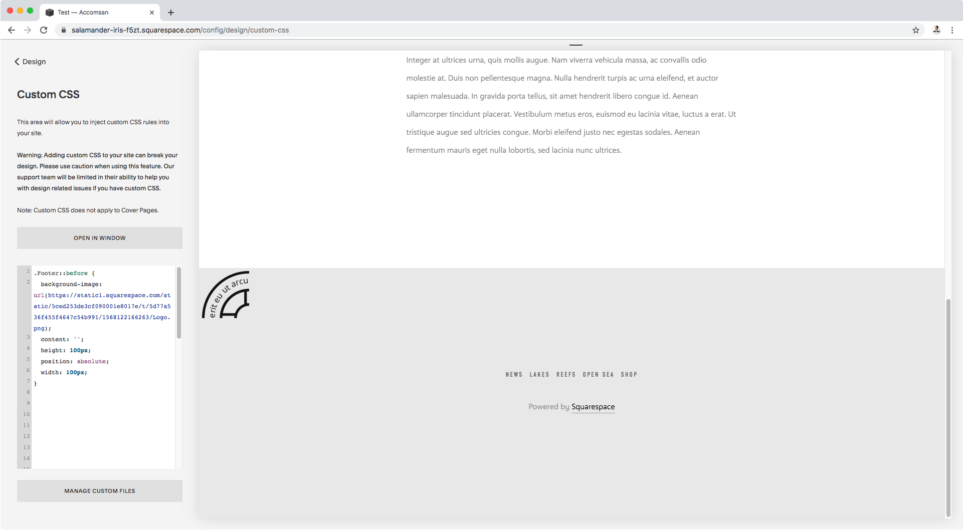
We can’t see anything right now, but we will in a second.
Let’s give our pseudo-element a position of absolute to be able to both see it, and move it into position.
.Footer::before {
  background-image: url(https://static1.squarespace.com/static/5ced253de3cf090001e8017e/t/5d77a536f455f4647c54b991/1568122166263/Logo.png);
  content: '';
  height: 100px;
  position: absolute;
  width: 100px;
}
It looks cropped because the actual image is bigger than the container we created for it.
No biggie! Let’s set the background-size to contain so the image resizes itself to fit the given container space (100px x 100px).
.Footer::before {
  background-image: url(https://static1.squarespace.com/static/5ced253de3cf090001e8017e/t/5d77a536f455f4647c54b991/1568122166263/Logo.png);
  background-size: contain;
  content: '';
  height: 100px;
  position: absolute;
  width: 100px;
}
Great! We have our image on our page.
Note: I got the icon in the middle from icon finder, in case you’re interested!
From here, you can decide where to position it.
I’ll place mine in the center, horizontally, and half between the footer and the page, therefore I’ll start by setting the left offset to 50% to push it towards the middle.
.Footer::before {
  background-image: url(https://static1.squarespace.com/static/5ced253de3cf090001e8017e/t/5d77a536f455f4647c54b991/1568122166263/Logo.png);
  background-size: contain;
  content: '';
  height: 100px;
  position: absolute;
  left: 50%;
  width: 100px;
}
It’s not quite in the center but we’ll take care of that in a minute.
First, let’s make sure it’s aligned to the top of the footer by setting the top offset to 0.
.Footer::before {
  background-image: url(https://static1.squarespace.com/static/5ced253de3cf090001e8017e/t/5d77a536f455f4647c54b991/1568122166263/Logo.png);
  background-size: contain;
  content: '';
  height: 100px;
  position: absolute;
  left: 50%;
  top: 0;
  width: 100px;
}
It looks like the logo disappeared.
But in fact, if we scroll higher up the page…
We’ll see our logo hanging out with our navigation.
That’s because, even when we’ve “attached” our pseudo-element to our footer, since we set the former to position absolute, we need to make sure the latter is acting as its point of reference.
Right now, there’s a different parent/ancestor container other than our footer container (we don’t really care which one) that’s acting as the guideline to determine where that “top” is.
Let’s change that.
Without going into too much detail, we’ll simply need to give a position: relative to our footer container, so it becomes the new reference for the position of our logo.
.Footer {
  position: relative;
}
And just like that, our logo’s top: 0 is the top edge of our footer container.
Alright, let’s finish placing our icon by using the transform property and use the translate() function with -50% to pull it slightly to the left so it sits in the dead center of the screen, and nudge it -50% upwards so it sits between the page and the footer area.
.Footer::before {
  background-image: url(https://static1.squarespace.com/static/5ced253de3cf090001e8017e/t/5d77a536f455f4647c54b991/1568122166263/Logo.png);
  background-size: contain;
  content: '';
  height: 100px;
  position: absolute;
  left: 50%;
  top: 0;
  transform: translate(-50%, -50%);
  width: 100px;
}
Done!
Let’s check this on all screens to see how it stays in place with this approach.
Now, before I let you go I have one last tip!
Just to make sure your image doesn’t get in the way of anything clickable behind it (especially if you have it overlapping content or something else), set the pointer-events property to none in your code!
This will stop any sort of interaction with the image and allow you to click anything that sits behind it.
.Footer::before {
  background-image: url(https://static1.squarespace.com/static/5ced253de3cf090001e8017e/t/5d77a536f455f4647c54b991/1568122166263/Logo.png);
  background-size: contain;
  content: '';
  height: 100px;
  pointer-events: none;
  position: absolute;
  left: 50%;
  top: 0;
  transform: translate(-50%, -50%);
  width: 100px;
}
There you have it!
Now go add stuff to your footer!
Until next time,
B.
Full code
.Footer {
  position: relative;
}
.Footer::before {
  background-image: url(https://static1.squarespace.com/static/5ced253de3cf090001e8017e/t/5d77a536f455f4647c54b991/1568122166263/Logo.png);
  background-size: contain;
  content: '';
  height: 100px;
  pointer-events: none;
  position: absolute;
  left: 50%;
  top: 0;
  transform: translate(-50%, -50%);
  width: 100px;
}


