How to create a low highlight behind your text (7.0, 7.1 CE & 7.1 FE)
Wondering how to create that cool low highlight that you see behind headings and links all around the interwebs? Then keep reading 'cause I'm gonna show you how to nail it!
We're going to be adding the highlight background to one word in a heading, to the entire heading and to links inside the body text so you can get a pretty broad idea of how to set it up.
Adding a low highlight to one word of your heading
Let's say you want to add a nice big h1 to your homepage and highlight just one word, it's going to say: "This is my awesome heading" with the word awesome highlighted.
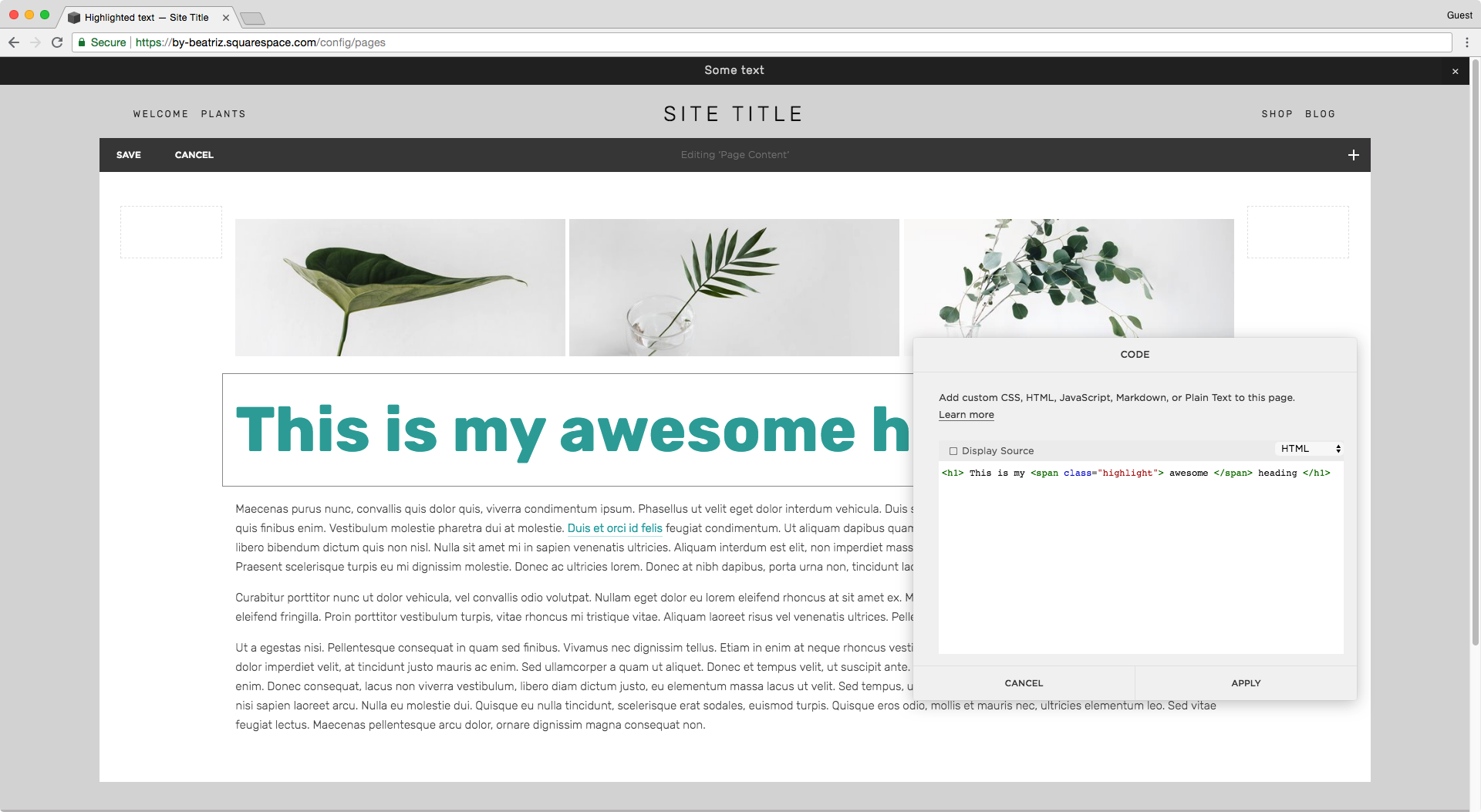
Since we need to target just ONE word, we need to create the h1 inside a code block like so:
<h1> This is my awesome heading </h1>
Next, we're going to surround our chosen word with a span tag:
<h1> This is my <span> awesome </span> heading </h1>
This way, we're going to be able to give our word a specific class we can target through CSS to style it however we like! I'm naming mine .highlight
<h1> This is my <span class="highlight"> awesome </span> heading </h1>
Pro tip: you can use id instead of class if you're not going to use the highlight class more than once per page. I rather keep it as class since I tend to change my mind and apply the same style everywhere!
Perfect! Now, we can hop onto our Custom CSS window and style away.
And here's the trick to achieve that highlight effect: we'll use a gradient background!
Let's target our class
.highlight {
}
Now, let's set the background property with the linear-gradient function (I talk more about it in this tutorial to add half backgrounds to index sections)
Briefly, what we're going to set is the angle to 180 degrees so the "gradient" is horizontal, make the first color transparent and set it to half the background, and add the color of our choice as the other half.
.highlight {
  background: linear-gradient(180deg,rgba(255,255,255,0) 50%, #FFD0AE 50%);
}
Ta-dá! That's all there is to it.
Pro tip: to display more or less of the highlight, play with the coverage percentages (50%) but make sure that you set both to the same number to avoid a blurry line, unless that's what you're going for!
Adding a low highlight to your entire heading
If you don't want to highlight just one word but the entire phrase, then you can either:
A. Keep using the code block and add the class to the h1 instead, and remove the span
<h1 class="highlight"> This is my awesome heading </h1>
B. If you're using an index page, stick with Squarespace's heading dropdown and target it through the section's url to give it the background style! It will look something like this in your Custom CSS window:
#sectionurl h1 {
  background: linear-gradient(180deg, rgba(255,255,255,0) 65%, #FFD0AE 65%);
}
C. If you want to do it across your entire site, simply add the background to all your headings 1, 2 or 3
h1 {
  background: linear-gradient(180deg, rgba(255,255,255,0) 65%, #FFD0AE 65%);
}
Regardless of the path you choose, you may find yourself with a little problem when doing this:
As you can see in the images above, the background highlight is expanding beyond the actual text and just appearing behind the last word when the heading breaks into two lines.
The issue here is that your h1 is set as a block level element, therefore your browser is considering the width of the entire container as the guide for the background size.
What we need to do is switch it to display: inline; so it uses the content – the heading itself – as the guide to place the background and set its width.
h1 {
  background: linear-gradient(180deg, rgba(255,255,255,0) 65%, #FFD0AE 65%);
  display: inline;
}
There we go!
Adding a low highlight to your links
If you choose to highlight the links across your entire site, then you'll need to do something very similar to option C above, and target your elements like so:
a {
  background: linear-gradient(180deg, rgba(255,255,255,0) 65%, #FFD0AE 65%);
}
However, this adds the highlight to ALL links on your site, so if you want to limit it to just your copy links, simply indicate that you're targeting all links that are inside a paragraph element, like so:
p a {
  background: linear-gradient(180deg, rgba(255,255,255,0) 65%, #FFD0AE 65%);
}
Good!
I'll also remove the underline from the body links that Squarespace automatically adds as a bottom border.
p a {
  background: linear-gradient(180deg, rgba(255,255,255,0) 65%, #FFD0AE 65%);
  border-bottom: none !important;
}
And there you go! Now you can add a low highlight to the text on your site to make it stand out and match your brand.
Until next time,
B.


