
Creating half, angled and floating effect backgrounds in Brine (7.0)

If you’re using one of Brine templates, or pretty much any other template in Squarespace, you’re most likely wanting to make the best out of their banner sections.
These can be used in many creative ways to add an extra touch of “huh… I wonder how they did that?“ and to create the oh so desired illusion of making images FLOAT over another index section.
So, in today’s post we’ll be looking at how you can create half backgrounds and angled backgrounds for Brine banners with and without parallax, as well as looking at the simplest way to create the illusion of blocks floating over another index section.
Let’s get to it!
Creating angled backgrounds in Squarespace
First thing’s first, we need a banner.
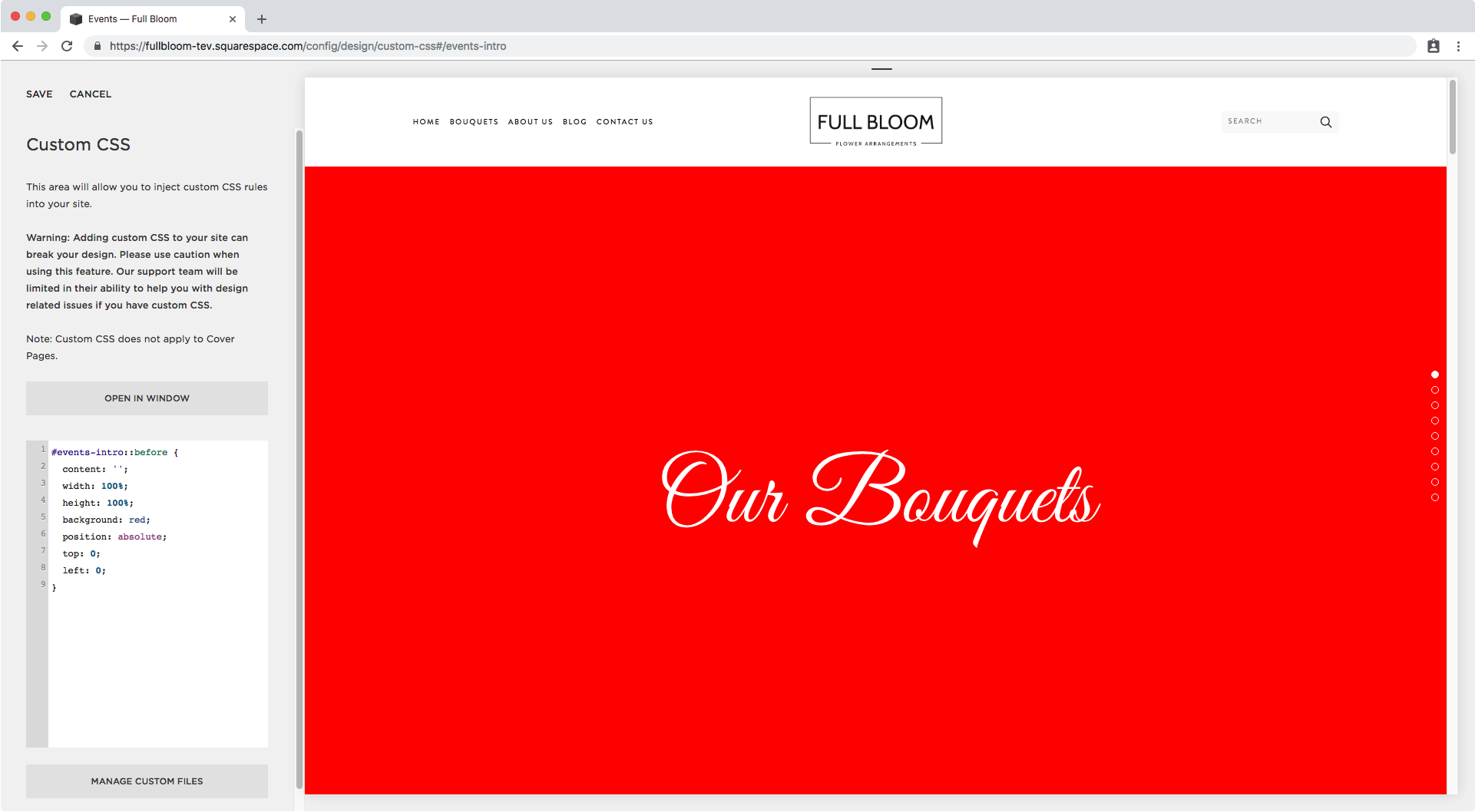
I’m working with one of Brine’s templates, have parallax on and have a nice background image inside a section called #events-intro.

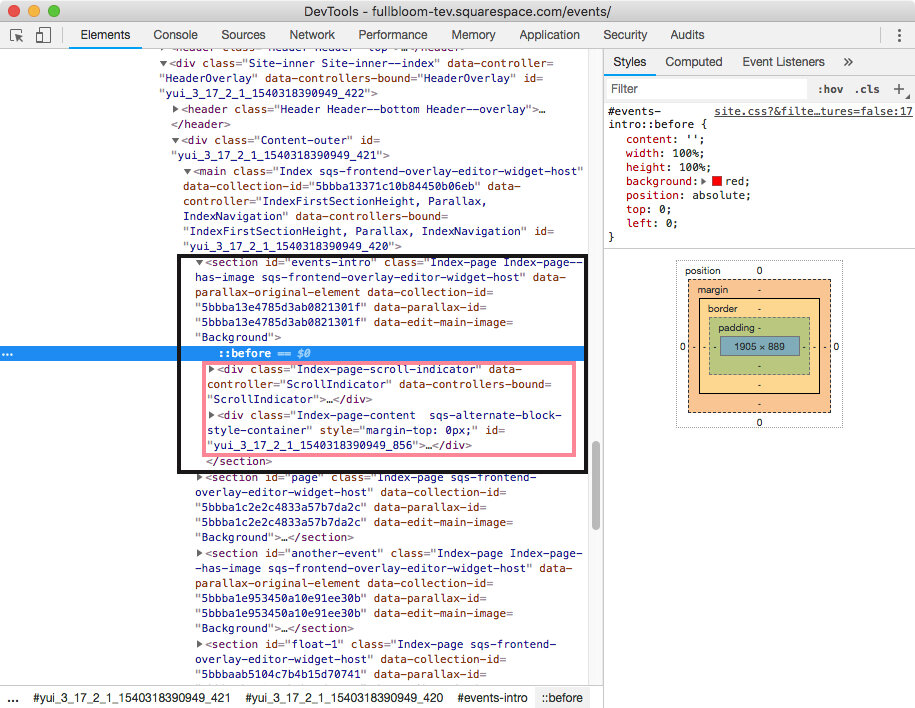
In my Custom CSS window, I’m going to be targeting that section’s ID to create an overlay over it that includes a background gradient with an angle that matches the color of my next section.
You’ll see what I mean in a second.
To add that overlay, I’ll be using what you’ve probably seen before in this blog: pseudo-elements.
As always, don’t let the name scare you! They’re pretty darn useful and pretty easy to use!
I’ll be creating a ::before pseudo-element, so I’ll be targeting it like this:
#events-intro::before {

}
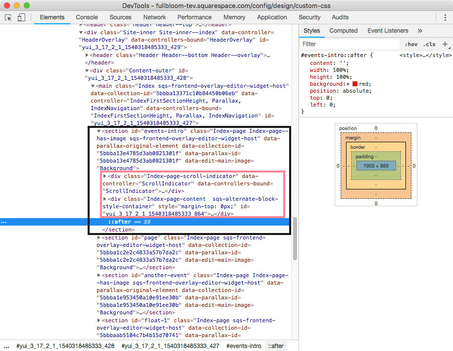
Note: we could use an ::after pseudo-element instead, but we’ll talk about some things to consider when choosing which one to use at the end of this post.
And then I’ll start by adding my content property.
This time I’m leaving it blank because I want to create an empty container.
#events-intro::before {
  content: '';
}

Then, I want to make it take the entire width and height of the section I’m building it on, so I’ll set both properties to 100%.
#events-intro::before {
  content: '';
  width: 100%;
  height: 100%;
}

We can’t see anything right now, so let’s give it a random color…
#events-intro::before {
  content: '';
  width: 100%;
  height: 100%;
  background: red;
}

…and give it a position of absolute so it stacks on top of the banner.
#events-intro::before {
  content: '';
  width: 100%;
  height: 100%;
  background: red;
  position: absolute;
}

Alright! Now I’m going to set the top and left offsets to 0, just to make sure the overlay starts in the top-left corner.
#events-intro::before {
  content: '';
  width: 100%;
  height: 100%;
  background: red;
  position: absolute;
  top: 0;
  left: 0;
}
Oki doks!
It’s time to create our angle.
To do this, we’ll be using the linear-gradient function to create a gradient that has a straight line. This way it will look like a solid angle instead of a blurry gradient.
I already know that based on how I want my angle to look, I need to set it to 177deg, make the first color transparent and the second one the same off-white of my next section.
As for the coverage percentage of each, they’ll both be around 87%.
Note: the coverage percentages for each color (87% for transparent and 87.2% for the off-white) are not exactly the same number because since we’re setting the break at an angle, it looks jagged if we do it that way. Therefore, using a .1 or .2 difference makes the angle line look straight and smooth.
All of this translated into code means:
#events-intro::before {
  content: '';
  width: 100%;
  height: 100%;
  background: linear-gradient(177deg, rgba(255, 255, 255, 0) 87%, #fcfcfc 87.2%);
  position: absolute;
  top: 0;
  left: 0;
}

Nice!
Here’s what our angle looks like on different screen sizes:


Creating half backgrounds in Squarespace (v 2.0)
The method for doing this is pretty much the same as before.
We have to select our banner image section, create a pseudo-element for it and set it up with a linear-gradient background.
I’m going to start with a section called #another-event that has some text aligned to the left.

Let’s set up an ::after pseudo-element this time (at the bottom of this post I’ll walk you through the difference between using one and the other), and set it exactly the same as last time:
#another-event::after {
  content:'';
  width: 100%;
  height: 100%;
  background: red;
  position: absolute;
  left: 0;
  top: 0;
}

Now this time, since what we want is a half vertical background, I’ll be setting the linear-gradient to a 90 degree angle, and make the first half white but slightly transparent, and the second half completely transparent, both meeting at 50%.
#another-event::after {
  content:'';
  width: 100%;
  height: 100%;
  background: linear-gradient(90deg, rgba(255, 255, 255, .9) 50%, rgba(255, 255, 255, 0) 50%);
  position: absolute;
  left: 0;
  top: 0;
}

Awesome!
But how about we change the text color to make it readable. I’ll turn it black by targeting both the paragraph text and the h1 title inside the #another-event section.
#another-event h1,
#another-event p {
  color: #000;
}

Beautiful! This is the final result in desktop.

However in both tablet and phone screens we should make some adjustments.
In tablets, the heading goes over the white portion…

So I’ll set a media query that reduces the size so it stays in place.
@media screen and (max-width: 960px) {
  #another-event h1 {
    font-size: 50px;
  }
}

Alrighty! And then on phones…

I’m simply going to cover the entire background with the white overlay, so I’ll set another media query.
@media screen and (max-width: 640px) {
  #another-event::after {
    background: rgba(255, 255, 255, 0.9);
  }
}

Perfect!!
Creating a floating effect over index sections
Don’t lie, you came here for this particular section didn’t you?
I’m not judging! I absolutely love this effect so I can’t wait to share it with you.
Now, keep in mind this is the simplest way to do it – albeit not the best for all cases – and it may not work 100% for your case depending on the layout you’re working with, because the elements may shrink or expand on smaller devices making the background readjust.
However, don’t let that stop you from giving it a shot!
Ok, so I pretty much already spoiled the secret method there.
We’re going to be using, once again, that linear-gradient function to create the illusion that your Squarespace blocks are floating over two index sections.
In this case we need to adjacent index sections. Mines are called #float-1 and #float-2 as you can see below.

We’ll be using the exact same styles we applied before setting it as a ::before for our topmost section.
#float-1::before {
  content: '';
  width: 100%;
  height: 100%;
  background: red;
  position: absolute;
  top: 0;
  left: 0;
}

And now we’re going to switch up the red color for our gradient.
This time, I’m setting the angle to 180 degrees so we get a straight horizontal line and making 70% of the area grey and the rest transparent.
#float-1::before {
  content: '';
  width: 100%;
  height: 100%;
  background: linear-gradient(180deg, #ebebeb 70%, rgba(255, 255, 255, 0) 70%);
  position: absolute;
  top: 0;
  left: 0;
}

Awesome! So here’s what that looks like on desktop.

I want to make a little adjustment to the spacing between both images, reduce it a bit, so I’ll be removing the top padding of the bottom section – aka the green bar shown below.
To do that I’ll simply target the container of the content of that section (.Index-page-content) and set it to 0.
#float-2 .Index-page-content {
  padding-top: 0;
}

Nice!
And just like that we created our own super easy floating effect for our image block between index sections!


Where to place these banner overlays or backgrounds
Major geek-out alert: even when it’s a good idea to know how this overlay thing works so you can avoid time-consuming issues, you can skip this next section and call it a day if you want since it gets pretty nerdy.
Depending on the overlay/background you’re creating you can use either the ::before or the ::after pseudo-element.
It all depends on the existing HTML structure you’re working with.
Since your goal in any of these cases is to have your overlay ON TOP of your image but BEHIND your section content, you have to consider the position of those two elements in the backend of your site.
I’m going to walk you through 3 different cases: when using parallax, when not using parallax, and when not having a banner image at all.
If you have a banner image with parallax
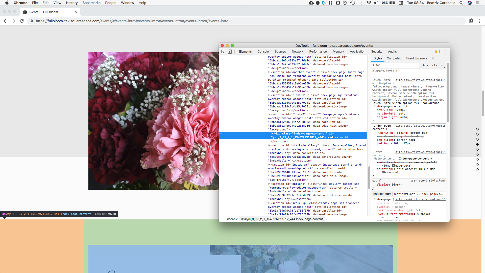
If we use our Inspect Element tool to check our first example here’s what we’ll see:

That ::before that’s highlighted is our overlay.
Taking a closer look we can see that its placed right before or behind the rest of the elements (in pink) of our section (in black).
However, what we’re not seeing amongst those elements is the container for our background image.
When we use parallax in one of the Brine templates, Squarespace sets that image higher up the code, outside of our chosen section. Therefore, it’s always going to be behind anything else we add in our section, including our ::before overlay.
Keep in mind that whatever is lower down your HTML code, gets to be more IN FRONT than the previous element – although this can change based on the CSS properties you use to style each of them.
So, in the case of this parallax banner, we could also use the ::after pseudo-element to create our overlay.
This is what our code would look like through Inspect Element:

Taking a closer look we can now see that our ::after sits in front of the rest of the elements (pink) of our section (black), which teeeeechnically would mean that we shouldn’t be able to see the title or anything else we have there, because our overlay should be covering it.
However… If we investigate a little bit deeper, we can see that our .Index-page-content element – aka the container holding all our blocks inside that section – has a z-index of 2.

This means is being purposefully brought to the front, leaving our ::after to sit behind it, even when structure-wise it should be in front.
Hey, I told you this section was going to get super nerdy but I mean, come on, CSS is awesome isn’t?
Ok, let’s move onto what happens if you DON’T have parallax activated.
If you have a banner image without parallax
I already mentioned that Squarespace moves the image element of parallax banners higher up the code because well… it’s just how it works for them.
However, when you DON’T have parallax turned on, things change a bit.
Here’s the same example from before but with parallax turned off.
In this case I’m still using the ::before pseudo-element to create the overlay which is again set to red.

Huh… curious right? It’s there, highlighted inside the Inspect Element window, but we can’t see it over the image.
Let’s zoom in…

Ok so, it seems like we have a new element inside our pink frame.
The figure element appeared and it’s the one carrying our image!
Which means that now our ::before is BEHIND our image, so that’s why we can’t see it.
In this case there are two things we can do: 1) give our pseudo-element overlay a z-index that brings it to the front of the image but keeps it behind our content; or 2) use an ::after instead.
If we take route #1, we can set the z-index as 1 since we already know that our .Index-page-content container – again, the one holding all our blocks in that section – was set to 2.
#events-intro::before {
  content: '';
  width: 100%;
  height: 100%;
  background: red;
  position: absolute;
  top: 0;
  left: 0;
  z-index: 1;
}

And if we take route #2, we don’t need to set the z-index! We can just switch before for after.
Let’s see what happens.

We immediately see our overlay hanging there all nice and bright.
If we zoom in…

We can see that our ::after is now IN FRONT of our figure element – our banner image – yet since our .Index-page-content has been brought forward through that z-index we saw previously, our ::after is not covering it.
If you’re not using a banner image
Last but not least, let’s see what happens if we’re not using a banner image at all.
In the floating-images-over-background section we worked with a plain index section that did not have an image as the background, so let’s bring up that example again.
If we have our overlay/background thingy set as a ::before, this is what we’ll see in our code:

We have our bright red background sitting behind the container of the blocks (pink) of our entire section (black).
So nothing’s being covered!

But what happens if we switch this to an ::after?
Want to guess?
As it turns out, the result is… unusual.
We have part of our image block covered but the other part sits in front of the red background.

If we take a closer look…


We can see that our ::after should be covering everything inside the block container.
But, as you may recall from one of our previous cases, the z-index property is very sneaky.
And that’s what’s making this weirdness happen here too.
This particular Squarespace block – the collage image layout – gives the text portion of the block a z-index of 2 so it sits in front of the image.
That’s why, in this case, we can see the text through the red background even when we can’t see the image itself!
So, once again we have two options here: 1) adding a z-index to the container of the blocks of our section so we can push everything inside it forward or, 2) keep using the ::before instead of the ::after.
By taking route #1, what we need to do is target the entire container (so .Index-page-content) and give it a z-index of 1 – it’s not necessary to make it bigger than that – and set its position to relative since you CAN’T add a z-index to an element that doesn’t have a declared position.

And if you take route #2, you just need to switch ::after for ::before and you’re done!
Phew, this was a long one! (TWSS)
But I hope this helps you add those super cool angles and floating effects you were after!
Until next time,
B.
Full code
/*ANGLED BANNER*/
#your-url-slug::before {
  content: '';
  width: 100%;
  height: 100%;
  background: linear-gradient(177deg, rgba(255, 255, 255, 0) 87%, #fcfcfc 87.2%);
  position: absolute;
  top: 0;
  left: 0;
}
/*HALF BANNER*/
#your-url-slug::after {
  content:'';
  width: 100%;
  height: 100%;
  background: linear-gradient(90deg, rgba(255, 255, 255, .9) 50%, rgba(255, 255, 255, 0) 50%);
  position: absolute;
  left: 0;
  top: 0;
}
@media screen and (max-width: 640px) {
  #your-url-slug::after {
    background: rgba(255, 255, 255, 0.9);
  }
}
/*FLOATING INDEX SECTIONS*/
#your-top-section-url-slug::before {
  content: '';
  width: 100%;
  height: 100%;
  background: linear-gradient(180deg, #ebebeb 70%, rgba(255, 255, 255, 0) 70%);
  position: absolute;
  top: 0;
  left: 0;
}
#your-bottom-section-url-slug .Index-page-content {
  padding-top: 0;
}