
Adding a hover mode to your menu items (Brine 7.0)
The simplest way to add a customization to your header in Squarespace is by adding some type of decoration to the menu links that pops up on mouseover.
You can do this by adding a line at the bottom or the top, making the font change color, lifting the text slightly, etc.
In today’s post, we’ll be looking at how you can add three different types of subtle hover mode to your menu items with some simple CSS!
Let’s get to it.
Adding an underline to your menu links on hover
You may already know that by simply using text-decoration: underline you’re able to add well… an underline to any text on your site.
However, if we want to adjust it in terms of color, size, position, and use it as a hover mode, it’s best if we use pseudo-elements instead.
Don’t let that word scare you because it’s actually pretty simple to set up!
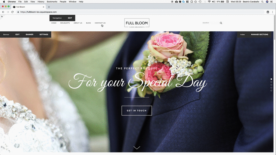
First, let’s find out what our menu links are called.
I’m using a template from the Brine family so if you’re using a different one, make sure to check which class you need to use by right-clicking over it.
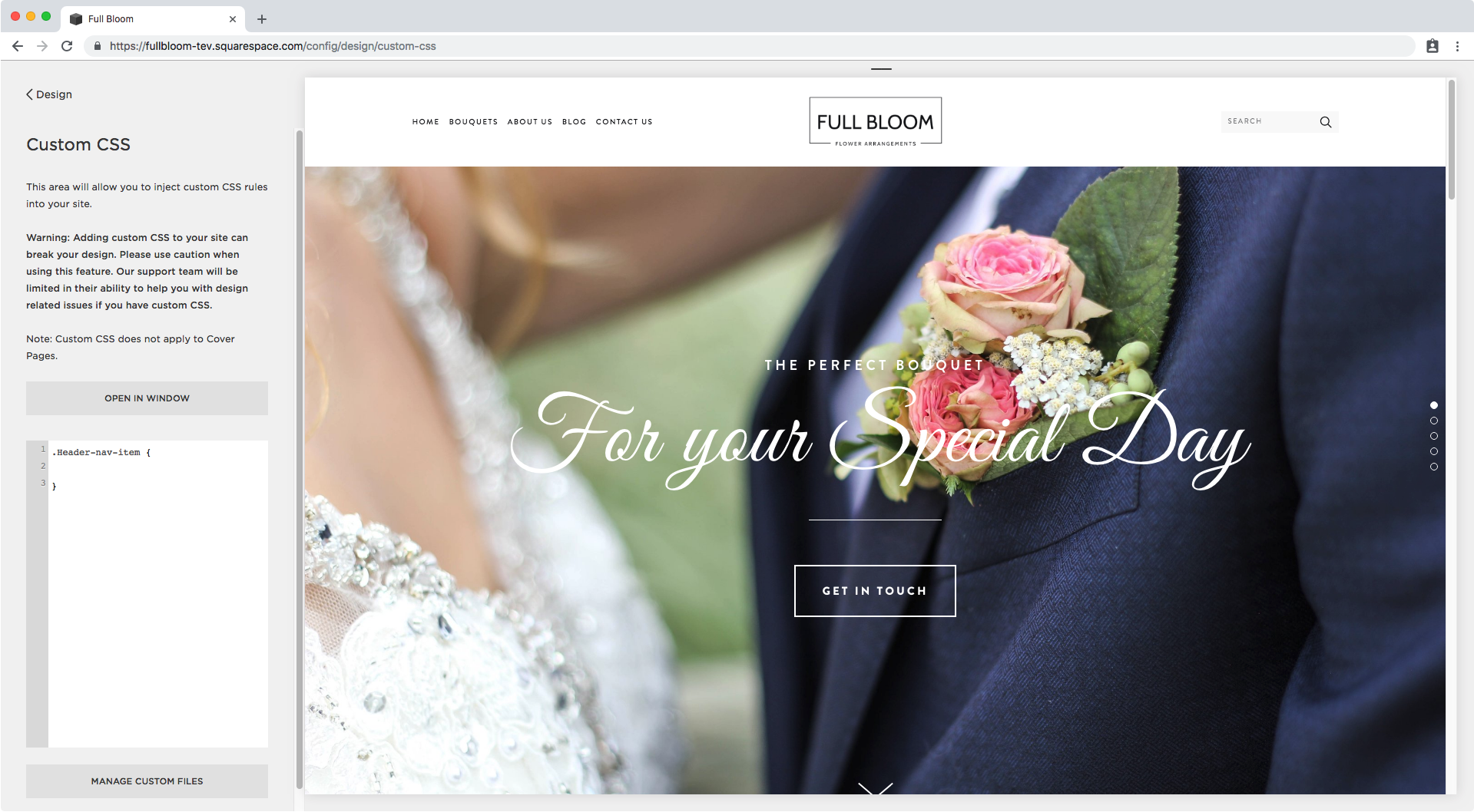
Here we have that our links have a class of .Header-nav-item so we’ll be using that. Let’s pop it into our Custom CSS window:
Perfect, now it’s time to create our underline through a pseudo-element.
Since we’re placing it below our current text, I’ll be using the ::after pseudo-element to save ourselves some time by not having to adjust its position.
.Header-nav-item::after {

}
As with any pseudo-element, we’ll begin by setting its content property, which in this case we’ll leave empty since what we want is to use it as a container.
.Header-nav-item::after {
  content: '';
}
Next, let’s set the style of our underline, I’ll make it 2px thick, black, 100% of the width of the link and set it as display block so it sits below the text and not next to it.
.Header-nav-item::after {
  content: '';
  background: #000;
  height: 2px;
  width: 100%;
  display: block;
}

Perfect! We have our underline created.
Now, I want to adjust its distance from the bottom of the link a little bit, so I’ll be setting a top margin of 2px.
.Header-nav-item::after {
  content: '';
  background: #000;
  height: 2px;
  width: 100%;
  display: block;
  margin-top: 2px !important;
}

Alright, much better.
Since we’re creating a hover mode here, we can’t have it show all the time but only on mouseover so we have to make it dissappear for now.
You could do that by simply setting the opacity to 0 and then setting opacity 1 on hover, but I want to make it more dynamic than that so I want it to expand in size on hover.
To do this, all I have to do is set the original width to 0…
.Header-nav-item::after {
  content: '';
  background: #000;
  height: 2px;
  width: 0;
  display: block;
  margin-top: 2px !important;
}

And then target the link class on :hover to set the width for our pseudo-element back up to 100%
.Header-nav-item:hover::after {
  width: 100%;
}

You can leave your hover mode like that but I personally like it when the change happens smoothly, so I’m going to go back into my initial non-hover snippet and add the transition property to make the change from 0px width to 100% last 1 second.
.Header-nav-item::after {
  content: '';
  background: #000;
  height: 2px;
  width: 0;
  display: block;
  margin-top: 2px !important;
  transition: width 1s;
}

Beautiful!
Lastly, I see that the line is expanding from the left side of the link but I want it to start from the center, therefore I’m going to set the margins for the pseudo-element as 0 auto, so it automatically adjusts to the center of the container.
.Header-nav-item::after {
  content: '';
  background: #000;
  height: 2px;
  width: 0;
  display: block;
  margin-top: 2px !important;
  transition: width 1s;
  margin: 0 auto;
}

There you have it! You’ve created a sleek-looking underline hover mode for your menu links.
Adding decorations or symbols to your menu links on hover
If you don’t like the idea of the underline but still want to have a little something extra when visitors hover over your links, you can use the same pseudo-element strategy we used before to place small details to the sides of the text, like plus signs or dots.
We already know that our link class is .Header-nav-item so we’ll be using that again.
But this time, instead of only using the ::after pseudo-element, we’ll also use the ::before pseudo-element.
Since the style of the decoration will be exactly the same for both sides, I’m going to group both in the same snippet:
.Header-nav-item::before,
.Header-nav-item::after {

}
Once again, we need to set the content property. In this case, we won’t leave it blank but add the symbol we want to display as the value:
.Header-nav-item::before,
.Header-nav-item::after {
  content: '•';
}

And to adjust it a little bit I’ll be adding a 2px padding to create some separation:
.Header-nav-item::before,
.Header-nav-item::after {
  content: '•';
  padding: 2px;
}

Since we don’t want the dots to be there at all times but only to appear on hover, I’ll be setting the opacity to 0 here and then target the links on :hover to bring back the opacity of the pseudo-elements to 1.
.Header-nav-item::before,
.Header-nav-item::after {
  content: '•';
  padding: 2px;
  opacity: 0;
}
.Header-nav-item:hover::before,
.Header-nav-item:hover::after {
  opacity: 1;
}

Perfect! Now the final result now looks like this:

Changing menu links color on hover
The third way we can add a simple hover mode to our menu links is to change their colors, either the background or text color or both!
Starting out again with our .Header-nav-item class, I’ll be creating the final result I want to see on hover: pink background, pill shaped, white text and slightly bigger than the current text.
I had to set the color and padding to !important since the initial values weren’t being overwritten. You may not have to!
.Header-nav-item {
  background: pink;
  color: white !important;
  padding: 8px !important;
  border-radius: 15px;
}

Ok! Now I’m gonna target the :hover mode and move both the color and the background color there since I don’t want them to show up all the time but on mouseover.
.Header-nav-item {
  padding: 8px !important;
  border-radius: 15px;
}
.Header-nav-item:hover {
  background: pink;
  color: white !important;
}

Nice! Lastly, to make the change between the colors a bit smoother, I’m going to use the transition property from before and set both the background and color properties to change within .5 seconds.
.Header-nav-item {
  padding: 8px !important;
  border-radius: 15px;
  transition: background .5s, color .5s;
}
.Header-nav-item:hover {
  background: pink;
  color: white !important;
}

And there you have it!
Three different quick ways to add a subtle hover mode to your menu links in Squarespace.
Until next time,
B.
Full code
/*EXPANDING LINES*/
.Header-nav-item::after {
  content: '';
  background: #000;
  height: 2px;
  width: 0;
  display: block;
  margin-top: 2px !important;
  transition: width 1s;
  margin: 0 auto;
}
.Header-nav-item:hover::after {
  width: 100%;
}
/*DOTS ON THE SIDES*/
.Header-nav-item::before,
.Header-nav-item::after {
  content: '•';
  padding: 2px;
  opacity: 0;
}
.Header-nav-item:hover::before,
.Header-nav-item:hover::after {
  opacity: 1;
}
/*BACKGROUND COLOR*/
.Header-nav-item {
  padding: 8px !important;
  border-radius: 15px;
  transition: background .5s, color .5s;
}
.Header-nav-item:hover {
  background: pink;
  color: white !important;
}