
Creating an extended logo illusion in Squarespace (7.0 & 7.1)

If you’re working on a site where the logo includes some sort of background color, you may find this customization pretty useful!
With just a little bit of CSS, we can create the illusion that that background extends all the way out to the edge of the browser window, without having to move things from their place.
So, if this is something you’d like to use in your projects, keep readin’ to find out how to make it happen!
The approach
The first thing that comes to mind, to create this effect, is using a wide logo image with one side of the background longer than the other. Then using either negative margins, the transform property, or absolute positioning to move the logo against the edge of the browser window.
Now, these options may work, but it’s likely that they’ll create more problems than not by making the other elements in the header shift from their place.
So, in order to save ourselves the headache, why don’t we take a different approach?
Instead of having to mess with the logo itself to extend it, we’re going to make use of our dear friend the pseudo-element to achieve our goal.
This way, we’ll create an “extra” bit of background that we’ll be able to place exactly where we want it and make it stretch as much as we need it to, leaving everything else untouched.
Targeting the logo
I’m starting out with a logo that already has a bit of black background behind some of its letters:

And the first thing we’ll need to do here is to look for the container that will act as our “anchor” for the extra bit of background we’ll be creating via CSS.
Taking a look through Inspect Element…


...we can see that our logo image has a couple of parent containers (from the img element upwards: an a element container, a div with a class of .header-title-logo, a div with a class of .header-title, and so on).
Technically, we could target any of them (except the img element itself), but I’ll go with the .header-title container highlighted above.
Creating the pseudo-element
Let’s add a ::before pseudo-element to our chosen container:
.header-title::before {

}

Alright, and now let’s set some basic properties to create an empty container that has the same height and width of our current logo container:
.header-title::before {
  background-color: red;
  content: '';
  height: 100%;
  width: 100%;
}
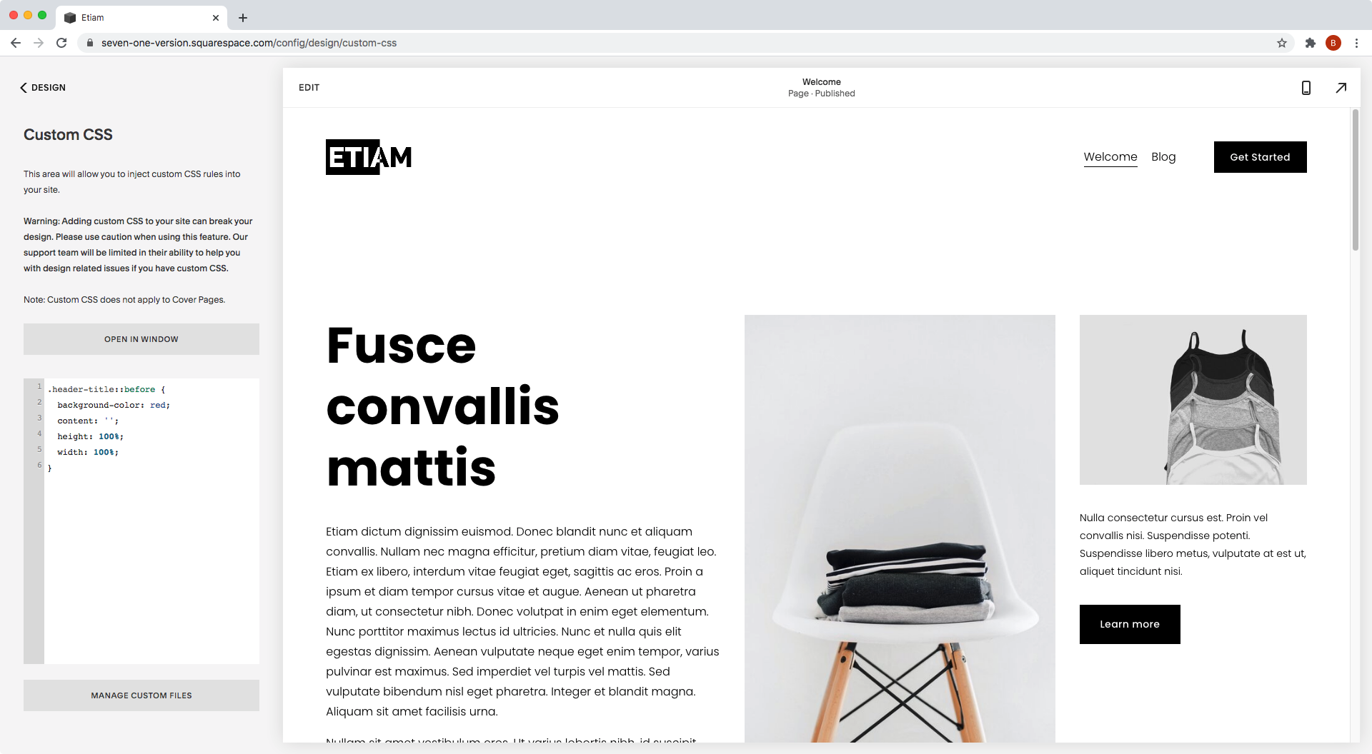
We can’t see anything right now because we need to either give our pseudo a display of block or use position absolute (which by default gives the element a display of block).
So, since we want our extra bit of background to sit next to our logo, without affecting its placement, let’s go with absolute positioning and a left and top offset of 0, to align it to the top/left corner of our logo container (for now):
.header-title::before {
  background-color: red;
  content: '';
  height: 100%;
  position: absolute;
  left: 0;
  top: 0;
  width: 100%;
}

Ok, at least we can see our pseudo-element now, but things are not quite right here.
In our code we said that the width of the element should match the one from the logo container and, as you can see, that’s waaaaay longer than our logo container.
It looks like our ::before is using a different ancestor container as its reference point to determine its position and dimensions, so let’s make sure that our browser uses the container WE want as the guide by targeting it and giving it a position of relative:
.header-title {
  position: relative;
}

Alright, much better!
Positioning the "extra" bit of background
Now that we created this little color block, let’s move it into place.
Since the logo is on the left side here, we want to push the red pseudo-element to the left side of the screen.
To do so, we’ll change that left offset we had for the right side one, and set its value to 100% so that, from right to left, the block moves 100% of the width of the container, (i.e all the way to the left side):
.header-title::before {
  background-color: red;
  content: '';
  height: 100%;
  position: absolute;
  right: 100%;
  top: 0;
  width: 100%;
}

Awesome!
Now the red container is all the way to the left side of the logo extending the background.
Let’s see what this looks like in fullscreen:

Perfect!
Making adjustments
Now, before we’re done here, there’s something we have to check.
Because our red pseudo-element is set to 100% width of the logo container and that logo container is not that wide, there’s a chance that on larger monitors the “extra” background may not reach all the way out to the edge of the browser screen, as we can see here:

To avoid that, we can swap that 100% width for 100vw instead, so that the background’s size depends on the size of the browser window and not on the logo container!
.header-title::before {
  background-color: red;
  content: '';
  height: 100%;
  position: absolute;
  right: 100%;
  top: 0;
  width: 100vw;
}


Awesome!
And now, let’s use the correct color to get the full effect:
.header-title::before {
  background-color: black;
  content: '';
  height: 100%;
  position: absolute;
  right: 100%;
  top: 0;
  width: 100vw;
}


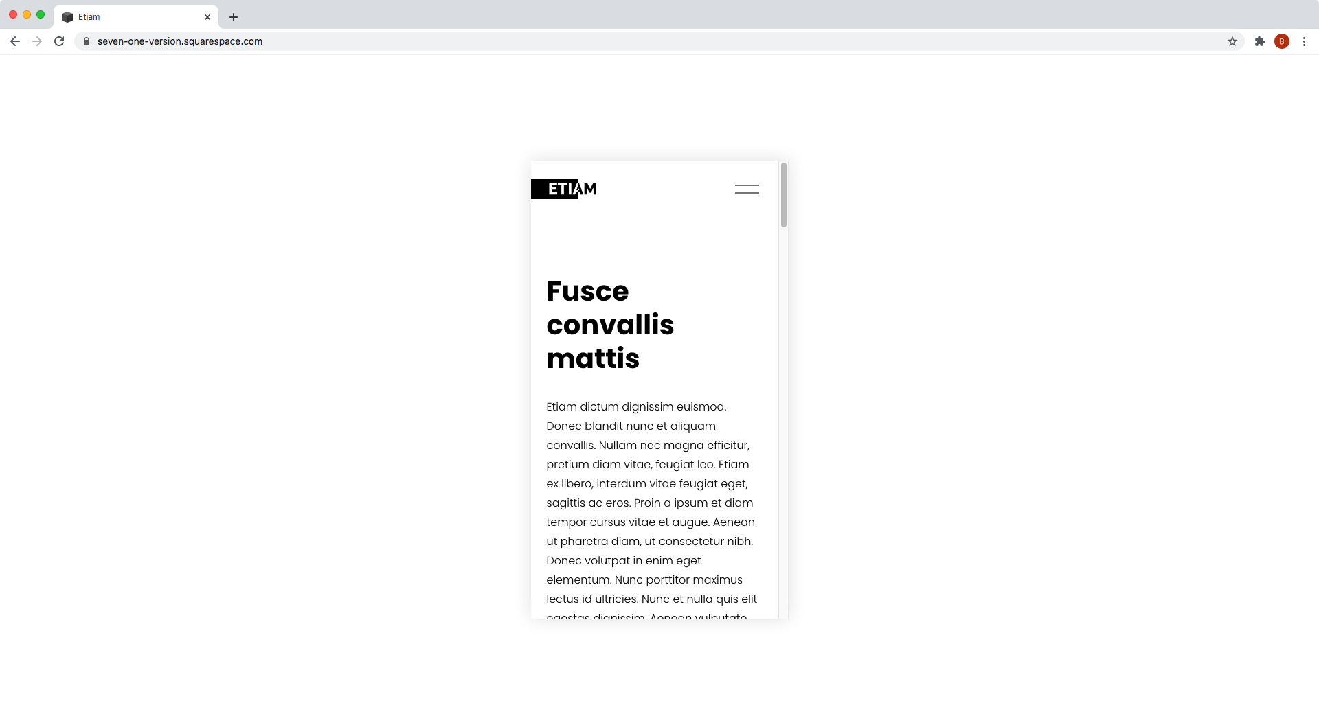
Whoop! It looks great! Even on mobile.
So, there you have it!
Now you know how you can extend the background of your logo to meet the edge of your browser, without having to deal with things shifting or moving out of place.
Until next time,
B.
Full code
Squarespace 7.1
/*EXTENDED LOGO ILLUSION IN SQUARESPACE (7.1)*/
.header-title {
  position: relative;
}
.header-title::before {
  background-color: black;
  content: '';
  height: 100%;
  position: absolute;
  right: 100%;
  top: 0;
  width: 100vw;
}
Squarespace 7.0 (BRINE)
/*EXTENDED LOGO ILLUSION IN SQUARESPACE (BRINE 7.0)*/
.Header-branding,
.Mobile-bar-branding {
  padding: 0 !important;
  position: relative;
}
.Header-branding::before,
.Mobile-bar-branding::before {
  background-color: black;
  content: '';
  height: 100%;
  position: absolute;
  right: 100%;
  top: 0;
  width: 100vw;
}