
How to easily create an alternated column blog layout (7.0 & 7.1)
So, you’re looking to spice up your client’s blog page without going too crazy?
Great! Because that’s exactly what we’ll be tackling on today’s post.
With just a few lines of CSS, we’ll be going from the regular grid layout we always see on the main blog page, to an alternated column layout that makes things more visually interesting.
Are you ready to learn how to make this happen?
Let’s jump to it!
Note: I’ll be using Brine for the tutorial breakdown and explanation, but you’ll find the 7.1 adapted version of the code at the end of the post!
Examining the current structure
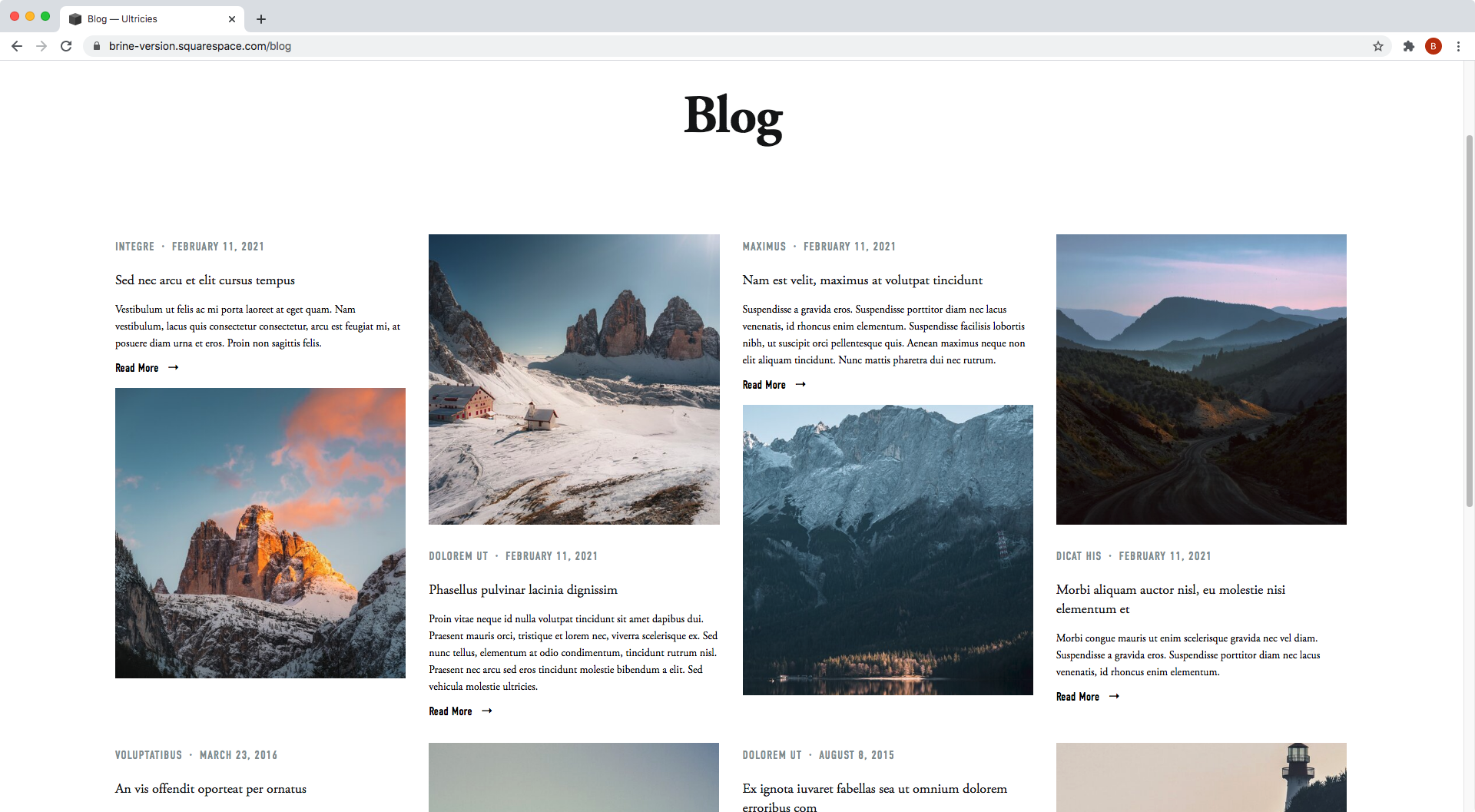
We’ll be starting out with a regular blog page in Brine.
I’ve set mine to display 4 columns via Site Styles.

To achieve our final look, the first thing we need to do is check how each of our blog items is built inside Squarespace’s HTML.
Looking through our Inspect Element tool…


…we can see that our blog item container is an article element with a bunch of classes.
And inside it, we can see that there’s an image container…


…an a element acting as the title…
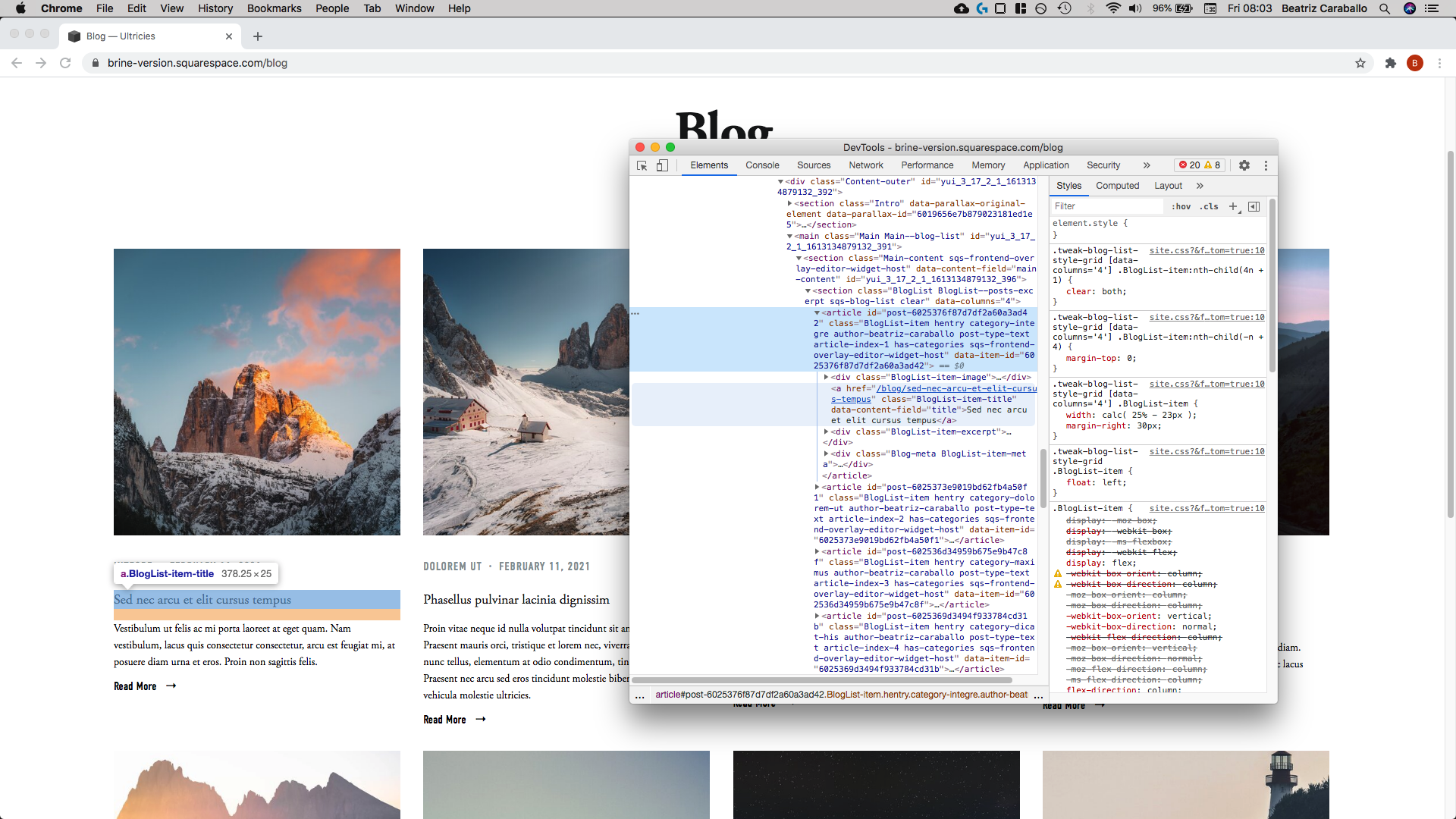
…a container for the excerpt…


…and a container for the metadata:


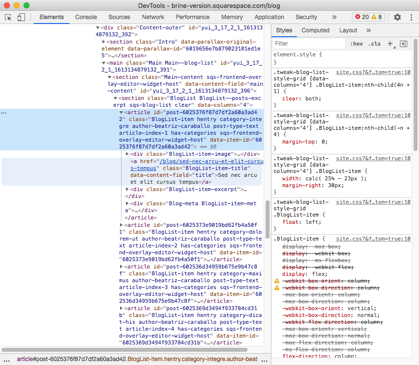
Now, I don’t know if you noticed, but although the metadata container is set as the last element of the blog item inside the HTML, it’s displayed as the second element on the screen.
That’s thanks to the blog item container being a flex container:

Why does this concern us? You may ask.
Well, because that’s the key to the reorganization we’ll be doing!
Checking the current order of elements
Going back to our Inspector tool, if we look at the image container, we’ll see that it has an order of 1:

And that the excerpt container has an order of 5:

And that the metadata has an order of 2:
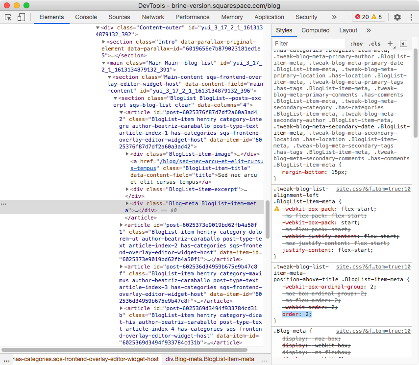
That little order property is the one that lets us reorganize a group of siblings that have a direct parent container as a flex container.
Which is exactly what we have right now.
So, in order to create our alternated layout, we need to change the placement of the image container, so that it sits at the bottom of the entire blog item.
In other words, we need to target the image container and give it an order value that equals or is as big as the number of total siblings inside the flex container.
If that doesn’t make too much sense right now, don’t worry.
First, let’s focus on the targeting part.
Targeting the image container
We’re moving the image container, so let’s look for a class to target it through:

Alright, so the container has a class of .BlogList-item-image.
Let’s use that!
.BlogList-item-image {

}
Now, as for the order thing we mentioned, basically, we just need to count how many items we have inside the blog item container, and set the order value of the image container as an equal or higher number.
We have 4 elements (the image, the title, the excerpt, and the metadata), so we could go with order: 4 or order: 5.
HOWEVER, since we previously saw that the excerpt already had an order: 5 applied…

…we’ll need to go a bit higher to make sure that our image sits below it.
So, order: 6 it is:
.BlogList-item-image {
  order: 6;
}
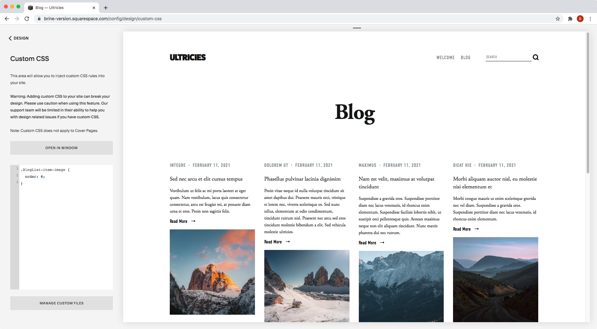
Ta-dá!
How about that? All the images have magically moved to the bottom of the blog items.
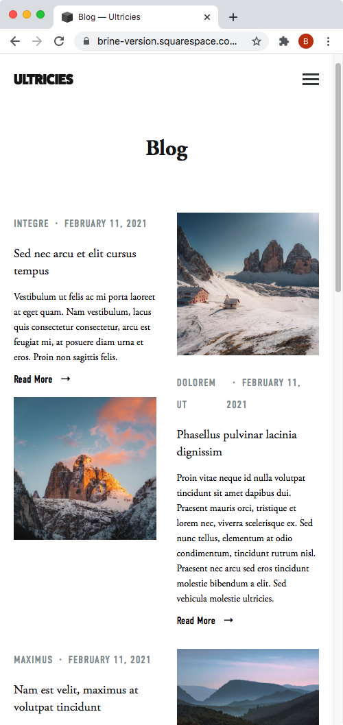
Creating the alternated layout
Now, you could absolutely leave it like this if you like the layout.
But, if you want to achieve the alternated version, there’s one more thing we need to do.
We’ll need to target every other blog item, instead of all of them.
To do so, we’ll make use of the :nth-child(odd) selector, which will target every odd sibling inside a group or list of elements.
All our blog items have the class .BlogList-item as seen here:

So what we need to do is target “the image container within every odd blog item”:
.BlogList-item:nth-child(odd) .BlogList-item-image {
  order: 6;
}


Amazing!
We’re done here.
A quick note
Before you go, I just want to highlight the fact that this trick WILL NOT create a masonry layout (as in the Summary Wall).
It may give that illusion, but the columns are still set in a grid pattern, so if you have uneven information (e.g. titles way longer than others, or excerpts with lots of text and others with very little), you will see white gaps between rows as seen here on mobile:
So, keep that in mind!
Alright, my friend, that’s all for today.
Now you know how to achieve a more interesting look for your client’s blog page with just a few lines of CSS.
Until next time,
B.
Full code
Squarespace 7.0
/*ALTERNATED COLUMN BLOG LAYOUT FOR BRINE (7.0)*/
.BlogList-item:nth-child(odd) .BlogList-item-image {
  order: 6;
}
Squarespace 7.1
Note: the blog page layout needs to be set to “Basic Grid Blog” through the page’s settings.
/*ALTERNATED COLUMN BLOG LAYOUT FOR BASIC GRID (7.1)*/
@media screen and (min-width: 767px) {
  .blog-basic-grid .blog-item:nth-child(odd) .blog-basic-grid--text {
    order: -1;
  }
  .blog-basic-grid .blog-item:nth-child(odd) > div:first-child {
    order: 3;
  }
}