
How to adjust your page/index section height on mobile
If you like creating really immersive designs for your clients, chances are you love setting your index sections (7.0) or page sections (7.1) to the full height of your screen.
The effect looks amazing on desktop but, on smaller screens, that extra space can be a little bit too much.
The good news is that you can easily adjust this on mobile with just a few lines of CSS.
And that’s exactly what we’ll be looking at today.
Let’s do this!
Looking for what creates the full height
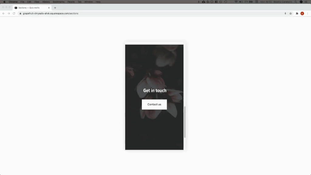
I’m starting out with a couple of full-height sections in a 7.1 site.
They look lovely on desktop…


…but, as I’m sure you’ve aware, full screen can sometimes be a bit too much on smaller devices:


Now, in order to modify this excess height we first need to take a look at what’s causing it.
I don’t know about you, but when I see extra space, my mind immediately thinks of padding.
However, if we check out our section’s content container (.content-wrapper) through the Inspect Element tool…

…we can see that even when there IS some padding present, that’s not accounting for the whole height of that area.
But, if we move up our site’s structure to look directly at the “main” wrapper of the section (.page-section)…

…we can see that a) the section occupies the full screen – as highlighted in the screenshot above – and b) we have a sneaky little min-height value of 100vh on the right side, applied to that container:
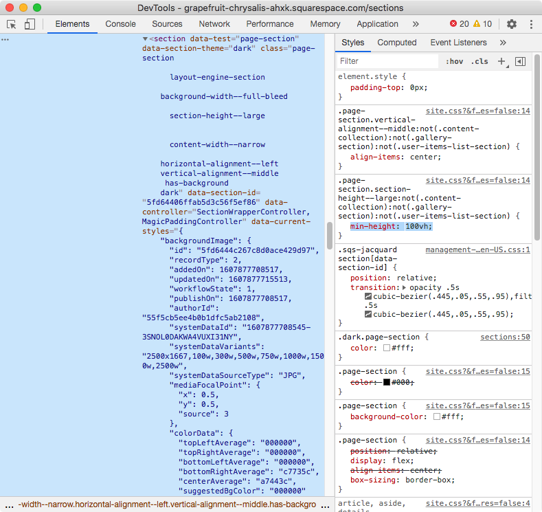
So there we go, we have our culprit!
Now, all we have to do is modify that value on mobile to remove the extra space that’s bugging us.
Choosing the approach
There are two ways we can go about targeting our sections to achieve this:
Reusing the selector that Squarespace already has in place to set the original min-height, based on our editor’s options.
Or, using our own selector.
The option you choose will depend on how global you want to make the changes.
The selector that’s currently in use (highlighted below) reads as follows: “all page sections with a large height option that are not a content collection container, nor a gallery section, nor a user item list section“.

In other words, it’s pretty much any regular page section on a 7.1 site that’s been set to a Large height through the section’s settings.
So, if you want to target ALL of the page sections on your site that match that, then you can reuse that selector.
However, if you prefer to target specific page sections, you’ll be better off using the data-section-id of each of your chosen areas.
And if you’re wondering why such two different selectors can be interchangeable, that’s because both the classes used in Squarespace’s selector and the data-section-id end up targeting the same container:

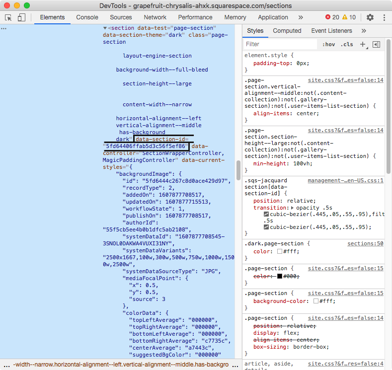
Personally, I just want to edit the hero and contact sections of my site, so I’ll look for their data-section-id and plop that into my code.
Putting everything together
We only want to make this height modification on mobile devices, correct?
If so, we need to use a media query to make sure that the change only takes effect for specific screen sizes.
I’ll be using 640px as my condition, but you can use a larger number (e.g 960px, 800px, etc) if you want to make the change happen for tablets too:
@media screen and (max-width: 640px) {

}
Alright, let’s add in our selector from before and set a new value for our min-height.
Note: if you want the content (plus any added padding) to determine the height of your sections on mobile, you can set min-height to 0. If you want them to start at a specific height, you can use a pixel value, or a vh value instead! E.g. 20vh, 500px, etc.
@media screen and (max-width: 640px) {
  [data-section-id="5fd64406ffab5d3c56f5ef86"] {
    min-height: 0 !important;
  }
}

Whoop! There we go!
And because I used the data-section-id instead of Squarespace’s global selector, all other areas on my site remain the same:

Applying the change to multiple specific sections
Now, I previously mentioned I wanted to alter not one, but TWO specific sections on my site.
In order to do that, and since I want to apply the exact same new value, I’ll simply group my data section ids inside my media query by separating them with a comma, like so:
@media screen and (max-width: 640px) {
  [data-section-id="5fd64406ffab5d3c56f5ef86"],
  [data-section-id="5fd644bdc4373837b906f66c"] {
    min-height: 0 !important;
  }
}

And just like that, my second section is also shorter, only on mobile!
So there you have it, that’s how you can adjust your page section or index section height on mobile, when working with full screen sections in Squarespace.
Until next time,
B.
Full code
Squarespace 7.1
Custom CSS Window
/*HOW TO ADJUST YOUR PAG SECTION HEIGHT ON MOBILE (7.1)*/
@media screen and (max-width: 640px) {
  [data-section-id="5fd64406ffab5d3c56f5ef86"],
  [data-section-id="5fd644bdc4373837b906f66c"] {
    min-height: 0 !important;
  }
}
Squarespace 7.0
Custom CSS Window
/*HOW TO ADJUST YOUR INDEX SECTION HEIGHT ON MOBILE (7.0)*/
@media screen and (max-width: 640px) {
  #your-index-section,
  #another-index-section {
    min-height: 0 !important;
  }
}