
Adding a fun twist to poster blocks (7.0 & 7.1 CE)

Recently, I was testing a couple of customizations in 7.1 and ended up with a pretty cool one that I’d like to share with you today!
I think this one would work great for poster blocks that don’t have a lot of text and are meant to catch the attention of your client’s visitors.
I decided to use the same image from the block as the title’s background, but you can absolutely mix and match to create a more interesting style!
There’s not really much more to say here, so why don’t we just get started?
Adding a background image to the heading
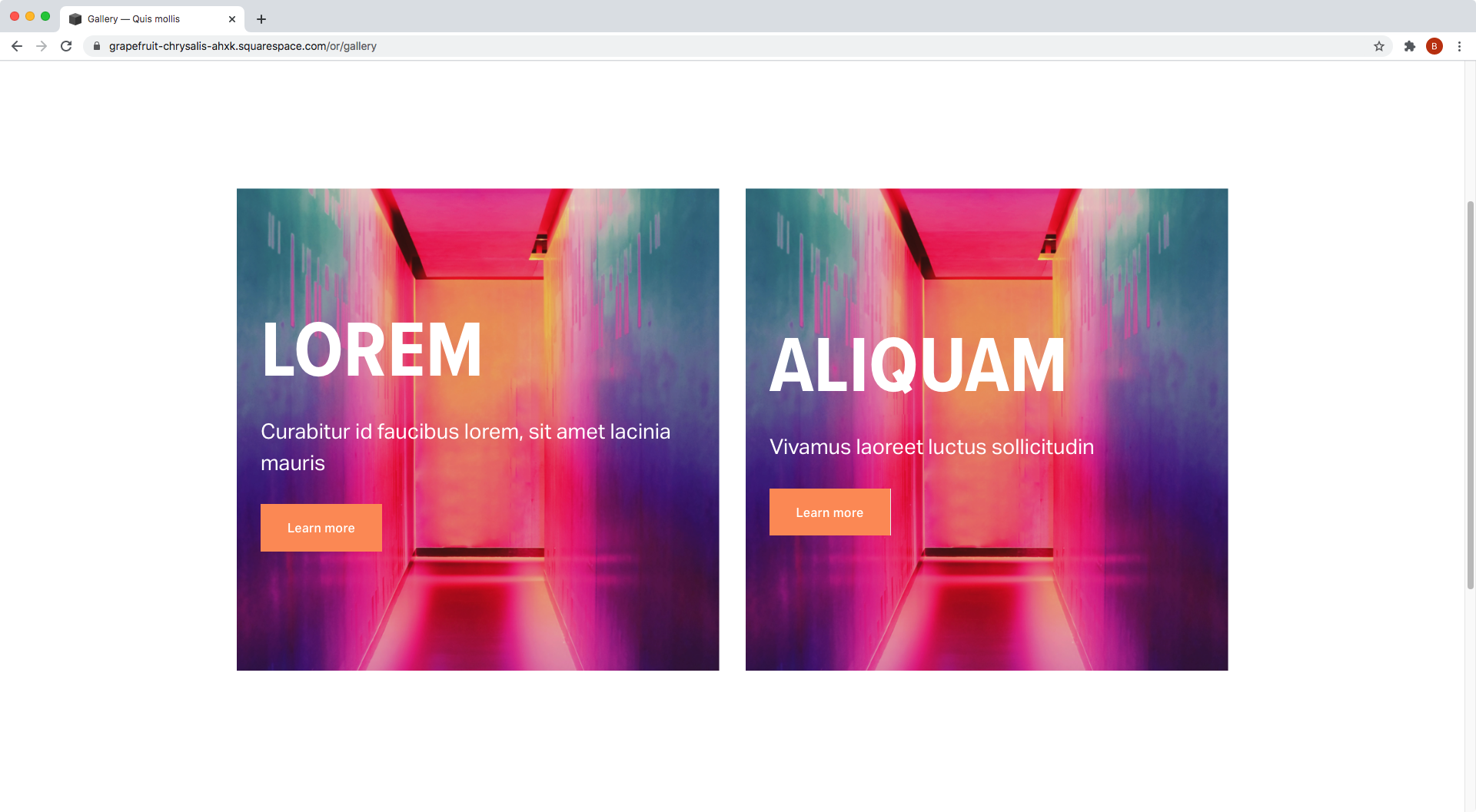
I’m starting out with two poster blocks in 7.1 that have a pretty large title and very little text.
To add the background image to the title text, we’ll need to target it directly. This means we have to look for the type of element it is and go from there.


As you can see, my title is an h1 so I’ll target it through that element selector.
However, that’s way too general and I don’t want to style any other h1 on the site.
So, I’ll look for a class that’s particular for poster blocks in order to make things more specific.
Scrolling up a bit from where we found the text element…

…we can see that one of the ancestors or parent containers has a bunch of classes, including one called .design-layout-poster that clearly indicates we’re working with a poster block. So let’s use that as well and create our selector:
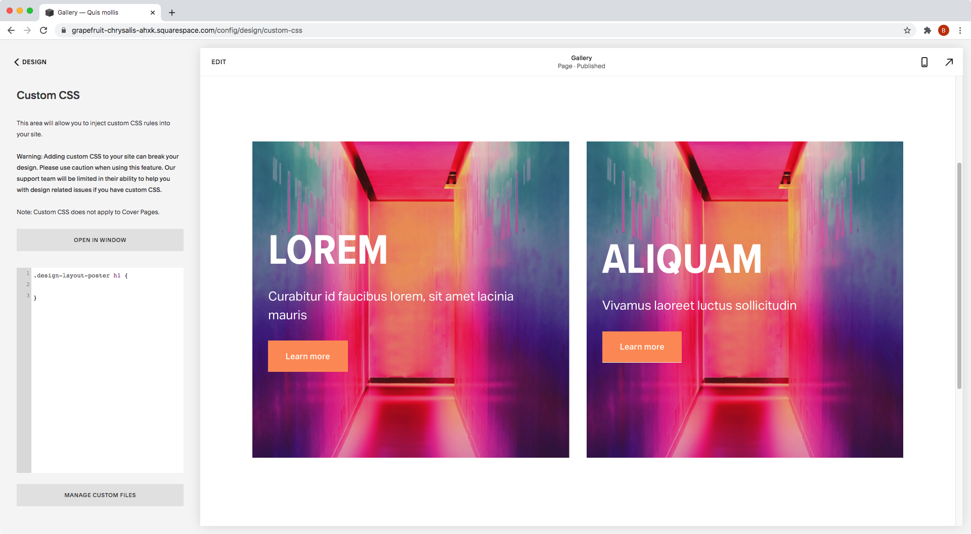
.design-layout-poster h1 {

}
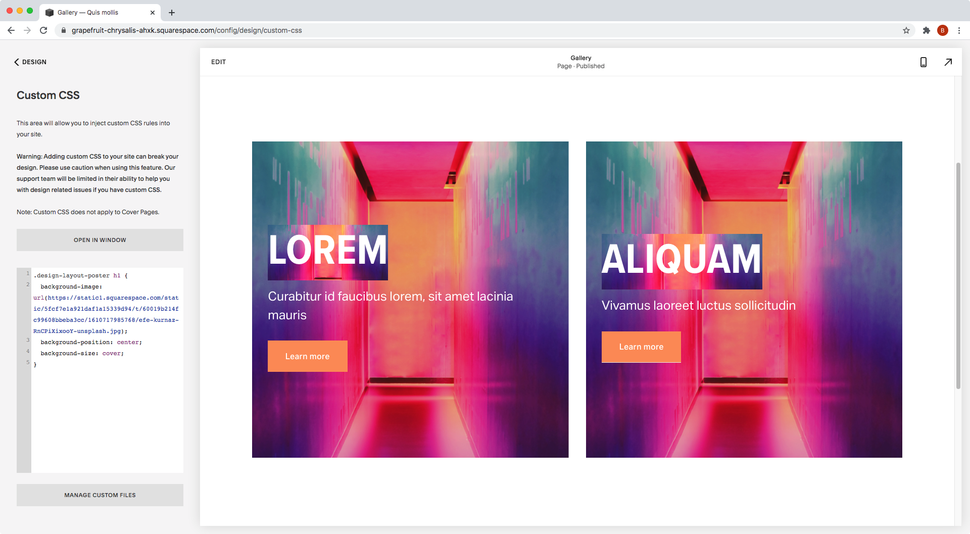
Awesome, now let’s get started by adding our background image as a URL:
.design-layout-poster h1 {
  background-image: url(https://static1.squarespace.com/static/5fcf7e1a921daf1a15339d94/t/60019b214fc99608bbeba3cc/1610717985768/efe-kurnaz-RnCPiXixooY-unsplash.jpg);
}

Alright!
The background is now sitting behind the text.
Let’s adjust it a bit, since we can only see the green part of the image at the moment.
We can center it and resize it to make it show up the way we want to:
.design-layout-poster h1 {
  background-image: url(https://static1.squarespace.com/static/5fcf7e1a921daf1a15339d94/t/60019b214fc99608bbeba3cc/1610717985768/efe-kurnaz-RnCPiXixooY-unsplash.jpg);
  background-position: center;
  background-size: cover;
}
Ok, much better!
We can see a lot more of the color now.
Let’s clip it with the -webkit-background-clip property, so that the image takes the shape of the text:
.design-layout-poster h1 { background-image: url(https://static1.squarespace.com/static/5fcf7e1a921daf1a15339d94/t/60019b214fc99608bbeba3cc/1610717985768/efe-kurnaz-RnCPiXixooY-unsplash.jpg); background-position: center; background-size: cover; background-clip: text; }

And, last but not least, let’s set the current white text color to transparent – with the -webkit-text-fill-color property – so we can actually see the clipped image behind it!
.design-layout-poster h1 { background-image: url(https://static1.squarespace.com/static/5fcf7e1a921daf1a15339d94/t/60019b214fc99608bbeba3cc/1610717985768/efe-kurnaz-RnCPiXixooY-unsplash.jpg); background-position: center; background-size: cover; background-clip: text; text-fill-color: transparent; }


Faaaantastic!
Note: when using -webkit-background-clip and -webkit-text-fill-color, it’s always recommended to add a fallback color, through the color property, so the text remains readable in case the background clip doesn’t work on a specific browser. However, Squarespace is already taking care of that for us! The text color we had at the beginning that’s being loaded through the section theme, will stay there as the fallback color.
Overlapping the title
For the next part of this customization, what we want to do is look for a title container that we can move to one side to create an effect similar to that of the overlap block.
We COULD target the same h1 element from before, but I rather go for one of its parent containers to avoid issues when using 7.1 animations.
Looking through the Inspector tool…


…I think it’s best if we target the .image-title-wrapper container, the grandparent of the h1.
So, let’s use that along with the .design-layout-poster class we used before to create our selector:
.design-layout-poster .image-title-wrapper {

}
And to move it, we’ll go with the translateX( ) function, so that nothing else budges from its place:
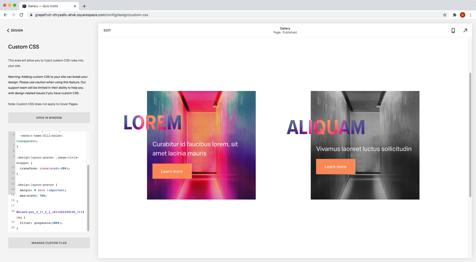
.design-layout-poster .image-title-wrapper {
  transform: translateX(-30%);
}


Ok, that’s not bad but… are you seeing what I’m seeing?
The titles are overflowing the boundaries of the poster block, and they will overlap with other stuff inside the page if we keep them this way.
Plus, they may get cut off in smaller screens if they’re too close to the edge!

To make sure that doesn’t happen, what we can do is counteract the space we just “added” to the block by reducing the final width of our block container.
We’ll do that by targeting our .design-layout-poster container, since that’s one of the wrappers holding all the content in place, and giving it a max-width of 70%.
Why 70%? Because if our block has a 100% width and we just “added” 30% more space to the side when we moved the title, to bring that back down to 100% (instead of keeping it at 130%) we need to reduce the original width 30%, leaving it at 70%.
.design-layout-poster {
  max-width: 70%;
}


Ok awesome, and now let’s make sure each block is centered by using margin: 0 auto;
We’ll need to make it !important to override a more specific margin that’s in place:
.design-layout-poster {
  margin: 0 auto !important;
  max-width: 70%;
}


Beautiful!
And now, just to make sure, if we check mobile…

…the titles don’t get cut off because they’re within the 100% width the block originally had!
Creating a hover mode
You know what would make this customization even better?
Having a hover mode that toggled the background image saturation!
To make this happen, we’ll make use of the filter property and the grayscale( ) function.
First, we’ll need to target the image inside our poster block.
Inside our Inspect Element tool we can see it’s an img element:


Now, because I don’t want to apply the change to ALL blocks but just one of them, I’ll swap the .design-layout-poster class for the block ID of the one I want to tweak.


Here’s what my selector looks like:
#block-yui_3_17_2_1_1611062209100_7174 img {

}
And now, let’s turn down the saturation of the normal mode of the image by setting the grayscale function to 100%…
#block-yui_3_17_2_1_1611062209100_7174 img {
  filter: grayscale(100%);
}
…and bring it back up once the block gets hovered over:
#block-yui_3_17_2_1_1611062209100_7174:hover img {
  filter: grayscale(0);
}

Nice!
Although I feel like the change is too abrupt, so I’ll go back into the normal mode of the image and give it a transition to make things smoother:
#block-yui_3_17_2_1_1611062209100_7174 img {
  filter: grayscale(100%);
  transition: all .3s;
}

Yes! Perfect!
Alrighty, so there you have it.
That’s how you can give your client’s poster blocks a fun little twist to make them “pop”!
Until next time,
B.
Full code
Squarespace 7.1
/*ADDING A FUN TWIST TO POSTER BLOCKS (7.1)*/ .design-layout-poster h1 { background-image: url(your-image-goes-here.png); background-position: center; background-size: cover; background-clip: text; text-fill-color: transparent; } .design-layout-poster .image-title-wrapper { transform: translateX(-30%); } .design-layout-poster { margin: 0 auto !important; max-width: 70%; } //Hover mode #your-block-id-goes-here img { filter: grayscale(100%); transition: all .3s; } #your-block-id-goes-here:hover img { filter: grayscale(0); }
Squarespace 7.0
/*ADDING A FUN TWIST TO POSTER BLOCKS (7.0)*/ .design-layout-poster .image-title p { background-image: url(your-image-goes-here.png); background-position: center; background-size: cover; background-clip: text; text-fill-color: transparent; } .design-layout-poster .image-title-wrapper { transform: translateX(-30%); } .design-layout-poster { margin: 0 auto !important; max-width: 70%; } //Hover mode #your-block-id-goes-here img { filter: grayscale(100%); transition: all .3s; } #your-block-id-goes-here:hover img { filter: grayscale(0); }