
Creating a custom overlay menu in Brine (7.0)

So, you’re using the mobile navigation as your desktop navigation?
And you’re working with Brine?
And you’re wondering if there’s a way to spice up your menu’s content to make it look more on-brand with your client’s site?
If you answered yes to all the above, or you’re just here to get more customization ideas for your future projects, then you’re going to love today’s tutorial!
We’ll be diving into an all-CSS way to customize Brine’s overlay menu and make it look like this:

Interested? Let’s do this!
Centering the menu's content
I’m starting out with a couple of links for my primary and secondary nav:

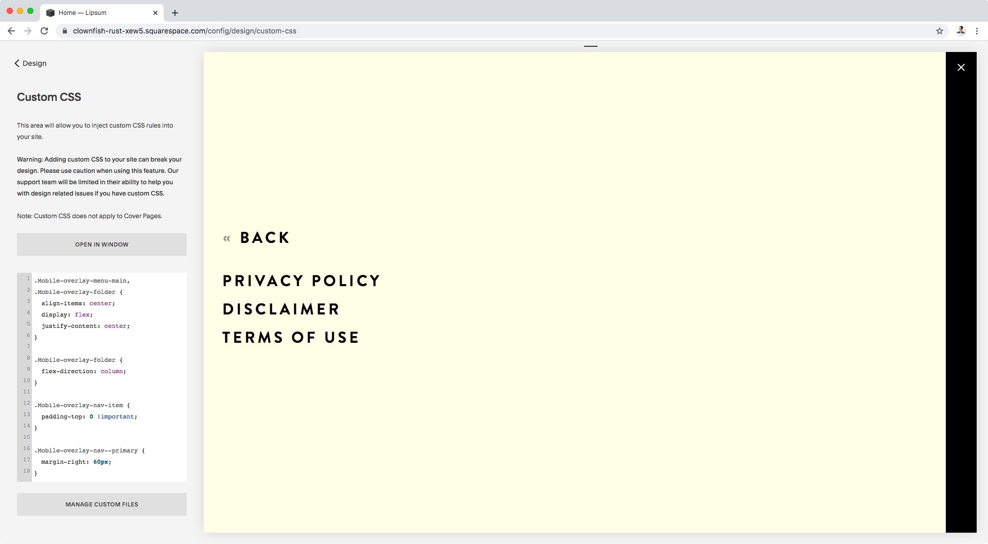
Including a folder link that opens up this second screen:

So, the first thing we’re going to be taking care of is the position of the current content of our menu.
The goal is to have everything in the center of the screen, so we’ll be using Flexbox to make this rearrangement super easy.
We need to look for the DIRECT PARENT container that’s holding the things we want to move (in this case, the chunk of primary nav and the chunk of secondary nav).
Looking through our Inspect Element tool here’s what we get:
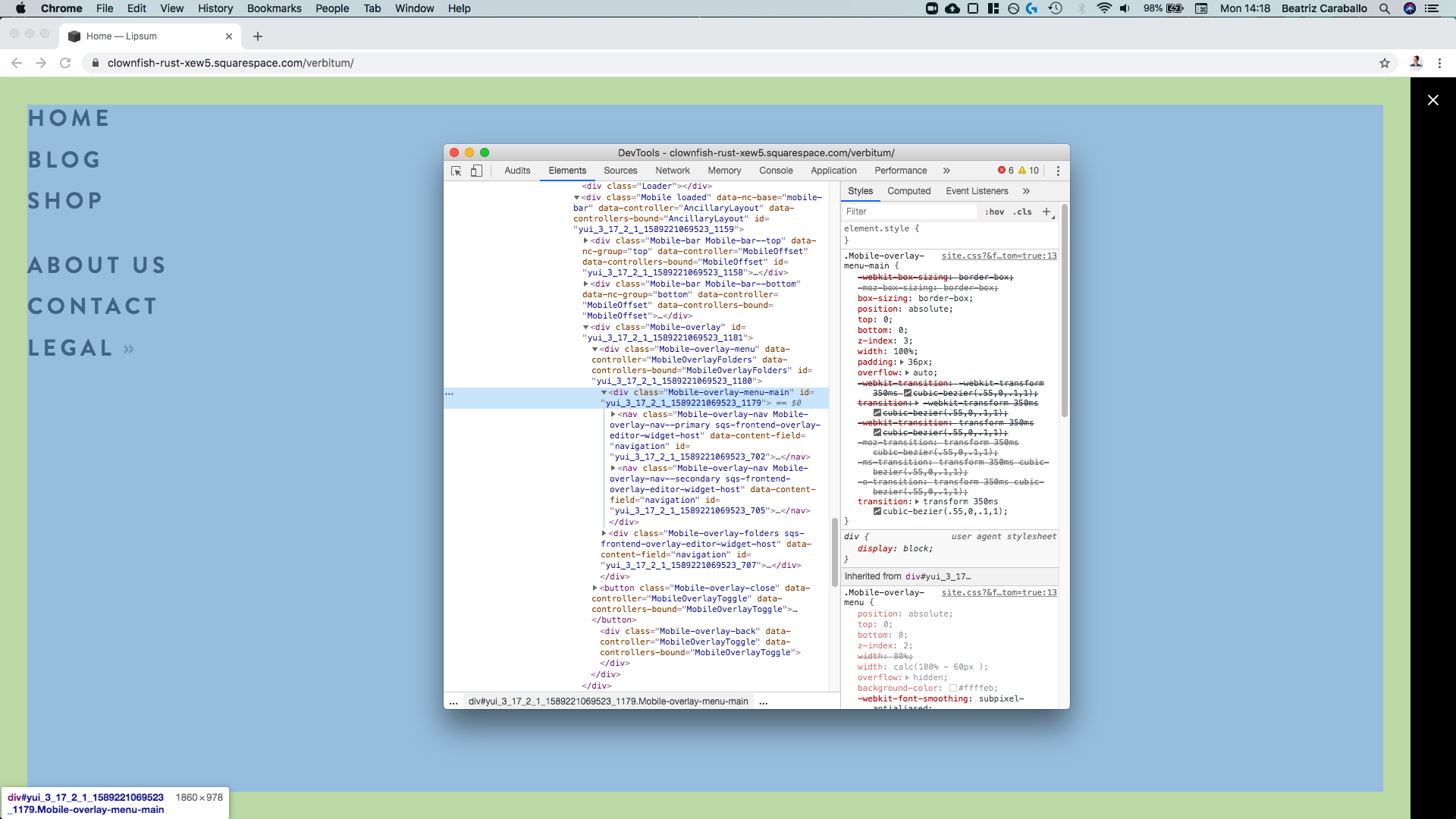

We can see that the direct parent container of both of our nav elements is a div with a class of .Mobile-overlay-menu-main, so we’ll be targeting it through that and setting it to flex:
.Mobile-overlay-menu-main {
  display: flex;
}

Alright, as we can see, our navigations are now next to each other, even if they’re a little bit misaligned.
Let’s go ahead and move them to the center of the screen with align-items and justify-content. Remember we need to do this on the DIRECT PARENT container, so that the elements inside it shift accordingly to the values we give it:
.Mobile-overlay-menu-main {
  align-items: center;
  display: flex;
  justify-content: center;
}

Ok, awesome!
The columns are still looking a bit crooked tho, so let’s check out what’s going on on the right side:

Ok, so it seems like that first link on the right has a top padding that’s making things look off.
Let’s remove it, along with any other top padding from the rest of the links just in case.
We can target all links with that .Mobile-overlay-nav-item class since they all share it!
.Mobile-overlay-nav-item {
  padding-top: 0 !important;
}

Perfect!
Now, let’s add some spacing between these two navigation groups.
We can do this by simply targeting one or the other, and adding a margin on the corresponding side.
If we look at the first group of links:


We can see once again it’s a nav with a couple of classes including one called .Mobile-overlay-nav--primary that can work for us, so let’s use that:
.Mobile-overlay-nav--primary {
  margin-right: 60px;
}

Beautiful!
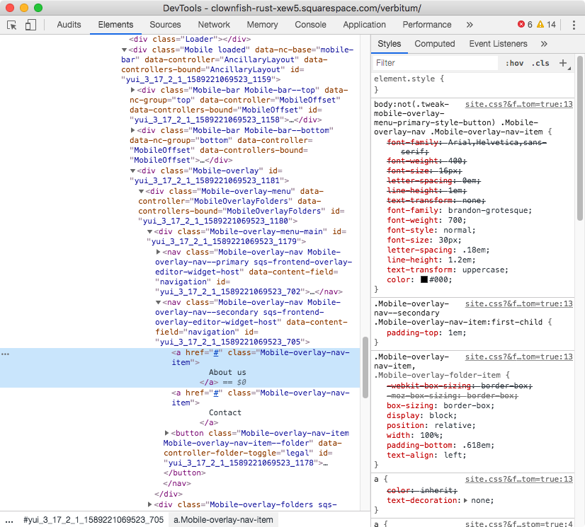
Tweaking the folder items
Before we continue and add the image that’ll be accompanying our menu links, let’s check our folder area for a second…

Aha!
The reorganization we did for our main overlay didn’t affect this part of the menu, so why don’t we take care of it?
The process is exactly the same, we’ll look for the DIRECT PARENT container holding our folder content:


Alright, so this one is a div, just like the first one we targeted, but it has a class of .Mobile-overlay-folder.
Now, because we’ll be doing the exact same thing in terms of display and alignment, we can simply group this class along with the main overlay selector (.Mobile-overlay-menu-main) so that the same styles apply:
.Mobile-overlay-menu-main,
.Mobile-overlay-folder {
  align-items: center;
  display: flex;
  justify-content: center;
}

Ok, cool!
Now, I don’t know about you but I rather have these folder links stacked, so how about we change the direction of the layout and set it to column by, once again, targeting the .Mobile-overlay-folder container:
.Mobile-overlay-folder {
  flex-direction: column;
}
Much better!
But, let’s check why the text isn’t in the middle of the screen like it should.
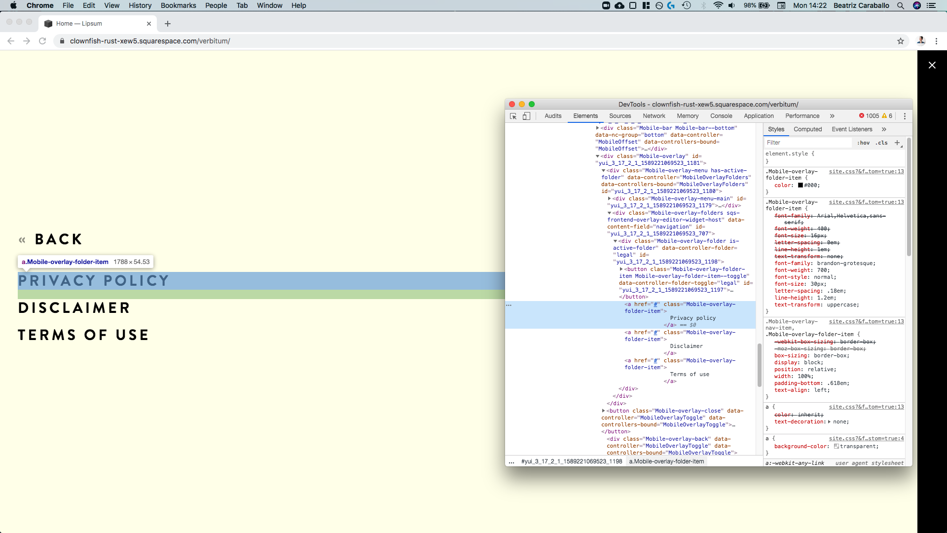

Ok, so the containers of each link are block elements expanding across the entire width of the parent container.
This is perfect because we can simply use text-align to realign the content to the center!
In fact, that’s what’s currently aligning the links to the left:

So let’s target these folder links through their common class .Mobile-overlay-folder-item and change that:
.Mobile-overlay-folder-item {
  text-align: center;
}

Perfect!
Here’s what we have so far:


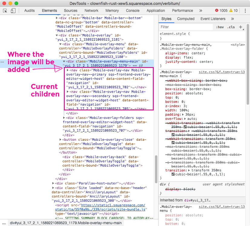
Adding an image to the overlay menu
With everything in place, let’s go ahead and set up our image!
I’ll be using a logo submark, but this would be a great place to feature the image of your choice.
Because we’re not able to add blocks to the overlay menu, we’ll be relying on our dear friend the pseudo-element to make this happen.
The idea is to include this pseudo-element as a sibling of our existing primary and secondary nav columns.
That way, it’ll be easy to make it sit and align with them both horizontally and vertically (on mobile).
So, we’ll be targeting the DIRECT PARENT container we already used at the beginning of the tutorial (.Mobile-overlay-menu-main), and attaching a ::before pseudo-element to it that’ll sit right before the two link columns:

Starting with the basic setup, let’s create an empty container 200 x 200px in size and with a temporary background color to make it visible:
.Mobile-overlay-menu-main::before {
  background-color: red;
  content: '';
  display: block;
  height: 200px;
  width: 200px;
}

Nice!
How about a little margin to the right side?
.Mobile-overlay-menu-main::before {
  background-color: red;
  content: '';
  display: block;
  height: 200px;
  margin-right: 60px;
  width: 200px;
}

Perfect!
And how about we swap that color for the actual image we want to display?
We’ll set it up using background-image, and then make sure it fits, sits and doesn’t repeat through a couple of other background settings:
.Mobile-overlay-menu-main::before {
  background-image: url('https://static1.squarespace.com/static/5e396e0cd589db5a1b0afc56/t/5eb9713879d8322ad16b44b7/1589211448597/Logo.png');
  background-position: center;
  background-repeat: no-repeat;
  background-size: contain;
  content: '';
  display: block;
  height: 200px;
  margin-right: 60px;
  width: 200px;
}


Oh my, this is looking awesome!
Note that the logo only shows up on the main overlay page, not the folder area, so keep that in mind. Although, you can absolutely adapt the code to make it display here too!

Adjusting the menu for mobile
We’re almost done here!
But first, we have to talk about mobile.
If we look at what we have so far on tablets and phones…


…in the first preview the layout is decent, but on mobile screens is not right, at least not at this font size.
So, let’s take care of both cases because I feel having a vertical layout here would be much more user friendly.
Since we’re already using Flexbox to set things side by side on desktop, we just have to make some slight adjustments to shift things around on smaller screens!
First, to stack our image and both navigations, we’ll need to use flex-direction and set it to column for our direct parent container, i.e .Mobile-overlay-menu-main.
Let’s set this under a 960px media query:
@media screen and (max-width: 960px) {
  .Mobile-overlay-menu-main {
    flex-direction: column;
  }
}

Awesome!
And now, let’s remove the margins we added to both the image and the primary navigation, and also align the links to the center, just like we did with the folder ones but using the corresponding class of .Mobile-overlay-nav-item.
Personally, I’ll also tackle the size of the logo to set it a bit smaller and with some margin at the bottom.
All of this translates to:
@media screen and (max-width: 960px) {
  .Mobile-overlay-menu-main {
    flex-direction: column;
  }
  .Mobile-overlay-nav--primary {
    margin-right: 0;
  }
  .Mobile-overlay-nav-item {
    text-align: center;
  }
  .Mobile-overlay-menu-main::before {
    height: 120px;
    margin-bottom: 40px;
    margin-right: 0;
    width: 120px;
  }
}

Perfect!!
Let’s check this out on mobile:

Aaaand the folder section, just in case:

Faaantastic!
So, there you have it!
You can now customize your client’s overlay menu and make it a bit more on-brand just with CSS.
Until next time,
B.
Full code
/*CUSTOM OVERLAY MENU FOR BRINE*/
.Mobile-overlay-menu-main,
.Mobile-overlay-folder {
  align-items: center;
  display: flex;
  justify-content: center;
}

//Tweaking the folder links
.Mobile-overlay-folder {
  flex-direction: column;
}
.Mobile-overlay-folder-item {
  text-align: center;
}

//Tweaking the main menu links
.Mobile-overlay-nav-item {
  padding-top: 0 !important;
}
.Mobile-overlay-nav--primary {
  margin-right: 60px;
}

//Adding an image
.Mobile-overlay-menu-main::before {
  background-image: url('https://static1.squarespace.com/static/5e396e0cd589db5a1b0afc56/t/5eb9713879d8322ad16b44b7/1589211448597/Logo.png');
  background-position: center;
  background-repeat: no-repeat;
  background-size: contain;
  content: '';
  display: block;
  height: 200px;
  margin-right: 60px;
  width: 200px;
}

//Mobile styles
@media screen and (max-width: 960px) {
  .Mobile-overlay-menu-main {
    flex-direction: column;
  }
  .Mobile-overlay-nav--primary {
    margin-right: 0;
  }
  .Mobile-overlay-nav-item {
    text-align: center;
  }
  .Mobile-overlay-menu-main::before {
    height: 120px;
    margin-bottom: 40px;
    margin-right: 0;
    width: 120px;
  }
}