
Expanding the Instagram Block to full width (Brine 7.0)

One of the easiest way to customize any Squarespace site is to expand its blocks to the full width of your design to contrast with the content that has some spacing on the sides.
In today’s post we’ll be looking at how to do that with the Instagram block.
This will allow you to use a nice little strip of images as a divider for any part of your website or to mark the end of the content and the beginning of the footer!
Targeting the instagram block
We’ll start off by adding an Instagram block inside an index section.
I’m using one of the Brine templates but you can use any other that allows to create indexes, just note that the code and process may be slightly different in that case.

Next, I’ll add a colorful background to the entire section so it’s easier to see if there are any borders or space remaining after we implement the code.
To do this, I’ll be targeting the specific section through its URL slug.
I named mine instagram as you can see through my Inspect Element window:

I’m gonna plop that ID inside my Custom CSS window, but I’m gonna use it along with the element selector as well (section) since the ID #instagram is also used by Squarespace to name the Instagram block option under Social Blocks:

Which means that if I use the ID on its own like this:
#instagram {
  background: #DADED1;
}
… I’m gonna give that block option a nice background color too!
(Guess how I found it it’s called the same way, lol)

So anyway, instead of targeting just #instagram, I’ll be using section#instagram, so my browser knows I’m talking about the INDEX section and not the SOCIAL BLOCK.
section#instagram {
  background: #DADED1;
}

Oki doki!
Making the Instagram block full width
Now, in order to stretch our Instagram block full width we need to understand why it’s not full width right now.
One of the reasons could be that the block itself has a max-width that keeps it restricted to a maximum size.
Another reason could be that the container holding it has some padding or a max-width that’s keeping from getting bigger.
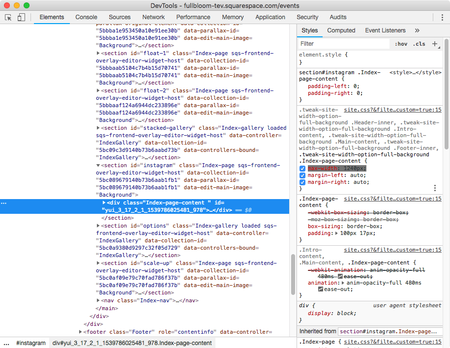
If we look at the inside of our instagram index section we’ll notice we’re dealing with the latter:

See the green frame and orange bars? We need to get rid of the one on both sides.
The green bars are just a little bit of padding we need to remove to make sure the block isn’t constrained by it.
But the orange part, the margin, is the biggest constraint here.
If we take a closer look at the Inspect Element window you’ll notice that the margin is actually set to auto, which means that it’s spreading evenly based on the space that remains outside of the MAX-WIDTH that has been set for the section.
So, if we change that current max-width to 100% instead of a fixed number, our index section content will expand across the entire width of our green area, which in turn will make our Instagram block expand full width as well!
All of this translated into code looks like this:
section#instagram .Index-page-content {
  padding-left: 0;
  padding-right: 0;
  max-width: 100%;
}

And here’s our full width Instagram block in all its glory!

Until next time,
B.
Full code
section#your-url-slug .Index-page-content {
  padding-left: 0;
  padding-right: 0;
  max-width: 100%;
}