
Grayscale to color hover mode for image blocks (7.0 & 7.1 CE & 7.1 FE)

Adding a hover effect to image blocks can be a fun way to spice up your client’s design without too much hassle.
So today, we’re going to be looking at how we can give a really cool grayscale to color + rotating + scaling effect to any images of your site on hover!
That may sound complicated, but I promise you it’s quite simple to achieve!
Let’s jump right into it, shall we?
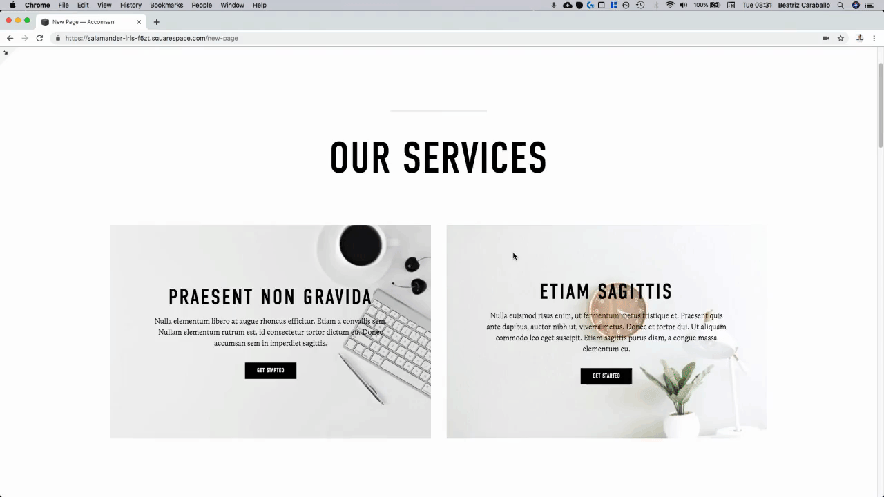
Creating a hover effect for poster block images
The code we’ll be using here will apply this hover effect to ALL image blocks on your site, but you can make it more specific so it gets applied only to one type of image layout, to a single image, to a single page, to a single index section, etc.
In the example, I’ll be showing you what it looks like on Poster blocks, but the code will still be the generalized version.
This is what I’m starting with:

I have two poster blocks side by side with a nice image and some text.
The first thing we need to do is to find out what our image block is called so we can target it via CSS:

Taking a closer look…

We can see our image block has a couple of classes, so I’ll be using .image-block.
Note: want to add the effect to just a few very specific image blocks on your site? Use their block id instead! In this example I would need to use #block-yui_3_17_2_1_1563975010437_11281, however, I’ll continue on with just the class.
Now that we know what our image block class is called, what I want to do is look for the image inside the block, since I want to apply the effect only to the image and not any other part of my block (I don’t want anything else – like the text, the button or the entire container – changing color or rotating!)

As you can see above, I found my image (highlighted in blue) inside the image block (highlighted in grey).
It’s an image element without any classes or ids, so we’ll just target it through its element selector: img
So, our entire selector will now look like this:
.image-block img {

}

We’re targeting the image element inside our image blocks.
Perfect!
Going from grayscale to color
To create our first part of the hover effect, we need the normal state of our image to be in grayscale.
In order to do this, we’ll be using a property called filter that will allow us to apply “graphical effects” to our image via code.
You can read more about this property here, but the function we’ll be using is simply called grayscale() and it allows us to determine how much we want to remove the color from our picture.
100% is completely grayscale while 0% leaves the image untouched.
In this case, we want our INITIAL image state to be 100% grayscale, so:
.image-block img {
  filter: grayscale(100%);
}

Easy as that!
Now, let’s target the hover state of our IMAGE BLOCK so whenever the cursor is on top of it, our image changes color.
.image-block:hover img {

}

And add the modified version of the grayscale function so the image goes back to its normal colors:
.image-block:hover img {
  filter: grayscale(0);
}

Let’s test this out!

Ok! We have our color change set!
Don’t worry, we’ll be making the transition smoother in a bit.
Making the image rotate and scale
Let’s move onto the next part of our hover mode.
Now, on top of going back to its original color, we want to make the image rotate slightly and increase in size for a more interesting visual effect.
Since we want this to happen on mouseover, we’ll be setting the transform property under the hover state of our image block.
We’re going to be combining 2 functions: the rotating function and the scaling function.
I’ll have my image rotate just -5deg and scale 1.2 times its size.
You can use any values you like!
.image-block:hover img {
  filter: grayscale(0);
  transform: rotate(-5deg) scale(1.2);
}

Let’s see what this looks like:

Alright, it’s all happening at the same time… it’s just waaaaaaaay too sudden.
Let’s fix that!
All we have to do here is set our transition property so that all of our changes take a bit of time to happen, and we can effectively see the alterations happening.
I’ll be applying the transition to all properties involved and setting the duration to .5s.
Pro tip: whenever you’re using the transition property for a hover mode, add it to the NORMAL state of your element so it continues happening after your mouse leaves the element instead of coming to a screeching halt (as it would happen if you add it to the hover mode directly).
.image-block img {
  filter: grayscale(100%);
  transition: all .5s;
}

Would you look at that?!
You’ve just created an awesome hover effect for your client image blocks!
Until next time,
B.
Full code
.image-block img {
  filter: grayscale(100%);
  transition: all .5s;
}

.image-block:hover img {
  filter: grayscale(0);
  transform: rotate(-5deg) scale(1.2);
}